Short answer: the 2026 Colors of the Year converge on grounded, calming green, from BEHR’s smoky jade to Benjamin Moore’s moody depth and Valspar’s eucalyptus, with PPG breaking away toward warm mahogany brown. Below we compare every brand’s pick side by side and show what each palette actually looks like in a real room, so you can choose the one that fits your light and your space.
Every major paint brand has now announced their 2026 Color of the Year and for the first time in years they almost all agree on one thing. Green is the color that defines how we want to live right now. Not the bright lime green of a decade ago. A deeper, calmer, more grounded green that makes a room feel like a place you actually want to sit down and breathe in.
But here is the thing. BEHR picked a smoky jade. Benjamin Moore went darker and moodier. Valspar chose eucalyptus. PPG went completely different with a warm mahogany brown. So which one is actually right for your room? We compared every pick side by side and used AI to show you what each palette looks like in a real apartment.
Watch: 2026 Color Trends to Know
The colors of the year sit inside a broader 2026 palette shift. This overview from Interior Insights runs through the color trends defining the year, useful context before we compare each brand’s pick below.

Video: “10 Interior Design Color Trends You Need to Know in 2026” by Interior Insights.
Every 2026 Color of the Year Compared
Here is every major brand pick for 2026 and what makes each one different:
| Brand | Color Name | Tone | Best For |
|---|---|---|---|
| BEHR | Hidden Gem | Smoky jade green | Living rooms, bathrooms |
| Benjamin Moore | Silhouette AF-655 | Deep muted anchor tone | Accent walls, bedrooms |
| Valspar | Warm Eucalyptus | Soft restorative green | Bedrooms, nurseries |
| PPG Paints | Warm Mahogany | Rich grounding brown | Living rooms, dining rooms |
| WGSN | Transformative Teal | Bold blue-green | Statement pieces, kitchens |
The common thread is warmth. Even the greens have warm undertones. The era of cool greys and stark whites is officially over. Every brand is pushing toward colors that make rooms feel inhabited, personal, and grounded.
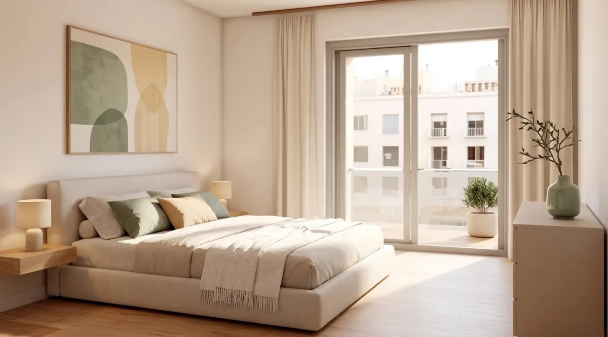
The Green Palette: BEHR Hidden Gem in a Real Room
BEHR Hidden Gem is the most versatile pick of the bunch. It is a smoky jade with enough grey in it to feel sophisticated without being dark. In the bedroom below, you can see how green tones create a calming atmosphere. The sage green pillows, abstract art with green and gold tones, and the green ceramic vase on the dresser all reference the Color of the Year without painting every wall.

The trick with green is layering. One shade of green on everything looks flat. But when you combine a muted sage on textiles with a deeper green in artwork and a lighter eucalyptus on a vase, the room feels rich and dimensional. The warm oak nightstands and linen bedding keep it from feeling cold.
Warm Earth Tones: PPG Warm Mahogany and Terracotta
PPG went in a completely different direction with Warm Mahogany, a deep rich brown that anchors a room the way dark navy used to. This is not the lifeless brown of 1990s interiors. It is warm, inviting, and works beautifully as an accent through furniture, textiles, and ceramics rather than painted walls.
The dining room below shows how terracotta and warm brown tones create an inviting space. The terracotta accent chairs, clay pitcher, and circular wall art in warm tones all reference the earthy palette. Meanwhile the raw wood dining table and cream upholstered chairs keep the room from feeling too dark.
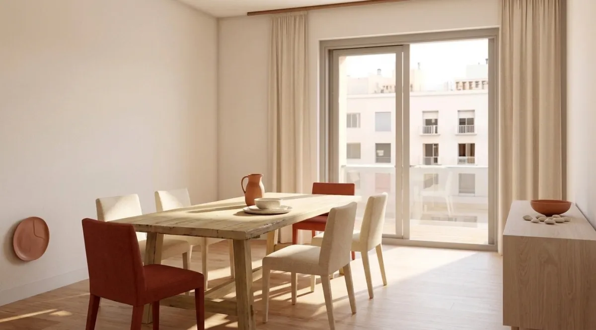
According to Apartment Therapy's State of Home Design 2026 report, chocolate brown is the single most popular color direction this year. Homes and Gardens reports that 73% of designers are now choosing warm toned furniture over cool toned alternatives.
Cool Tones: When Blue Grey Still Works
Not everyone is ready to go full earth tone. If you prefer cooler colors, the 2026 way to do it is with a sophisticated blue grey rather than the pure cool grey of previous years. The key is choosing a blue grey with enough warmth to feel livable rather than clinical.
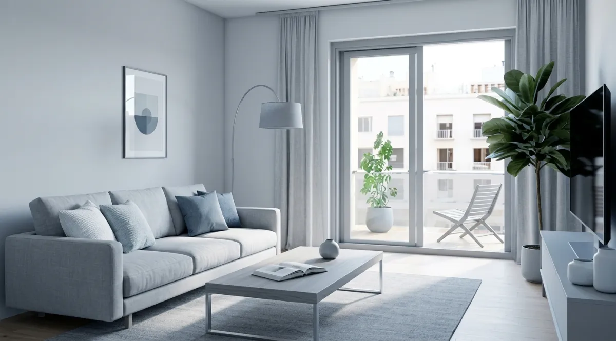
This version of the same apartment uses a blue grey palette with a modern grey sofa, abstract blue toned art, and an arc floor lamp. The fiddle leaf fig plant adds the mandatory 2026 green accent. Notice how the room still feels warm because of the oak hardwood floors. The floor acts as a natural warming element that prevents the blue grey from feeling sterile.
Warm Neutrals: The Safe Pick That Always Works
If you are not sure about committing to green or brown, the warm neutral palette is the 2026 version of playing it safe. And safe does not mean boring. The living room below uses cream, sand, warm beige, and natural jute with a sage green throw as the only color accent.
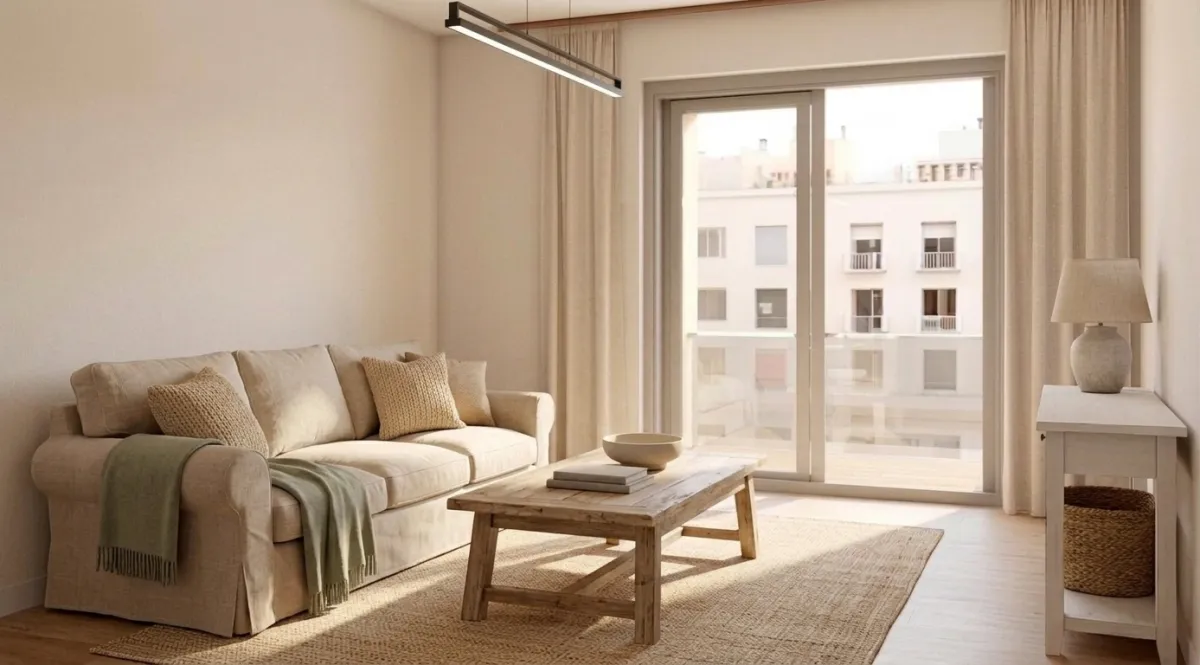
The reclaimed wood coffee table and ceramic lamp base add texture without adding color. This is what designers call a tonal room where everything is in the same warm family but with enough texture variation to keep it interesting. It is the look that Emily Henderson identified as one of 2026's 11 dominant decor trends.
The Dark Home Office: Deep Tones for Focus
One of the most interesting applications of 2026 color trends is in home offices. Dark, grounding colors help with focus and make a workspace feel separate from the rest of your home. The room below uses a dark wood desk and chair with warm lighting to create a professional atmosphere in a residential space.
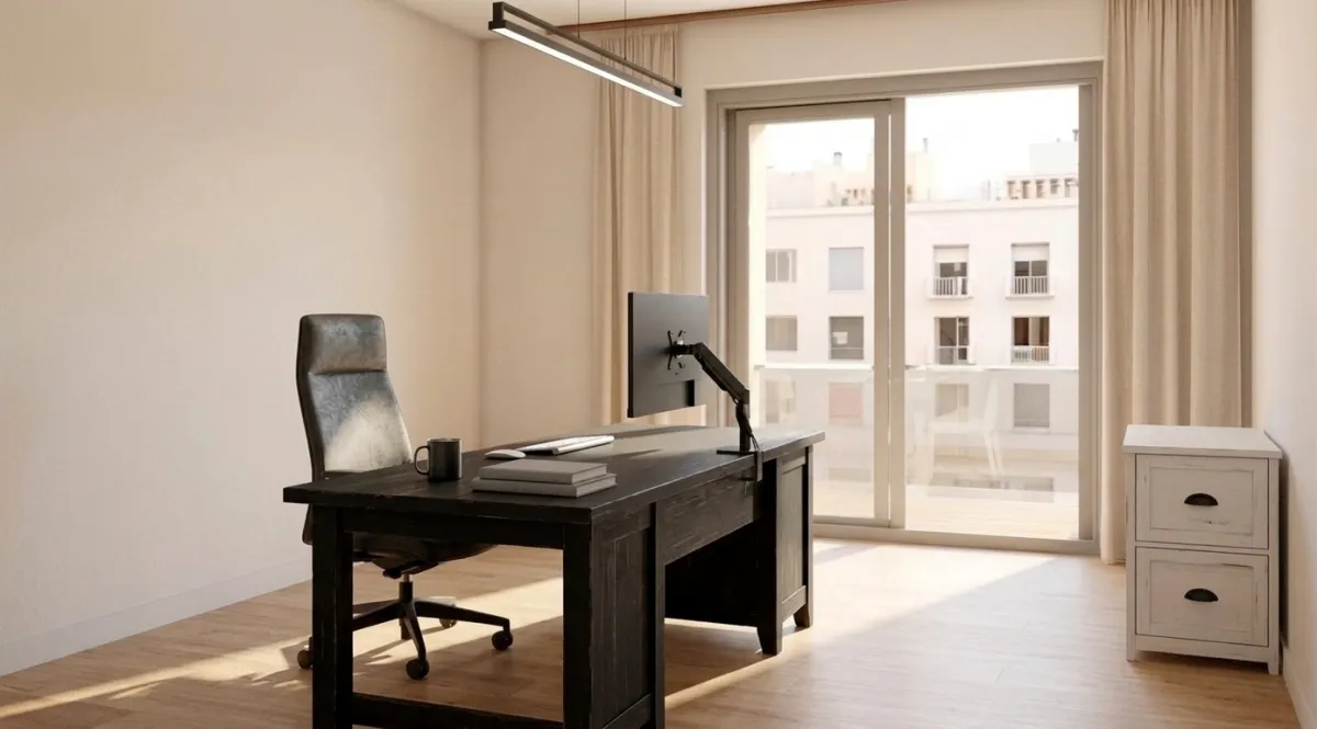
PPG's Warm Mahogany would pair perfectly with this setup. A single accent wall behind the desk in a deep brown would ground the space even further. The distressed white storage cabinet prevents the room from feeling too heavy by providing contrast.
Starting From Scratch: The Empty Room
Every room above started as the same empty apartment. Oak hardwood floors, beige curtains, sliding glass door to a terrace, and a pendant light fixture. Nothing else.
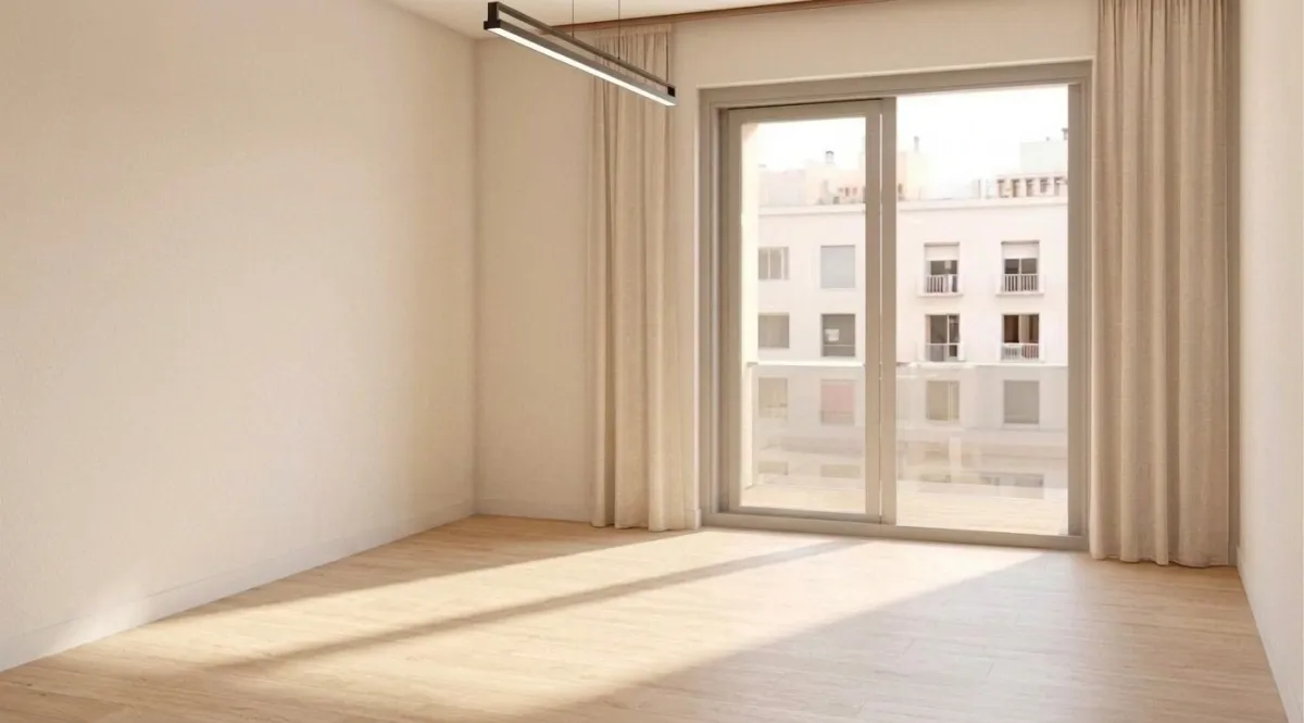
Seeing the same room in five completely different color palettes shows how much power color has over mood. The architecture does not change. The floors are the same. The windows are the same. But the feeling of each room is completely different. That is why choosing the right color palette matters more than almost any other design decision.
How to Preview 2026 Colors in Your Actual Room
Paint samples cost $5 to $8 each. If you test five colors on your wall, that is $25 to $40 before you even decide. And paint samples never look the same in the store as they do on your wall because lighting changes everything.
The faster approach: upload a photo of your room to MeltFlex and type a prompt describing the color palette you want. Something like "warm living room in sage green and cream tones with natural wood furniture" or "bedroom in BEHR Hidden Gem green with warm oak accents." You will see a photorealistic version of your actual room in that palette in about 30 seconds.
Generate three or four versions with different palettes. Compare them side by side. You will know which direction feels right before you spend a dollar on paint. Every piece of furniture shown in the result is real and purchasable, so you can go directly from color decision to shopping.
For more color guidance, check our guide to choosing paint colors and the broader 2026 interior design trends and wallpaper trends. If you want to see how other rooms were transformed, browse our creations gallery with 50+ before and after examples. And if brown is your color, read our farmhouse interior design guide for the ultimate warm earth tone room. The same 2026 palettes work on the outside of the house too, and our exterior house colors guide shows all seven trending directions on one real facade.