How to Choose Paint Colors for Any Room: The AI Guide That Eliminates Guesswork (2026)
Choosing a paint color should be simple. There are only a few thousand options. The problem is that every single one of them looks different on your wall than it does on a 2cm swatch, in a different room, under different light, next to different furniture. And once it is on the wall, you are stuck with it.
The average homeowner buys 5-8 sample pots before committing to a color. Each pot costs €5-€10. Each test patch takes an hour to apply and a day to dry. And after all that, 35% of people still regret their final choice within six months.
There is a faster way. This guide covers everything you need to know about choosing paint colors — the rules designers actually use, how lighting changes everything, the trending colors for 2026, and how AI tools let you see any color on your actual walls in 30 seconds, without buying a single pot.
Why Choosing Paint Colors Is So Hard (And Why Most People Get It Wrong)
Paint color is the single biggest visual element in any room. It covers more surface area than furniture, flooring, and decor combined. Yet most people choose it last, in a rush, based on a tiny chip they held up to the wall for three seconds.
The core problem is that color does not exist in isolation. It interacts with everything:
- Light direction — north-facing rooms cast cool blue light; south-facing rooms glow warm
- Light source — incandescent bulbs warm colors up; LED daylight bulbs cool them down
- Time of day — morning sun vs. evening sun vs. artificial light at night
- Adjacent colors — a grey wall next to warm oak looks blue; next to cool marble it looks warm
- Room size — dark colors in a small room can feel cozy or claustrophobic depending on execution
A paint swatch cannot account for any of this. That is why the same "perfect grey" that looked elegant in the store looks purple on your north-facing bedroom wall at 7pm.
The 60-30-10 Rule: How Designers Build Color Palettes
Professional interior designers do not pick colors randomly. They use the 60-30-10 rule — a ratio that creates visual balance in any room:
- 60% dominant color — walls and large surfaces. This sets the mood of the room.
- 30% secondary color — furniture, curtains, large rugs. This adds depth and contrast.
- 10% accent color — throw pillows, art, decorative objects. This adds personality.
For example: warm white walls (60%) + a slate blue sofa with blue-grey curtains (30%) + mustard yellow cushions and a brass lamp (10%). The room feels balanced because no single color overwhelms.
The biggest mistake people make is choosing the wall color first and trying to match everything else to it. Start with a piece you already love — a rug, a sofa fabric, a piece of art — and extract your 60-30-10 from there.
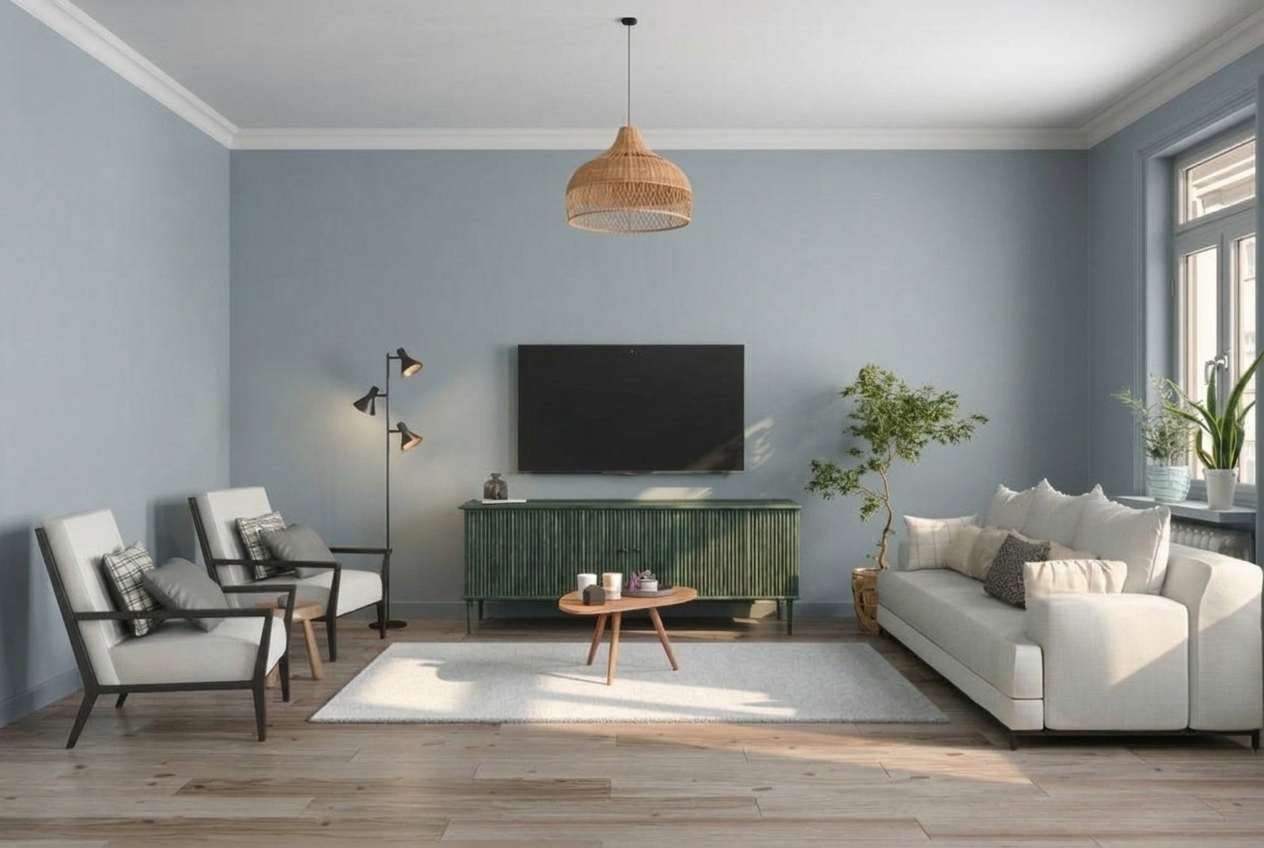
One Room, Four Colors: See the Difference AI Makes
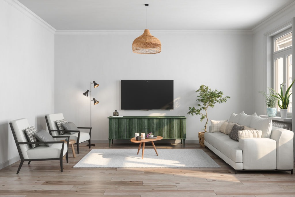
To show how dramatically wall color changes a room, we took one living room and used AI to test four completely different paint colors. Same furniture, same floor, same light — only the walls changed.
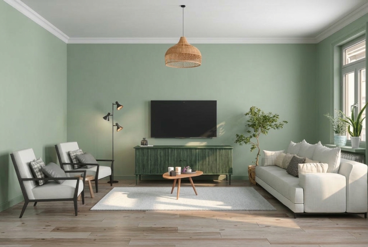
Here is the original room — neutral light grey walls, clean and bright:
Sage Green — The 2026 Favorite
Sage green transforms the room into something organic and calming. The green TV console blends into the wall instead of standing out, creating a more unified look. The warm oak floor and rattan pendant balance the cool green perfectly.
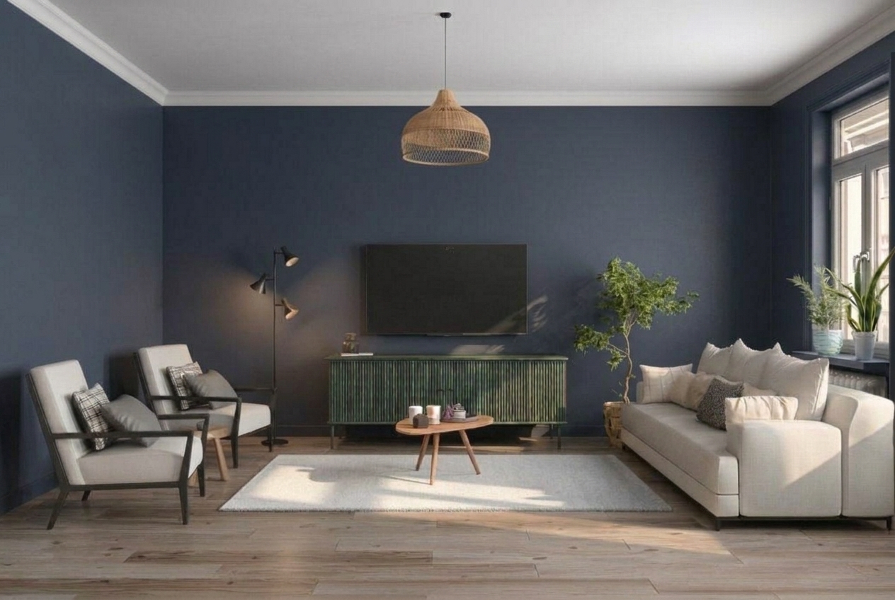
Deep Navy Blue — The Dramatic Statement
Navy walls make this room feel like a completely different space — sophisticated, moody, and intentional. The white sofa and armchairs pop against the dark backdrop. The green console adds depth. This color works in rooms with good natural light (notice the sunlight on the floor keeping it from feeling dark).
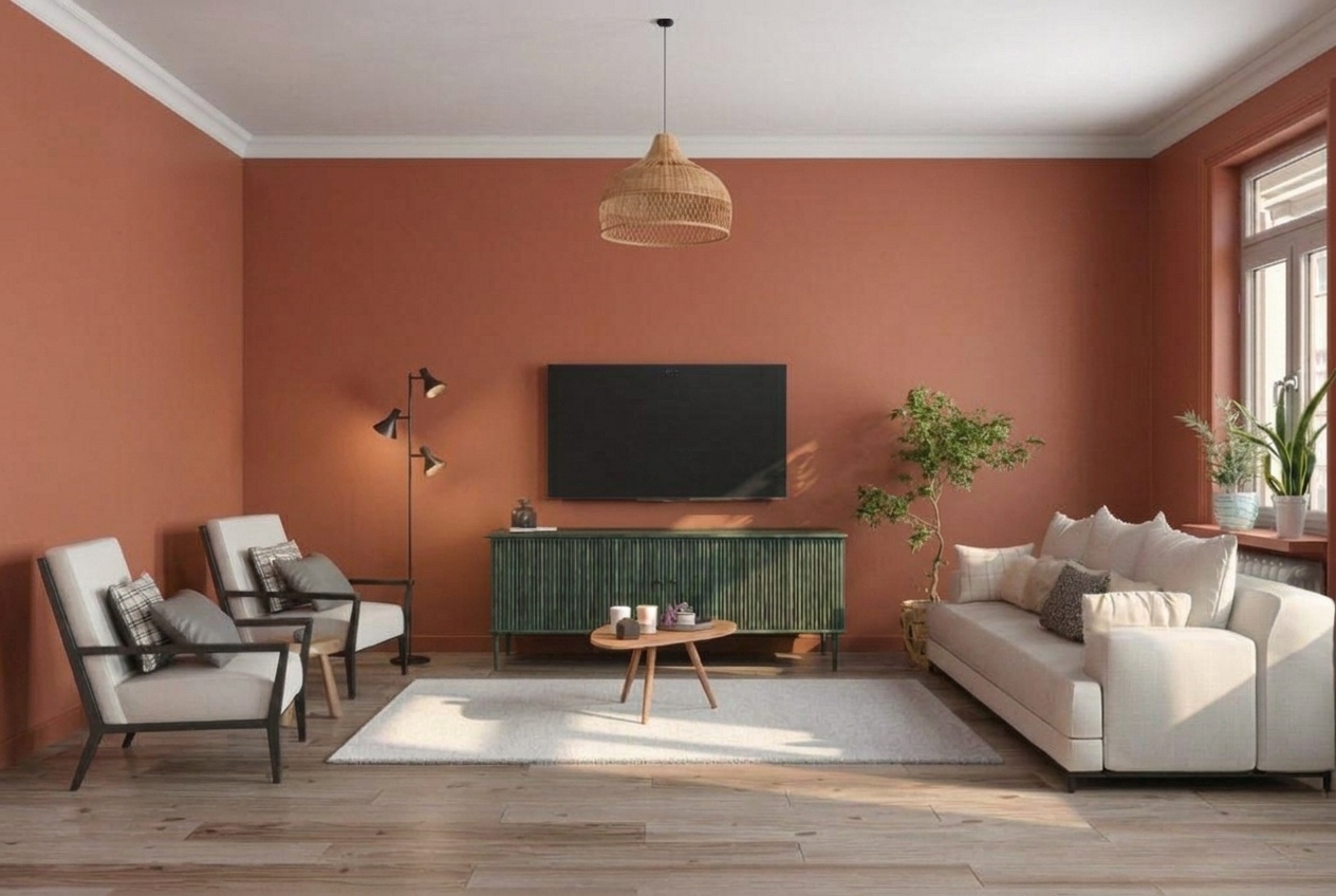
Terracotta — Warm and Earthy
Terracotta brings immediate warmth. The room feels cozy and inviting — like a Mediterranean villa. The neutral sofa and warm oak floor complement the earthy wall color naturally. This is a bold choice that rewards commitment.
Soft Blue-Grey — Cool and Modern
Blue-grey is the safe-but-stylish option. It adds color without drama, feels modern and fresh, and works with almost any furniture style. The cool wall tone pairs beautifully with the warm wood floor — the contrast between warm and cool creates visual interest.
Every render above was generated in under 30 seconds from one photo. No sample pots, no waiting, no cleanup. Upload your room to MeltFlex and try any color you want — free.
How AI Paint Color Visualizers Work (And Why They Beat Sample Pots)
Traditional approach: buy a pot, paint a 30cm square on the wall, wait a day, look at it in different light, decide you hate it, repeat 5 times. Total: €40-€80, 2 weeks, significant frustration.
AI approach: upload a photo of your room, type "warm white walls" or "sage green bedroom," and see the result in photorealistic quality in 30 seconds. Try 10 colors in 5 minutes. Total: free, instant, zero cleanup.
AI tools like MeltFlex do not just change the wall color in a flat, unrealistic way. They render the color with accurate lighting, shadows, and reflections based on your actual room photo. The window on the left wall casts warm light that shifts the color slightly. The corner shadow deepens it. The result looks like a real photograph, not a digital paint bucket fill.
Step-by-Step: How to Choose Paint Colors Using AI
Step 1: Photograph Your Room in Natural Light
Take a photo during the day with curtains open. Stand in the doorway and capture the full room — walls, floor, furniture, windows. The more context the AI has, the more realistic the render.
Step 2: Start with Your Dominant Color (60%)
Upload the photo to MeltFlex and try your wall color first. Start with safe neutrals — warm white, soft beige, light grey — and see how they interact with your existing furniture and flooring.
Step 3: Test Bold Options You Would Never Try in Real Life
This is where AI shines. Try sage green. Try deep navy. Try terracotta. Colors that would cost €10 per sample pot and days of testing are free and instant. You might discover that the "too bold" color you would never have sampled is actually perfect in your room.
Step 4: Check Morning vs. Evening
Take two photos of the same room — one in morning light, one in evening light. Generate the same color on both. A color that looks warm and inviting at noon might look grey and flat under evening artificial light.
Step 5: Compare 3-4 Finalists Side by Side
Generate your top 3-4 choices and compare them. Show them to anyone who lives in the home. This is infinitely more useful than holding up paint chips — you are comparing photorealistic renders of your actual room.
Best Paint Colors for Every Room in 2026
Living Room
Warm whites and creamy neutrals dominate. Think "Swiss Coffee" (Benjamin Moore OC-45) or "Alabaster" (Sherwin-Williams SW 7008). These create a bright, airy foundation that works with any furniture style. For a bolder statement,sage green (like Benjamin Moore HC-114 "Saybrook Sage") adds personality without overwhelming.
Bedroom
Soft, muted tones that promote calm: dusty blue, lavender grey, soft sage, warm blush. Avoid high-contrast or saturated colors — they stimulate rather than relax. Benjamin Moore's "Pale Oak" (OC-20) is the most popular bedroom neutral for a reason: it is warm without being yellow, and neutral without being cold.
Kitchen
White or near-white remains the default for a reason — it makes kitchens feel clean and spacious. But in 2026, warm greens and earthy tones are appearing on kitchen cabinets and accent walls. "Evergreen Fog" (Sherwin-Williams SW 9130) works beautifully with white countertops and wood accents.
Bathroom
Warm white with texture is the safest choice — it coordinates with any tile and fixture finish. For personality, deep green or navy blue in a bathroom creates a moody, spa-like feel, especially with brass or gold fixtures.
Not sure which works in your bathroom? We tested 7 color schemes in one real bathroom using AI — see the results in our bathroom design ideas guide.
How Lighting Changes Everything: Testing Colors in Morning vs. Evening
This is the single most important factor that paint swatches cannot show you. The same paint color behaves completely differently depending on light:
- North-facing rooms — receive cool, indirect light all day. Colors appear more blue/grey. Warm colors (cream, beige, warm white) counterbalance this. Cool greys will look even colder.
- South-facing rooms — flooded with warm, direct light. Colors appear warmer and more saturated. Cool colors (blue, grey, green) work well here without feeling cold.
- East-facing rooms — warm morning light, cool afternoon. Colors shift throughout the day. Test at multiple times.
- West-facing rooms — cool morning, warm golden afternoon and evening. Deep warm colors glow beautifully at sunset but may feel flat in the morning.
Artificial light matters too. Incandescent and warm LED bulbs (2700K) push colors toward yellow/orange. Cool LED (5000K+) pushes toward blue. If you primarily use your living room in the evening under warm bulbs, test the color under that light — not just in daylight.
Warm vs. Cool Paint Colors: How to Match Your Room's Undertone
Every paint color has an undertone — a subtle base color hidden beneath the surface. This is why "white" can look pink, blue, yellow, or green depending on the specific white.
- Warm undertones — yellow, red, orange. These make rooms feel cozy and inviting. Best for: living rooms, bedrooms, north-facing rooms.
- Cool undertones — blue, green, purple. These make rooms feel crisp and modern. Best for: bathrooms, south-facing rooms, contemporary spaces.
- Neutral undertones — balanced, minimal color bias. These are the "safe" choices that work in most rooms: true greige, balanced warm white.
The cheat test: hold a pure white piece of paper next to the paint chip. Whatever color you see in the chip compared to the paper — that is the undertone. If the chip looks slightly yellow, it has a warm undertone. If it looks slightly blue or purple, it is cool.
5 Common Paint Color Mistakes (And How to Avoid Them)
1. Choosing Color from a Tiny Swatch
A 2cm paint chip looks nothing like a full wall. Colors appear more saturated and darker at large scale. Always test at wall scale — or use AI to see the full room effect.
2. Ignoring the Floor
Your floor is the second-largest surface in the room. A warm-toned hardwood floor clashes with cool grey walls. A cool-toned tile floor makes warm beige walls look muddy. The wall color and floor must work together.
3. Painting Every Room Different Colors
This creates a disjointed, chaotic feel as you walk through the home. Instead, choose 2-3 related colors across the entire house. Same warm white in hallways and living areas. One accent color for bedrooms. One for the kitchen or bathroom.
4. Following Trends Without Testing
That Instagram-famous dark green looks incredible in a south-facing loft with 3-meter ceilings. In your north-facing 2.4-meter bedroom, it might feel like a cave. Always test trending colors in YOUR space.
5. Not Testing Under Artificial Light
You love the color at 2pm. At 8pm under your warm LED ceiling light, it turns yellow. Test at night too — that is when you actually use the room most.
How to Coordinate Paint Colors Across Your Entire Home
A whole-house color palette does not mean every room is the same color. It means every room feels connected as you move through the space. Here is how designers do it:
- Pick one neutral base — use this in hallways, open-plan areas, and as a thread that connects all rooms. Warm white or greige works best.
- Assign accent rooms — bedrooms, bathrooms, and studies can have their own personality color, but it should relate to the base (same undertone family).
- Flow test — stand at each doorway and look at the two rooms you can see. Do the colors fight or complement? If they fight, one needs to change.
- Ceiling stays consistent — the same white ceiling throughout the house creates visual continuity, even when wall colors vary.
AI makes this much easier: upload photos of adjacent rooms, generate the same color palette on both, and see how the flow feels before painting.
Try Any Paint Color on Your Walls — Free
Every technique in this guide becomes easier when you can see the result before committing. Upload a photo of any room to MeltFlex and:
- Test warm vs. cool tones on your actual walls
- Compare 5 colors in 5 minutes (not 5 weeks)
- See how your existing furniture looks against each option
- Check morning light vs. evening light renders
- Share photorealistic results with your partner before deciding
It is free. No sample pots, no test patches, no waiting for paint to dry. Just your room, your color, in 30 seconds.
Upload your room photo and try any paint color now →
Related guides: living room design ideas, bedroom design ideas, kitchen design ideas, bathroom design ideas, interior design styles guide, and AI room makeover before & after.