How to Match Furniture to Your Existing Floors, Walls, and Lighting (2026)
You fall in love with a walnut dining table online. Rich, warm, beautiful grain. Then it arrives and sits on your cool-toned grey laminate floor under your north-facing window and it looks... orange. Not warm. Not rich. Just wrong.
The table is not the problem. The mismatch between the table and the room is the problem. Furniture does not exist in a vacuum, it exists in a specific room with specific floors, walls, and light. Get the match right and everything looks intentional. Get it wrong and the most expensive piece in the room becomes the thing that bothers you every time you walk past it.
This guide covers the rules that interior designers use to match furniture to rooms, and how AI makes it possible to test any combination before you buy.

Why New Furniture Clashes With Your Room (And How to Prevent It)
The number one reason furniture clashes is temperature mismatch. Every color and material has a temperature: warm (yellow, red, orange undertones) or cool (blue, green, grey undertones).
Warm oak furniture in a room with cool grey floors and blue-tinted light looks like it belongs in a different house. It is not about style or taste, it is physics. The same piece in a room with warm-toned floors and south-facing light looks exactly like the product photo that made you buy it.
Before buying anything, look at your existing room and decide: is this a warm room or a cool room? Then buy furniture in the same temperature family.
Matching Furniture to Wood Floors: Oak, Walnut, Laminate Rules
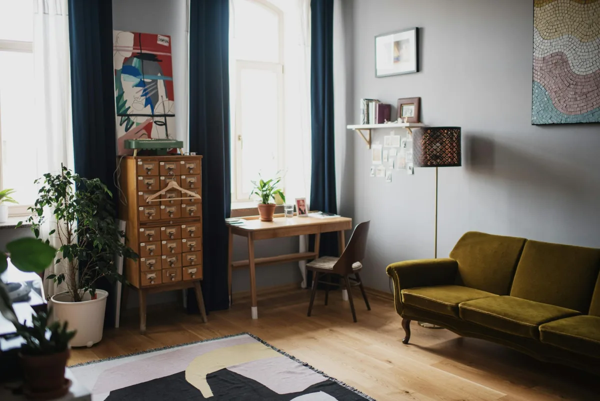
Light oak floors (the most common in modern apartments): Almost everything works. Avoid light pine or birch furniture, it will blend into the floor and look invisible. Instead, go for contrast: walnut, black, white, or medium grey furniture pops against light oak.
Dark walnut or espresso floors: Light furniture creates beautiful contrast. White oak, natural rattan, light grey upholstery, and brass accents work well. Avoid dark brown furniture, it will merge with the floor and make the room feel like a cave.
Grey laminate floors: Cool-toned furniture is your friend. White, grey, black, or cool-toned woods (ash, whitewashed oak) work. Warm woods like cherry, mahogany, or honey oak will clash with the grey undertone of the floor.
The general rule: your furniture should be at least 2-3 shades different from your floor. Same shade = invisible. Slightly different = accidental. Clearly different = intentional.
And sometimes the honest answer is that the floor, not the furniture, is the problem. Grey laminate in particular is now firmly dated; the 2026 flooring trends guide covers what replaced it, what each option costs per square foot, and includes 12 texture swatches you can test on a photo of your own room.
What Colors Work With Grey Walls? (The Most-Searched Combo)
Grey walls are the blank canvas of modern apartments, and that is both a blessing and a trap. They work with almost anything, which means you can also get it subtly wrong in ways that are hard to pinpoint.
Warm grey walls (Greige, Revere Pewter, Agreeable Grey): Pair with warm wood furniture (walnut, oak, teak), caramel or cognac leather, cream upholstery, and brass or gold metal accents. The warmth in the walls needs warmth in the furniture.
Cool grey walls (Stonington Grey, Coventry Grey, Silver Chain): Pair with white oak or ash furniture, navy or dusty blue upholstery, white and marble accents, and chrome or brushed nickel metals. Cool + cool = cohesive.
The one rule everyone breaks: Do not put grey furniture against grey walls. It does not look monochromatic, it looks like you could not decide. If your walls are grey, your sofa should be literally any other color.
Dark Room? How Lighting Changes How Furniture Colors Look
The same sofa looks different in a north-facing bedroom than in a south-facing living room. This is the most overlooked factor in furniture buying.
North-facing rooms (cool, indirect light): Warm tones get muted. That "warm beige" sofa will look grey. That honey oak table will look washed out. Compensate by choosing warmer, richer versions of what you want, caramel instead of beige, dark oak instead of light.
South-facing rooms (warm, direct light): Cool tones warm up. A grey sofa can look slightly blue or slightly beige depending on the time of day. White walls glow golden in the afternoon. This room is forgiving, most furniture looks good here.
Artificial lighting matters too. Warm bulbs (2700K) make everything look cozier and more yellow. Cool bulbs (4000K+) make everything look crisper but can make warm woods look orange. Most homes do best with 3000K, warm enough to be comfortable, neutral enough not to distort colors.
Mixing Wood Tones Without It Looking Like a Mess
The old rule was "all wood must match." That rule died in 2010 and nobody misses it. Mixed wood tones look more natural, more layered, and more expensive than a room where every piece is the same color.
The new rule is the Rule of Three: maximum three different wood tones per room. One dominant (your floor or largest furniture piece), one secondary (a table, a shelf), and one accent (smaller items, picture frames, a tray).
Keep all three in the same temperature family. Warm woods together: oak + walnut + cherry. Cool woods together: ash + grey-washed oak + whitewashed pine. Mixing a warm floor with cool furniture is what creates the "this does not look right but I cannot explain why" feeling.
How to Use a Room Photo to Test Color Combinations Instantly
Every rule in this article requires you to imagine the result. And imagination is unreliable when it comes to color, scale, and light.
Here is what actually works: take a photo of your room and upload it to MeltFlex. Describe the furniture you are considering: "add a walnut dining table with grey upholstered chairs" or "furnish with warm oak furniture and a cream sofa." In 30 seconds, you see a photorealistic image of that exact combination in your actual room.
Does the walnut table clash with your grey floor? You will see it immediately. Does the navy sofa disappear against your dark walls? You will know before spending $2,000 to find out the hard way.
Try three or four variations. Light furniture vs. dark. Warm woods vs. cool. Leather vs. fabric. Each one takes seconds and uses your actual walls, floors, and lighting, not a generic showroom.
The 60-30-10 Rule Applied to Furniture Shopping
Interior designers use the 60-30-10 color rule: 60% dominant color, 30% secondary color, 10% accent color. Applied to a room:
60% (walls + floor + large furniture): Your neutral base. This is typically your wall color, floor color, and sofa color. Keep these in the same temperature family.
30% (secondary furniture + curtains + rug): Your supporting tone. This adds visual interest without overwhelming. A contrasting wood tone, a textured rug, or colored curtains.
10% (pillows + art + accessories): Your pop. This is where you add personality, a bold pillow, a colorful vase, a piece of art. These are cheap to swap when you get bored.
When people say a room "just works," they usually cannot explain why. It is almost always because the 60-30-10 balance is right, even if nobody planned it that way.
Stop Guessing, Start Seeing
Color matching, wood tone harmony, and lighting effects are the hardest parts of furniture buying because they require seeing the result in your specific room. No amount of Pinterest browsing or showroom visiting can show you how a piece looks next to your floors, against your walls, in your light.
That is exactly what AI visualization does. Upload a photo of your room to MeltFlex and test any furniture combination in 30 seconds. See the colors. See the scale. See the match. Then buy with confidence instead of hope.
For design style inspiration once you have your palette, see the complete interior design styles guide with examples for all 12 major styles. If you are furnishing from scratch, our new apartment furnishing guide walks through the full process. And to see what a room actually looks like with different furniture combinations before buying, the one room, 4 AI designs guide shows real results with real costs.