Color Drenching: The 2026 Interior Design Trend That Makes Any Room Feel Bigger
You know that feeling when you walk into a really good restaurant or hotel room and something about the space just feels right? The walls feel like they are hugging you. The room feels bigger than it should. Everything looks intentional. Nine times out of ten, that room has been color drenched.
Color drenching is the single biggest interior design trend of 2026 and once you understand what it is, you will start seeing it everywhere. 55 percent of industry experts named it the top color trend this year. Google searches for the technique hit an all time high. And for good reason. It is one of those rare design moves that actually makes a room look more expensive, feel larger and seem more intentional, all for the cost of a few extra tins of paint.
But here is the thing. Most people who try it get one critical detail wrong and the whole room falls flat. This guide covers exactly how to do it right, which colors work, which rooms work best and the mistakes that will ruin it.
Color drenching at a glance
- What it is: painting every surface, walls, ceiling, trim, and doors, the same color for a seamless, boundary-dissolving effect.
- Why it makes rooms feel bigger: with no color change between wall and ceiling, your eye can’t lock onto edges, so the space reads as one continuous volume.
- The one rule most people break: the ceiling must match. A white ceiling is what separates drenching from just painting your walls.
- Best colors: muted, earthy tones, sage green, terracotta, midnight navy, chocolate brown, dusty rose. Avoid cool greys, neons, and pure black.
- Best rooms to start: powder rooms and bedrooms. See it in your own space first at MeltFlex.
What Is Color Drenching and Why Does It Work?
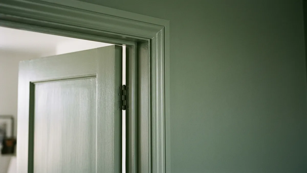
Color drenching means painting every surface in a room the same color. Walls, ceiling, trim, baseboards, doors, radiators. Everything gets wrapped in one hue. No white ceiling. No contrasting trim. No accent wall. Just one continuous envelope of color.
Whitney Romanoff of Meet West Design describes it perfectly. “Color drenching is like a great big hug of color in a room. It sets a clear vibe and draws you into a space.” And that is exactly what it feels like. When you walk into a color drenched room, the color stops being something you notice on the walls and becomes the atmosphere itself.
The reason it works comes down to how your eyes process space. In a typical room, your brain constantly registers transitions. White ceiling meets colored wall. White trim frames colored surface. Each transition is a visual boundary that tells your brain exactly where one plane ends and another begins. In a small room, those boundaries make the space feel even smaller because your eye can clearly see every edge and corner.
When you drench a room in one color, those transitions disappear. Your eye cannot tell where the wall stops and the ceiling starts. The boundaries dissolve. And something interesting happens. The room actually feels larger because your brain cannot lock onto edges anymore. Stephanie Cole of Habitar Design explains it this way. “Color drenching blurs the lines that separate vertical and horizontal planes, creating an aesthetic that is cohesive and feels more embracing.”
This is not a new idea. Designers have used monochromatic techniques for decades. But the trend exploded in 2025 and 2026 because people got tired of the predictable formula. White ceiling, colored walls, white trim. It is safe. It is fine. And it is the design equivalent of ordering a Caesar salad. Nothing wrong with it but nothing memorable either.
Color Drenching vs. the Accent Wall (And Why the Accent Wall Is Dying)
The accent wall had a great run. For a decade, the go to advice for anyone wanting color in their home was to pick one wall and paint it bold. It was approachable. It was low commitment. And now designers are calling it outdated.
The problem with an accent wall is that it divides a room instead of unifying it. One bold wall creates a heavy visual anchor on one side while the other three walls just sit there in white looking like they did not get invited. It can make rooms feel lopsided. In small rooms, it can actually make the space feel tighter because you have introduced a hard color boundary that your eye fixates on.
Color drenching does the opposite. Instead of highlighting one surface and ignoring the rest, it wraps the entire room in a unified experience. Nothing competes. Nothing feels unfinished. The whole room makes sense as a single thought rather than one bold decision surrounded by three white walls.
Susana Simonpietri of Chango puts it well. “When a room is monochromatic, you make a bold decision creating impact, yet normalize the color.” That is the key insight. An accent wall says look at this wall. Color drenching says look at this room. If you are still weighing the two, our guides to accent wall ideas and feature walls cover when a single statement wall still makes sense.
The Best Colors for Color Drenching
Not every color works for drenching. When you spread a color across every surface in a room, you amplify everything about it. A great color becomes more atmospheric. A bad color becomes suffocating. The difference comes down to undertones and intensity.
The colors that work best are muted, complex and earthy. They have depth that shifts with light throughout the day. Here are the specific colors that designers keep coming back to.
Deep Sage and Olive Green
Green is the single most popular color for drenching in 2026 and for good reason. It connects a room to nature without feeling literal. Deep sage greens are calming in bedrooms, sophisticated in living rooms and fresh in bathrooms. Try Farrow and Ball Calke Green, Benjamin Moore Salamander or Sherwin Williams Dried Thyme. These have enough warmth and complexity to stay interesting across all surfaces.
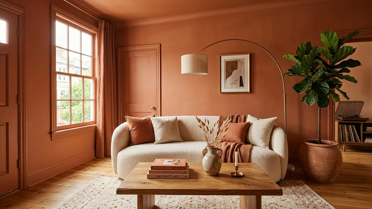
Warm Terracotta and Clay
Terracotta drenching creates an instant Mediterranean warmth. The room feels like a villa in Tuscany at golden hour. It works especially well in dining rooms and living rooms where you want to encourage lingering. Be careful with terracotta in rooms that get harsh artificial light in the evening. It can shift toward orange under the wrong bulbs.
Midnight Navy
Navy drenching creates drama without feeling heavy. It is one of the most forgiving dark colors because it reads as rich rather than gloomy. Farrow and Ball Stiffkey Blue was practically made for this technique. The trick is adequate lighting. A navy drenched room with three or four warm light sources feels like a private members club. The same room with one ceiling fixture feels like a cave.
Rich Chocolate Brown
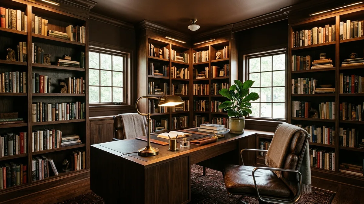
Brown is making a serious comeback and it is one of the best drenching colors because it is warm by nature. Benjamin Moore chose Silhouette, a deep espresso brown, as their 2026 Color of the Year. A chocolate brown study or library with brass accents and warm lighting looks like old money in the best possible way.
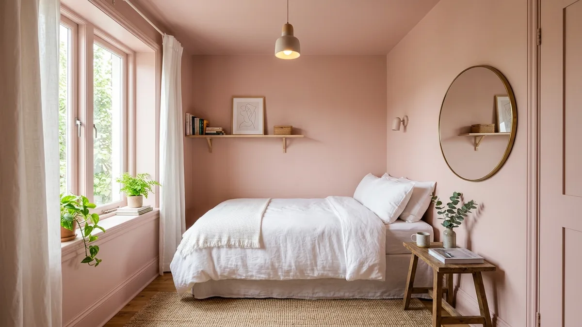
Dusty Rose and Blush
Soft pink drenching creates one of the most unexpected effects. It makes small rooms feel significantly larger because the gentle color dissolves boundaries without adding visual weight. Farrow and Ball Setting Plaster is the gold standard for this. It works beautifully in bedrooms, nurseries and powder rooms. Drenching is one of several tricks in our guide on how to make a small room look bigger.
Colors to Avoid
Some colors that work perfectly on a single wall become problems across all surfaces. Cool greys like Agreeable Gray and Repose Gray can look dingy when drenched. According to color consultant Kristin Bartone of The Color Concierge, these popular greige tones lose their sophistication when they cover the ceiling and trim too. Bright, fully saturated colors like vivid orange or neon green become overwhelming. And pure black shows every dust particle and imperfection in the paint.
Which Rooms Work Best for Color Drenching
Color drenching does not work equally well in every room. Some spaces are natural fits. Others need more care. Here is where to start and which colors suit each room.
| Room | Why it works | Best drench colors |
|---|---|---|
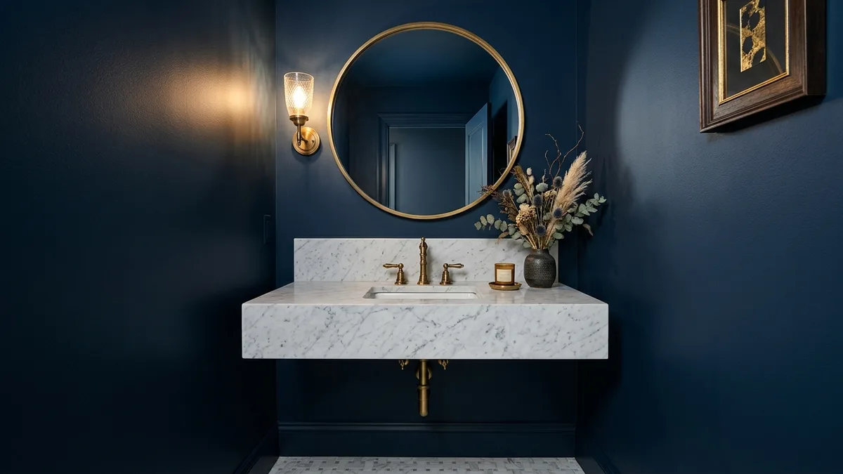
| Powder room (start here) | Small, self-contained, instant impact, cheapest to paint | Deep green, bold navy, jewel tones |
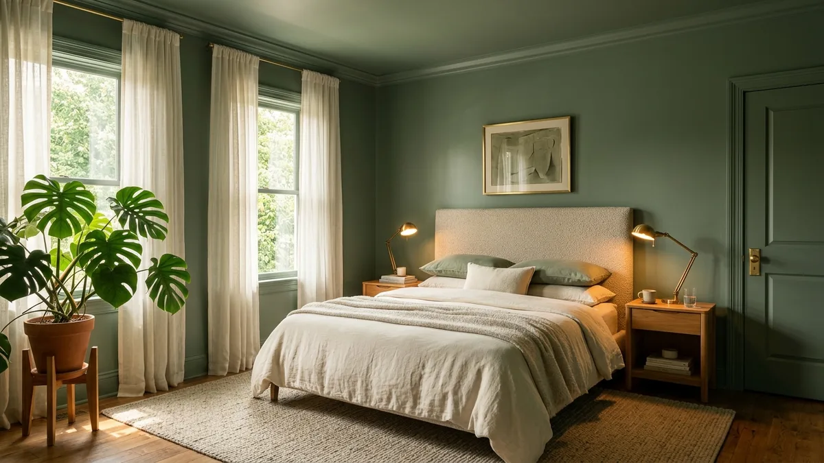
| Bedroom | Cocooning effect suits a room built for rest | Sage green, midnight navy, dusty rose, warm clay |
| Dining room | Intimate, restaurant-like atmosphere for lingering | Deep green, navy, chocolate brown |
| Home office / study | Enclosed, low-distraction feel aids focus | Chocolate brown, forest green |
| Large open-plan area (careful) | No architectural breaks, so the effect can fall flat | Drench a defined zone, or try color capping |
Powder Rooms and Half Bathrooms (Start Here)
If you want to try color drenching for the first time, a powder room is the best place to start. It is small, self contained and the impact is instant. Guests walk in and the color hits them like a statement. Deep greens, bold blues and jewel tones all work because the room is small enough to feel intentional rather than overwhelming. It is also the cheapest room to paint because there is so little surface area.
Bedrooms
Bedrooms are the second best room for drenching. The cocooning effect that color drenching creates is exactly what you want in a space designed for rest. Deep blues and greens promote calm. Warm clays and blush tones feel nurturing. Even rooms with sloped ceilings benefit because the drenching turns architectural awkwardness into intimate charm. Colleen Simonds says “Painting walls, trim, and ceilings all the same color makes the room feel cozy and enveloping.”
Dining Rooms
A drenched dining room creates an intimate atmosphere that encourages people to sit and talk for hours. Think of the best dinner you have had in a restaurant. The room was probably dark, warm and enveloping. You can recreate that at home with a deep green, navy or warm brown drench.
Home Offices and Studies
Dark drenched home offices are one of the best applications of this technique. Deep colors reduce visual distractions and the enclosed feel helps you focus. A chocolate brown or forest green study with good lighting feels like a room where serious thinking happens.
Where to Be Careful
Large open plan living areas can be tricky because without clear architectural breaks the drenching loses its impact. If your living room flows into your kitchen and dining area without doorways, full drenching might make the space feel flat rather than immersive. In those cases, you might want to drench a defined zone or consider what Benjamin Moore calls “color capping,” which is a 2026 variation where the ceiling gets a different shade than the walls.
The Technique: How to Color Drench Properly
The actual process is simpler than you might think. But there are a few details that separate a room that looks intentionally designed from one that looks like you just ran out of painter’s tape.
Same Color, Different Sheen
This is the detail that most people miss. Every surface should be the same color but the sheen should vary. Luke Hass of Pearl Painters says “The color is the only thing that is the same. Your trim should be a sheen higher than the walls.” The standard approach is flat or matte on the ceiling, eggshell on the walls and satin on the trim and doors. The sheen variation creates subtle light play that adds dimension to the monochromatic scheme. Without it, the room can look flat and lifeless. If you want to test the boldest version, drenching a door in black, our black interior doors guide lets you preview it on your own room first.
Prep Matters More Than Usual
When every surface is the same color, imperfections become much more visible. A small dent in the wall that you would never notice against white trim suddenly stands out when the trim is the same shade. Fill every hole, sand every rough patch and apply at least a proper primer before the color coats. Plan on three coats of paint for full, even coverage. This is not the project to rush.
Test in Your Actual Room
Color drenching amplifies the effect of lighting. A color that looks beautiful in a south facing room at 2 PM can look completely different in a north facing room at 8 PM. Amy Stoddart, an interior designer, advises that “if you are color drenching, then picking the color needs to come first, with everything else inside the space flowing from that main choice.”
Test with large paint samples, at least A3 size, on both a wall and near the ceiling. Look at them at morning, afternoon and evening. Or upload a photo of your room to MeltFlex and test different drenching colors in seconds. You will immediately see whether sage green or navy or terracotta feels right in your specific space with your specific light.
Seven Mistakes That Ruin Color Drenching
The technique is simple but there are several ways to get it wrong. These are the mistakes that turn a sophisticated design choice into a room you regret.
1. Leaving the ceiling white. This is the number one mistake and it completely undermines the effect. A white ceiling creates a visible lid that makes the walls feel like they are closing in. The ceiling must be part of the drench. That is literally what separates color drenching from just painting your walls.
2. Choosing a color that is too bright. Muted, earthy tones work beautifully across all surfaces. Bright, fully saturated colors become overwhelming. A vibrant lemon yellow on one wall is cheerful. On every surface including the ceiling it is a headache.
3. Using one sheen everywhere. Without sheen variation, the room looks flat and two dimensional. Vary the finish between ceiling, walls and trim even though the color stays the same.
4. Not having enough light. Dark drenched rooms need multiple light sources at warm color temperature. A single overhead fixture creates harsh shadows and makes the space feel like a basement. You need at least three to four sources of warm light (2700K to 3000K). Table lamps, floor lamps, wall sconces and candles all contribute to the atmosphere that makes dark drenching work. Our dark moody interior design guide goes deep on lighting strategies.
5. Trying it in large open plan spaces. Without clear architectural breaks like doorways or alcoves, drenching in big open areas loses its impact. The technique works best in rooms with defined boundaries.
6. Ignoring the furniture. When every surface is one color, your furniture becomes the focal point. A mismatched collection of furniture that was fine against white walls will stick out in a drenched room. Take time to make sure your pieces work together. This is where matching furniture to your room becomes especially important.
7. Using cheap paint. Every imperfection shows when the ceiling and walls are the same color. Invest in quality paint that covers evenly. Farrow and Ball Dead Flat finish was specifically designed for color drenching. It makes dark colors look rich and velvety rather than flat and plasticky.
Color Drenching on a Budget
Here is the good news. Color drenching is one of the most affordable ways to dramatically transform a room. You do not need new furniture. You do not need renovations. You need paint and a weekend.
A powder room might take two to three tins of paint. A bedroom might take four to five. At $40 to $70 per gallon for quality paint, you can completely transform a room for under $300. Compare that to the thousands you would spend on new furniture or the five to ten thousand an interior designer might charge. For more on costs, see our interior designer cost breakdown.
The key is testing the color first. Paint samples cost $5 to $8 each and you will need at least three or four before finding the right shade. Or save that money entirely by uploading a photo of your room to MeltFlex and seeing different drenching options in your actual space before buying anything.
See Color Drenching in Your Room Before You Paint
The biggest barrier to trying color drenching is fear. Fear that the color will be wrong. Fear that it will feel claustrophobic. Fear that you will paint an entire room including the ceiling and hate it.
That fear is valid. Repainting a ceiling is genuinely miserable work. So do not guess. Upload a photo of your room to MeltFlex and type something like “color drench this room in deep sage green, all walls ceiling and trim the same color, with warm lighting and natural wood furniture.” In 30 seconds you will see exactly what that looks like in your space. Try sage green, then navy, then terracotta, then chocolate brown. Compare them side by side. You will know which one feels right before you spend a single dollar on paint.
For more on choosing the right colors, check our complete guide to choosing paint colors with AI. And if you are leaning toward darker drenching options, our dark moody interior design guide covers lighting and material choices that make dark rooms feel alive.