You just moved in, or maybe you’ve been staring at the same room for three years and something about it still feels off. You open ChatGPT or Google and type one of these questions: “What color should I paint my living room?” “What size rug do I need?” “Can I mix different wood tones?”
You get an answer. Sometimes it’s good. Often it’s vague. “It depends on your personal style.” “Consider the proportions of your space.” Thanks. Very helpful.
This is not that kind of guide. Below are 25 questions that people ask more than any others about designing and decorating their homes, and each one gets a direct answer with actual numbers, real rules, and specific advice you can act on today. No “it depends.” Where something truly does depend on your situation, you will get the two or three most common scenarios with a clear recommendation for each.
Getting Started
1. Where Do I Start When Decorating an Empty Room?
Start with the largest piece of furniture, usually the sofa or bed, and build everything else around it. This single piece determines the scale, the color direction, and the layout of the entire room. Choose it first, place it, and then work outward.
The mistake most people make is buying small things first because they are cheaper and less committal. They end up with a collection of side tables, lamps, and cushions that don’t relate to each other, and then they buy a sofa last and none of it works together. Reverse the order. The anchor piece comes first. Everything else follows.
If you don’t know what to buy first, start with a floor plan. Measure your room, sketch it on paper or use a free tool like MeltFlex AI to generate a furnished version of your empty space. Seeing furniture in context, even digitally, prevents the most expensive mistake in interior design: buying something beautiful that doesn’t fit.
2. How Do I Find My Interior Design Style?
Save 30 to 50 images of rooms you love on Pinterest or Instagram. After a week, look at them together and find the patterns. If 80 percent have neutral walls, natural wood, and clean lines, you lean Scandinavian. If you see dark moody walls, rich textures, and layered decor, you are drawn to warm contemporary or maximalist. Your saves reveal your taste better than any online quiz because they capture what you are genuinely attracted to, not what you think you should like.
Once you have a direction, you do not need to follow it rigidly. No real home is purely one style. The point is having a baseline so that when you walk into a furniture store or scroll through an online shop, you can quickly filter what belongs and what does not. A person who knows they lean Scandinavian will not waste an afternoon debating a baroque chandelier.
If you want to take this further, our complete guide to interior design styles breaks down the 12 most popular styles with visual examples and specific furniture picks for each.
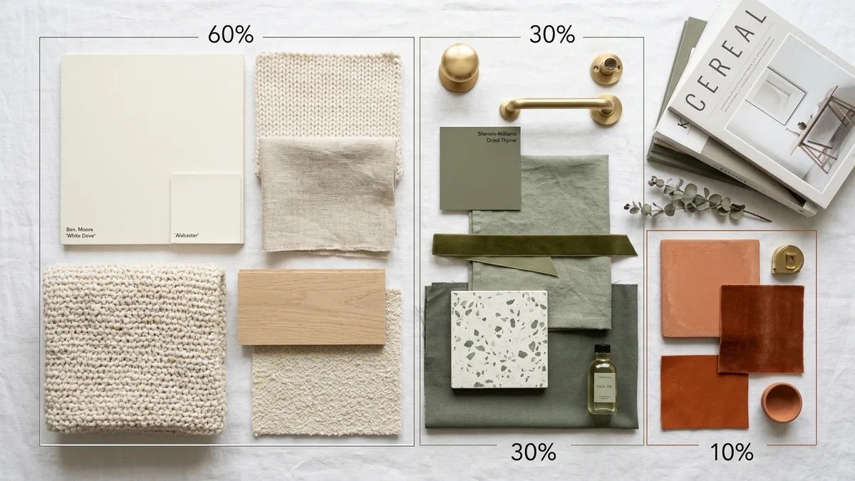
3. What Is the 60-30-10 Color Rule?
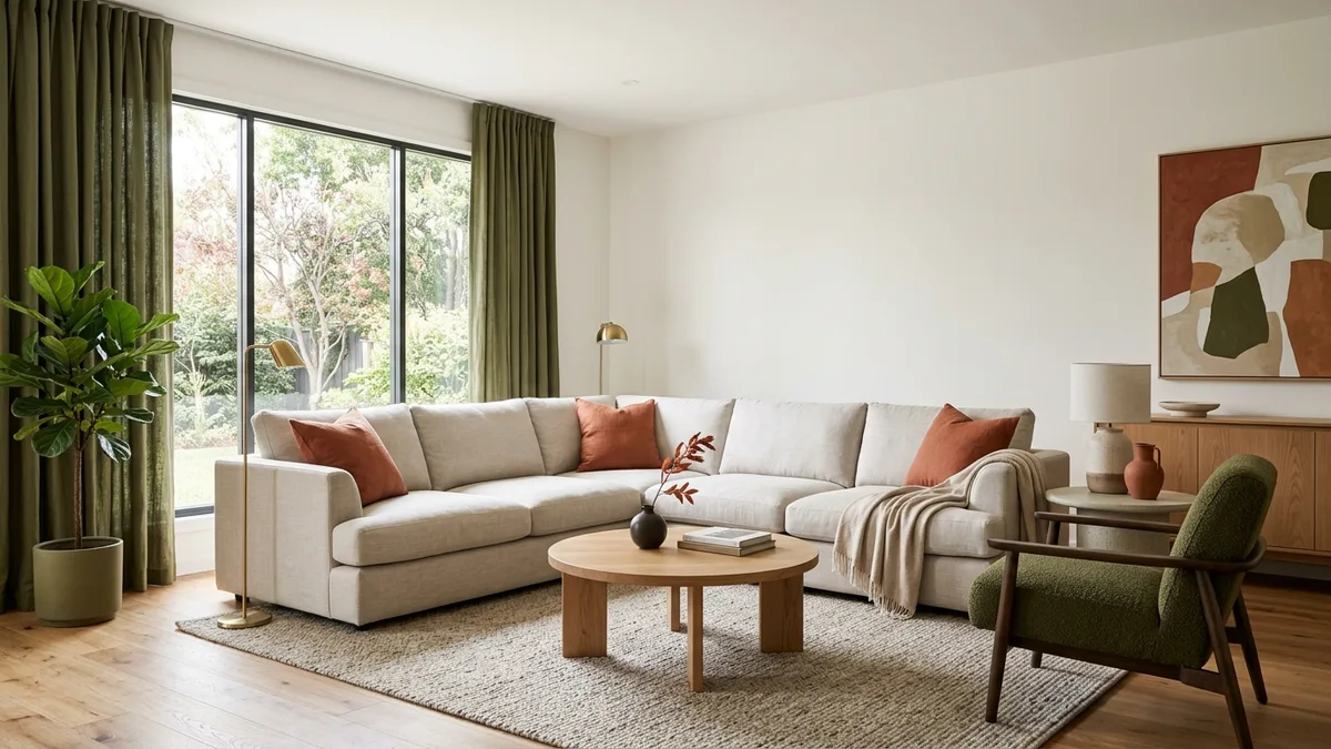
60 percent of your room should be a dominant color, 30 percent a secondary color, and 10 percent an accent. The dominant color covers your walls and the largest pieces of furniture. The secondary color shows up in curtains, an accent chair, bedding, or a rug. The accent color appears in throw pillows, artwork, vases, and small decorative objects.
Here is what that looks like in practice. Imagine a living room where the walls are warm white and the sofa is a light linen color. That is your 60 percent. The curtains are olive green and there is a green accent chair. That is your 30 percent. The throw pillows are terracotta and there is a small terracotta vase on the shelf. That is your 10 percent. The room feels cohesive without feeling monotone, and it took no design training to achieve. You just followed the ratio.
The reason this works is that it mirrors how humans naturally perceive visual harmony. Too much of one color feels flat. Equal parts of three colors feels chaotic. The 60-30-10 split gives enough variety to be interesting and enough consistency to feel calm.
4. Do I Need to Hire an Interior Designer?
For a single room or an apartment, probably not. For a full house renovation or a space with structural complexity, it is worth considering. The reality is that the vast majority of design decisions, color, furniture selection, layout, textiles, are things you can handle yourself with the right references and a bit of patience.
Where designers genuinely earn their fee is in managing complexity: coordinating contractors, specifying custom pieces, solving unusual spatial problems, and accessing trade-only furniture lines. If your project involves knocking down walls, custom cabinetry, or a budget above €50,000, a designer saves you from expensive mistakes that would cost more than their fee.
For everything else, there is now a middle ground that did not exist five years ago. AI tools can visualize your room in any style before you buy anything. That used to require hiring someone to create 3D renders. Today you upload a photo and get a photorealistic result in 30 seconds. If you are curious how your space would look in a different style, try it yourself here.
Colors and Paint
5. What Color Should I Paint My Living Room?
If you are unsure, go with a warm white or warm light gray. These work in every lighting condition, with every furniture style, and in every size room. They are not boring. They are versatile. The rooms you see on Pinterest that look effortlessly beautiful almost always have neutral walls with color introduced through furniture, art, and textiles.
If you want actual color on the walls, pick a muted, desaturated version of the color you like. Not bright teal but dusty teal. Not primary green but sage. Muted tones work in real life because they shift gracefully with changing daylight throughout the day, while saturated colors can look harsh in morning light and muddy in evening light.
One more thing that people forget: always test paint on the actual wall before committing. Buy a sample pot, paint a 60 by 60 centimeter square, and look at it in morning light, afternoon light, and evening artificial light. Colors change dramatically depending on the light source, and a color that looked perfect on a small chip at the store can look completely different on your wall.
6. What Colors Make a Small Room Look Bigger?
Light colors that reflect natural light make walls feel further away. White, light gray, soft sage, and pale blue are the most effective. Painting the ceiling the same color as the walls removes the visual boundary between them and adds perceived height. This single trick makes more difference in a small room than almost any furniture change.
Avoid high-contrast color blocking in small rooms. A dark accent wall in a 12 square meter bedroom chops the space into an even smaller visual section. If you want depth without going dark, try painting all walls the same soft color and adding one large mirror on the wall opposite the window. The mirror doubles the perceived light and creates the illusion of a second room behind it.
For a deeper look at how to make small rooms feel larger, including furniture tricks and layout strategies, we have a dedicated guide.
7. What Color Furniture Goes With Grey Walls?
Warm wood tones like oak and walnut, and warm accent colors like mustard yellow, blush pink, or terracotta, create warmth against grey. The most common mistake people make with grey walls is adding cool-toned furniture on top, ending up with a room that feels like an office building in January.
Grey walls are actually one of the most versatile backdrops in interior design, but they need warmth injected through furniture and textiles. A light oak coffee table, a camel leather armchair, a warm-toned rug, and some brass or gold-toned hardware instantly bring a grey room to life. If your grey has blue undertones, lean into warm wood and warm textiles. If your grey is more of a greige (grey-beige), you have even more flexibility and can pair it with both warm and cool accents.
We have an entire article on choosing furniture colors for grey walls with specific product recommendations if you want to go deeper.
8. Can I Use Dark Colors in a Small Room?
Yes, and it can work beautifully. Dark colors make a small room feel cozy and enveloping rather than cramped, as long as you get the lighting right. The key is adding at least three light sources at different heights: an overhead fixture or flush-mount, a table lamp, and a floor lamp or wall sconce. Dark walls absorb light, so you need more sources to compensate.
The best dark colors for small rooms are deep greens, navy blues, and charcoal rather than pure black. These have enough color depth to feel rich without making the room feel like a cave. Pair dark walls with lighter furniture and metallic accents. A dark green bedroom with white linen bedding, a light wood nightstand, and brass reading lamps feels like a luxury hotel room, not a closet.
9. Should I Paint the Ceiling the Same Color as the Walls?
For rooms with ceilings under three meters, yes. It removes the visual “lid” and makes the room feel taller. The traditional advice to always paint ceilings white creates a visible line where the wall color meets the ceiling color, and this line draws your eye and makes you aware of how low the ceiling actually is. When everything is one color, the eye cannot find where the wall ends and the ceiling begins.
For rooms with high ceilings, three meters or more, a slightly darker or warmer ceiling can actually improve the space by making it feel less like a warehouse. Very tall rooms can feel cold and echoey, and a ceiling that is one or two shades darker than the walls brings the proportions back to something that feels intimate and comfortable.
Furniture and Layout Rules
10. How Do I Arrange Furniture in a Small Living Room?
Pull furniture five to ten centimeters away from the walls. This counterintuitively makes the room feel bigger. When furniture is pressed flat against every wall, the room feels like everything was pushed aside to clear the center. A small gap behind each piece creates the illusion that the room is spacious enough that furniture does not need to be against the wall.
Keep your main walking path at least 90 centimeters wide. This is the path from the door to the seating area or through the room. Narrower than this and the room feels cramped even if it is technically large enough. Create one clear focal point, your TV, a fireplace, a large window, and point your main seating toward it. Avoid the common mistake of centering everything on the TV and ignoring the window. If possible, position seating so it gets both a view and screen access.
In rooms under 20 square meters, choose a sofa with visible legs. Furniture that sits on the floor blocks your eye from seeing the full floor area, which makes the room feel smaller. Legs lift the visual weight and let light pass underneath, and that small detail changes how big the room feels.
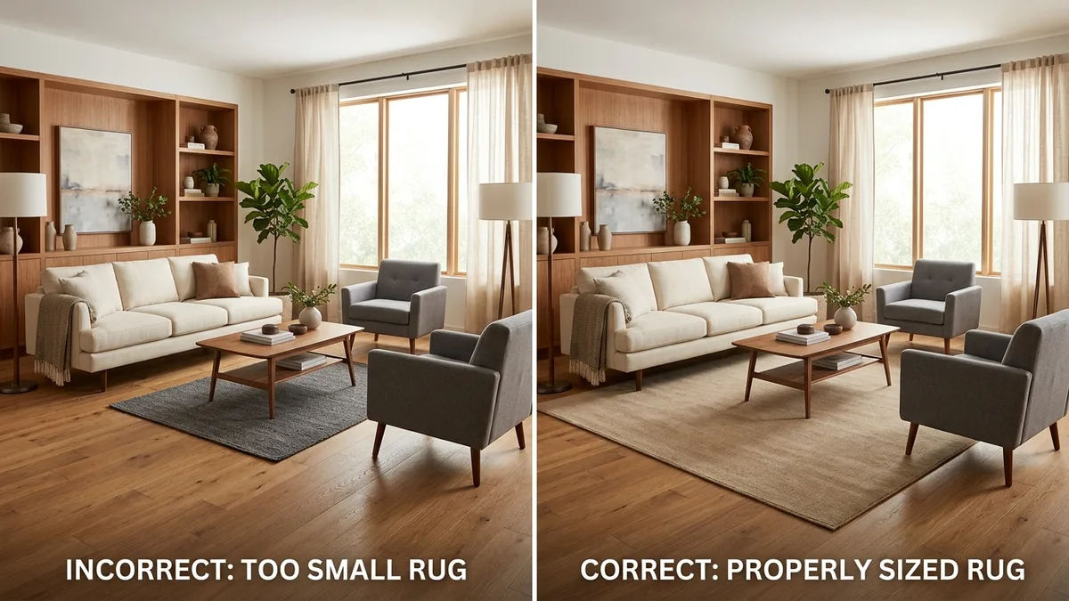
11. What Size Rug Do I Need?
For a living room, 200 by 300 centimeters is the standard size that works in most layouts. The front legs of all seating should sit on the rug. A rug that is too small is the single most common decorating mistake people make. A 120 by 170 centimeter rug floating in the middle of a living room looks like a bath mat that wandered into the wrong room. It makes the space feel smaller, not cozier.
For bedrooms, the rug should extend at least 60 centimeters beyond the sides and foot of the bed. A 160 by 230 centimeter rug works for most queen beds. Place it so about two-thirds sits under the bed and the rest extends out where your feet land in the morning.
For dining rooms, measure your table and add 60 centimeters on every side. This ensures chairs stay on the rug even when pulled out. Nothing looks worse or feels more annoying than dining chairs that rock because their back legs are on the rug and their front legs are on the floor.
12. Can I Mix Different Wood Tones in One Room?
Yes, and most professionally designed rooms do. Limit yourself to two or three tones and repeat each one at least twice. A room where the floor is oak, the coffee table is walnut, and the shelves are oak again feels intentional because the oak appears twice. A room where the floor is oak, the table is walnut, the shelves are cherry, and the TV stand is pine feels random because nothing repeats.
Choose one wood tone as your dominant. This is usually the floor or the largest piece of furniture. The second tone plays a supporting role, and if there is a third, it should appear only in small accents. A walnut dining table with oak chairs and a small cherry cutting board on the counter works. Four equally prominent wood tones in one room does not.
One thing that helps tie mixed woods together is having them share the same undertone. Warm-toned woods (oak, cherry, walnut) mix well with each other. Cool-toned woods (ash, grey-washed pine, whitewashed pieces) work together too. Mixing warm and cool woods in the same room is harder to pull off and usually looks accidental.
13. Should All My Furniture Match?
No. Matching furniture sets look dated. Instead, choose pieces that share one connecting element but are not identical. The fully coordinated bedroom set, where the bed frame, nightstands, dresser, and wardrobe are all from the same collection, had its moment in the 1990s. Today it reads as catalog furniture rather than a curated home.
The modern approach is cohesion without uniformity. Pick a thread that runs through your pieces. Maybe all your furniture has tapered legs. Maybe everything stays in the same wood family. Maybe the upholstered pieces share a color palette even though the shapes are different. The room should feel like everything belongs together, not like everything was ordered from the same page.
14. What Size Coffee Table Fits My Sofa?
Your coffee table should be roughly two-thirds the length of your sofa and sit five to ten centimeters lower than the seat cushion height. A table that is the full length of the sofa overwhelms it. A table that is half the length or less looks like it was borrowed from a smaller room.
Leave 40 to 45 centimeters between the edge of the sofa and the nearest edge of the table. This is close enough to reach a drink without leaning and far enough that you can walk past without bumping your shins. If you are choosing between round and rectangular, round tables work better in small rooms because there are no sharp corners to navigate around, and they create softer traffic flow.
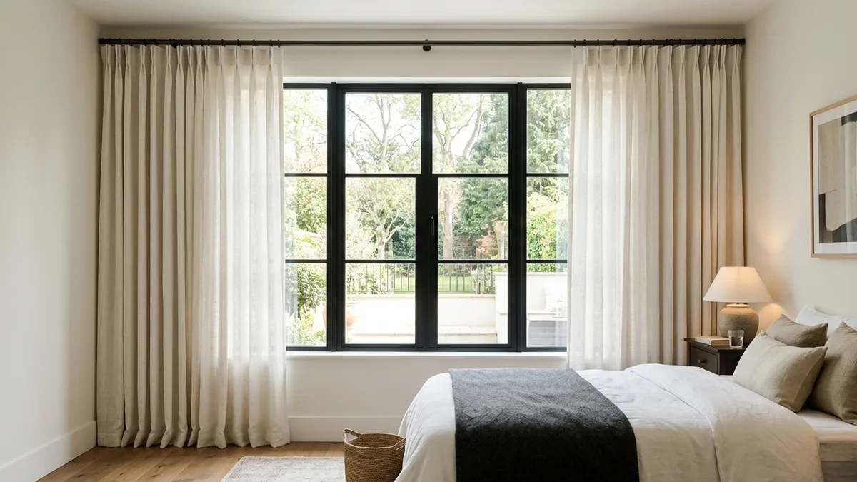
15. How High Should I Hang Curtains?
Hang curtain rods 10 to 15 centimeters above the window frame, or at ceiling height for a more dramatic, taller look. Curtains should just touch the floor or puddle two to three centimeters. Hanging them at the exact top of the window frame makes the window appear shorter, and curtains that stop five centimeters above the floor look like pants that shrank in the wash.
For width, extend the rod 15 to 25 centimeters beyond each side of the window frame. When the curtains are open, they should stack on the wall beside the window rather than covering the glass. This lets in maximum light and makes the window appear wider than it is.
16. How High Should I Hang Art and Pictures?
The center of the artwork should sit at 145 to 150 centimeters from the floor, which is roughly average eye level. This is the gallery standard used by museums worldwide, and it works in homes too. The most common mistake is hanging art too high, which forces you to look up at it and creates a visual gap between the furniture below and the art above.
When hanging art above a sofa, leave 15 to 20 centimeters between the top of the sofa and the bottom of the frame. The art should feel connected to the furniture beneath it, not floating away toward the ceiling. For a gallery wall with multiple pieces, lay them out on the floor first to find an arrangement that works, then transfer the layout to the wall.
Making Rooms Feel Right
17. How Do I Make a Room Feel Cozy?
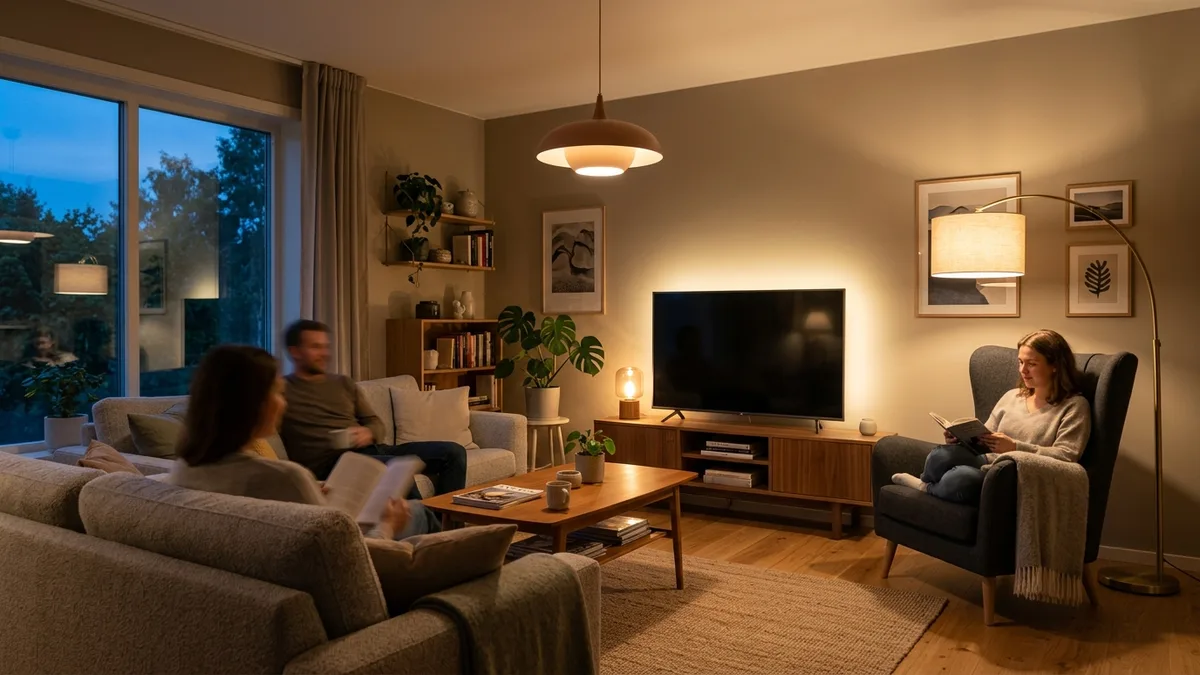
Layer textures and lower the light temperature. A room with a single overhead light and smooth surfaces feels like a waiting room regardless of how much you spent on the furniture. Coziness comes from variety in texture, warmth in lighting, and a sense of enclosure.
Start with textiles. A knit throw over the sofa arm, a textured rug underfoot, linen curtains, a velvet cushion. Each material catches light differently and creates visual and tactile warmth. Then address lighting. Replace any cool-white bulbs (4000K and above) with warm white (2700K). Add at least two light sources besides the overhead, a table lamp and a floor lamp, so you can turn off the ceiling light in the evening. The overhead light is the enemy of coziness.
Lower furniture also helps. A low-slung sofa, a coffee table closer to the ground, floor cushions. When the eye level drops, the room feels more intimate. High ceilings with low furniture feel cozy. High ceilings with tall furniture feel like a lobby.
18. How Do I Make My Home Look More Expensive Than It Is?
Three changes make the biggest difference for the least money: paint one clean wall color, switch to warm 2700K LED bulbs everywhere, and hang one large piece of art instead of ten small frames. Total cost is under €200 and the effect is immediate.
Beyond that, a few more things separate expensive-looking rooms from cheap-looking ones. Visible cords are a big one. Route them behind furniture, use cord covers, or tape them along baseboards. Nothing says “didn’t bother” like a nest of cables under the TV. Another is hardware. Replacing cheap chrome cabinet handles with brass or matte black ones costs €2 to €5 per handle and makes your kitchen or bathroom look like it was renovated.
The single most overlooked trick is editing. Remove things from flat surfaces. If your coffee table has twelve items on it, take away nine. A stack of two books and a candle looks expensive. A cluttered surface looks cheap regardless of what the individual items cost.
19. What Lighting Does Each Room Need?
Every room needs a mix of ambient, task, and accent lighting. A room lit by a single overhead fixture always feels flat and uninviting. Here is what works for the main rooms.
Living rooms need three to five light sources. An overhead or pendant for general light, a floor lamp next to the reading chair, a table lamp on a side table, and optionally a picture light or LED strip behind the TV for ambient glow. The goal is to be able to turn off the overhead in the evening and still have enough light from the other sources.
Bedrooms should never rely only on overhead lighting. A pair of bedside table lamps or wall-mounted reading lights is essential. Add a floor lamp in the corner and possibly a string of warm lights along a shelf or headboard. The bedroom is the one room where dim, warm lighting should be the default, not the exception.
Kitchens need strong task lighting above the counter and stove. Under-cabinet LED strips are one of the best upgrades you can make for under €30. They illuminate your actual work surface instead of casting your own shadow onto it, which is what happens with only ceiling lights.
Bathrooms need even, shadow-free lighting around the mirror. Two sconces mounted at face height on either side of the mirror is the gold standard. A single fixture above the mirror creates shadows under your eyes and chin, which is why you always look worse in your bathroom mirror than you do in person.
20. How Do I Create a Cohesive Look Across Multiple Rooms?
Choose three to five colors and repeat them throughout your home. Each room uses the same palette in different proportions. Your living room might be 60 percent warm white, 30 percent sage, and 10 percent terracotta. The bedroom uses the same colors but shifts the proportions: 60 percent warm white, 30 percent terracotta, and 10 percent sage. The palette connects the rooms without making them identical.
The same principle applies to materials. If your living room has an oak coffee table and your bedroom has an oak bed frame, those rooms feel related even if everything else is different. One or two recurring materials, such as oak and brass, or walnut and black metal, running through the entire home are enough to create flow.
Flooring is the biggest unifier. If possible, use the same flooring throughout connected spaces. Changing flooring from room to room, especially with different colors, visually chops your home into small disconnected boxes. Consistent flooring through hallways, living room, and kitchen makes even a small apartment feel like one continuous space.
Room-Specific Questions
21. How Do I Design a Bedroom for Better Sleep?
Keep the room cool, dark, and visually calm. Research consistently shows that bedroom design directly affects sleep quality, and the three biggest factors are light control, temperature, and visual clutter.
Start with blackout curtains or blinds. Even small amounts of light from street lamps or early morning sun disrupt melatonin production. Layer blackout blinds behind decorative curtains if you want the room to look good during the day. Choose wall colors in the blue, green, or warm neutral family. Studies on color psychology in sleep environments found that blue bedrooms are associated with the longest average sleep duration, while red and purple are associated with the shortest.
Remove screens if possible, or at least turn them face-down at night. Position the bed so you can see the door from your pillow without being directly in line with it. This sounds like superstition but it is actually rooted in environmental psychology. Feeling safe and oriented in the room reduces low-level alertness that can interfere with deep sleep. For a deeper look at how room design affects your brain, see our article on room design psychology.
22. How Do I Set Up a Home Office in a Small Space?
Face the desk toward the room or a window, not the wall. And separate the work zone from the rest of the room with at least one visual barrier, even if it is just a rug.
The biggest mistake in small home offices is putting the desk against a wall so you stare at drywall all day. This increases visual fatigue and makes the workspace feel claustrophobic. If the room is small enough that the desk must be against a wall, choose the wall with a window. Natural light is the single biggest factor in sustained focus and reduced eye strain.
If your office is in a corner of your bedroom or living room, define its boundaries. A small rug under the desk and chair, a different paint color on that one wall, or a low bookshelf acting as a divider. The physical separation does not need to be dramatic. It just needs to exist so your brain registers the transition between work mode and home mode. Working and sleeping in a space with zero visual separation between the two zones is a recipe for poor sleep and poor focus.
23. How Do I Make an Open Kitchen and Living Room Work?
Use the sofa as the divider, not a wall. Position it with its back toward the kitchen area, creating a natural boundary between cooking and living without blocking sightlines.
The challenge with open plan spaces is that without clear zones, the entire area feels like neither a proper kitchen nor a proper living room. Define each zone with a different rug, different lighting, or a change in ceiling fixture. The kitchen gets pendant lights over the island. The living room gets a floor lamp and table lamps. These lighting differences tell your eye where one zone ends and another begins.
Keep the color palette consistent across both zones. An open plan room with a grey kitchen and a beige living room feels disjointed. One continuous color story with different functional furniture is what makes open plans feel intentional rather than accidental. Our guide on open floor plan layouts has specific furniture arrangements that work for different room shapes.
Budget and Shopping
24. Where Should I Splurge and Where Should I Save?
Splurge on the sofa, the mattress, and the dining table. Save on side tables, decorative objects, and shelving. The rule is simple: spend more on items you use daily and that are difficult or expensive to replace. Save on items that are easy to upgrade later or that wear out regardless of price.
A €1,500 sofa will last ten years and you will sit on it every single day. A €400 sofa will sag in two years and you will buy another one, spending €800 total for a worse experience. The expensive sofa was the cheaper choice. Meanwhile, a €200 side table and a €30 side table from IKEA perform the exact same function and look similar enough that guests will not notice the difference.
Lighting is an interesting middle ground. Expensive designer fixtures are often not worth the premium because cheaper alternatives look nearly identical from eye level. But cheap light bulbs ruin everything. Spend €5 per bulb on good warm-white LEDs and your €15 IKEA lamp will look better than a €300 designer lamp with a cold blue bulb in it.
25. How Much Does It Actually Cost to Furnish a Room?
A living room costs between €2,000 and €10,000 depending on your quality expectations. At the budget end, you are buying from IKEA and secondhand marketplaces. At the mid-range, you are mixing IKEA staples with a few quality pieces from brands like Article, Made, or local furniture shops. At the premium end, every piece is selected for longevity and design.
If you want a detailed breakdown with item-by-item prices across three budget tiers, we wrote a full guide on the cost of furnishing a home in 2026 and a focused version on living room costs specifically.
The most practical advice on budget is this: it is better to buy five good pieces over 12 months than fifteen mediocre pieces in one weekend. A room with a great sofa, a good rug, nice lighting, and empty corners looks ten times better than a room stuffed with cheap furniture to fill every gap. Empty space is not a problem. Cheap filler is.
Can AI Help With All of This?
What Can AI Interior Design Tools Actually Do in 2026?
Upload a photo of your room and see it transformed into any design style in under 30 seconds. That is the core capability, and it has gotten remarkably good. The results are photorealistic enough that people regularly mistake AI-generated room images for professional photography.
Beyond style changes, AI tools can furnish empty rooms, remove existing furniture and replace it, test different wall colors, try different flooring, and visualize renovations before you commit. Five years ago, this required hiring a 3D artist and waiting days. Today it takes a phone photo and half a minute.
The practical use case is simple: before you spend €3,000 on a new sofa and rug, upload your room photo and see whether Scandinavian, mid-century, or minimalist actually looks good in your specific space with your specific lighting. It is the difference between buying based on a Pinterest image of someone else’s room and buying based on a visualization of your own.
If you have ever stared at your room and wondered “what would this look like if I changed everything?” this is the fastest way to find out. Try it with your own room photo here.
Quick Reference: The Rules That Matter Most
If you read nothing else and just want the cheat sheet, here are the ten rules that solve 80 percent of interior design problems.
The 60-30-10 rule. 60 percent dominant color, 30 percent secondary, 10 percent accent. Apply it to any room and the colors will work.
The rug rule. If you think your rug is big enough, it probably is not. Go one size up. Front legs of all seating should be on the rug.
The curtain rule. Hang them high, hang them wide, let them touch the floor. Never at the window frame, never hovering above the ground.
The art rule. Center at 145 to 150 centimeters from the floor. Fifteen centimeters above furniture. Never floating near the ceiling.
The furniture spacing rule. Forty to 45 centimeters between sofa and coffee table. Ninety centimeters for walkways. Five to ten centimeters between furniture and walls.
The lighting rule. Three sources minimum per room. Kill the overhead light in the evening. Warm white bulbs only.
The wood rule. Two to three tones maximum. Repeat each one at least twice. One dominant, the rest supporting.
The matching rule. Never buy a full matching set. Connect pieces through shared elements, not identical design.
The editing rule. When in doubt, remove something. A room with three good things on the shelf looks better than a room with twelve okay things.
The testing rule. Visualize before you buy. Whether it is a paint sample on the wall, a fabric swatch on the sofa, or an AI render of your room, always see things in context before committing money.