How to Design Any Awkward Room: L-Shaped, Narrow, Low Ceiling & Dark Rooms (Layout Solutions That Work)
Every design blog, every Pinterest board, every Instagram reel shows you a room that happens to be a perfect 4×5 meter rectangle with two windows centered on one wall and a single door on the other. The lighting is even. The proportions are generous. The ceiling is a comfortable 2.7 meters.
Your room has an L-shape where you can’t figure out where the sofa goes. Or it’s so narrow that you feel like you’re living in a hallway. Or the ceiling is 2.3 meters and every piece of furniture makes it feel lower. Or there are four doors, two windows in odd positions, and exactly one usable wall.
You are not bad at interior design. Your room is just weird. And weird rooms need different strategies than what Pinterest shows you. This guide covers the five most common awkward layouts and what actually works for each one — no generic advice, just specific solutions you can apply today.
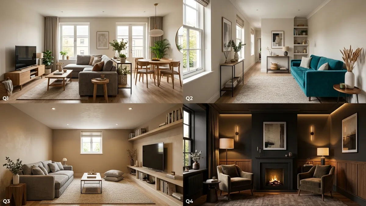
L-Shaped Living Rooms: The Layout That Confuses Everyone
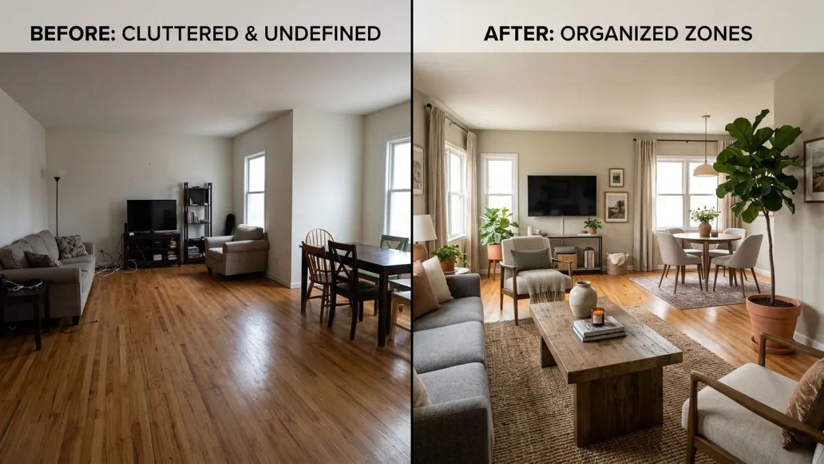
The L-shaped room is the most common awkward layout in modern apartments. The problem is simple: your brain wants to treat it as one room, but the shape creates two distinct areas that don’t naturally connect. You end up with a dead zone in the corner where the L turns, furniture that doesn’t face anything useful, and a room that feels unfinished no matter what you do.
The solution: stop trying to make it one room. Treat the L as two zones with different purposes.
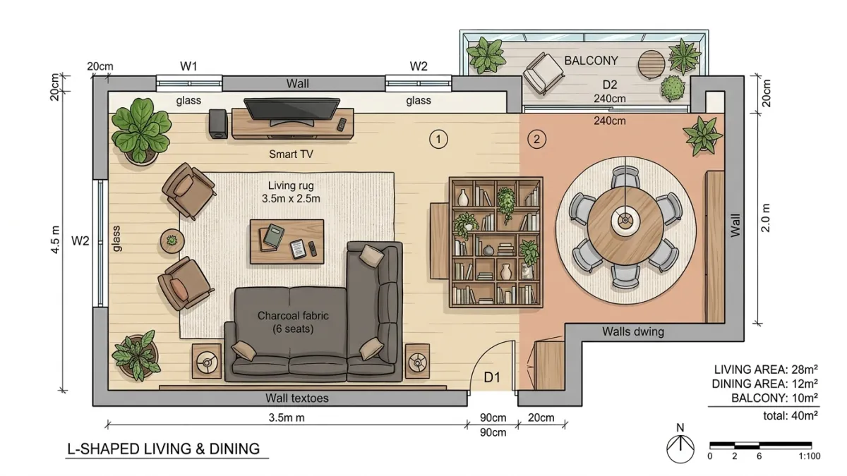
The Zone Strategy
Zone 1 (the larger section): This becomes your main living area. Sofa, TV or focal point, coffee table, and seating. Anchor it with a rug that defines the boundaries of this zone. The sofa typically goes along the longest wall, facing the TV or a window.
Zone 2 (the smaller section): This becomes a secondary function — a dining area, a reading nook, a home office, a play area. Give it its own rug (different from zone 1, but in a complementary style) so it reads as an intentional separate space, not as leftover square meters.
The transition point: Where the L turns is where most people struggle. This is the spot that connects both zones. Place something with height and visual weight here — a bookshelf, a tall plant, a floor lamp, a console with a mirror above it. This object acts as a visual anchor that makes the transition feel deliberate rather than accidental.
Three Layout Options for L-Shaped Rooms
Option 1: Living + Dining. The most common and usually the best. Main sofa area in the larger section, dining table and chairs in the smaller section. The dining area doubles as a work surface during the day. This works in almost every L-shaped room regardless of proportions.
Option 2: Living + Office. If you work from home and don’t need a formal dining area. Desk in the smaller section facing the wall or window, with a bookshelf dividing it from the living area. This creates a psychological separation between work and relaxation even though they share a room. See our home office design guide for more on this setup.
Option 3: Living + Reading Nook. For rooms where the smaller section is too small for a table. An armchair, a floor lamp, and a small side table create a perfect reading corner. Add a bookshelf along the wall and you have a space that feels like a library alcove.
L-Shaped Mistakes to Avoid
- Pushing all furniture against the walls. This makes the center of the L feel empty and the room feels underfurnished. Float at least one major piece (the sofa or the dining table) away from the wall.
- One giant rug for the whole room. A single rug that tries to cover both sections of the L either looks wrong or costs a fortune. Two coordinating rugs create clearer zones and are easier to find in standard sizes.
- Ignoring the inside corner. The inner corner of the L where two walls meet is dead space if you leave it empty. Put something there: a corner shelf, a tall plant, a small desk, a cozy chair. Fill the void.
Long Narrow Rooms: Breaking the Bowling Alley Effect
A room that is three times longer than it is wide creates an instant problem: everything feels like a corridor. You can see from one end to the other without interruption, which makes the space feel transitional rather than livable. Your brain reads it as a hallway with furniture in it, not a room.
The fix is breaking the sight line. You need to create visual interruptions that divide the length into shorter segments.
The Interruption Technique
Place furniture perpendicular to the long walls. This is the single most effective move. A sofa crossing the width of the room (perpendicular to the long walls, not parallel) immediately breaks the tunnel effect. It creates a visual barrier that divides the room into “this side” and “that side,” which makes each half feel more proportioned.
Use round and oval shapes. Rectangular furniture running parallel to the long walls reinforces the narrowness. A round coffee table, an oval dining table, or a circular rug softens the linear feeling and draws the eye sideways rather than down the length of the room. This isn’t just an aesthetic preference — curved shapes literally disrupt the directional pull of a long room.
Create three zones from front to back. In a long living room, the typical arrangement is: entry zone (console table, mirror, coat hooks) → seating zone (sofa, coffee table, TV) → dining or work zone (table and chairs or desk). Each zone gets its own rug or floor treatment that signals a new function. The rugs should run side to side (pulling the eye wide) rather than front to back (which would emphasize the length).
What Doesn’t Work in Narrow Rooms
- Running a long rug the full length of the room. This is a runner in a hallway, not a rug in a living room. It makes the narrowness worse. Use wide, shorter rugs that stretch toward both long walls.
- A single long sofa against the long wall. This turns the room into a train car. Either place the sofa perpendicular or use two smaller seats (armchairs, loveseats) across from each other to create width.
- Symmetrical furniture placement. Everything lined up on both sides creates a formal corridor look. Offset your furniture — an armchair at a slight angle, a side table that isn’t perfectly centered — to create visual variety that fights the tunnel effect.
For more on furniture placement strategies, see our furniture arrangement guide and AI furniture placement tool.
Low Ceiling Rooms: Adding Visual Height Without Adding Height
A ceiling below 2.5 meters can make any room feel compressed. Large furniture, heavy pendant lights, and dark ceilings all make it worse. But some of the most atmospheric rooms in the world have low ceilings — old cottages, cozy pubs, Japanese tearooms — because they use design tricks that work with the low height instead of fighting it.
The Furniture Paradox: Go Lower
This is counterintuitive: lower furniture makes a low ceiling feel higher. When there’s more visible space between the top of your furniture and the ceiling, the ceiling appears taller by comparison. A sofa with a low back (70–75 cm seat back height instead of 85–90 cm), a platform bed instead of a tall frame, a low media console — these all increase the visible gap between furniture and ceiling.
Choose furniture with visible legs. When you can see the floor under the sofa, bed, or armchair, the room feels more open and airy. Heavy, floor-sitting furniture blocks sight lines and makes a low room feel even more closed in.
The Curtain Trick
Hang curtains at ceiling height, not at the window frame. Even if your window starts 30 cm below the ceiling, mount the curtain rod at the very top of the wall. The vertical fabric running from ceiling to floor creates an unbroken vertical line that draws the eye upward and makes the ceiling feel higher than it is. This is one of the oldest tricks in interior design and it works every single time.
Vertical Lines and Patterns
Anything that draws the eye vertically works. Tall, narrow bookshelves that go floor to ceiling. Vertical stripe wallpaper or paneling on one wall. Tall, slim floor lamps. Tall plants. Artwork hung slightly higher than normal (with its center at eye level or above, not below). All of these create upward visual movement that counteracts the low ceiling.
What doesn’t work: horizontal stripes, wide shelving at mid-wall height, and picture rails or molding at the midpoint of the wall. These all create horizontal lines that emphasize the ceiling’s height (or lack of it).
Ceiling Color and Lighting
Paint the ceiling a shade or two lighter than the walls. This creates a subtle illusion that the ceiling is receding upward. If your walls are warm gray, paint the ceiling a lighter warm white. If your walls are a color, paint the ceiling the palest version of that same color.
Avoid pendant lights that hang down. Every centimeter of hanging fixture eats into your already limited headroom. Use flush-mount ceiling lights, recessed downlights, or wall sconces that cast light upward (washing the ceiling with light makes it appear to float). If you must have a pendant over a dining table, keep it on a short drop so it doesn’t dominate the vertical space.
Dark Rooms: When “Just Paint It White” Makes Everything Worse
You have a room with one small window, a north-facing orientation, and maybe a wall of the building blocking whatever natural light might have arrived. Everyone tells you to paint it white. You paint it white. And now your room looks like a cloudy hospital hallway instead of a bright, airy space.
Here’s why: white needs light to work. White paint reflects whatever light hits it. In a bright room, it reflects sunlight and looks fresh and clean. In a dark room, it reflects the gray light from a small window and looks flat, cold, and slightly depressing. The problem is not the room. The problem is that white paint was the wrong solution.
Option 1: Go Warm Instead of White
Warm colors reflect warm light beautifully, even artificial light. In a room without much natural light, switch to:
- Soft cream or warm ivory (not cool white — there’s a real difference). These feel bright and welcoming under lamp light.
- Pale warm yellow. Not banana yellow. Think the color of butter or old parchment. It catches warm bulb light and distributes it softly.
- Light blush pink or peach. In a bedroom or bathroom, these create warmth and life that white never achieves in low light.
- Light sage green. Cool enough to feel fresh, warm enough to work without sunlight.
The key is warm undertones. Hold any paint swatch under a warm light bulb (2700K–3000K) in the actual room before committing. The color you see under store lighting means nothing. For more on choosing paint colors, see our complete paint color guide.
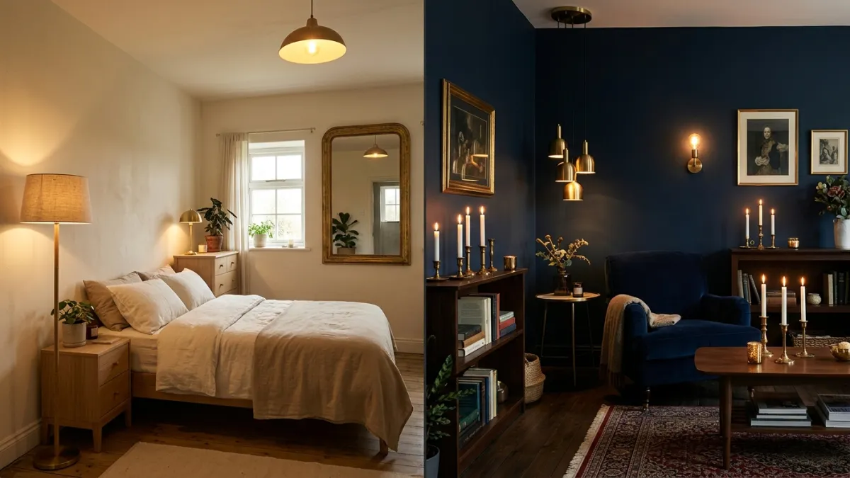
Option 2: Go Fully Dark (the Counterintuitive Move)
Sometimes the smartest response to a dark room is to stop pretending it can be bright and lean into the darkness. A room painted deep green, navy, or charcoal with warm, layered lighting can feel like a cozy cocoon instead of a gloomy box. This works especially well for bedrooms, dens, home offices, and bathrooms — rooms where the mood benefits from intimacy rather than brightness.
The difference between a dark room that feels cozy and one that feels depressing is entirely about lighting. You need at least three to four sources of warm light (2700K) at different heights: a floor lamp, table lamps, candles, an LED strip behind a shelf. No overhead light alone. The warm light bouncing off dark walls creates exactly the kind of atmosphere that makes people exhale when they walk in. See our dark and moody design guide for the full approach.
Mirrors and Reflective Surfaces
Mirrors don’t create light — they redistribute it. Place a mirror directly across from whatever light source you do have (a window, even a small one). The mirror reflects that light back into the room, effectively doubling the reach of your single window. A large mirror on the wall opposite the window is the most impactful single change you can make in a dark room.
Other reflective surfaces help too: glass-front cabinets, metallic picture frames, glossy tile or lacquered furniture, brass accents. Each surface catches and redistributes a small amount of light. Together, they make a meaningful difference.
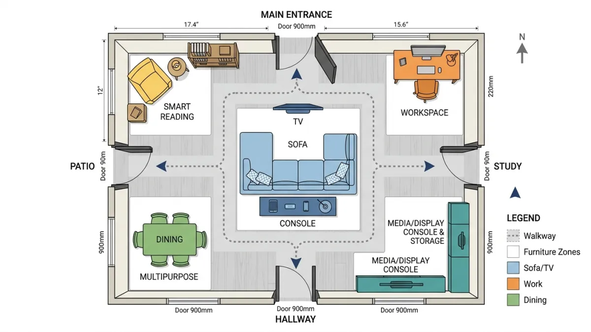
Rooms with Too Many Doors: The Furniture Puzzle
Three doors. Or four. Maybe a closet door, a bathroom door, a hallway door, and a patio door. Each one creates a traffic lane that you cannot block, and each one eats into the usable wall space where furniture could go. You end up with a room where there’s nowhere to put the sofa.
The Traffic Map Method
Before placing any furniture, draw the room from above and trace a line from every door to every other door and to the main window. These lines are your traffic lanes. Nothing goes on them. Whatever wall and floor space remains between these lanes is where your furniture lives.
Usually, this exercise reveals that there’s more usable space than you thought — it’s just not where you expected it. The center of the room, rather than the edges, often becomes the best spot for a seating area. Float a sofa in the middle of the room with its back to one traffic lane, facing the TV or window. Put a console table behind the sofa to create a visual barrier between the walkway and the seating area.
Furniture Solutions for Multi-Door Rooms
- Float furniture. Stop trying to push everything against walls. A sofa in the center of the room, a desk perpendicular to a wall, chairs angled away from corners — these all work when walls are interrupted by doors.
- Use open-back furniture. A bookshelf with no back, a console table, or a bench can serve as a room divider between a traffic lane and a living zone without blocking the visual flow of the room.
- Consider sliding or pocket doors. If budget allows, converting a hinged door to a sliding door eliminates the swing arc and makes that entire wall usable for furniture. Even one door conversion can transform the room.
- Identify the rarely-used door. In most multi-door rooms, one door is used ten times a day and another is used twice a week. You can partially block the rarely-used door with a bookshelf or console that can be moved if needed, as long as it can still open in an emergency.
For more on open floor plan furniture solutions, see our open floor plan layout guide.
Dead Corners and Awkward Alcoves: Making Weird Spaces Work
Every oddly-shaped room comes with at least one spot where nothing seems to fit. A corner that’s too narrow for an armchair, too wide to ignore. An alcove that’s 60 cm deep and 90 cm wide. A nook under the stairs. A wall indentation left over from a structural column.
The worst thing you can do with these spaces is leave them empty. An empty awkward corner draws attention to the awkwardness. Fill it, and the room reads as intentional.
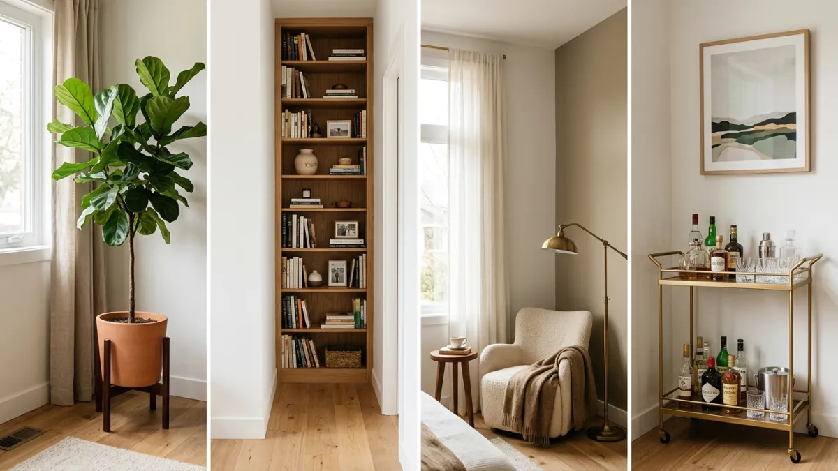
The tall-and-narrow rule: Awkward corners need something with height. A tall plant (fiddle leaf fig, snake plant, bird of paradise) fills the vertical space and draws the eye up and away from the weird proportions. A floor-to-ceiling bookshelf (even a narrow one, 30–40 cm deep) turns an unusable corner into storage that looks like it was planned. A tall floor lamp adds both function and visual interest.
Mini-function zones: A corner that’s 70–90 cm wide is perfect for a reading chair with a floor lamp. A shallow alcove works as a bar cart station, a small desk, or a display shelf for plants and objects. Under-stair spaces can be home offices, pet nooks, or book storage. The key is giving the space a clear purpose rather than dumping random items in it.
When all else fails, light it. A well-placed floor lamp or picture light transforms an empty corner from “we didn’t know what to put here” to “this is the accent lighting that makes the room interesting.” Light gives any space purpose.
Test Your Layout Before Moving a Single Piece of Furniture
Here is the practical problem with everything I’ve just described: you have to move heavy furniture to test whether it works. A sofa perpendicular to the wall sounds great in a blog post, but will it actually fit? Will it block the path to the kitchen? Will it look weird when you’re standing at the door? You won’t know until you’ve dragged 80 kg of sofa across the room three times and your back hurts.
Upload a photo of your awkward room to MeltFlex and test different furniture arrangements, styles, and layouts before moving anything. See whether a perpendicular sofa works in your narrow living room. Test whether dark walls make your low-ceiling bedroom feel cozy or claustrophobic. Try three different configurations for your L-shaped space in five minutes instead of five hours.
The AI generates realistic visualizations of your actual room with different furniture placements, colors, and styles. It’s faster than taping rectangles on the floor, more accurate than imagining it in your head, and it costs nothing compared to buying furniture that doesn’t fit.
Your Room Is Not the Problem. The Template Is.
Every design template, every furniture store showroom, every apartment listing photo is based on a room that probably doesn’t look like yours. That’s not a flaw in your apartment — it’s a flaw in the advice.
L-shaped rooms become more functional than rectangles when you zone them properly. Narrow rooms become more interesting than wide ones when you break them into sections. Low ceilings create intimacy that tall ceilings never achieve. Dark rooms produce atmosphere that bright rooms can’t. And dead corners become the spots visitors remember.
Stop trying to make your awkward room look like a different room. Start designing it like the room it actually is. The shape you have is not a limitation. The strategies you’ve been using are.
For more layout planning, explore our guides on small living room ideas, studio apartment layouts, making small rooms look bigger, and decorating a room from scratch.