On Airbnb you are not really competing on price or location, you are competing in a grid of thumbnails. A guest scrolls past dozens of listings in seconds, and the ones that get the click are the ones that look like an experience, not a spare room with a bed in it. That is a design problem, and it is the most controllable lever a host has.
We build an AI room design tool, MeltFlex, and hosts use it for exactly this: to find the ideas that make a space stand out and to see the look before spending a euro on furniture. So this guide is the practical version. Here is what good design actually does to a listing, the twelve ideas that make an Airbnb memorable, and how to get those ideas and preview them without the expensive trial and error.
The short version
- Design is a booking lever, not decoration. Professional design can lift bookings around 24 percent and revenue around 40 percent.
- Win the first photo. Your cover thumbnail is your shopfront. Design the room for that shot first.
- Stand out with one strong idea. A single memorable feature beats a room full of safe, beige choices.
- Spend where guests look. The bed, linens, lighting, and one statement piece earn the bookings and the reviews.
- Preview before you buy. AI can generate ideas for your exact room and show the look with real furniture, so you plan instead of guess.
Why Airbnb design decides whether you get booked
Design is the highest-return change most hosts can make, because it moves three numbers at once: how many people book, how much they pay, and how often the calendar fills. The data backs it up. According to short-term rental operator AvantStay, professional design paired with quality photos can lift bookings by about 24 percent and total revenue by around 40 percent. Airbnb’s own platform data points the same way: in its analysis of more than 100,000 listings, professional presentation alone drove roughly 28 percent more bookings, and good presentation starts with a space worth photographing.
| What strong design does | Reported impact |
|---|---|
| Average nightly rate (ADR) | Up 10 to 25 percent, 40 to 60 percent in competitive markets |
| Year-round occupancy | 8 to 12 percent higher with professional staging |
| Nightly price guests will pay | 20 to 40 percent more for a boutique feel vs a generic rental |
| Payback on a design refresh | Typically 6 to 12 months |
Reviews compound the effect. Research from Cornell’s Center for Hospitality Research, cited by AvantStay, found that a single one-point rise in review score lets a property raise prices by 11.2 percent without losing bookings. A space guests love to photograph and write about is a space that quietly earns more every month.
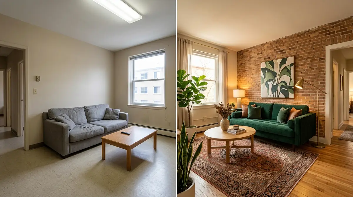
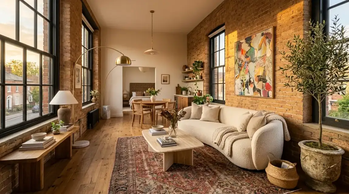
Same room, two outcomes. The left is what most listings look like and what guests scroll past. The right is the kind of space that earns the click, the higher rate, and the five-star review. The difference is design, not square metres.
Design for the first photo, because it is your shopfront
Before anyone reads your description, they judge your cover photo. As ArchDaily puts it in its guide to standout listings, “it is all about first impressions, and having that curb appeal will ultimately bring in people seeking one-of-a-kind experiences” (ArchDaily). So design the hero room for the shot: pick the angle that shows depth and light, style that exact frame, and make sure the most interesting thing in the room is the first thing a guest sees. Everything else in this guide is in service of that one image earning a click.
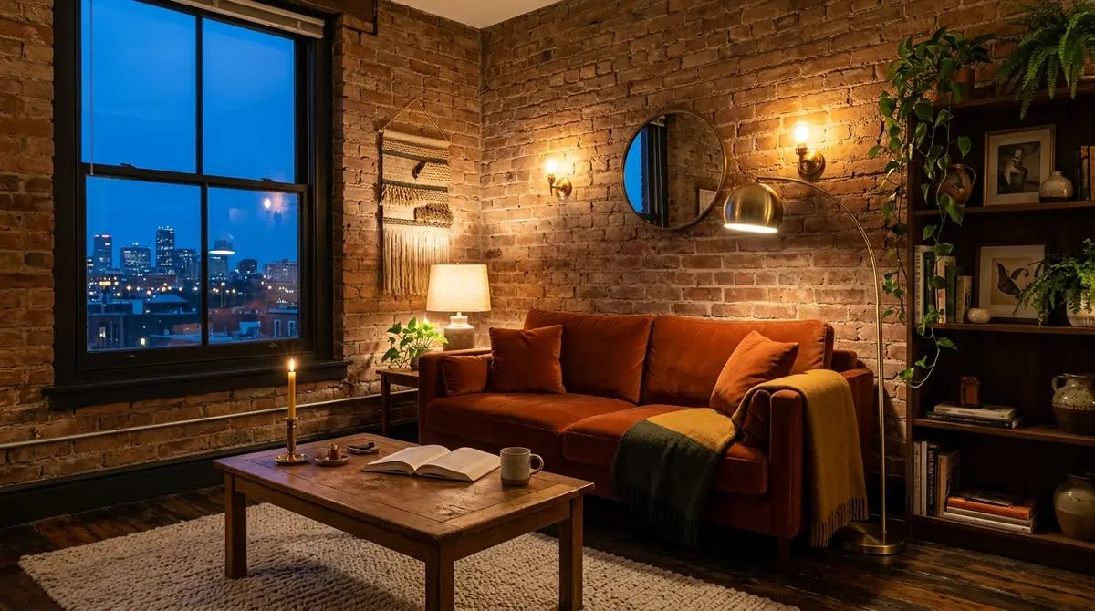
Light is half the photo. Warm, layered lighting from lamps and sconces reads as cosy and photographs far better than a single flat ceiling light, which is why it does so much work in a hero shot.
12 design ideas that make an Airbnb stand out
You do not need a renovation to stand out. You need one strong idea and a handful of details that photograph well. Here are the twelve that move the needle most.
- Lead with a scroll-stopping hero shot. Style one room specifically for the cover thumbnail, the frame that decides whether anyone clicks.
- Give the space one memorable feature. A statement headboard wall, a canopy bed, a built-in reading nook. One wow moment guests remember and photograph.
- Anchor it to its location. Local art, materials, and colours that say where you are beat generic hotel neutrality every time. Lean on one or two real local pieces, a regional textile or work by a nearby artist, rather than a wall of generic prints.
- Layer warm lighting. Lamps, sconces, and dimmers, never just the ceiling light. Aim for at least three light sources per room so you get warm pools of light that read as cosy in photos and in person.
- Commit to one cohesive style and palette. A space that looks designed, not assembled from leftovers, is what reads as a boutique stay. Pick three or four colours and repeat them across the room.
- Invest in the bed and the linens. The bed is the most photographed and most reviewed item in any listing, so spend here first. Crisp white, hotel-grade bedding photographs cleaner and signals quality more than almost any other single buy.
- Style one small photogenic corner. A coffee nook, a window seat, a styled shelf. The detail guests post to their stories, and free marketing every time they do.
- Make the living area read for groups and for photos. Clear sightlines, a real sofa, and a layout that shows the space is genuinely usable.
- Add the texture that signals boutique. A rug, a throw, curtains that reach the floor, a headboard. Soft layers are what separate styled from sparse.
- Solve the review-killers. Blackout curtains, a great mattress, real storage, and a comfortable work corner. These rarely show in photos but they win the five-star reviews that let you raise your price.
- Keep it shoot-ready. Declutter hard. Negative space photographs better and makes a small room feel generous.
- Nail the entry and the outdoor first impression. A welcoming doorway or a styled balcony is the curb appeal that sets the tone before guests step inside.
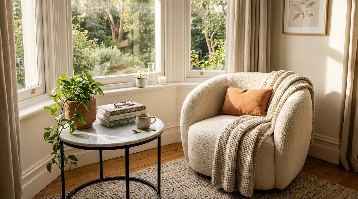
Idea seven in practice. One small, deliberately styled corner like this reading nook gives guests something to photograph and post, which is the cheapest marketing a listing can have.
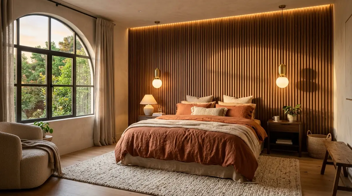
The wow moment in practice. A single statement feature, here a bold headboard wall with a styled reading nook, gives guests something to remember and something to photograph. That is what turns a listing from forgettable into bookable.
The one thing that actually makes a listing memorable
If you take one idea from this guide, take this: pick a point of view and commit to it. The listings that get booked are not the most expensive ones, they are the ones with a clear identity, a calm Scandinavian studio, a warm Mediterranean apartment, a bold maximalist loft. Generic is invisible. A space that feels like a deliberate, specific experience is what makes a guest stop scrolling, and it is what they tell their friends about afterwards.
How AI gives you the ideas and shows you before you spend
The hard part is not knowing that design matters, it is knowing what to do with your specific room without spending thousands to find out. That is the gap AI closes. Instead of buying furniture and hoping it photographs well, you generate the ideas for your exact space and see the look first.
How MeltFlex helps you design an Airbnb that books
- Ideas for your real room. Upload a photo or floor plan and get standout design options tailored to your actual space, not a generic mood board.
- See several styles side by side. Compare a Scandinavian, warm minimalist, or boutique look in seconds and pick the one that fits your market.
- Real, shoppable furniture. Every piece is an actual product from retailers like IKEA, Amazon, and Wayfair, so the look you choose is one you can actually buy and recreate.
- Preview before you spend. Plan and budget the whole room before a single delivery, instead of guessing and returning what does not work.
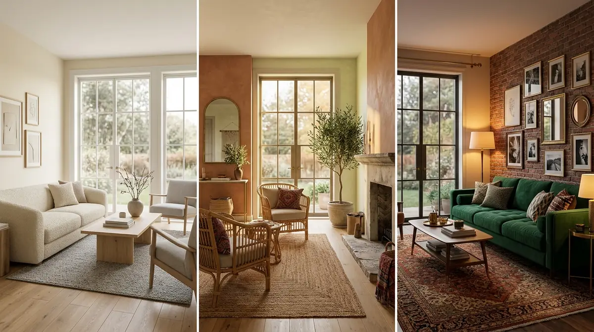
The same room, three directions, generated in seconds. Seeing the options side by side is how you pick a look that fits your market and commit to it with confidence, before you spend on furniture.
For the deeper, data-backed playbook on styles, colours, and staging that lift bookings, see our full guide to Airbnb interior design for a short-term rental that books. And if you are starting from an empty or tired space, virtual staging before and after shows how far a redesign can take a room.
Frequently asked questions
How do I make my Airbnb stand out?
Give it one memorable design idea, then design the whole space around the first photo. Lead with a scroll-stopping hero shot, add a single wow moment, anchor the style to the location, layer warm lighting, and invest in the bed and linens. Standing out is about one strong, cohesive idea that photographs well, not about spending the most.
Does design really increase bookings?
Yes. Professional design with quality photos can lift bookings around 24 percent and revenue around 40 percent, raise nightly rates 10 to 25 percent, and improve occupancy 8 to 12 percent, according to AvantStay. Design refreshes typically pay back within 6 to 12 months.
Can AI design my Airbnb?
Yes. AI can generate standout ideas for your exact space, show several styles side by side, and let you preview the look with real, shoppable furniture before you spend anything, so design becomes a preview you can plan and budget rather than an expensive guess.
Keep reading
- Airbnb interior design: design a short-term rental that books, the full data-backed playbook.
- Virtual staging before and after, how a redesign transforms an empty room.
- Measure a room from a photo, so the furniture you choose actually fits the space.
- Design your space with AI, generate standout ideas and preview them with real furniture.