For most of the last decade, the safe move in any room was to take the color out. Beige walls, greige sofas, white kitchens, soft minimalism everywhere. Then in early 2024 an interior designer named Taylor Migliazzo Simon said something that broke the internet a little: a room is never really finished until you add a bit of red. She called it the unexpected red theory, and two years later it is still one of the most searched ideas in interior design.
What is interesting is that it did not fade like most viral decor trends. Homes & Gardens revisited it in 2026 and found designers still using it everywhere, with many of them arguing it was never really a trend at all but a timeless way to decorate. This guide breaks down exactly what it is, why it works, the one ratio that keeps it from looking loud, the earthy reds designers prefer in 2026, and the fastest way to know if it will work in your room before you buy a single red thing.
The short version
- What it is: add one small, deliberate touch of red to a neutral room and the whole space looks finished.
- Why it works: red is the highest-contrast accent you can add, so it makes a flat palette read as layered and intentional.
- The ratio: keep red to about 10 percent of the room using the 60-30-10 rule. Past that it stops being unexpected.
- The 2026 shade: earthy reds like oxblood, terracotta, brick, and currant, not bright cherry.
- Before you buy: see the red in your own room first, because the same shade changes completely against your real walls and light.
What is the unexpected red theory?
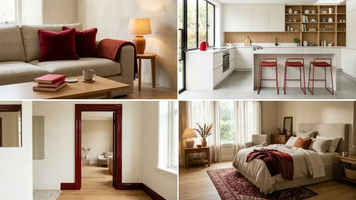
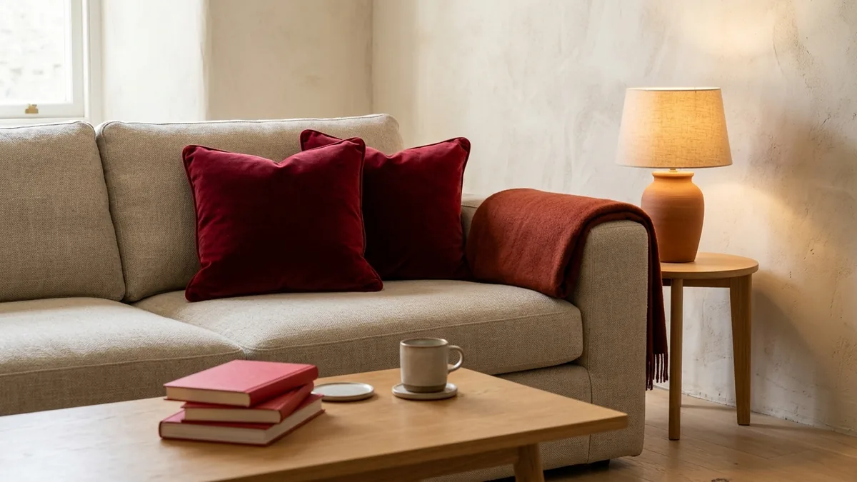
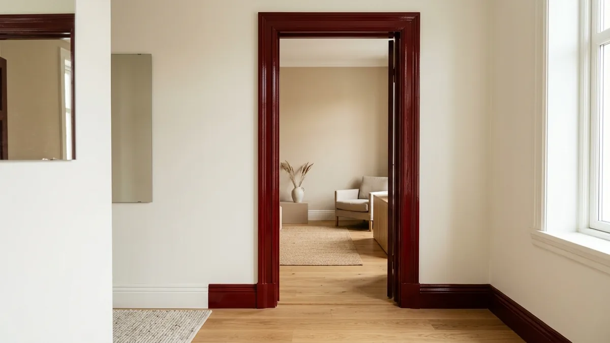
The unexpected red theory is the idea that almost any room looks more complete once you add a small, deliberate touch of red, placed somewhere you would not normally expect it. The red is not meant to match the rest of the palette. That slight, intentional clash is the entire point: it is what makes a neutral or monochrome room feel considered and alive instead of flat. It works at any scale, from a single ceramic vase on a shelf to a fully painted door frame.
Designer Taylor Migliazzo Simon coined the phrase on social media in 2024, and it spread fast because it gave people permission to add personality back into rooms that had become very safe and very beige. Over time it has come to mean more than red specifically. At its core it is about using one unexpected pop of color to break visual monotony, but red remains the original and most reliable version because of how the eye responds to it.
Why does a pop of red actually work?
Red is the highest-contrast color you can drop into a neutral scheme, so the eye lands on it instantly and then reads the entire room as more layered and intentional. There is a real psychological pull to it: red carries energy and presence, which is exactly why a tiny amount changes how a whole space feels. After years of muted palettes, that jolt of warmth feels like a relief rather than a shock.
The reason it rarely looks garish comes down to proportion. Most designers frame it with the classic 60-30-10 rule: about 60 percent of the room in your main neutral, 30 percent in a secondary supporting tone, and 10 percent in the accent. In the unexpected red theory, red is that 10 percent and nothing more. Stay inside that 10 and the red energizes the room. Push past it and you no longer have an unexpected accent, you have a red room, which is a completely different and much bigger decision.
Where to add red, from easy to bold
The smartest way to try the theory is to start reversible and work up only if you love it. Here is how the options stack up by commitment, cost, and how easily you can undo them.
| Where you add it | Commitment | Reversible? |
|---|---|---|
| Cushion, throw, vase, books, single artwork | Low, a few euros to a few dozen | Instantly |
| Table lamp, small stool, ceramics, a tray | Low to medium | Yes, just move it |
| Accent chair, ottoman, bench, rug | Medium, a real purchase | Yes, but it costs you |
| Curtains, a single cabinet, lampshade | Medium to high | Partly |
| Painted door frame, window trim, shelf interior, one cabinet | High, paint and time | Only by repainting |
One placement trick separates the look that feels designed from the look that feels forced: put the red slightly away from the obvious focal point. A red object on a side table, the spine of a few books, or the edge of a shelf reads as a happy accident. The same red dropped dead-center on the main sofa can look like you were trying too hard.
How to use the unexpected red theory room by room
The theory scales to any space. The trick is matching the boldness of the red to how much you use and want to commit to the room.
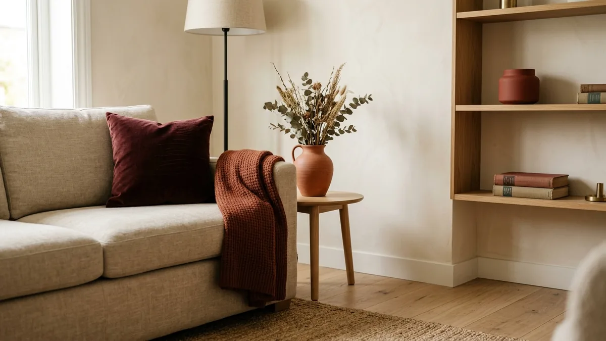
Living room. The easiest place to start. A single red cushion on a neutral sofa, a stack of red-spined books on the coffee table, or one terracotta lamp on a side table. If you fall for it, graduate to a single oxblood accent chair set against beige and oak.
Kitchen. Red works beautifully against monochrome or industrial kitchens. Think a single red small appliance, a row of currant-red bar stools, or, for the brave, the interior of an open shelf or one lower cabinet painted brick red.
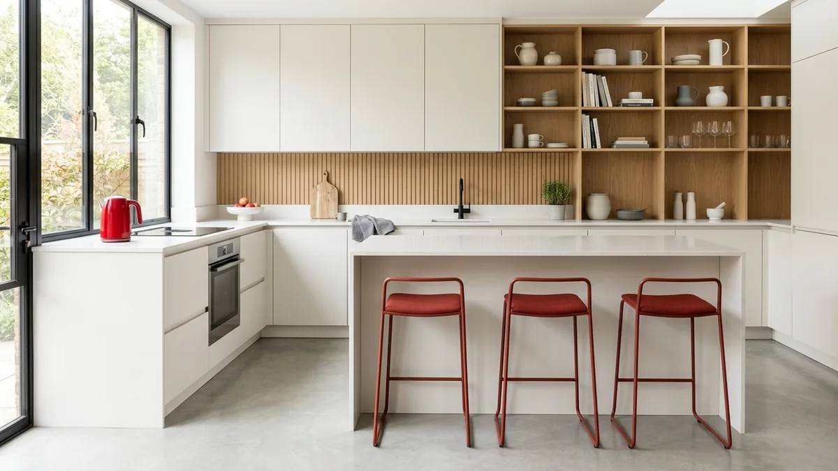
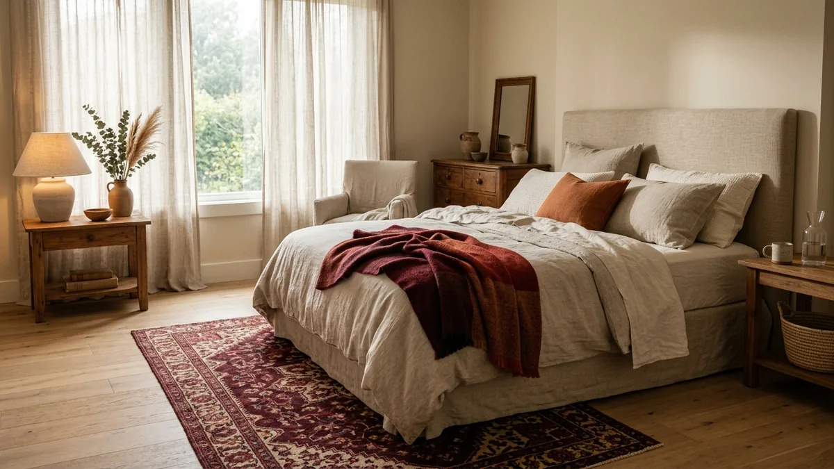
Bedroom. You rarely want a loud bedroom, so keep it grounded: a maroon or burgundy rug underfoot, a rust throw folded across the bed, or a single piece of red art. Earthy reds here read as cozy rather than energetic.
Bathroom. One of the most underrated spots. A red towel, a small vase, or a painted vanity in oxblood against white tile turns a purely functional room into one that feels styled.
Entryway and hallway. The unexpected red theory loves a threshold. A red door frame, a single runner, or a lacquered console makes the first and last thing you see in your home feel intentional.
Home office. A red desk lamp or chair gives a flat workspace a focal point without turning it into a distraction.
The 2026 evolution: earthy red, not fire-engine red
This is the single biggest shift since the trend began. The red of 2024 was often a bright, almost primary pop. The red of 2026 has matured. As designers told Woman & Home, the accent does not need to be a strong primary red at all: terracotta, blush, and currant work just as well, and earthy, natural-leaning reds are the shades the pros are reaching for now.
The reason is harmony. Current interiors are built on warm neutrals, plaster tones, and natural wood, the same palette behind the rise of warm minimalism and color drenching. Oxblood, brick, and rust sit inside that warm family instead of fighting it, so the accent feels deliberate and grounded rather than loud. If you want the look to feel current rather than dated, choose the earthy end of the red spectrum and let your room's wood and neutral tones tell you whether to go warmer (terracotta, rust) or deeper (oxblood, currant).
How to get the 60-30-10 ratio right
If a room with red ever feels off, the ratio is almost always why. Walk the room and roughly tally it: the walls, large rugs, and the sofa are usually your 60 percent neutral base. Secondary furniture, curtains, and a feature tone make up the 30 percent. Everything red should add up to no more than that final 10 percent.
A practical way to stay honest: count your red objects. In a living room, that might be one chair plus one or two small accessories, and that is it. The moment you find yourself adding a fourth and fifth red thing to balance the others, you have left unexpected-accent territory and started designing a red room. There is nothing wrong with a red room, but it is a deliberate, high-commitment look, not the quiet trick this theory is famous for.
Common mistakes that make it look off
- Too much red. The number one error. Past roughly 10 percent it stops being unexpected and starts being the theme.
- Matching everything. Three identical red items lined up looks coordinated and safe, which is the opposite of the effect. Vary the shade and placement.
- The wrong undertone. A cool, bluish red in a warm oak-and-cream room can look harsh. Match the red's temperature to the room.
- Centering it. Red placed at the dead-center focal point looks planned and stiff. Offset it.
- Guessing from a tiny swatch. A paint chip or product photo lies about how the color reads at full scale in your actual light. This is the mistake that costs real money.
Using the unexpected red theory to sell a home
Stagers caught onto this quickly. The National Association of Realtors has written about using a controlled pop of red to make listing photos stop the scroll and to make staged rooms feel finished rather than empty. In a sea of beige listing photos, one well-placed red accent is what makes a thumbnail get the click.
The rule for selling is restraint. One or two small, reversible red accents per room is plenty. You want buyers to see a characterful, finished space, not to feel they are inheriting a stranger's strong taste. Because staging lives or dies on the photo, it pays to test the exact placement digitally first, so the red reads as a designed highlight in the final shot instead of a distraction that pulls the eye to the wrong corner. The same logic applies whether you are staging to sell or just want a room that photographs well for yourself.
The fastest way to know if red will work in your room
Here is the honest truth about every tip above: the same red looks completely different in your room than it does in a magazine. Your wall color, your floor, the direction your windows face, and the time of day all change how a red reads. A terracotta that looks perfect in a south-facing room can turn muddy in a north-facing one. This is exactly why people buy a red chair, get it home, and quietly return it.
So before you spend anything, see it in your actual space. With MeltFlex you upload a photo of your real room and try the red accent right there: a chair, a rug, a painted door frame, an oxblood versus a terracotta, side by side, in seconds. It keeps your real walls, windows, and layout, so what you see is what you will actually get, and the furniture it shows is real and shoppable. You get to make the bold call with zero risk and zero guesswork.
Test the unexpected red theory on your own room first
- Keeps your real room. Upload one photo and add the red to your actual space, not a stock photo.
- Compare shades instantly. Oxblood vs terracotta vs currant, side by side, before you commit.
- Try every placement. Chair, rug, cushions, or a painted door frame, all reversible on screen.
- Real, shoppable furniture. Love the red chair you see? You can actually buy it.
Frequently asked questions
What is the unexpected red theory in simple terms?
Add one small, deliberate touch of red to a neutral room, somewhere a little unexpected, and the whole space suddenly looks finished. Designer Taylor Migliazzo Simon named it in 2024 and it has stuck around because it genuinely works.
Does the red have to be bright?
No. Terracotta, blush, currant, oxblood, and brick all count, and in 2026 those earthy reds are what designers prefer because they sit naturally beside warm neutrals and wood.
How much red is too much?
Keep it to roughly 10 percent of the room using the 60-30-10 rule. Once red passes that, it stops being an unexpected accent and becomes the room's theme.
Is the unexpected red theory over?
No. It went viral in 2024 and is still widely used in 2026, with many designers now calling it a timeless way to decorate rather than a trend. The shade has simply shifted toward earthier reds.
How do I know which red suits my room?
Match the undertone to your space, warmer reds for oak and beige rooms, sharper reds for cool grey or white ones, and then see it in your actual room before buying. Testing the color in your real space removes the guesswork that leads to returns.
The unexpected red theory lasted because it solves a real problem: neutral rooms that feel safe but lifeless. One earthy red accent, kept to 10 percent and placed slightly off-center, is often all a space needs. The only thing standing between you and the look is knowing whether your particular red works against your particular room, and that is a five-second test now, not a gamble. Try it on your own room and see the finished space before you spend a cent.