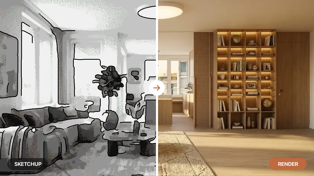
The Most Detailed AI Interior Designer: Why Detail Separates Good Design From Excellent

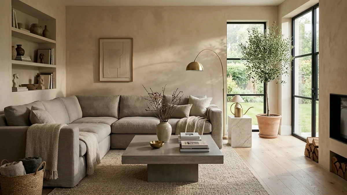
Almost every AI interior tool can get the vibe right. Far fewer get the details right, and the details are where good design quietly becomes excellent. A model can hand you a warm, minimal living room in seconds. The question that separates a nice thumbnail from a design you can act on is what happens when you lean in: does the linen actually weave, does the oak have grain, does the sofa sit at a size that would fit your wall, and is there a real shadow where it meets the floor. That is the detail gap, and it is the whole story.
Our articles are still written by humans!
Get human written articles in your Google feed.
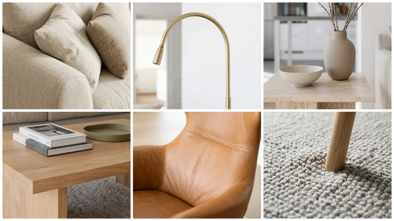
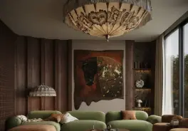
The cover above is not a mood board. It is six close-ups from a single living room our AI designed, one material at a time: the linen, the brushed brass, the ceramic, the oak, the leather and the wool. Here is the room they all come from.
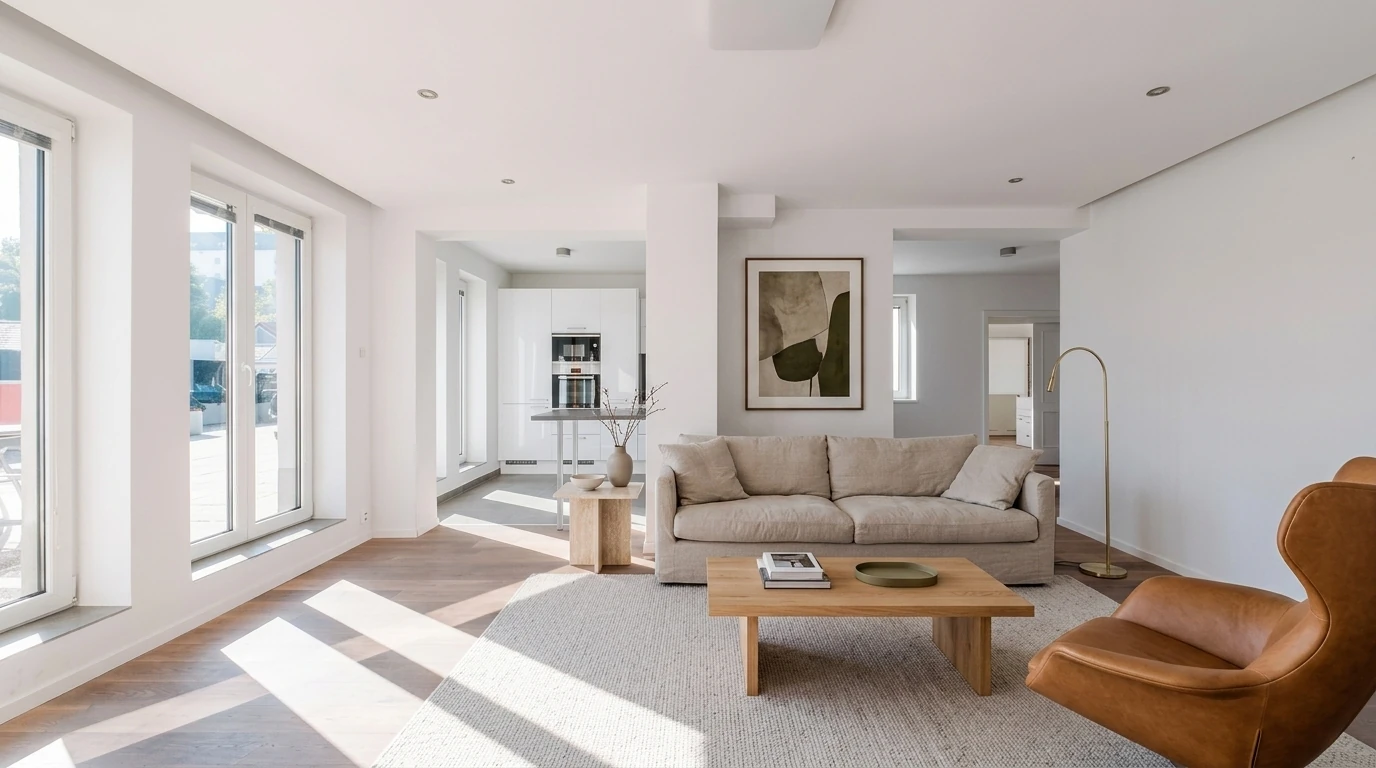
The full room, designed by the AI engine behind MeltFlex from a photo of a real empty apartment. Every close-up on the cover, and every one below, is the same engine rendering one piece of this exact space. Judge the detail where it actually matters: the weave, the grain, and the way light sits on a surface.
A detailed AI interior designer is one whose output survives a closer look. The concept holds at thumbnail size, and it also holds when you zoom into any corner, because the scale, the materials, the light and the furniture are all consistent and believable rather than merely suggestive. That consistency is not a style choice. It is a build choice, and it is the reason two tools can produce a “similar” room where one is usable and the other is wallpaper.
The short version
- Good design gets the vibe right. Excellent design gets the details right. The gap between them is scale, materials, light, grounding and buyability.
- Detail is what the eye judges. People catch fake renders on physics, not on style: flat light, floating objects, plastic surfaces.
- Detail has to be anchored to a real room. Tools that keep your actual walls, windows and proportions render detail you can trust and use.
- The zoom test settles it. Crop into any corner. If the weave, the grain and the contact shadows still read, the detail is real.
- MeltFlex is built for that standard, starting from your photo, sizing furniture to your space, and matching every piece to something you can buy.


What makes AI interior design look realistic, not just detailed?
The most realistic AI interior design is the one where the small, checkable things are correct: furniture sized to the real room, materials that answer the light the way real materials do, shadows where objects actually touch surfaces, and pieces that correspond to products you can order. Realism and detail are the same thing seen from two sides. A render looks real precisely because the details hold, and it looks fake the moment one of them slips. It is the opposite of an image that looks great as a thumbnail and dissolves when you inspect it, and it is the difference between a picture of a room and a plan for one.
There is a reason detail, not style, is the thing that convinces. When researchers tested how well people can tell AI images from real photographs, humans landed at roughly 62 percent accuracy, barely better than a coin flip (sources below). The images that got caught almost always failed on the same physical tells: light coming from nowhere, shadows that do not match, surfaces that behave like plastic. In other words, people do not reject a render because the style is wrong. They reject it because a detail betrays that the physics is wrong. Nail the details and the design reads as real. Miss them and no amount of nice styling saves it.
The Detail Gap: 6 things excellent AI design gets right
We call the space between a good-enough render and an excellent one the Detail Gap. It is not one big thing, it is six small ones, and a tool has to close all of them for the result to hold up. Here is the whole framework in one place.
- Structural fidelity. It keeps your real room, not a convincing lookalike. Same walls, windows, camera angle and proportions.
- True-to-scale furniture. Pieces sized to your actual wall and ceiling, not a generic shape dropped in at a guessed size.
- Materials that answer the light. Oak reads as oak, linen as linen, brass as brass, each with the right texture and sheen.
- Contact and grounding. Real soft shadows where a leg meets the floor or a cushion meets the frame, so nothing floats.
- Coherent, buyable furniture. Whole, plausible pieces that match real products, not invented shapes no factory makes.
- Usable resolution. Detail that survives a zoom, a print and a client’s second look, instead of smearing when you get close.
Notice that only one of these, structural fidelity, is about the room itself. The other five are about whether the objects in it behave like real objects. That is the part most tools skip, because it is much harder to get a linen weave and a contact shadow right than to get an overall palette right. The rest of this article walks the gap up close, one piece of that room at a time.
The zoom test: proof the detail holds up
Here is the honest way to judge any AI interior designer, and it costs you nothing: stop looking at the thumbnail and look at the detail up close. A detailed tool gets more convincing the closer you get, because there is real information in the surface. A shallow one falls apart, because the detail was only ever implied. Below, the same engine that designed the room renders each piece of it in close-up, so you can see exactly how far the detail goes.
The 30-second detail test (works on any AI tool)
- Crop into a corner, away from the hero furniture, and zoom in to 200 percent.
- Check the weave and grain. Fabric should look woven, wood should have grain. If it smears, it was decorative, not detailed.
- Look for contact shadows. Every leg, cushion and rug edge should ground with a soft shadow. Floating objects mean fake light.
- Test the metal and glass. These break first: too shiny reads as chrome, too flat reads as plastic.
- Ask if it is buyable. Could you actually order that sofa? If not, the render is a fantasy, not a plan.
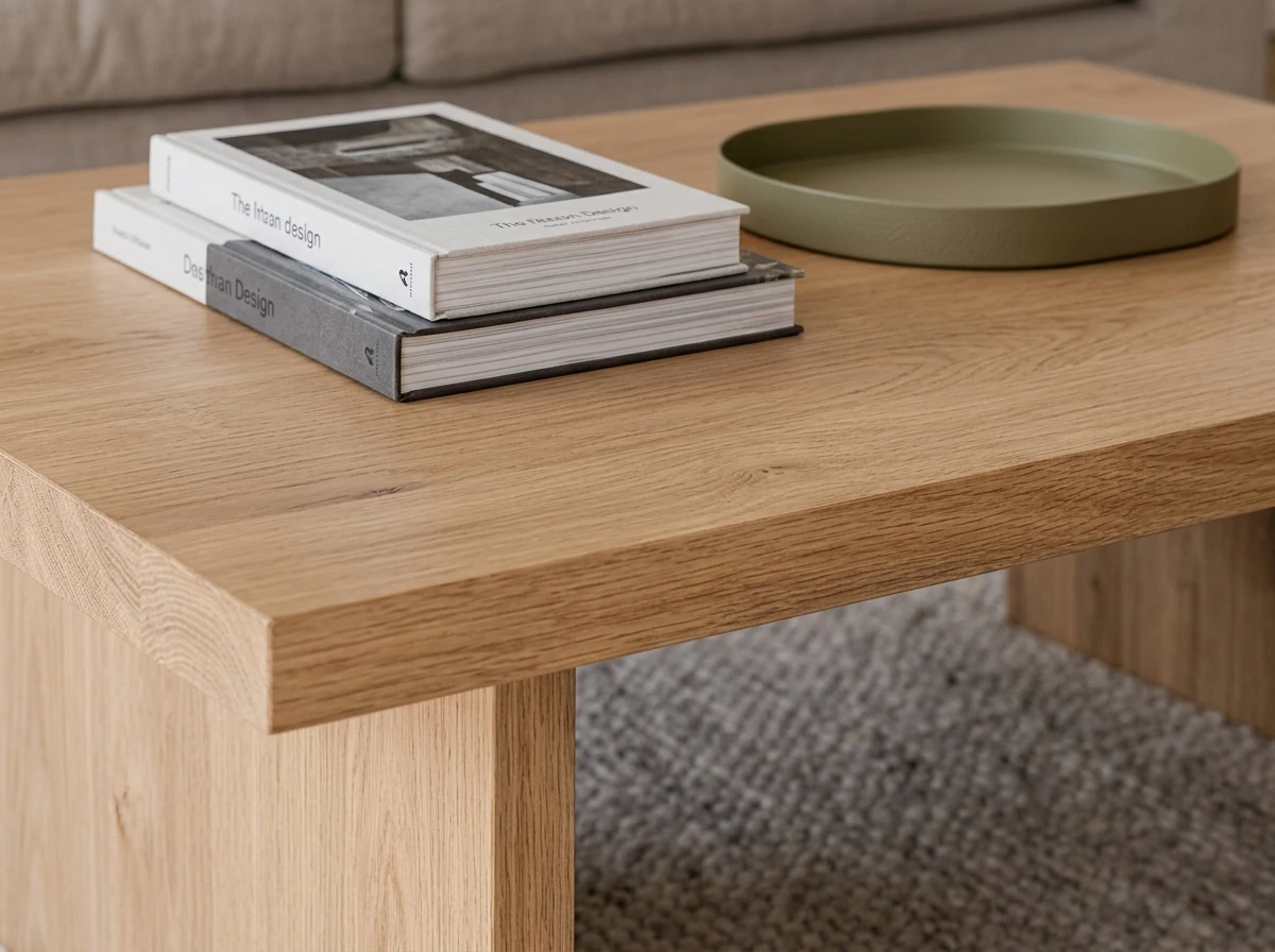
The oak coffee table, up close. Real grain running along the top, a mitred waterfall edge, and a soft sheen that shifts with the daylight. This is materials that answer the light: the wood looks like wood because it reflects the way wood does.
Compare that to what a shallow render gives you when you zoom in: a smooth, sourceless tan panel that reads as “wood-colored” but has no grain, no edge, and no sense of a surface catching light. At thumbnail size the two look identical. Up close, only one of them is a table. This is exactly the failure we broke down in why AI renders look fake, and the craft behind getting it right in the anatomy of a photorealistic render.

The sofa. Notice three separate details doing their job at once: the woven texture of the linen, the creases where weight has settled into the cushions, and the velvet pillow catching light differently from the linen around it. Two fabrics, two behaviors, correctly.
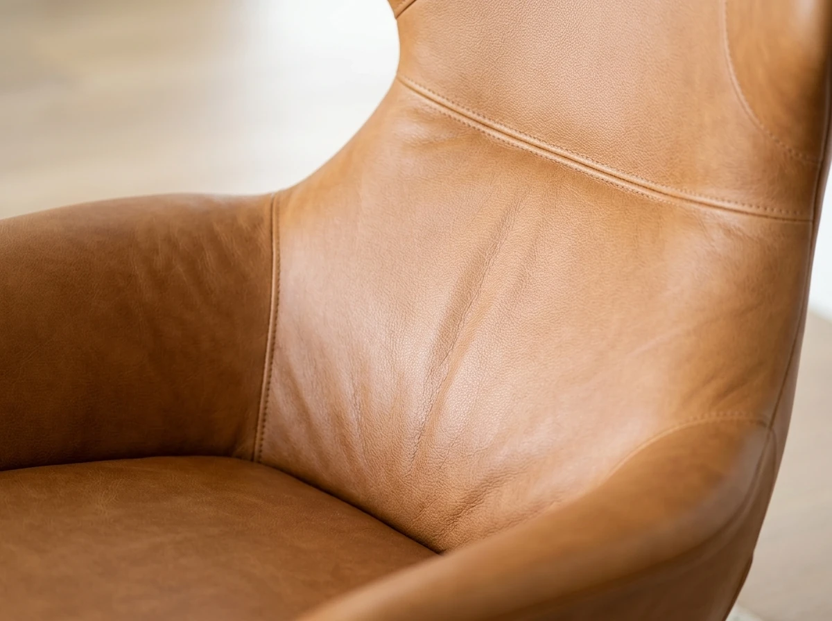
The leather chair. Full-grain leather has a specific way of catching a highlight along a curve and creasing at the seat, and it is here. Get this wrong and leather instantly reads as vinyl, the single most common giveaway in cheap renders.
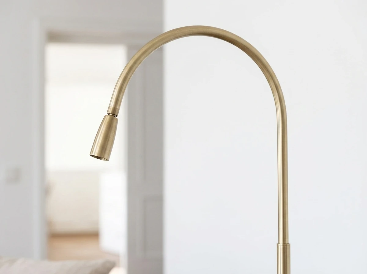
The brass lamp. Brushed metal is a trap: too shiny and it turns to chrome, too flat and it turns to plastic. Here it holds a soft satin sheen that only makes sense if the light falling on it is real. Metal is where thin renders give themselves away fastest.
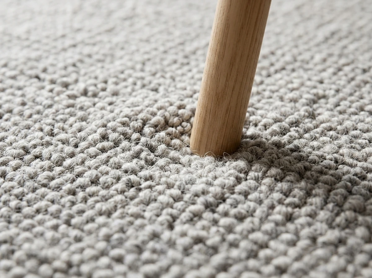
The floor. The wool rug has actual pile you could run a hand across, and the oak leg resting on it presses in with a soft contact shadow. That grounding is what stops furniture from floating. It is subtle, and it is the first thing missing in a flat render.
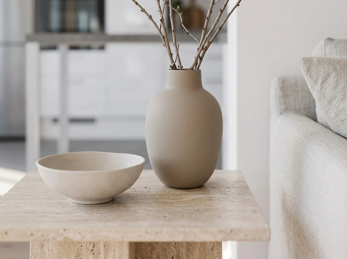
The styling corner. A matte ceramic vase, a stone bowl, honed travertine and dried branches: four different surfaces in one small space, each answering the light its own way. This layered texture is what reads as expensive rather than rendered, and it is the hardest thing for a shallow tool to fake.
Six pieces, one room, one engine, no cherry-picking. That is the point: in an excellent design the detail holds up everywhere, not just in a staged hero shot. If a tool only convinces at thumbnail size and falls apart up close, it did not close the gap. And detail only means something if it is at the right size for your room, which is where scale comes in. If you have ever bought a sofa that turned out too big, our furniture size guide and room-fit calculator show why true scale is a detail, not a nicety.
Good vs excellent AI interior design, side by side
The same six details, laid out as what “good enough” delivers versus what excellent delivers. This is the checklist to run against any AI interior designer before you trust its output.
None of the “good enough” column is a disaster on its own. Together they add up to a render you cannot act on: pretty, and useless the moment you try to buy something or check whether it fits. The excellent column is not luxury. It is the minimum for a design that becomes a real room.
Watch: the details that make a room look expensive
This is not an AI point, it is a design one, and it is worth hearing from a stylist rather than a tool. The reason some rooms read as expensive has almost nothing to do with the price of the furniture and almost everything to do with the details: the materials, the layering, the way light lands. It is the exact quality an AI interior designer either captures or flattens, which is why the same instinct that makes a real room look expensive is the one you should judge a render by.

Six details that make a home look expensive. Video by baixu on YouTube. The same details, materials, layering and light, are exactly what a detailed AI interior designer has to get right to turn a good render into an excellent one.
Why most AI interior design tools miss the detail
It is not that these tools are bad. It is that most of them are built the wrong way around for detail. A pure text-to-image tool paints a room from a text prompt, so there is no real room, no real product and no fixed scale to anchor anything to. It optimizes for a pleasing overall image, which is exactly the thing that looks great small and hollow up close. The detail was never part of the objective, so it shows up only by luck.
The failures are predictable once you know where to look. Furniture is invented pixel by pixel, so it corresponds to nothing you can order and often to nothing a factory could build. Scale is a guess, so a sofa may be sized for a ballroom or a dollhouse with equal confidence. Light is decorative rather than physical, so shadows point in contradictory directions and objects hover. And resolution is spent on the whole frame rather than on surfaces, so materials smear when you crop in. Every one of these is a detail problem, and together they are why a roundup like the best AI interior design tools compared matters: the tools genuinely differ, and they differ most on the things you only see when you look closely. It also explains why 3D-model tools such as Coohom (we cover it in our Coohom AI review) still exist alongside photo tools: modeling buys precision, while photo-first AI buys speed.
How MeltFlex is built for detail
MeltFlex is built the other way around, and that is the entire reason its detail holds. It does not paint a room from a prompt. It starts from a photo of your real room and treats your walls, windows, ceiling and camera angle as fixed, then designs inside them. That single decision closes the hardest detail in the gap, structural fidelity, before any furniture is placed, and it forces everything else to be honest, because the new pieces have to sit correctly in a real space at real scale.
From there the other details follow. Furniture is sized to your actual room rather than a generic canvas, so a sofa that looks right in the render is a sofa that fits. Materials and light are rendered to behave physically, which is why the oak, linen, leather and wool in the crops above read as themselves rather than as colored plastic. And because the pieces are matched to real products, the detail is not just visual, it is shoppable: every item comes back as something you can actually buy, the way we break down in shop the look. The through-line is that detail is only useful when it maps back to reality, and a photo-first tool is anchored to your reality from the first pixel.
It also keeps that detail consistent when you iterate. Change the wall color or swap the sofa and the rest of the room stays put, so you are refining one real space instead of rolling the dice on a new imaginary one each time. If you want to push the detail further with your own prompts, our guide on lighting prompts shows how much of the realism is controllable rather than accidental.
Is MeltFlex the most detailed AI interior designer?
Honest take: for detail on a room you actually have, MeltFlex is one of the strongest tools available, and the reasons are the six in the framework. It keeps your real space, sizes furniture to it, renders materials and light believably, grounds every object, and hands you pieces you can buy. That is the specific combination that makes an output survive the zoom test and turn into a real room rather than a nice picture.
Where it is not the answer: if you want to daydream imaginary concept spaces with no rules, a pure text-to-image generator is looser, faster and happy to invent a room that could never exist, which is sometimes exactly what you want early in a mood-board phase. A photo-based tool trades that freedom for accuracy on purpose. And to be clear about what a tool cannot do, ranking as “the most detailed” in search takes authority and time as much as it takes quality, so treat this as our argued case, not a decree. The part we can stand behind fully is the output: crop into it and judge for yourself.
Try it on your own room
The fastest way to settle whether detail matters is to run the zoom test on your own space. Photograph the room, design it, and then crop into the render the way we did above. You will see immediately whether the furniture sits at your true scale, whether the materials hold up, and whether every piece is something you could order tomorrow. That is the difference between a good design and an excellent one, on the one room you care about.
Design your actual room, in detail you can trust, and get a buy list to match. Try it free on your own room, then read the anatomy of a photorealistic render for the craft behind why the details land.
Detailed AI interior design FAQ
What is the most detailed AI interior designer?
The most detailed AI interior designer is the one that gets the small things right, not just the overall look: furniture at your true scale, materials that behave like real materials under light, shadows where objects actually touch the floor, and finished pieces you can buy. MeltFlex is built around that standard because it starts from a photo of your real room and keeps your exact walls, windows, angle and proportions, so the detail is anchored to a real space instead of an invented one.
What makes AI interior design look realistic instead of fake?
Realism lives in the details the eye checks without being told to: light that falls in one believable direction, soft contact shadows under every object, materials with the right texture and sheen, and furniture at a plausible size for the room. Fake renders usually get the vibe right and then fail on these, with flat sourceless light, objects that float, and plastic-looking surfaces. Detail, not style, is what separates a render that convinces from one that does not.
Why do most AI room designs get the details wrong?
Most AI room tools generate a picture from scratch with a text-to-image model, so nothing in the scene is tied to a real room or a real product. The furniture is invented pixel by pixel, the scale is a guess, and the light is whatever looked pleasant. That produces a nice thumbnail that falls apart when you zoom in or try to act on it. Tools that start from your actual photo and match real products avoid most of these errors by construction.
Does more detail actually matter in interior design?
Yes, because detail is where a design becomes a decision. A vague, pretty render tells you nothing about whether the sofa fits, whether the oak matches your floor, or where to buy any of it. A detailed one shows the piece at your true scale, in your real light, with a product you can order. The difference between good and excellent design is almost never the concept. It is whether the details survive a second, closer look.
Can AI interior design keep the exact details of my real room?
Some tools can, most cannot. A photo-based tool like MeltFlex keeps your real walls, windows, ceiling height, camera angle and proportions, then restyles the space inside those fixed constraints. That is what makes the result usable: the furniture is shown at the true scale of your room and in its real light, so what you see is what would actually fit. Pure text-to-image tools invent a lookalike room instead, which is why their detail rarely maps back to your space.
What resolution do AI interior design images need to be usable?
Usable detail is less about a single megapixel number and more about whether the image holds up when you zoom in, print it, or show it to a client. If the materials smear and the edges go soft the moment you look closely, the render was decorative, not detailed. The practical test is simple: crop into any corner of the image. If the linen weave, the wood grain and the contact shadows still read as real, the detail is there.
Is MeltFlex better than other AI tools for realistic interior design?
For detail on your own room, MeltFlex is one of the strongest options, because it keeps your real space, sizes furniture to it, renders materials and light believably, and matches pieces to buyable products. It is not the right pick for everything: if you want to brainstorm imaginary concept rooms with no constraints, a pure generator is looser and faster. The honest framing is that MeltFlex wins when accuracy and detail matter, which is most of the time you are designing a room you actually intend to furnish.
What is the best AI for interior design?
There is no single best, it depends on what you are optimizing for. If you want a full head-to-head of the main tools, we keep a detailed comparison of the best AI interior design tools. But if the thing you care about is realistic, usable output on a room you actually have, the deciding factor is not the tool name, it is whether it starts from your real photo and keeps your walls, scale and light, versus inventing a room from a text prompt. Photo-based tools like MeltFlex win on that axis, pure generators win on free-form imagination.
What is the most realistic AI interior design tool?
The most realistic tool is the one whose output survives a close-up. Realism is not a single setting, it is the sum of true scale, materials that answer the light, contact shadows and coherent furniture. Tools that generate from scratch tend to look great as a thumbnail and fall apart when you zoom in, because nothing anchors the detail. Tools that start from your real room keep the detail tied to a real space, which is why it holds up under the crop-into-a-corner test above.
Sources
- Can Humans Distinguish AI-Generated Images From Real Ones? (arXiv, 2025), a large study finding people identify AI images at roughly 62 percent accuracy, with failures concentrated on physical tells like light and shadow.
- Perception of AI-generated versus real imagery (PMC, 2025), on how viewers judge realism through natural light, shadow and material imperfection rather than overall style.
- AI in Interior Design Market to Surpass 4 Billion by 2030 (2026), industry projection of growth from 1.39 billion dollars in 2025 to 4.55 billion by 2030.