You have seen it a hundred times. An interior that is almost convincing, and then your eye snags on something. The sofa floats a centimetre above the floor. The marble looks like a printed sticker. The light comes from everywhere and nowhere at once. You cannot always say what is wrong, but you know in half a second: that is a render, not a room.
The good news is that “looks fake” is not random. It comes from a short list of specific, fixable mistakes. Once you can name the tells, you start spotting them in every bad render, and you know exactly what to change to cross the line from “nice AI image” to “wait, is that a photo?”
Quick answer: AI renders look fake mostly because of flat, sourceless lighting and plastic-looking materials, then backed up by warped geometry, furniture at the wrong scale, dead reflections and a room too clean to be real. The single fastest fix is to stop generating a room from a text prompt and start from a real photo of the actual space, so the AI keeps true walls, windows and light instead of inventing them.
Key takeaways
- Lighting and materials do 80% of the damage. Flat light and plastic surfaces are the two biggest giveaways, so fix those first.
- There are 7 repeatable tells. Light, materials, cleanliness, geometry, scale, reflections and hallucinated details. Walk them in order.
- Warped walls come from no real 3D underneath. Pure prompt-to-image tools paint plausible pixels with no geometry, so lines drift.
- The real fix is the input, not the prompt. Start from a photo so the AI keeps the real room instead of dreaming up a new one.
- Realism is mostly about restraint. A render that keeps your actual space and changes less almost always reads as more real.
The 2-second test: real or rendered?
Before the detailed list, here is the quick gut check professionals use. Look at three things in this order: where is the light coming from, do the materials look like they would feel cold or warm to the touch, and are the straight lines actually straight. If the light has no obvious source, the surfaces look uniformly glossy, or the window frames bend, you are looking at a fake. Almost every tell below is a more specific version of one of those three questions.

The seven tells at a glance. The rest of this guide walks each one, what causes it, and the single change that fixes it.
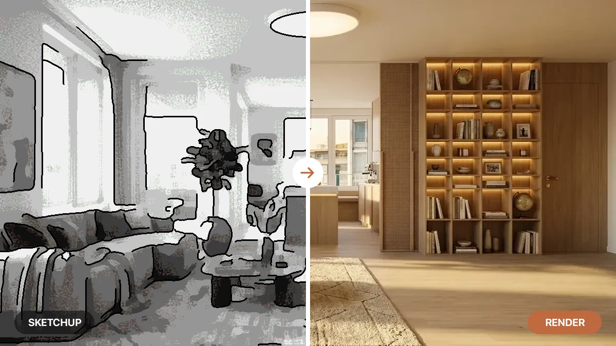
Here is the same room twice to make it concrete. Same furniture, same layout, same camera. The only difference is the realism, and your eye picks the fake instantly even before you can say why.
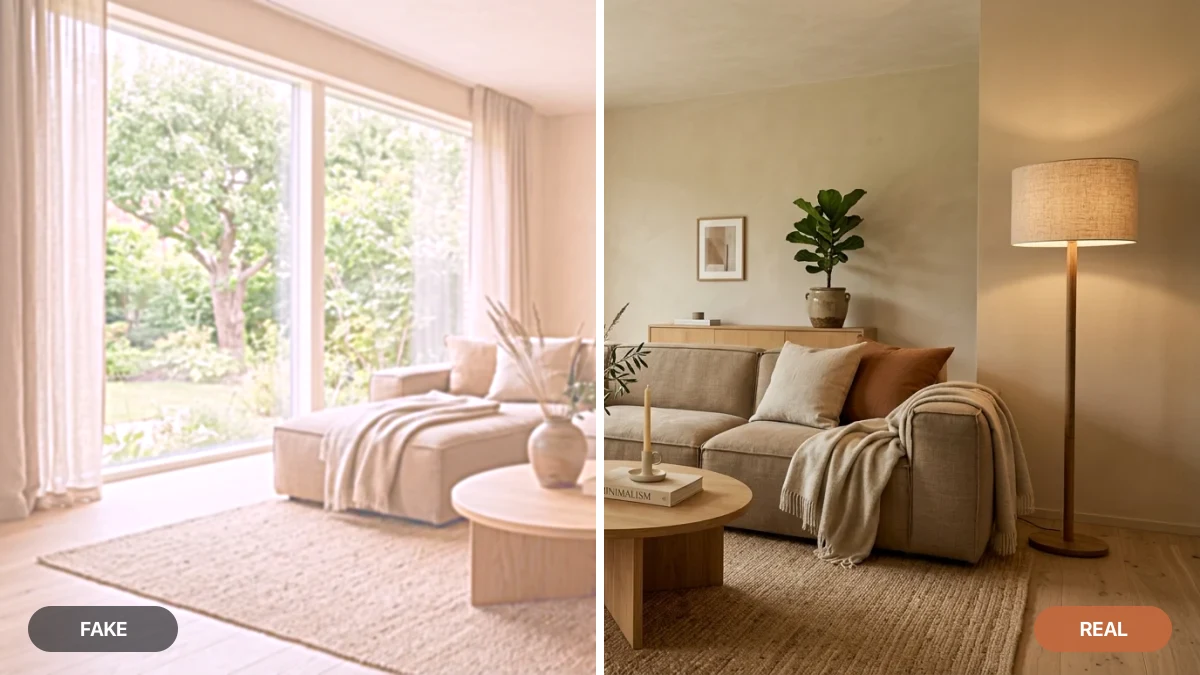
Left (fake): flat, hazy light, oversaturated surfaces, no depth. Right (real): one warm directional light, materials that hold detail, and shadows that give the room weight. Same room, and the seam down the middle is the whole story of this article.
Tell 1: Flat, even lighting with no source
This is the number one giveaway, and the easiest to spot once you know it. In a real room, light comes from somewhere: a window, a lamp, the sky. It falls off across the space, casts soft shadows, and gives objects a bright side and a dark side. Fake renders skip all of that. Everything is lit to the same even brightness, like a passport photo, so the room looks flat and oddly weightless.
The fix: there should be one dominant light source you can point to, and the shadows should agree with it. A lamp should pool light around itself and leave the far corner darker. Sunlight should come through the window at an angle and throw a long shadow across the floor. If you are generating renders, the surest way to get believable light is to start from a photo where the real light already exists, then let the AI enhance it rather than reinvent it.
Tell 2: Plastic-looking materials
The second big tell is surfaces that all read as the same shiny plastic. Real materials each treat light differently. Marble lets light sink a few millimetres in and glow back. Wood shows grain and a soft sheen. Linen is matte and slightly fuzzy. When an AI flattens all of that into one uniform glossy look, marble becomes a printed countertop, wood becomes laminate, and fabric becomes vinyl.
What right looks like: the curtain glows, the marble catches the light, the onyx vase reads as real stone. Light goes into these surfaces, not just off them.
The fix: the technical name for the effect that sells real materials is subsurface scattering, light entering a translucent material and glowing softly back out. You do not have to set it by hand, but you do have to use a tool that gets it right. When a render nails materials, the marble looks like something you want to run your hand across, not a photo taped onto plastic.
Tell 3: Too clean to be real
Real rooms are lived in. There is a slight crease in the cushion, a faint scuff near the doorway, a stack of books that is not perfectly squared. AI renders love to scrub all of that away and hand you a spotless showroom where nothing has ever been touched. Ironically, the perfection is what tips you off. Our brains read “too perfect” as “not real.”
The fix: you want a little controlled imperfection. Soft creases in upholstery, a throw that is not folded with a ruler, gentle wear on a leather chair, the natural unevenness of real textiles. The goal is not mess, it is evidence that a human exists in the space. A render that keeps the small irregularities of your real photo will always beat one that polishes everything to a catalogue finish.
Tell 4: Warped geometry and bent lines
Look at the walls, door frames and window mullions. In fake renders they drift: a wall bows slightly, a corner does not quite meet, a window frame bends like it is underwater. This happens because pure text-to-image models have no real 3D structure underneath. They paint what looks plausible pixel by pixel, with no actual geometry holding the lines straight, so architecture warps under pressure.
The fix: this is the tell that is almost impossible to patch by hand, which is why the input matters so much. A tool that locks the layout of your original photo or 3D draft keeps walls straight and corners square, because it is editing a real structure rather than hallucinating one. If your renders keep bending architecture, the answer is not a better prompt, it is a tool that respects geometry. Our comparison of the best AI architectural rendering tools calls out which ones hold a layout and which ones drift.
Tell 5: Furniture at the wrong scale
A pendant light the size of a car. A sofa that would not fit through any door. Chairs hovering a few centimetres off the floor. Scale errors are subtle individually but they add up to a deep sense of wrongness, because we read rooms by comparing objects to human size without even thinking about it.
The fix: every object should make sense next to a person. A dining chair is about knee-to-hip height, a counter hits mid-thigh, a doorway is about a head taller than you. Furniture should also sit flat on the floor with a contact shadow underneath, not float. When a render keeps the real proportions of your room, scale fixes itself, because the AI is filling a space with known dimensions instead of guessing them.
Tell 6: Dead reflections in glass and mirrors
Mirrors, windows at night, glossy tabletops and polished metal all reflect the room around them. Fake renders get lazy here: the mirror reflects nothing, or it reflects a completely different room, or a window shows a generic blue instead of what is actually outside. Once you notice a dead or wrong reflection, you cannot unsee it.
The fix: reflections should match the scene. A mirror should show the part of the room in front of it. A glossy floor should pick up the legs of the furniture standing on it. A window should reflect the interior when it is dark out. This is another area where working from a real photo helps, because the reflections in the original are already correct and a good tool preserves them.
Tell 7: Invented details that were never there
The last tell is the most frustrating for anyone using renders for real work. You ask for a new sofa and the AI also moves the window, adds a doorway that does not exist, swaps your hardwood for tile, or grows a radiator out of the wall. For a mood board that is harmless. For a renovation visual, a listing, or a client presentation, an invented detail is a lie you have to walk back later.
The fix: the render has to stay anchored to your real space and change only what you asked it to. The difference between a tool that decorates your actual room and one that dreams up a new room that vaguely resembles yours is the whole game for serious use. If you are choosing between options, our roundup of the best AI interior design tools breaks down which ones keep your room and which invent one.
The real fix: start from a photo, not a prompt
Notice the pattern. Almost every fix above traces back to one decision: where the render starts. When you generate a room from a paragraph of text, the AI has to invent the light, the geometry, the reflections and the scale from nothing, and it gets all of them slightly wrong at once. That is why prompt-only renders look fake no matter how good your prompt is.
We see this every day building MeltFlex. Across the renders that pass through it, the single biggest predictor of a believable result is not how the prompt is worded, it is whether the model is anchored to a real photo. The flat-light, plastic-material look that this whole article is about almost always traces back to one thing: a room generated from scratch instead of a real room upgraded.
When you start from a real photo of the actual room, all of that comes for free. The walls are already straight. The light already falls from the real window. The reflections are already correct. The proportions are real because the room is real. The AI only has to do the part it is genuinely good at: upgrading the finishes, swapping the furniture, and rendering believable materials. This is exactly how MeltFlex works. You upload a photo of your space, and it redesigns it while keeping the real geometry, windows and light, then renders new furniture and finishes with the soft, lit-from-within materials that make a render look photographic.
An AI render that passes the test: one clear light source, materials that catch the light, furniture sitting flat at the right scale, and nothing invented. It reads as a photo because it started as one.
That is the honest takeaway. You do not beat the “fake render” look with a cleverer prompt or more detail sliders. You beat it by changing where the render starts, so the AI keeps everything that already makes a real room look real and only changes the part you actually wanted to change.
The fix in practice: a 5-step photo-first workflow
“Start from a photo” only helps if you take the right photo. Most fake-looking results we see come from a weak input, not a weak tool. Here is the exact way to give an AI render the best possible chance of looking real.
- Shoot the whole room, not a corner. Stand in or near the doorway and get two walls and a good stretch of floor in frame. The AI needs to see the real proportions; a tight crop of one sofa gives it nothing to anchor to.
- Hold the phone level. Keep the camera straight and at chest height so the vertical lines stay vertical. Tilting up or down is what later reads as “warped walls,” because the AI inherits the distortion in your photo.
- Let the real light do the work. Shoot at the time of day you want to show, with the curtains as they will be. It is fine if the window blows out a little; that slight overexposure is exactly what makes real photos read as real. Do not even out the lighting.
- Skip the ultra-wide lens. Wide-angle modes bend straight walls and exaggerate the room. Step back instead, or use the standard lens. Straight input means straight output.
- Change one layer at a time. Ask for new furniture and finishes, but tell the tool to keep the walls, windows and layout. Over-asking (“redesign everything”) is what triggers the invented doorways and moved windows from Tell 7. Restraint is what keeps it believable.
Do these five things and most of the seven tells never get a chance to appear, because you have handed the AI a real room with real light and real geometry, and left it only the job it is actually good at.
Frequently asked questions
Why do AI renders look fake?
Almost always because of lighting and materials. AI renders tend to use flat, sourceless light with no real shadows, and they make marble, wood and fabric look like shiny plastic. On top of that you usually get warped lines, furniture at the wrong scale, dead reflections and a room so spotless it reads as a showroom, not a home. Each of these is a separate, fixable tell.
How do you make an AI render look realistic?
Start from a real photo instead of a text prompt, so the AI keeps the true walls, windows and natural light of the actual room. Then look for one clear light source with soft shadows, materials that catch and absorb light instead of reflecting flatly, furniture sized correctly to the space, and small signs of life like creases and edge wear. Fixing lighting and materials gets you most of the way there.
Can AI renders look like real photos?
Yes. Modern AI image models are trained on millions of real photographs, so a strong render of a real room can be indistinguishable from a photo. The trick is keeping the model anchored to a real space. When it generates a room from scratch off a prompt it drifts and invents; when it upgrades a photo you give it, it keeps the geometry and light that make a photo read as real.
Why does AI warp walls, windows and straight lines?
Because pure text-to-image models do not understand 3D space. They paint what looks plausible pixel by pixel, with no real geometry underneath, so straight architectural lines drift, corners melt and windows bend. The fix is to use a tool that locks the layout of your original photo or 3D draft instead of inventing the room, which keeps walls straight and corners square.
What is the most realistic AI interior render tool?
For realism, the tools that keep your real room beat the ones that generate from scratch. MeltFlex works from a photo of your actual space and upgrades the lighting, materials and furniture while keeping the real walls, windows and camera angle, which avoids most of the tells that make renders look fake. Our roundup of the best AI interior design tools compares which ones preserve your room and which invent a generic one.