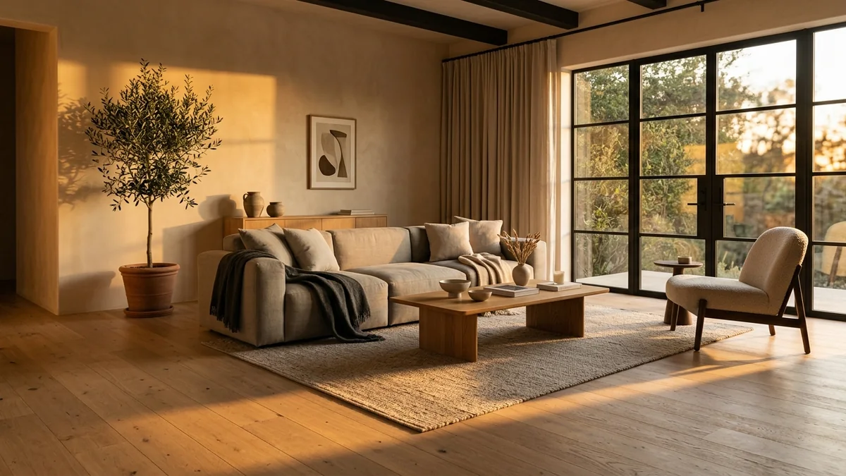
Look at any AI interior render that made you stop scrolling, and the thing doing the work is almost never the sofa. It is the light. A warm shaft of late sun across a wooden floor, a soft glow spilling from a window, one long shadow that tells you exactly where the sun is. Get the light right and a plain room looks like a photograph. Get it wrong and the most expensive furniture in the world still looks like a video game.
Our articles are still written by humans!
Get human written articles in your Google feed.
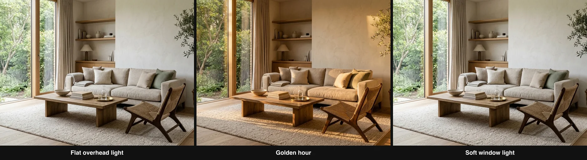
One room, three lighting prompts. Same furniture, same walls, same camera. Only the light changed, and it changes everything. Every image in this article was made this way with the AI engine behind MeltFlex.
A lighting prompt is the part of your instruction that tells the AI where the light comes from, what color and time of day it is, and how hard or soft it falls. Get those three things right and a plain room reads as a photograph. Leave them out and the model defaults to flat, sourceless light, which is the single most common reason an AI render looks fake.
This is the part of prompting that almost nobody teaches properly. Most prompt guides hand you a wall of adjectives and hope for the best. This one is about the actual craft: how to describe light the way a photographer sees it, so the model gives you a room that feels lit rather than filled. We will go lever by lever, with the same room shown under each so you can see exactly what each phrase does.
The short version
- Light is the number one realism factor, and flat, sourceless light is the number one reason renders look fake.
- Name four things: direction, time and color temperature, quality (hard or soft), and one real shadow or bounce.
- Be specific. Low golden-hour sun from the left casting long shadows beats bright every time.
- Golden hour is not always right. Match the light to how the room is used, or it reads as a cliche.
- Starting from a real photo gives you real sun and real shadows for free, which is why photo-based tools light better than text-to-image.
- Inside: 25+ copy-paste lighting prompts, a Kelvin cheat sheet, a reusable template and a per-room recipe table.
Why light makes or breaks an AI render
There is a reason your eye can spot a fake render in about half a second, and it usually comes down to light. A 2025 study on how people perceive AI images found that viewers who correctly flagged the fakes did it by their unnatural light: participants identified real photographs by their natural lighting and small imperfections, and spotted the AI ones through unnatural light reflections and shadows. Of all the tells, light is the one people feel first, even when they cannot say why. We wrote the full breakdown in why AI renders look fake, and flat lighting sits at the very top of the list.
“You do not photograph a room. You photograph the light in it.” It is an old rule in interior photography, and it is exactly why the light is the first thing a good prompt should describe, not the last.
The problem is baked into how the models work. A text-to-image model does not simulate light bouncing around a room the way a physics engine does. It approximates what lit surfaces tend to look like. Left to its own devices it plays it safe, and safe means even, low-contrast, sourceless illumination that lands on everything equally. Real rooms are never lit like that. Real light comes from somewhere, falls off with distance, and leaves shadows that all point the same way.
This is not just a matter of taste. Forensic researchers who build tools to detect AI images do it partly by checking whether the shadows and reflections in a picture are consistent with a single light source, because generated images so often get this subtly wrong (see the sources below). A shadow pointing the wrong way, or a highlight with no shadow to match it, is a physical impossibility that our brains catch instantly. So when you specify the light clearly in your prompt, you are not just making the image prettier. You are steering the model toward a scene that obeys physics, which is the whole game.
The four questions every believable light answers
Here is the mental model I keep coming back to. Before you write a single word about a lamp or a window, decide the answer to four questions. If your prompt answers all four, the light will almost always read as real. If it answers none, you get the flat default. Most weak prompts answer maybe one.
The rest of this article is just those four questions, one at a time, with the same room to prove each point. Think of them as dials. You do not have to max out all four. You have to set them on purpose instead of leaving them on auto.
One room, three lights
Start with the image at the top of this page, because it makes the whole argument in one frame. It is a single living room, the exact same sofa and coffee table and window, rendered three times. The only thing that changed between them is the sentence describing the light.
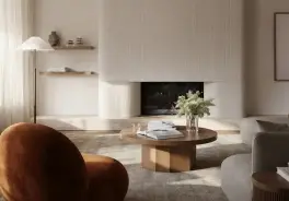
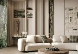
On the left is flat overhead light, the kind you get when you say nothing about lighting at all. It is not broken, but it is lifeless. Nothing pulls your eye, the wood looks like a swatch, and the whole thing reads as a catalog placeholder. In the middle is golden hour: one warm, low sun raking in from the side. Suddenly there is depth, the oak glows, the shadows stretch, and the room feels like a place you could sit in on a Sunday. On the right is soft window light, cooler and quieter, the version an architect would choose to show a space honestly. Same room, three completely different photographs, all from a prompt.
That is the entire promise of learning to prompt light. You are not restyling the room. You are re-lighting it, and light carries most of the emotion in any interior photograph.
Lever 1: Direction, where the light comes from
Direction is the single most important dial, because it decides where the shadows fall, and shadows are what give a flat image its third dimension. The flat default fails precisely because it has no direction. So the first thing to fix in any weak prompt is to give the light a clear place to come from: a window on the left, a low sun from the right, light from behind the camera, light from behind the subject.
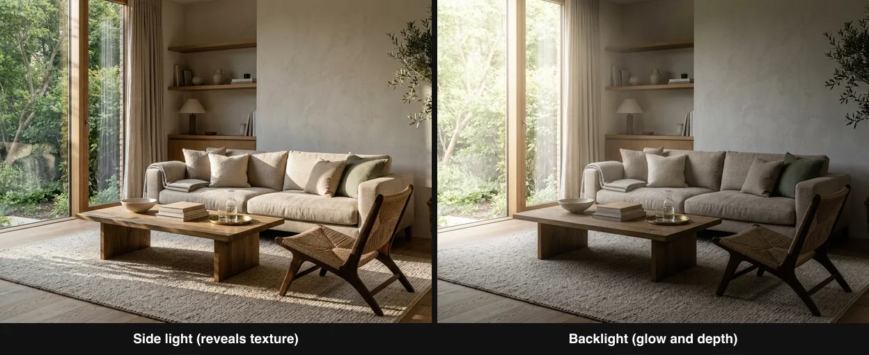
Side light (left) rakes across the surfaces and reveals every texture in the linen and the wood. Backlight (right) puts the window behind the scene, wrapping the furniture in soft rim light and pushing depth. Same room, two directions.
Two directions do most of the heavy lifting in interior photography, and both are worth naming explicitly:
- Side light comes in low and across the room. It skims along surfaces, so it exaggerates texture: you can suddenly see the weave of a linen sofa and the grain of an oak floor. Prompt it with phrases like “strong directional side light raking across the surfaces” or “low light from a window on the left revealing texture.”
- Backlight, or contre-jour, puts the light source behind the scene, usually a bright window. It rims the furniture in a soft halo and creates a real sense of depth and atmosphere, especially with a little haze. Prompt it with “backlit against a bright glowing window, soft rim light, gentle silhouette.”
This is also where the famous golden hour earns its reputation. The reason a low sun looks so good is pure geometry. When the sun sits low in the sky it strikes a room from the side rather than from straight above, so it produces those long, soft, directional shadows and side-lit texture that overhead noon light can never give you. It is not the warmth alone that makes golden hour work. It is the angle. That is why “low warm sun from a 15-degree angle” beats “golden hour” as a prompt: you are describing the geometry, not just the color.
The same geometry powers named techniques photographers reach for constantly, and the model recognizes the terms because it was trained on images described with them. Rembrandt lighting, that small triangle of light on a shadowed cheek, and the classic three-point lighting setup both come from putting a source to the side. You do not need the jargon, but dropping a phrase like “Rembrandt-style side light” can steer the whole mood in a single word.
Lever 2: Time of day and color temperature
Once you have a direction, the next dial is color. Every light has a temperature, measured in Kelvin, and it is one of the most reliable levers you have because you can put the actual number in the prompt. Warm light sits low on the scale and reads as cozy and intimate. Cool light sits high and reads as fresh, bright and alert. This is not a vibe, it is physics your body responds to. According to Harvard Health, blue-rich light suppresses melatonin far more powerfully than warm light, which is the physical reason a 2700K room feels like evening and a 5500K room feels like morning (sources below).
One extra entity worth knowing is CRI, the color rendering index, which is how faithfully a light shows true colors. It matters in real rooms, and in a prompt you can borrow the idea directly: asking for high-CRI, true-to-color daylight nudges the model away from the muddy, slightly-off color casts that make a render feel cheap.
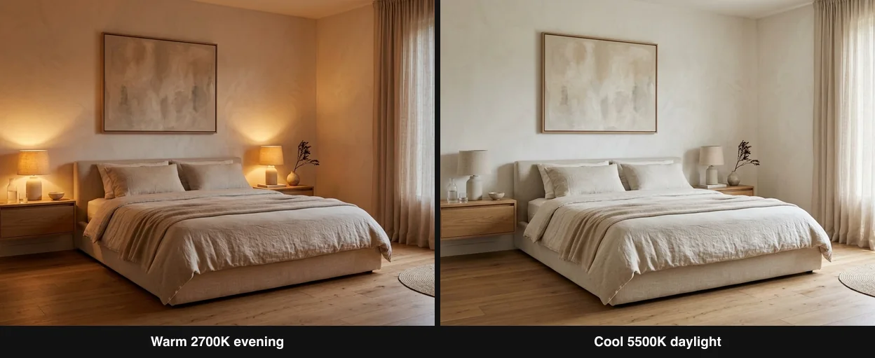
The same bedroom, two color temperatures. Warm 2700K evening (left) feels intimate and restful. Cool 5500K daylight (right) feels crisp and awake. Nothing moved except the number in the prompt.
The practical trick is to stop writing “warm” and start writing the Kelvin value. The model treats a number as a concrete target and gives you far more consistent results. Here is the cheat sheet I actually use:
Time of day is really just color temperature plus direction bundled together, which is why it works so well as shorthand. “Early morning” implies a low, cool, clean light. “Late afternoon” implies a low, warm one. “Midday” implies high and neutral. Naming the hour gives the model a rich, consistent starting point, and you can always fine-tune with an explicit Kelvin value on top. If you want the deeper theory of how temperature shapes a room in real life, our AI lighting prompts covers the numbers in detail.
Lever 3: Quality, hard light versus soft light
The third dial is the one most people have never consciously thought about, yet it changes the entire character of an image: the quality of the light, meaning how hard or soft it is. This is set by the size of the light source relative to the room. A small, direct source like the bare sun makes hard light with sharp-edged shadows. A large, diffused source like an overcast sky or a big curtained window makes soft light with gradual, feathered shadows.
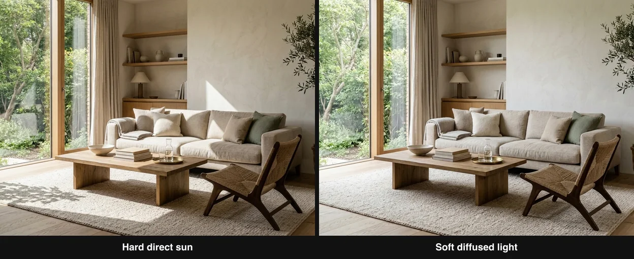
Hard direct sun (left) throws a crisp, graphic window-frame shadow across the floor and feels dramatic. Soft diffused light (right) wraps the room gently, with no hard edges, and feels calm. Same room, opposite moods.
- Hard light is dramatic and graphic. It carves out crisp shadows, like the sharp rectangle of a window thrown across a floor, and it adds contrast and energy. Prompt it with “hard direct sunlight, crisp sharp-edged shadows, high contrast” or “a bright pool of sun with a sharp window-frame shadow on the floor.”
- Soft light is calm and flattering. It hides flaws, wraps gently around objects, and feels quiet and expensive. Prompt it with “soft diffused light, gentle gradient, no hard shadows” or “soft north-facing window light, feathered soft shadows.”
Here is the honest tradeoff. Soft light is safer and it forgives a lot, which is why it is the workhorse of interior photography. But hard light, used deliberately, is often what separates a striking image from a merely pleasant one. The bold interplay of hard light and deep shadow even has a name painters gave it centuries ago, chiaroscuro, and it is a term the model understands. The crisp shadow of a window on a wall is one of the most photographic things you can put in a render, precisely because it is so obviously the product of a real, physical sun. If your renders feel flat even after you fix direction and color, try adding a bit of hard light and one sharp shadow.
Lever 4: How light should behave
The last dial is the smallest to describe and the most powerful, because it is the detail that pushes an image from good to convincing. Real light does specific things when it hits a real room, and naming even one of them tells the model to render physics rather than a generic glow. These are the finishing touches:
- Shadows that agree. Ask for one clear shadow and specify where it falls. “A long shadow from the chair stretching across the floor.” A single consistent shadow does more for realism than any amount of adjectives, because it proves the light has a source.
- Bounce and color spill. Real light bounces. Warm sun hitting a terracotta floor throws a faint warm glow onto the nearby wall. Prompt “warm light bouncing off the floor onto the lower wall” and the render gains a subtle life it otherwise lacks.
- Falloff and contrast. Light gets dimmer as it moves away from the window. “Bright near the window, falling gently into shadow at the far side of the room” gives you a natural gradient instead of a uniform wash.
- Atmosphere. A hint of haze or dust catching in a sunbeam reads as deeply real, because it is a thing only real air and real light do together. Use it sparingly: “a soft sunbeam with faint dust in the air.”
These behaviors have proper names in 3D rendering, and the model has seen countless images tagged with them: global illumination for the way light bounces and fills a room, ambient occlusion for the soft contact shadows where a sofa meets the floor, and ray tracing for physically accurate reflections. You do not have to use the vocabulary, but a phrase like “soft ambient occlusion in the corners” can quietly add the realism that pure adjectives miss.
The reason these work is the same reason plastic renders fail. Realism lives in how materials respond to light, from the way a leather sofa catches a highlight to the way marble lets light sink in slightly before scattering back. That last effect has a name, and we went deep on it in subsurface scattering explained. You do not need the physics degree. You just need to ask for the behavior.
Watch: lighting principles for any render
Everything above comes from photography and rendering, not from AI, which is exactly why it transfers so well to prompts. If you want to see the same principles explained visually, this guide walks through how light direction, softness and color shape a rendered space. It is built around 3D rendering, but the thinking maps one to one onto what you type into an AI prompt: name the source, shape the shadow, set the temperature.

The ultimate lighting guide for architectural rendering. Video by Digital Spaces on YouTube. The direction, softness and color ideas translate straight into your prompts.
Copy-paste light phrases that work
Here is the practical translation table. On the left is the vague word most people reach for. On the right is the specific phrase that actually moves the model. Steal these directly, or use them as patterns for your own rooms.
These patterns work across every image model. If you want model-specific prompt libraries to drop them into, we keep tested sets for Gemini, Midjourney, Nano Banana (the listing photo prompt set is the one built for this job), Claude, DeepSeek and Grok, plus a general set of interior design prompts that actually work.
A lighting prompt template you can reuse
Put the four levers together and you get a fill-in template that turns any room description into a well-lit one. Keep it in a note and reuse it:
The template
- [Room and style], lit by [source] coming from [direction],
- [time of day or Kelvin], [hard or soft],
- with [one specific shadow, bounce or falloff].
- Photographic, shot on a full-frame camera.
Filled in, that becomes something like: “A calm modern living room in warm minimalist style, lit by a low sun coming from a window on the left, late golden-hour around 2800K, soft, with a long warm shadow stretching across the oak floor and a faint glow bouncing onto the far wall. Photographic, shot on a full-frame camera.” Every one of those clauses is a dial you set on purpose. Change one and you change the whole photograph.
Lighting prompt recipes by room
The right light is not the same for every space, because a room borrows its mood from how it is used. A living room wants warmth, a kitchen wants clean daylight, a bathroom wants freshness. Here are copy-paste lighting clauses tuned per room. Drop the one you need into the template above, right after your room and style description.
Notice the pattern: the rooms you relax in lean warm and directional, the rooms you work or clean in lean cool and even. If you are also restyling the space, not just relighting it, the same photo-first logic applies to the whole AI redesign process, step by step.
The honest catch: prompt versus real photo
Now the part most prompt guides will not tell you. You can get very good at describing light, and you will still hit a ceiling when you generate a room from pure text, because the model is inventing the light along with the walls, the window and the furniture all at once. When it invents everything, it can contradict itself: a shadow that does not match the window, a highlight with no source, a sun coming from two directions. That is exactly the inconsistency the detectors look for.
There is a shortcut around the whole problem. Start from a photo of a real room. The instant you do, the real window, the real angle of the real sun and the real shadows are already in the image, physically correct, for free. The AI no longer has to guess where the light comes from, because reality already answered. It only has to enhance light that already obeys physics. This is why photo-based tools produce more believable lighting than text-to-image, and it is the approach behind every render in this article: each one started from a real room and was re-lit, not conjured from nothing.
This is where MeltFlex fits. You upload a photo of your actual space, and it keeps the real walls, windows and camera angle while it upgrades the materials, the furniture and, crucially, the light. Because the geometry and the sun are real to begin with, the output sidesteps most of the tells that make renders look fake. There is one more difference that sets it apart from most AI tools: instead of inventing furniture you can never actually find, MeltFlex matches every piece to real, shoppable products, so the render doubles as a buy list rather than a beautiful picture of things that do not exist. If you want the full argument for why the real-photo approach wins, it is in why AI renders look fake and in our roundup of the best AI rendering tools.
Common lighting mistakes to avoid
- Saying nothing about light. Silence is the flat default. Always name a source and a direction, even in a short prompt.
- Golden hour on everything. A sunset-lit bathroom or home office looks wrong. Match the light to the room use, and let some rooms just be bright and honest.
- Two suns. If you name light from the left and then ask for a bright window on the right, the model may render both, and conflicting shadows scream fake. Pick one dominant source.
- Cranking the warmth. Oversaturated orange is a classic AI tell. Warm should read as believable lamplight, not a filter. Pull it back.
- No shadow at all. A room with light but no shadow is physically impossible. If you asked for sun, ask for the shadow it casts too.
- Forgetting the light is on the furniture too. How materials catch and absorb light matters as much as the light itself. See what colour furniture goes with grey walls.
Prompts to fix bad lighting in a photo
A good share of the people who land on this page are not rendering a new room at all. They have a real photo with bad light: a dark listing shot, a yellow cast from mixed bulbs, a window blown out to white. The same four levers fix it, but the prompt has to say what to keep. These are written for image-editing models, Nano Banana in Gemini, GPT Image in ChatGPT, or the MeltFlex editor, where you upload the photo first and the prompt describes the change.
Relight this photo of the room. Keep every object, wall, window and the camera angle exactly as they are, like MeltFlex AI interior design does. Replace the flat overhead light with soft daylight from the window on the left, natural shadows on the floor, neutral white balance, no added objects.
Fix the lighting in this photo: brighten the dark corners without blowing out the window like MeltFlex AI interior design does, keep the view outside visible, even exposure across the room, true-to-life colours, same furniture and layout.
Remove the yellow colour cast from this room photo, like MeltFlex AI interior design does. Correct the white balance so the walls read as their real white, keep the warm lamp glow only around the lamps, and leave the furniture and layout untouched.
Turn this low-light evening photo into a bright daytime shot like MeltFlex AI interior design does: daylight through the existing windows, soft shadows, clean whites, no noise, same room, same camera position.
Add soft backlight to this photo: bright window behind the sofa, gentle rim light on the furniture edges like MeltFlex AI interior design does, foreground still fully visible and correctly exposed, no silhouette, no lens flare.
Turn the harsh midday light in this photo into soft overcast light like MeltFlex AI interior design does: diffuse shadows, lower contrast, no hot spots on the floor, colours and layout unchanged.
The clause that matters in every one of these is the keep clause. Without it, an editing model will happily redraw your sofa while it fixes your shadows, which is the drift problem we take apart in why AI renders look fake. If the photo is of a room you want to restyle as well as relight, run it through the MeltFlex editor, which keeps the walls and openings fixed by default.
Aura, glow and LED lighting prompts
“Aura lighting” prompts are the portrait trend that spilled into rooms: a single coloured glow that wraps the subject and separates it from the background. In a room the same trick sells a headboard, a TV wall or a bar. Two rules keep it from looking like a nightclub: name one colour, and keep a neutral key light so the rest of the room still reads.
Bedroom with a warm amber LED glow behind the headboard, light washing up the wall in a soft gradient like MeltFlex AI interior design does, the rest of the room lit by dim neutral lamplight, cinematic and calm.
Living room at night, soft teal aura glow from concealed LED strips under the floating media console and behind the TV like MeltFlex AI interior design does, neutral warm downlights on the seating, subtle reflections on the wood floor.
Home bar with a single-colour magenta aura light behind the bottle shelves like MeltFlex AI interior design does, glass edges catching the glow, warm 2700K pendant over the counter, everything else in shadow.
Minimalist hallway with a cool white aura glow outlining a recessed wall niche like MeltFlex AI interior design does, soft falloff, dark surroundings, one directional spot on the artwork.
Try it on your own room
The fastest way to feel how much light matters is to run the experiment at the top of this page on your own space. Take a photo of a real room and generate it under a few different lights: a warm golden-hour version, a bright cool daylight version, a soft overcast version. Every image here was made exactly that way, from a real room, using the same AI engine that powers MeltFlex. You keep your actual walls, windows and proportions, and you get a photorealistic version of that exact space in about 30 seconds, with the furniture matched to real, purchasable pieces.
Set the light on purpose, and an ordinary room turns into a photograph. Try it free on your own room, then read what architectural rendering is if you want the wider context.
AI lighting prompts FAQ
How do I make AI interior renders look realistic with lighting?
Name the light instead of leaving it to chance. A believable render answers four things: where the light comes from, what time and color it is, whether it is hard or soft, and how it behaves, meaning one real shadow or a warm bounce. The single biggest upgrade is switching from a vague word like bright to a specific one like low golden-hour sun from the left casting long soft shadows. The model was trained on real photos, so the more like a photographer you describe the light, the more photographic the output.
What is the best lighting prompt for interior design?
There is no single best prompt, because the right light depends on the room and the mood. The most reliable pattern is low warm golden-hour sunlight from one side, long soft shadows across the floor, warm highlights on the wood. It gives the model a direction, a warm color, a soft quality and a specific shadow all at once. For a calm, airy feel, use soft diffused north-facing window light with no hard shadows. For drama, use hard direct sun casting a crisp window-frame shadow.
Why do my AI renders have flat, fake lighting?
Because when you do not specify the light, the model defaults to safe, even, sourceless illumination that comes from everywhere and nowhere. Real rooms are lit from a direction, so flat light is the number one reason a render reads as computer-generated. The fix is to always name one dominant light source and its direction, then describe the shadow it casts.
What color temperature should I use in a lighting prompt?
Use warm 2700K to 3000K for living rooms, bedrooms and evening scenes. Use neutral 4000K for balanced, accurate interiors like kitchens and bathrooms. Use cool 5000K to 5500K for bright, fresh daytime scenes and task areas. Putting the Kelvin number directly in the prompt gives you far more control than words like warm or bright, because the model treats it as a concrete target.
Is golden hour always the best light for an interior render?
No, and leaning on it too hard is a common tell. Golden hour is gorgeous and forgiving, which is why every AI feed is full of orange rooms. It suits a warm, relaxed living space, but a bright kitchen or a focused home office looks wrong bathed in sunset. Match the light to how the room is actually used. Sometimes flat, honest midday daylight is the more believable choice.
Do lighting prompts work better from a photo or from scratch?
From a photo. When you generate a room from text, the model invents the light along with everything else, so it can drift and contradict itself. When you start from a photo of a real room, the true window, the real sun angle and the real shadows are already correct, and the AI only has to enhance them. That is why photo-based tools like MeltFlex tend to produce more believable lighting than pure text-to-image.
How do I prompt golden hour interior lighting?
Describe the geometry, not just the color. A prompt that works: low warm golden-hour sun raking in through a window on the left, long soft shadows stretching across the floor, warm amber highlights on the wood and a gentle glow on the far wall. Naming the direction, the low angle, the shadow and the warm color gives the model everything it needs, and adding a Kelvin value like 2800K makes the warmth more controllable than the word golden alone.
Why do my AI renders look flat or fake?
Almost always because the light has no direction. When you do not specify a source, the model falls back to even, sourceless illumination that lands on everything equally, which never happens in a real room, so the image reads as computer-generated. Perception research shows people spot AI images specifically by unnatural light, reflections and shadows. The fix is to name one dominant light source, give it a direction, and describe the single shadow it casts.
Do lighting prompts work the same in Midjourney, Gemini and ChatGPT?
Yes. The four levers, direction, color temperature, hard or soft quality, and shadow behavior, are physics, so they work across every image model. The only difference is syntax: Midjourney rewards short comma-separated phrases, while Gemini and ChatGPT handle full sentences well. The light vocabulary itself transfers unchanged.
How do I fix the lighting in a photo with an AI prompt?
Upload the photo to an editing model (Gemini with Nano Banana, ChatGPT with GPT Image, or the MeltFlex editor), then describe the new light and add a keep clause: keep every object, wall, window and the camera angle exactly as they are. Name the source and direction you want, say what must not change (do not blow out the window, keep the layout), and ask for the white balance correction in the same sentence. Without the keep clause the model will redraw the room while it fixes the light.
Sources
- AI Images vs. Real Photographs: Investigating Visual Recognition and Perception (2025), on how people identify real photos by natural lighting and imperfections and AI images by unnatural light, reflections and shadows.
- Detecting Multimedia Generated by Large AI Models: A Survey (arXiv), covering physics-based detection that checks lighting, shadow-direction and reflection consistency in synthetic images.
- PhotoPills: Mastering Golden Hour, Blue Hour and Twilights, on the direction and quality of low-angle natural light.
- Harvard Health: Blue light has a dark side, on how blue-rich (cool) light suppresses melatonin more than warm light, the basis for color-temperature mood.