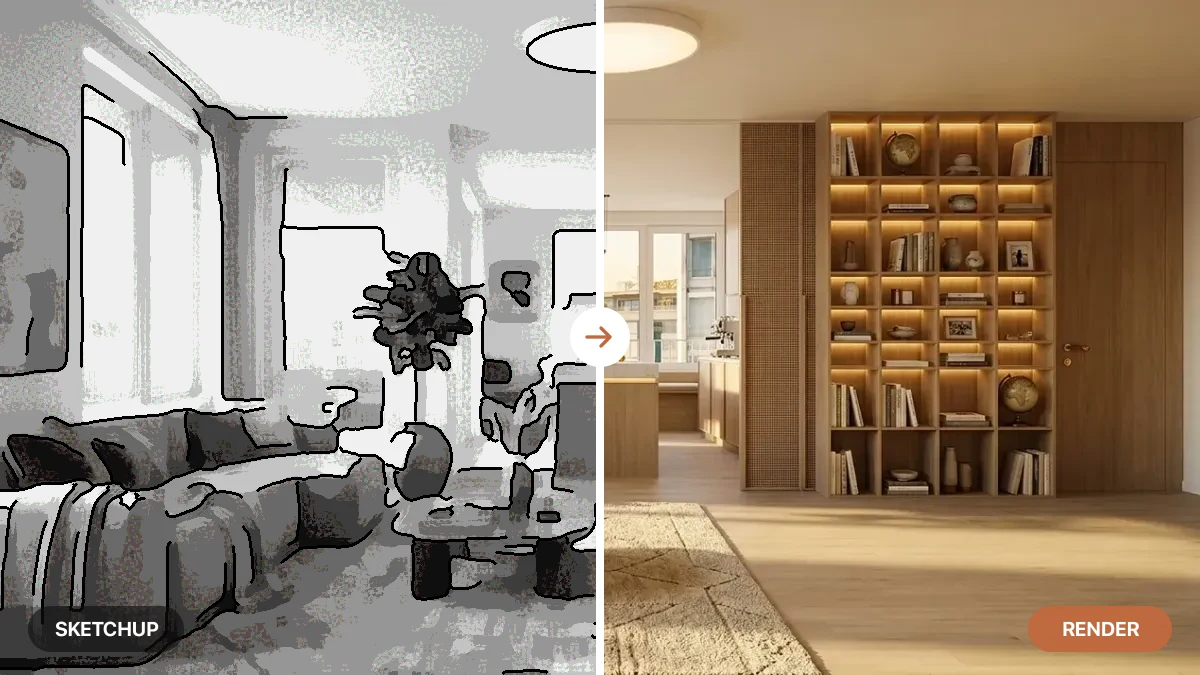

Two renders of the same living room can be built from the same furniture and the same layout, and one will read as a photograph while the other screams computer. The difference is almost never the thing people fuss over, the sofa, the color, the trend. It is a stack of quieter decisions about how light, materials and space behave. Professional visualization studios have understood this for decades. This is that craft, taken apart pillar by pillar, and shown on real renders you can copy.
Our articles are still written by humans!
Get human written articles in your Google feed.

Four materials, one light, four completely different answers. That is photorealism in a single frame: plaster absorbs the light, marble reflects and lets it sink in, velvet sweeps a soft sheen, brass streaks along its brushing. Every image in this article was made with the AI engine behind MeltFlex.
A photorealistic render is an image that obeys the physics of light, materials and scale so faithfully that a viewer reads it as a photograph rather than a simulation. It is not about resolution or a fancier sofa. It is about consistency: every surface answering the same light the same way a real surface would. Get that consistency and the room feels real. Break it in one place and the whole thing collapses into the uncanny valley.
This is a deep dive in the spirit of how the big visualization studios write about their work, but pointed at a different question. Instead of a single hero product built ray by ray, we are asking what a room needs in order to be believable, and how that changes now that AI can do in thirty seconds what used to take a rendering artist a day. We will go pillar by pillar, with the same room broken one variable at a time so you can see exactly what each one does.
The short version
- Photorealism is a system of five pillars, not one setting: light, materials, scale, contact, and controlled imperfection.
- Light and materials do most of the work. Direction plus a real shadow, and surfaces that each answer the light differently.
- Scale is the silent killer. Furniture even slightly out of proportion reads as fake before you can say why.
- Nothing should float. A contact shadow where an object meets the floor grounds it into the scene.
- Sterile is fake too. A touch of wear, a rumpled rug and shallow depth of field beat flawless every time.
- Starting from a real photo solves light, perspective and scale for free, which is why it beats text-to-image.



What makes a render photorealistic?
Ask why your eye can flag a fake render in about half a second, and the honest answer is that it is not reading the image the way you think. It is checking whether the picture is physically consistent. A 2025 study on how people tell AI images from real ones found viewers spotted the real photographs by their natural lighting and small imperfections, and caught the fakes by their unnatural light, reflections and shadows (sources below). Your visual system is a physics detector, and it never turns off.
Here is the twist that makes this worth mastering: most fakes now slip past. Across roughly 287,000 judgments in a 2025 experiment, people told AI images from real ones only 62 percent of the time, barely better than a coin flip (sources below). So a render does not have to be flawless to pass, it only has to avoid the specific tells the eye is trained to catch. And those tells are almost all physical: a shadow that disagrees with the light, a reflection with nothing to reflect, a size the body knows is wrong. Master the physics and you are not chasing perfection, you are just removing the handful of contradictions that give a render away.
So photorealism is not a look you apply at the end. It is a set of physical agreements the whole image has to keep. A render fails the moment two things disagree: a shadow that points the wrong way, a highlight with no source, a sofa a size no factory makes, a lamp that glows but casts no light. Each of those is a small physical impossibility, and the brain catches impossibilities instantly even when it cannot name them. The studios that do this for a living, from architectural visualization houses to product-render specialists, are really just enforcing consistency across five areas at once, the same consistency an AI adds automatically when you turn a flat 3D model into a photorealistic render.
“Realism is not a single trick, it is the absence of tells.” Every believable render is one where nothing in the frame contradicts anything else. That is the whole game.
The five pillars of photorealism
Here is the framework we come back to on every render. Photorealism stands on five pillars. A render is only as convincing as its weakest one, so the goal is not to max out any single pillar but to make sure none of them is obviously broken. Skim the table, then we take each one in turn on the same room.
Notice that the first two, light and materials, are where professional artists spend most of their time, and for good reason: they carry most of the realism. The last three are finishing pillars that quietly decide whether a good render tips over into a great one or into the uncanny valley. Let us build them up in order.
Pillar 1: Light that behaves
Light is the foundation because it is the one thing every other pillar depends on. Materials cannot show their character without a direction to answer, scale is read through shadow, and contact is literally a shadow. Get the light right and you are most of the way home. Get it wrong and nothing else can save the frame.
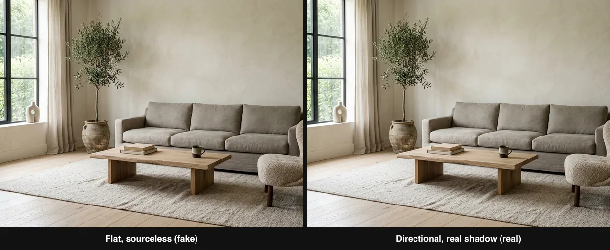
Same room, same furniture, same camera. On the left, flat sourceless light: the default a model reaches for when you say nothing, and it looks computer-generated. On the right, one directional source and a real cast shadow. Only the light changed.
The failure on the left is specific. Flat light lands on every surface equally, from everywhere and nowhere, which never happens in a real room. Real light comes from somewhere, falls off with distance, and leaves shadows that all point the same way. That single agreement, one dominant source and shadows that obey it, is what forensic AI-detection tools actually check for, because generated images so often get it subtly wrong (sources below). When you fix the light, you are not just prettifying the image, you are steering it toward physics.
The physics underneath has names worth knowing, because they are the levers. Global illumination is the way light bounces off one surface and softly colors the next, the warm wash a terracotta floor throws onto a nearby wall. Direction decides where shadows fall and how texture reads. Quality, hard or soft, is set by how large the source is relative to the room. We wrote the full, prompt-by-prompt playbook for controlling all of this in the magic of light, and the shorter diagnosis of what happens without it in why AI renders look fake. For the physical numbers behind color temperature and mood, our AI lighting prompts has the detail.
Pillar 2: Materials that answer the light
If light is the question, materials are the answer, and the reason the study at the top of this page matters is that every real surface answers differently. This is where most renders quietly die: everything gets rendered with the same slightly-plastic sheen, so plaster, marble, fabric and metal all look like the same substance painted different colors. Real materials are defined by two properties above all, how reflective they are and how rough they are, and those two dials decide everything about how a surface catches light.
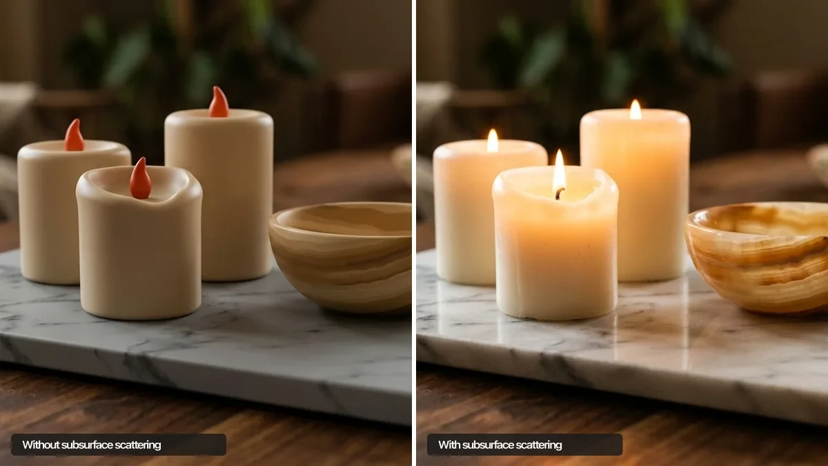
Two effects on that list deserve a special mention because they are the ones cheap renders skip. The first is anisotropy, the way brushed metal stretches a highlight into a streak along the direction it was brushed, instead of a round dot. It is why the brass panel in the study reads as real metal and not gold plastic. The second is subsurface scattering, the way light sinks into a translucent material like marble, a lampshade, a curtain or wax, scatters around inside, and comes back out softened. Without it marble looks like painted stone. We went deep on that one effect in subsurface scattering explained, because it single-handedly separates a believable surface from a flat one.
The practical takeaway is that a good render needs materials that disagree with each other under the same light. When you describe or judge a scene, ask of every surface: is it absorbing this light or reflecting it, and is the highlight sharp or broad? If half the room is matte and half is glossy and each behaves correctly, the eye relaxes. If everything shares one sheen, it does not. How your real floors, walls and furniture answer light together is its own craft, which we cover in what colour furniture goes with grey walls.
Pillar 3: Scale and proportion
Scale is the silent killer, the pillar that breaks a render while you struggle to say why. Light and materials can be flawless, but if the sofa is a size no factory makes, or the coffee table comes up to the wrong height, some part of your brain that has sat on a thousand real sofas registers the wrongness instantly. You do not think “that is 15 percent too deep.” You just think it looks off.
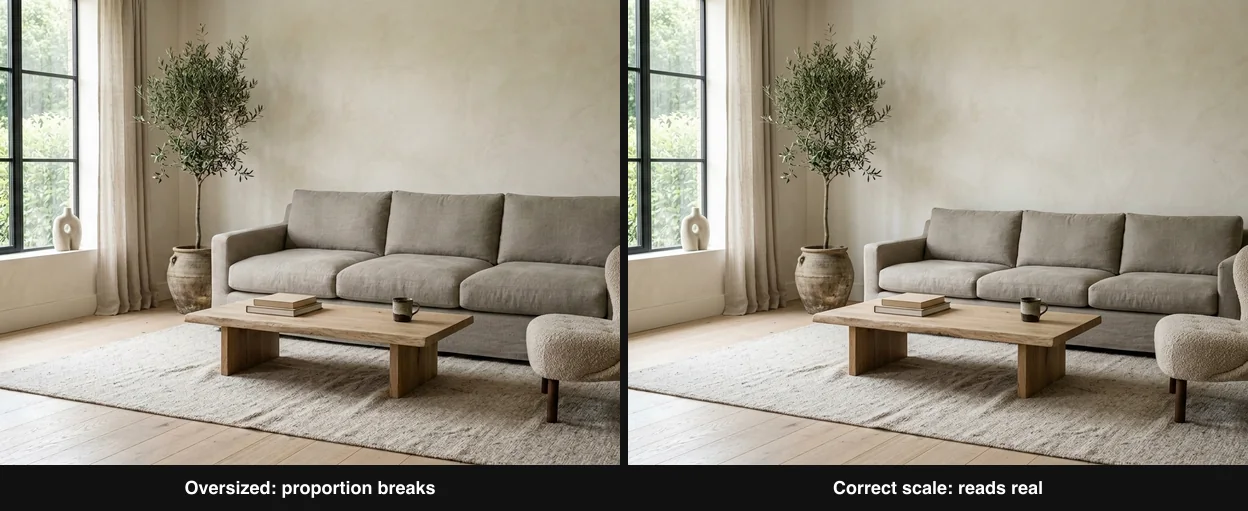
Left: the sofa is oversized, too deep and too bulky for the room, and the whole space feels subtly wrong even though the light and materials are identical. Right: the same sofa at correct scale. Proportion is doing quiet, invisible work.
The fix is to anchor everything to real human dimensions, because a room is a machine built around the human body. These are the numbers worth checking a render against, and they are the same whether the image came from a camera, a CAD model or an AI:
The door is the most useful reference in any interior, because everyone knows how tall a door is, so it silently calibrates everything around it. If the furniture starts rivaling the door for height, the scale is off. This is also why matching real, buyable furniture matters so much for realism: a real product has real dimensions baked in. If you want the full method for sizing pieces to a space, we built a visual guide to what size furniture fits your room.
Pillar 4: Contact and occlusion
Here is the pillar almost nobody names, yet it is the difference between furniture that sits in a room and furniture that hovers over a photo of a room. When a real object meets a real floor, it does two things: it casts a tight, dark contact shadow right where they touch, and it blocks a little of the ambient light in the crevice, an effect renderers call ambient occlusion. Together they weld the object to the surface. Take them away and the sofa looks pasted on, like a sticker floating a millimeter above the floor.
You can see it working in the light comparison above. On the realistic right-hand panel, look at the base of the coffee table and the legs of the chair: there is a soft darkening where each one meets the oak, and a crisp little shadow directly beneath. That grounding is subtle enough that you would never point to it, but remove it and the entire image loses its weight. It is one of the most common reasons a text-to-image room, where the model never really worked out what touches what, feels slightly dreamlike and wrong.
The lesson generalizes: every object needs evidence that it has weight and touches the world. A rug should press flat under a table leg. A vase should throw a small shadow onto the shelf. A curtain should touch the floor and pool slightly. When you judge a render, run your eye along every point where two things meet and ask whether the contact is described. Where objects float, realism leaks out. Ambient occlusion, contact shadows and soft corner darkening are quiet, but they are load-bearing.
Pillar 5: Controlled imperfection
The final pillar is the most counterintuitive, because it asks you to make the image slightly worse in order to make it real. A flawless room is a fake room. Real spaces have a throw blanket that is not folded at right angles, a rug with a soft rumple, a wood floor with grain variation and a scuff near the door, a stack of books left mid-read. Cameras have imperfections too: a shallow depth of field that lets the background go soft, a faint grain, a gentle vignette. Strip all of that out and you get the sterile, too-perfect look that instantly reads as computer-generated.
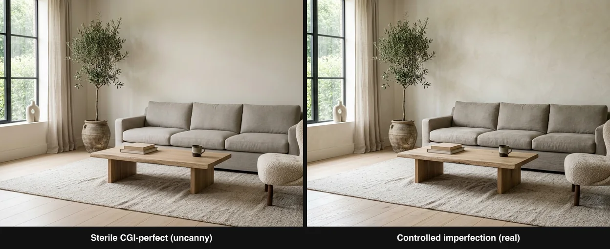
Left: cleaned up to be flawless and symmetrical, every surface pristine, which quietly drifts toward the uncanny. Right: the same room with controlled imperfection, a soft rumple in the rug, faint wear, a lived-in ease. The difference is subtle on purpose, and the slightly messier one reads as more real.
The word that matters is controlled. This is not an excuse for clutter, it is the deliberate reintroduction of entropy. Interior photographers stage this on purpose: they crease a cushion, pull a book half out, let the light catch a bit of dust. The goal is to leave just enough evidence that a real person lives here and a real camera stood in the room. Research on why viewers can tell AI images apart keeps landing on the same two cues, unnatural light and the absence of natural imperfection, which is exactly why this pillar and the first one carry so much weight (sources below).
In practice, controlled imperfection is often the single fastest upgrade once light and materials are handled. Ask for grain variation in the wood, a soft rumple in the textiles, a little asymmetry in the styling, and shallow, natural depth of field. It is the seasoning, not the meal, but a render without it always tastes like plastic.
Watch: how materials and light build realism
The two pillars that carry the most weight, light and materials, are easier to feel than to read about. This walkthrough builds a photorealistic render from the material and lighting up, and even though it is aimed at product visualization, the logic maps one to one onto a room: define how each surface answers the light, then light it with intent. It is the same craft the whole visualization industry runs on.

Photorealistic product rendering, materials and lighting. Video by Nikita Kapustin on YouTube. The two-pillar logic, materials then light, is identical for interiors.
The photorealism checklist
Put the five pillars together and you get a checklist you can run against any render, yours or someone else’s, in under a minute. If every box is ticked, the image will almost always read as a photograph. If two or more fail, you have found why it looks fake.
Run this on any render
- Light: is there one clear source, and do all the shadows point the same way?
- Materials: do matte and glossy surfaces behave differently, or share one sheen?
- Scale: check the furniture against the door and against real dimensions.
- Contact: does every object have a shadow where it meets the floor, or does it float?
- Imperfection: is there any wear, rumple, grain or depth of field, or is it sterile?
- Consistency: does anything in the frame contradict anything else physically?
Better yet, run it interactively. Tick the pillars your render actually keeps and it will tell you your weakest link, the one fix that will do the most:
Interactive calculator
Loading… if it does not appear, refresh the page.
AI versus manual: does it change the rules?
None of these pillars are new. They were worked out over decades in manual engines like V-Ray, Corona and Octane, where an artist places lights, assigns materials and simulates every bounce of light by hand. What has changed is not the physics but who does the labor. An AI model has effectively absorbed millions of real photographs, so it has a strong prior for what lit surfaces are supposed to look like. That is a genuine shift, and it cuts both ways.
The honest read is that manual rendering still owns the absolute ceiling, especially for a building that does not exist yet or a product shot that needs pixel-level direction. That is the world the classic visualization studios live in, and it is worth respecting. But for an interior that already exists, a photo-based AI render inherits three of the five pillars, light, scale and perspective, already correct from reality, and does the rest in seconds. For staging, redesign and iteration, that trade is usually decisive. We put the leading options side by side in our roundup of the best AI architectural rendering tools, and explain the underlying idea in what architectural rendering is.
The shortcut most guides miss
Here is the part most photorealism guides, written for people building scenes from nothing, never mention. You can skip half the battle by not starting from nothing. When you generate a room from pure text, the model has to invent the light, the scale, the perspective and the materials all at once, and juggling all of that is exactly where it contradicts itself: a shadow that fights the window, a sofa the wrong size, a vanishing point that drifts. Three of the five pillars are at risk before you have typed a word about style.
Start from a photo of a real room and those three pillars, light, scale and perspective, arrive already solved, because reality solved them. The real window, the real sun angle, the true dimensions of the actual space are baked into the pixels. The AI no longer has to guess where the light comes from or how big the room is. It only has to handle materials and finish, which is the part it is best at anyway. That is the approach behind every image in this article: each one started from a real room and was transformed, not conjured.
This is where MeltFlex fits. You upload a photo of your actual space, and it keeps your real walls, windows, camera angle and proportions while it upgrades the materials, the furniture and the light, so the output inherits the pillars that are hardest to fake. There is one more difference that matters beyond realism: instead of inventing furniture you can never actually find, MeltFlex matches every piece to real, shoppable products, so a believable render doubles as a buy list rather than a beautiful picture of things that do not exist. If you want to see the whole transformation end to end, we walk through it in how to design your home with AI, step by step.
Realism-killers to avoid
- Sourceless light. The number one tell. If you cannot say where the light comes from, the render will look fake. Name one source and one shadow.
- One sheen for everything. When plaster, fabric and metal all share the same glossiness, the eye reads plastic. Let materials disagree.
- Guessing at scale. Furniture even slightly out of proportion breaks realism silently. Check it against the door and real dimensions.
- Floating objects. No contact shadow means no weight. Ground everything where it touches the floor.
- Flawless everything. Sterile is fake. Add wear, rumple, grain and shallow depth of field on purpose.
- Conflicting cues. Two light directions, a reflection with nothing to reflect, a lamp that lights nothing. Any contradiction is a crack the eye finds.
- Chasing resolution instead of consistency. A sharper fake is still fake. Fix the pillars first, then worry about pixels.
Try it on your own room
The fastest way to understand these pillars is to watch them appear on a room you actually know. Take a photo of a real space and transform it: because the light, scale and perspective come from your photo, you get to feel how much the materials and finish alone can do, and how a believable render is really just five agreements kept at once. Every image here was made exactly that way, from a real room, using the same AI engine that powers MeltFlex. You keep your actual walls, windows and proportions, and you get a photorealistic version of that exact space in about thirty seconds, with the furniture matched to real, purchasable pieces.
Keep the five pillars in agreement and an ordinary room turns into a photograph. Try it free on your own room, then read why AI renders look fake for the diagnostic version of everything above, or the most detailed AI interior designer for the buyer’s-eye version: whether the detail is actually there when you zoom into a render.
Photorealistic rendering FAQ
What makes an interior render look photorealistic?
Photorealism is a system, not a setting. Five things have to agree at once: the light has a direction and casts real shadows, the materials answer that light correctly, the furniture is scaled to real human dimensions, every object is grounded with a contact shadow instead of floating, and the whole scene carries a little controlled imperfection instead of being flawlessly clean. Miss one and the eye catches it in about half a second. Get all five and a plain room reads as a photograph.
Why do my AI renders look fake or like CGI?
Almost always because one of the five pillars is broken. The most common culprit is flat, sourceless light with no real shadow, which is the single biggest tell. The next are surfaces that are too clean and uniform, furniture that is subtly the wrong size, and objects that look like they float because they have no contact shadow. Fixing the light and adding one real cast shadow usually does more than any other single change.
What are the most important factors in photorealistic rendering?
Light and materials, in that order, do most of the work, which is why professional 3D artists spend most of their time on those two. Light gives the scene depth, direction and mood. Materials decide whether a surface reads as real plaster, real marble or plastic. Scale, contact shadows and controlled imperfection are the finishing pillars that stop an otherwise good render from tipping into the uncanny valley.
How do you make a 3D or AI render look real?
Work the five pillars in order. Give the light one clear source and a real cast shadow. Make each material answer that light the way it would in life. Check every piece of furniture against real dimensions. Ground each object with a contact shadow so nothing floats. Then add a touch of controlled imperfection, slight wear, a rumpled rug, shallow depth of field, so the scene is not sterile. Realism is the sum of all five, not any one trick.
Do AI renders look as real as V-Ray or manual rendering?
For a real, existing room, a good photo-based AI render can look every bit as convincing, because it inherits genuinely correct light, perspective and shadows from the source photograph instead of simulating them. For a building that does not exist yet, or a hero product shot that needs pixel-level art direction, manual engines like V-Ray or Corona still hold the ceiling. The gap is closing fast, and for interiors the speed difference, seconds versus hours, usually decides it.
Does subsurface scattering really matter for interior renders?
Yes, more than people expect. Subsurface scattering is the way light sinks slightly into a translucent material like marble, a lampshade, a curtain or wax, bounces around inside, and comes back out softened. Without it, marble looks like painted stone and a lampshade looks like cardboard. It is one of the quiet material cues that separates a believable surface from a flat one.
Does starting from a real photo make a render more realistic?
Significantly. When you start from a photo of a real room, three of the five pillars are already solved for free: the light is physically correct, the perspective is real, and the scale is true to the actual space. The AI only has to handle materials and finish. That is why photo-based tools tend to produce more believable results than pure text-to-image, where the model has to invent light, scale and geometry all at once.
Does a photorealistic render now have to be labelled as AI?
Inside the EU, if you publish it as part of a business, usually yes, and realism is precisely the trigger. Article 50 of the AI Act has applied since 2 August 2026 and turns on whether a viewer could take the image for a photograph, which means the five pillars above double as a checklist for when the labelling duty attaches. A render that still reads as CGI sits outside it. One that passes for a photo does not. The EU AI Act rules for AI generated images set out the test and where the label has to sit.
Sources
- AI Images vs. Real Photographs: Investigating Visual Recognition and Perception (2025), on how people identify real photos by natural lighting and small imperfections, and AI images by unnatural light, reflections and shadows.
- Detecting Multimedia Generated by Large AI Models: A Survey (arXiv), covering physics-based detection that checks lighting, shadow-direction and reflection consistency in synthetic images.
- How Good Are Humans at Detecting AI-Generated Images? (arXiv, 2025), the large-scale experiment of roughly 287,000 judgments where participants told AI images from real photographs only about 62 percent of the time.
- Physically Based Rendering: From Theory to Implementation, the standard reference on light transport, reflectance and how surface roughness governs the way materials answer light.