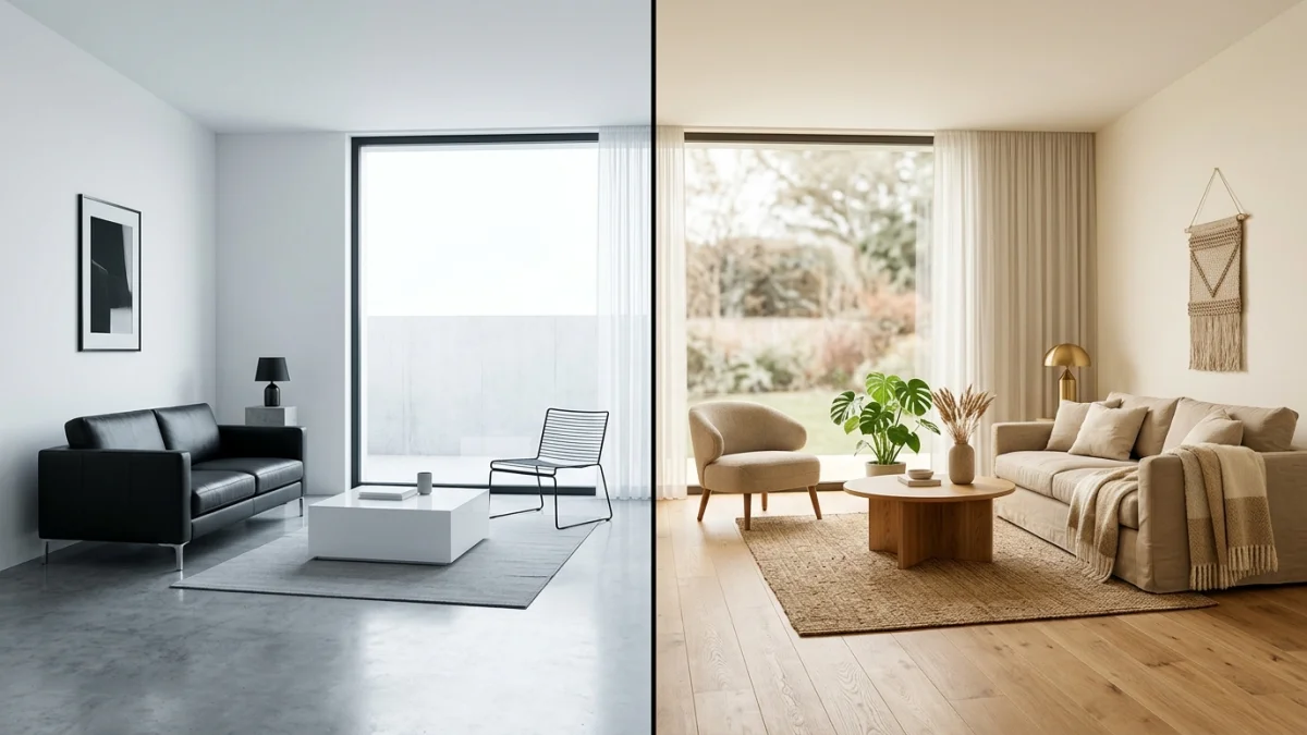
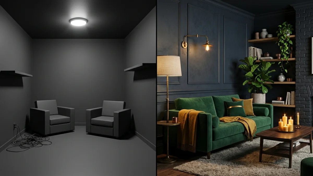
Fall Interior Design Trends 2026: What Is Actually Worth It (and What Looks Tacky)

Short answer: fall 2026 is warm, deep and cocooning. The colors that matter are burnt umber, burgundy, forest green and deep gold over creamy neutrals. Textiles get heavier and layered, lighting drops to a warm glow, dark wood is back, and natural styling means real foraged branches, not plastic. The one thing every good version of this trend has in common is restraint. The tacky version, pumpkins on every surface and a “Hello Autumn” sign, is exactly what designers are telling people to stop buying.
Our articles are still written by humans!
Get human written articles in your Google feed.
Almost every roundup of fall interior design trends for 2026 you will read this year is a shopping list with the brakes cut. It loves everything equally, tells you to buy velvet and dried grass and forty small pumpkins, and never once says which of these will look dated by November. This one is written differently. We build an AI interior design tool, which means we watch thousands of real rooms get restyled every week, and the pattern is blunt: the fall looks that hold up are the ones that change light, texture and one color, and the ones that fail are the ones that treat a room like a themed display. Here is what is genuinely worth doing this autumn, and what to leave on the shelf.
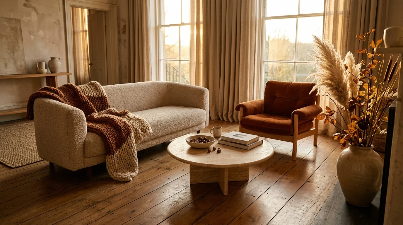
The fall 2026 room in one frame: warm neutrals, one rust accent, real dried branches, and low autumn light doing most of the work. Rendered from a text prompt with MeltFlex.
FreeUpload photo · freeRedesign my room for freeUpload a photo and let MeltFlex design your space. Your first AI design is free, no card needed.
Fall 2026 in Numbers (Not Vibes)
Most trend posts run on adjectives. Here is the actual data behind the fall 2026 direction, from the 1stDibs 2026 Interior Designer Trends Survey, which polls working designers rather than guessing:
Read those four numbers together and the season writes itself: warm and brown-led, unafraid of saturated color, layered rather than minimal, and leaning on old pieces over new. Every trend below is really just one of these numbers made physical. The burgundy line is the one to watch, tripling in a single year is not a vibe, it is a shift.
Watch: What Is In and Out for 2026
Before the specifics, here is the same warm, curated, anti-kitsch direction from a working designer. Rebecca Robeson runs through what is in and what is out for 2026, useful context for the fall picks below.

Video: “Interior Design Trends 2026 (What’s In & What’s Out)” by Rebecca Robeson (338K+ views).
The Fall 2026 Mood: Warm, Deep, Cocooning
The mood this year is a reaction, not an invention. After a decade of cool gray, stark white and minimalism stripped down to nothing, rooms are being pulled back toward warmth and weight. Designers describe it as cocooning: spaces built to be sat in on a dark afternoon, not photographed empty. That is the lens to judge every fall trend by. If it makes a room feel more like a place you want to be at 6pm in October, it is worth it. If it just makes the room look more “autumn” in a photo, it is decoration for its own sake.
The industry consensus backs this up. Every major 2026 color forecast, from the paint brands to trade press like Kitchen & Bath Design News, points the same way: warm is in, cool gray is out, and the palette is getting richer and more saturated rather than paler. Fall is simply the season where that shift looks most at home.
The Colors Worth Copying (and the One That Anchors Everything)
If you take one thing from this whole guide, make it this: burnt umber is the anchor color of fall 2026. It sits at the intersection of brown and deep orange, so it carries the warmth of terracotta with the sophistication of chocolate. The reason it beats the pumpkin-orange most people reach for is that it reads as a real color, not a seasonal costume. It works as paint, as a velvet chair, as leather, as a ceramic. You can leave it up in January and nobody will think “that was for Halloween.” If you do want the full costume for a few weeks, put it where it comes down in ten minutes: our Halloween bathroom decor ideas keep it to the shower curtain, the towels and one shelf.
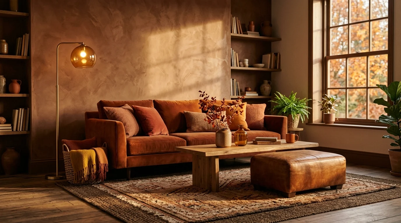
Burnt umber as the whole scheme, not a single accent. Note how the oak floor and brass keep it warm rather than muddy.
Around that anchor, three colors do the heavy lifting. Burgundy is the fastest-rising color of the year, tripling among designers from 7 percent naming it for 2025 to 21 percent for 2026, and the reason it works where a bright red would not is its undertones: enough blue and brown to feel refined instead of aggressive. Forest green is the grounding color, the evergreen that stays when the leaves drop, and it is the safest way to bring depth into a room without going dark. Deep gold is the warm-luminosity color that keeps the whole palette from getting heavy, usually through brass, amber glass and lamplight rather than paint.
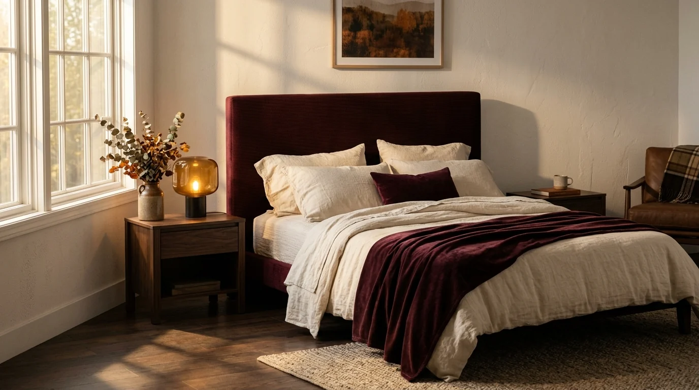
Burgundy used as depth, not drama: one headboard and a throw against cream linen. This is the whole trend in a single restrained move.
The honest caveat nobody prints: these colors punish low light. Burnt umber and burgundy come alive in a room with real daylight and warm lamps, and go flat and muddy in a north-facing box lit by a single cool bulb. Before you commit to a wall, this is exactly the kind of thing worth previewing in your actual room, which we get to at the end.
Layered Textiles: The Cheapest Real Upgrade
If color is the risky move, texture is the safe one, and it is where the season is actually won. The fall 2026 rule is layer, do not match. A single fabric on everything reads flat; a bouclé armrest against a chunky cream knit against a rust velvet cushion against a nubby linen pillow reads rich and lived-in. Velvet is the fabric of the moment, wool and chunky knit do the cozy work, and layered rugs (a wool or vintage piece thrown over a larger flatweave) add the weight underfoot that a bare floor never will.
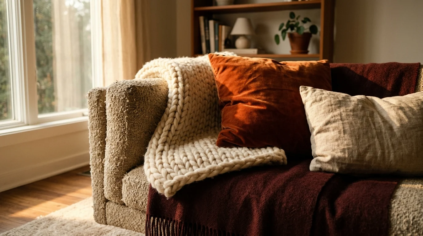
Four textures, one corner. This is the quickest, lowest-risk way to make a room feel like fall, and it costs a fraction of new furniture.
This is also the tactic to reach for if you rent or hate commitment. Cushions and throws are the quick-change strategy: swap them in October, box them in April, and the room resets. You get the whole seasonal feeling for the price of a few textiles instead of repainting or rebuying.
Warm, Layered Lighting: The Trend Everyone Skips
Here is the fall upgrade almost nobody talks about because you cannot buy it in a decorative bundle: your light temperature. The single biggest reason a room feels cold in autumn is a cool 4000K-plus bulb blasting from one ceiling fixture. Drop to warm 2700K, then stop lighting from the top. Layer three or four low sources instead: a table lamp, a floor lamp, a couple of candles, and if you have it, a fire. The room stops being lit and starts glowing.
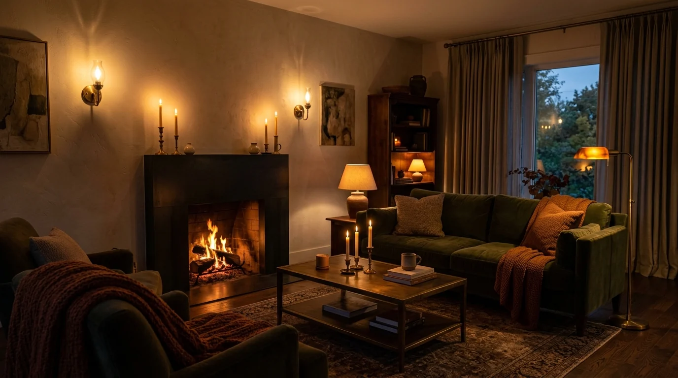
Same furniture, warm 2700K light from several low points. This one change does more for the fall mood than any amount of seasonal decor.
This is the highest-return, lowest-cost move in the entire guide, and it pairs directly with the color palette above. Warm light makes burnt umber and burgundy sing; cool light makes them look dirty. If you only do one thing this season, change your bulbs.
The Dark Wood Revival
After years of pale oak and painted everything, dark wood is back, and fall is where it looks best. Walnut, stained oak and rich espresso tones anchor a room the way dark cabinetry and dining tables used to, and they read warmer than the cool grays they are replacing. The move is not a full brown room, it is one grounding piece: a walnut dining table, a stained media console, a dark-framed mirror, set against the creamy neutrals so it feels intentional rather than dated.
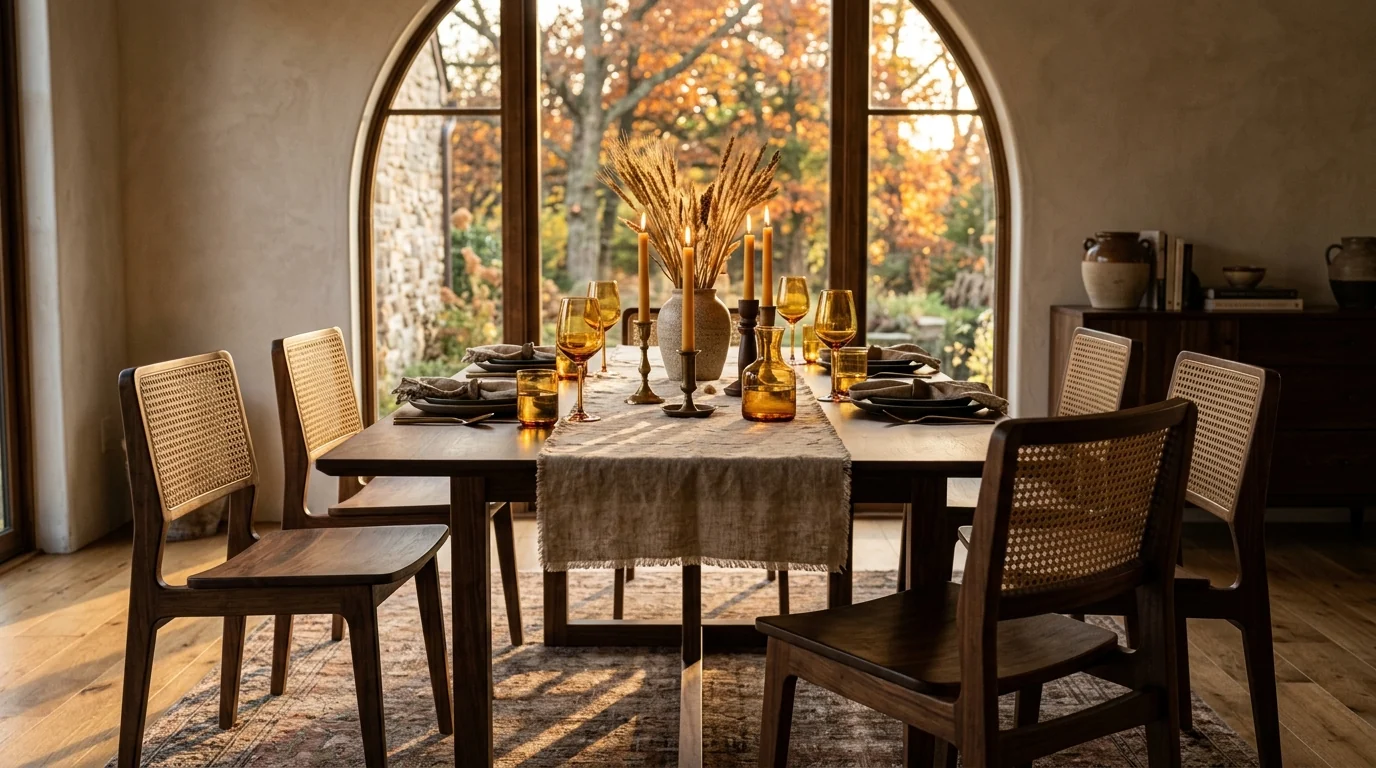
Dark wood as the anchor, warm neutrals as the room. This is the difference between the 2026 revival and the heavy brown interiors it is often confused with.
If you want to push this further into the moody end of the spectrum, our dark and moody interior design guide covers how to go deep without making a room feel like a cave, and it pairs naturally with the fall palette here.
Foraged, Not Fake: The Sustainability Angle
The natural-elements trend is real and worth doing, with one hard rule: forage it, do not fake it. The 2026 version is dried hydrangeas, seeded eucalyptus, wheat, branches and grasses you cut yourself or buy dried, arranged in a stoneware vase or urn. It lasts all season, costs almost nothing, and has the artisanal, sustainable feel designers keep pointing to. The moment you swap in a plastic fall-leaf garland or a bag of silk stems, you land in exactly the tacky territory the next section is about.
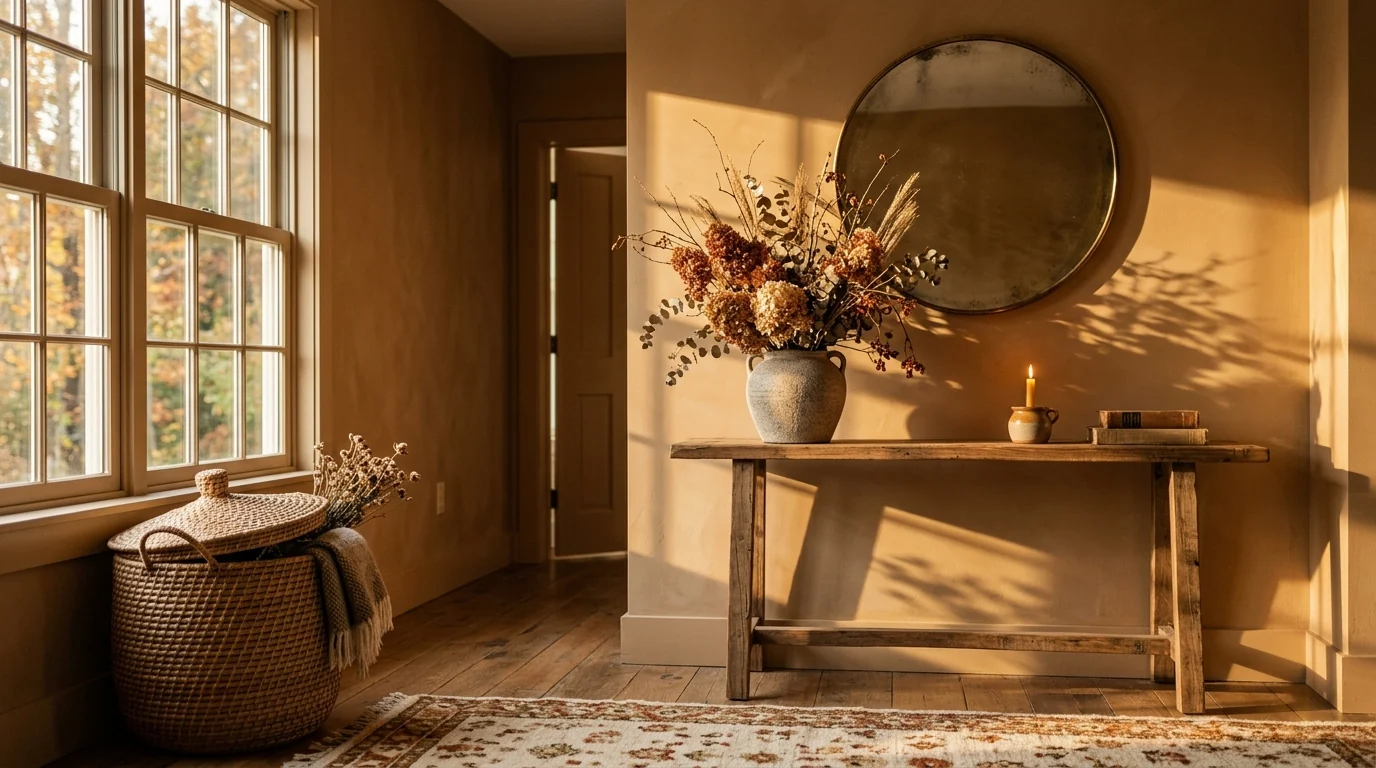
Foraged and dried, arranged with restraint. Real botanicals age into the season; plastic ones just look like plastic in warm light.
This is also where fall overlaps with the broader move toward biophilic design, the idea that rooms feel better when they carry real natural texture and material. A single foraged arrangement does more for that than a shelf of manufactured props.
5 Fall Trends to Skip in 2026 (Designers Are Begging You)
This is the part the shopping-list articles leave out. Trade coverage this year, including roundups like these designer “tacky trends” lists, is unusually direct about what to stop buying. Here is the honest cut list for fall.
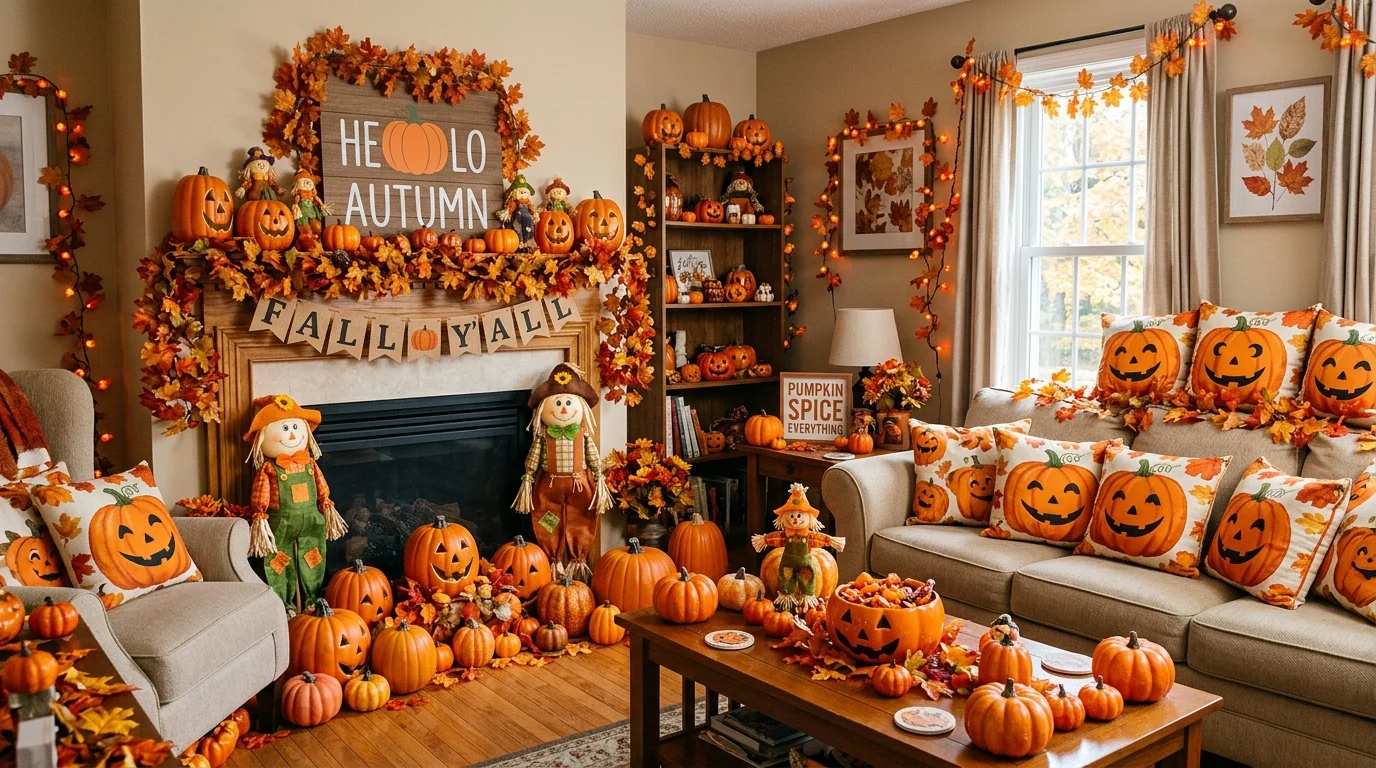
The version to avoid: pumpkins on every surface, a word sign, plastic garlands, matching seasonal print. It photographs as “fall” and reads as clutter in the room.
- Pumpkins on every surface. One sculptural bowl of real heirloom squash is styling. Twenty orange foam pumpkins across every shelf is a display. Pick a single moment and stop.
- “Hello Autumn” and other word signs. Word art is the trend designers name most often as generic and passe. It tells the room what to feel instead of making it feel that way.
- Fake fall-leaf garlands and silk stems. Plastic botanicals fall apart under the warm light this whole look depends on. Dried real stems cost less and age into the season.
- Matching seasonal sets. The pumpkin-print cushion, table runner and doormat that all match kill the layered, collected feel that makes 2026 rooms work. Mix textures and eras instead.
- All-orange everything. Leaning the whole room on pumpkin-orange is what makes fall decor read cheap. Anchor on burnt umber and burgundy, and let orange be a small warm note, not the theme.
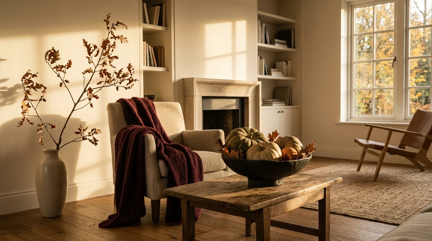
The version worth copying: the same season said with one bowl of real squash, one dried arrangement and one warm throw. Restraint is the whole trend.
Room by Room: The 20-Minute Fall Refresh
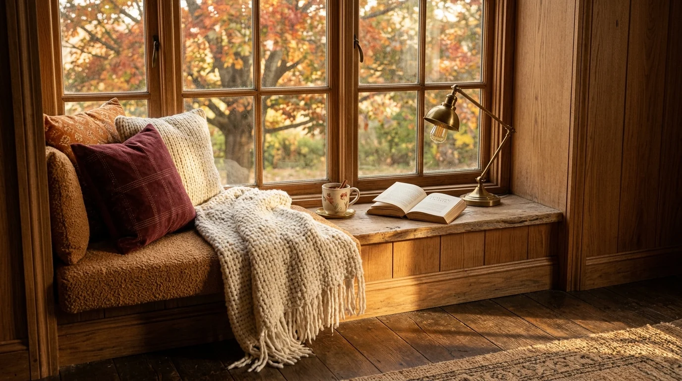
The cozy corner, done with three things instead of thirty. Warm textiles, one lamp, real light from the window.
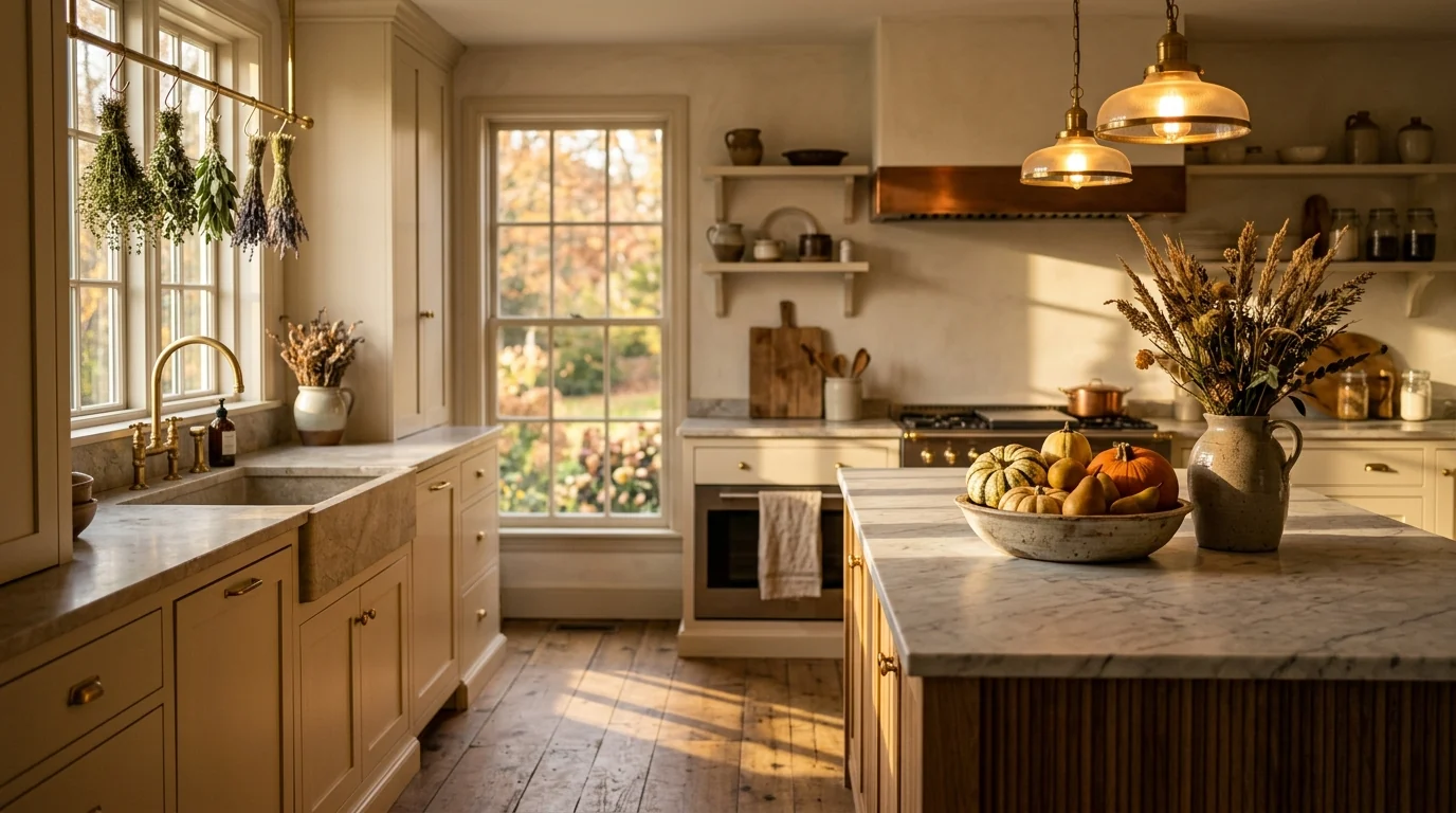
Seasonal kitchen styling that stays restrained: real fruit, brass, dried grasses. No pumpkin-print anything.
How to Preview Fall Trends in Your Actual Room
Every color and every piece above looks great in a rendered room. The question that actually matters is how it looks in your room, with your light, your floor and your proportions. Paint samples cost real money and never match once they are on the wall, and a velvet chair you regret is a lot harder to return than a paint chip.
The same photo-in, photo-out trick carries straight into December: our guide on whether AI can decorate your house for Christmas compares eight tools that add the tree, garland and lights to a photo of your actual room.
The faster route: upload a photo of your room to MeltFlex and describe the fall look you want, something like “warm living room in burnt umber and cream with a rust velvet chair, chunky knit throw and dried branches, warm evening light.” You get a photorealistic version of your real room, keeping your exact walls, windows and layout, in about 20 seconds. Generate three or four palettes side by side, see whether burnt umber goes rich or muddy in your specific light, and only then spend a cent. Every piece shown in the result is real and shoppable, so you can go straight from the render to the checkout.
For the year-round context behind these seasonal picks, read our 2026 interior design trends guide, the 2026 colors of the year compared, and the two styles fall leans on hardest, warm minimalism and dark and moody. When the season turns, the same warm palette works outdoors too, and our exterior house colors guide shows it on a real facade.



)