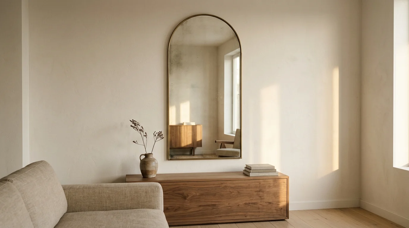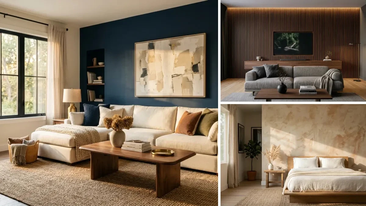
The plate wall is back, and it is nobody’s grandmother’s version. After a decade of identical framed prints and letter boards, decorative plates are showing up again on the walls of very current interiors: hand-thrown stoneware in organic clusters, thrifted delft mixed with modern minimalist ceramics, sculptural all-white relief plates treated like gallery objects.
Our articles are still written by humans!
Get human written articles in your Google feed.
There is a catch, and it is the whole reason this guide exists. The distance between a plate wall that looks collected and one that looks like a farmhouse Airbnb is about five decisions. Get them right and you have the most personal, least generic wall treatment available at any budget. Get them wrong and you have shiplap energy, rooster plates, and a wall that guests quietly photograph for the group chat.
This guide covers 15 plate wall ideas that hold up in 2026, the styling rules that separate curated from kitsch, exact hanging hardware and spacing numbers, and how to preview the whole thing on your actual wall with AI before you drill anything.
Are Plate Walls in Style in 2026?
Yes, with an asterisk the size of a serving platter.
The comeback has been building since “grandmillennial” style, a term House Beautiful coined back in 2019, made inherited china socially acceptable again. What pushed it into 2026 is a bigger shift: gallery walls of framed prints became so universal that they stopped saying anything. A wall of plates is dimensional, it casts real shadows, it can be thrifted for the price of one framed poster, and no algorithm can serve your neighbor the same collection. In a year when interiors keep moving toward texture, craft, and personal objects, a curated ceramic wall fits perfectly.
What is not back is the version most people picture: a rigid grid of matching white plates with rooster or rose decals, mounted on shiplap next to a wooden sign about gathering. That look was the plate wall’s 2015 farmhouse era, and it is the reason the whole category needed a decade to recover. The 2026 plate wall works precisely because it refuses to match.
The 5 Rules That Keep a Plate Wall From Going Full Farmhouse
1. Run One Color Thread Through Every Plate
The single most reliable trick. Every plate can be a different size, era, and pattern as long as they all share one color: a cobalt line, a warm cream base, a rust accent. The thread is what makes strangers on a wall read as a family. No thread, no wall, just plates.
2. Never Buy a Matching Set
A boxed set of twelve identical plates is catalog decor, and the eye reads it instantly. Build the collection the slow way: two thrifted, one inherited, three from a ceramicist, one from a trip. If you need the wall done this weekend, at least buy from three different sources so the plates argue a little.
3. Odd Numbers, Varied Sizes, One Anchor
Odd counts are easier to balance. Use at least three plate sizes and give the composition one oversized anchor, usually a platter or charger, placed near the visual center. Everything else orbits it. A wall of same-size plates has no hierarchy, and no hierarchy is exactly what a rigid farmhouse grid looks like.
4. Let the Architecture Set the Shape
The arrangement should answer something in the room: the width of the credenza below it, the curve of a headboard, the frame of a doorway. A plate cloud floating on a random wall section looks unfinished. The same cluster hugging the furniture line below it looks designed.
5. Template on the Floor First
Lay kraft paper on the floor, arrange the plates on it until the composition works, trace every plate, mark each hanger’s hook point, then tape the sheet to the wall and drill straight through the marks. Zero test holes, perfect transfer. This is the difference between a wall you planned and a wall you negotiated with.
The Looks: 6 Modern Plate Wall Compositions
1. The Salon-Style Cluster
The defining 2026 arrangement. One oversized handmade platter anchors the center, and eight to twelve smaller plates in related glazes orbit it in an organic, irregular cluster with even 2 to 3 inch gaps. It borrows the logic of a salon-style art hang, which is why it reads as gallery rather than granny. Keep the palette tight, neutrals with one or two accents, and let the size variation do the talking.
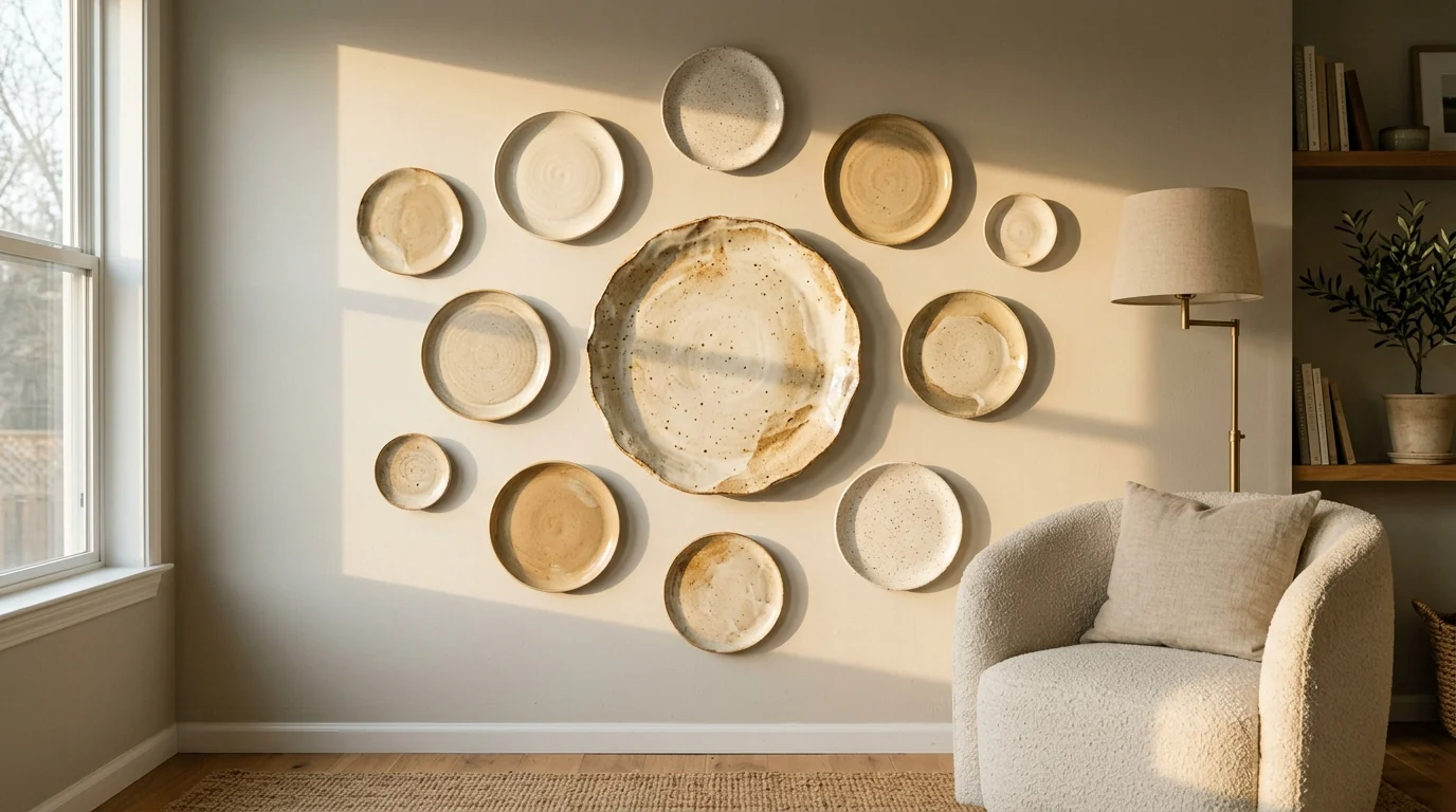
One anchor platter and its satellites, even gaps throughout. The irregular outline is planned down to the centimeter.
2. The Color-Thread Collection
Blue and white is the classic proof that a color thread beats matching. Genuine delft, thrifted chinoiserie, and sharp modern blue-rimmed plates from three different decades hang together because the cobalt connects them. The mix of eras is the point: all-antique tips into grandma territory, all-modern feels like a showroom, the blend feels collected. Works equally well with green and cream or terracotta and sand.
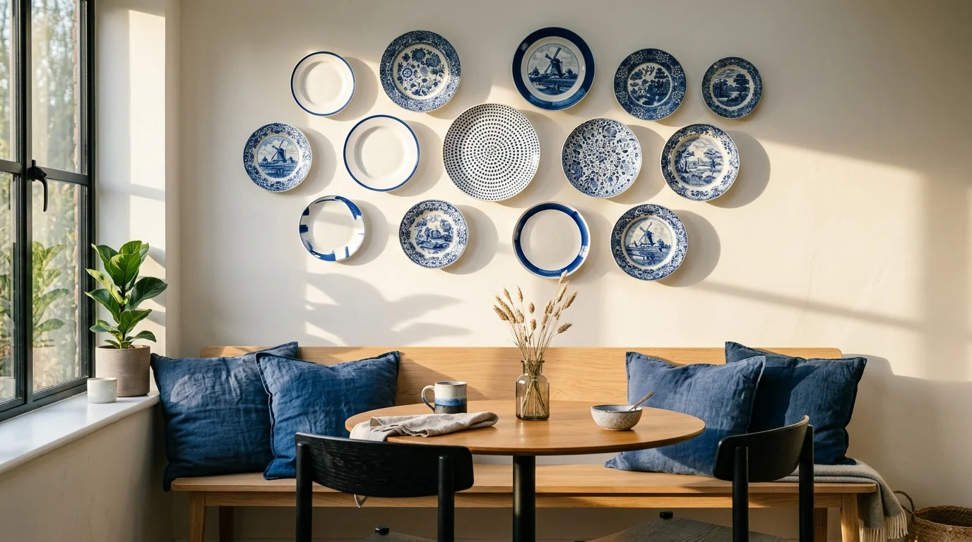
Three eras of blue and white on one wall. The cobalt thread is doing all the work.
3. Sculptural White on a Colored Wall
Flip the formula: keep every plate matte white and let texture carry the composition. Relief patterns, ruffled rims, hand-thrown ridges. On a terracotta, sage, or deep green wall, white ceramics behave like sculpture, and the raking light throws curved shadows that change through the day. This is the most gallery-like version of the trend and pairs naturally with an accent wall you already love.
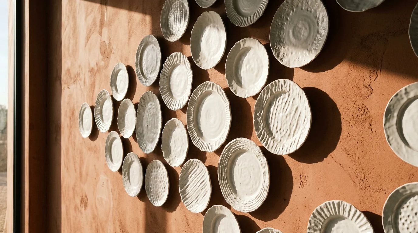
White relief plates on terracotta plaster. The shadows are half the composition.
4. Plates Mixed With Art and Mirrors
Interleaving ceramics with a couple of small framed works and one vintage convex mirror creates the most layered wall in this guide. The flat frames make the plates read more dimensional, the plates make the art feel less predictable. Keep frames thin and quiet, oak or black, and let the shared palette connect everything. This is the best option if you already have a gallery wall you are bored of. The reverse works just as well: our mirror wall ideas guide builds the same layered wall with mirrors in the lead role.
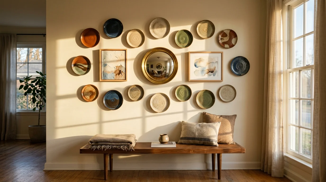
Plates, two quiet abstracts, one convex mirror. Dimension is the thing frames cannot fake.
5. The Minimalist Trio
Three very large handmade plates in a loose diagonal, generous negative space, and nothing else. On a limewashed wall in strong afternoon sun, each plate casts a long elliptical shadow that becomes part of the arrangement. This is the plate wall for people who think they hate plate walls: maximum craft, zero clutter, and the cheapest idea here if you find three good platters secondhand.
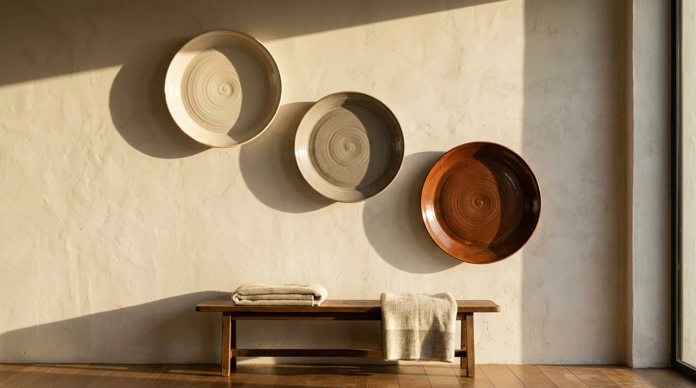
Three plates, a limewashed wall, and the afternoon sun. Restraint reads as confidence.
6. The Soft Pastel Mix
Pale pink, powder blue, lavender, and cream, patterns thoroughly mixed but held together by the light palette. This is the softest version of the trend and the easiest to overdo, so anchor it with plenty of cream plates and keep the surrounding room quiet. In a breakfast corner or a bedroom it reads fresh; next to floral curtains and ruffled cushions it tips into a themed B&B, so pick one.
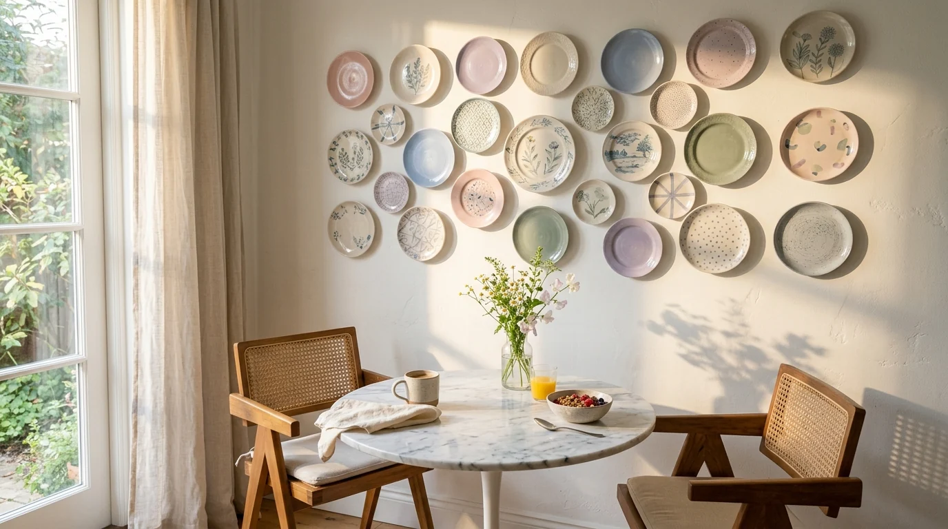
Pastels survive when cream does the heavy lifting and the rest of the room stays calm.
Plate Wall Ideas by Room
7. Dining Room: Above the Credenza
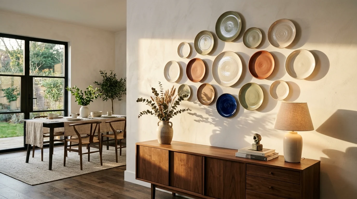
The natural habitat. Plates above a sideboard connect the wall to what the furniture is actually for, and the credenza line gives the arrangement its base. Keep the cluster slightly narrower than the credenza, let a mirror or lamp share the wall, and resist symmetry: loosely balanced beats mirrored. This is also the highest-traffic wall guests will see, so it is where the color-thread rule matters most.
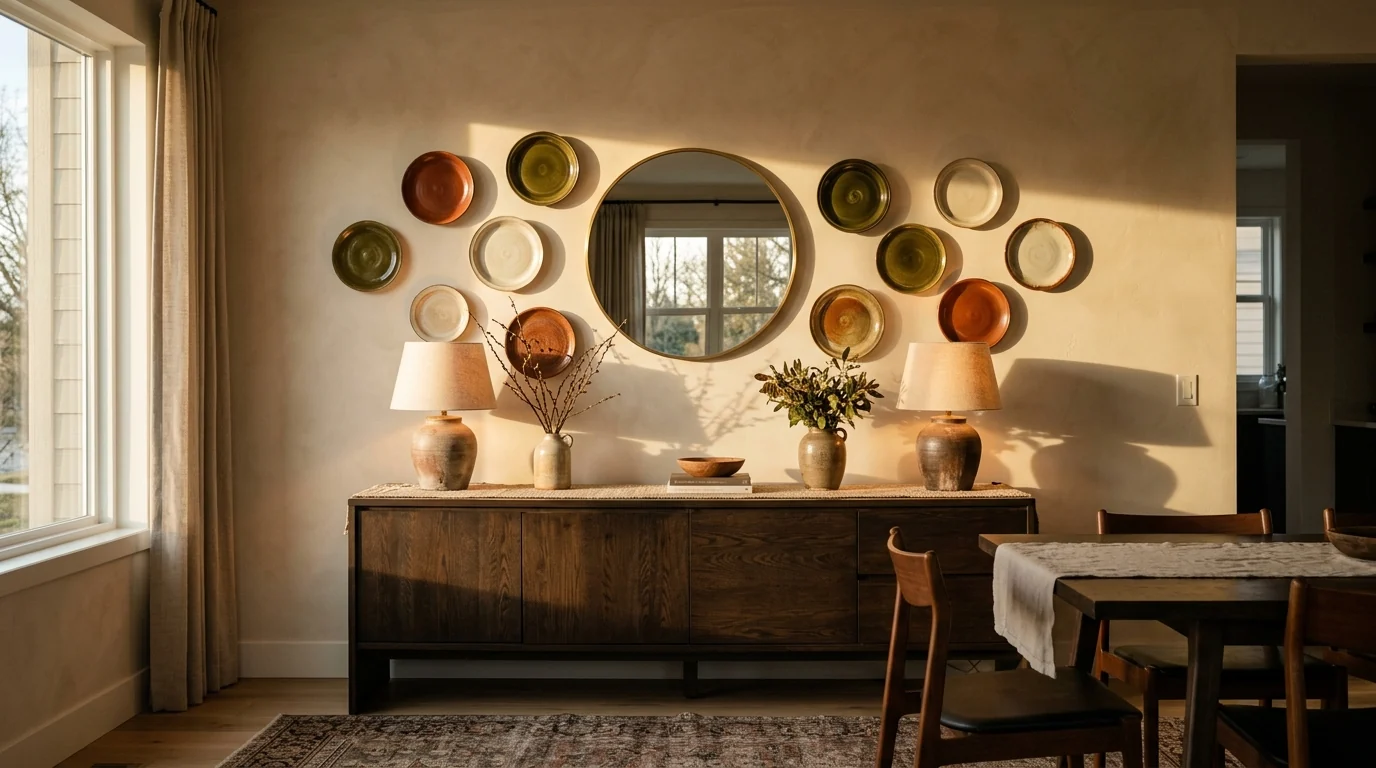
Loosely balanced, never mirrored. The credenza sets the width, the mirror keeps a breathing point.
8. Kitchen: The Plate Rack Revival
The most functional version and the one designers are quietly obsessed with: a full-width oak rack holding the plates you actually eat from, upright and face-out. The display changes every time you empty the dishwasher, which is exactly why it never goes stale. It suits kitchens that already lean craft, zellige, wood, open shelving, and it costs less than most art. Everyday stoneware in two or three glazes looks better here than fine china.
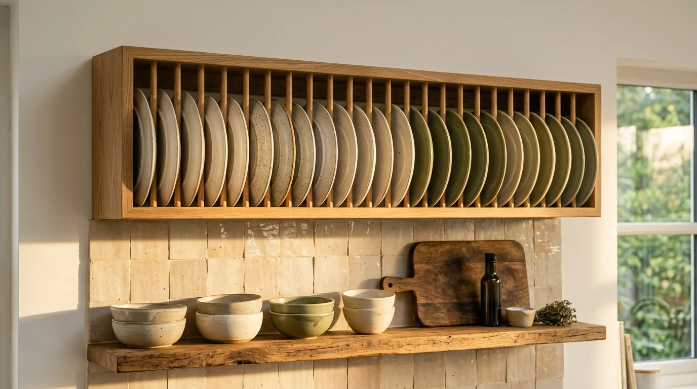
The working plate wall. If you eat from it, it never becomes set dressing.
9. Bedroom: The Arch Above the Headboard
A soft arc of small plates echoing the curve of an upholstered headboard is the gentlest idea in this guide, and one of the few wall treatments that makes a bedroom calmer instead of busier. Stay small, saucers and salad plates, stay pale, and keep the arc shallow. Because you face away from it while sleeping, it follows the same logic as a headboard accent wall: drama on entry, silence at night.
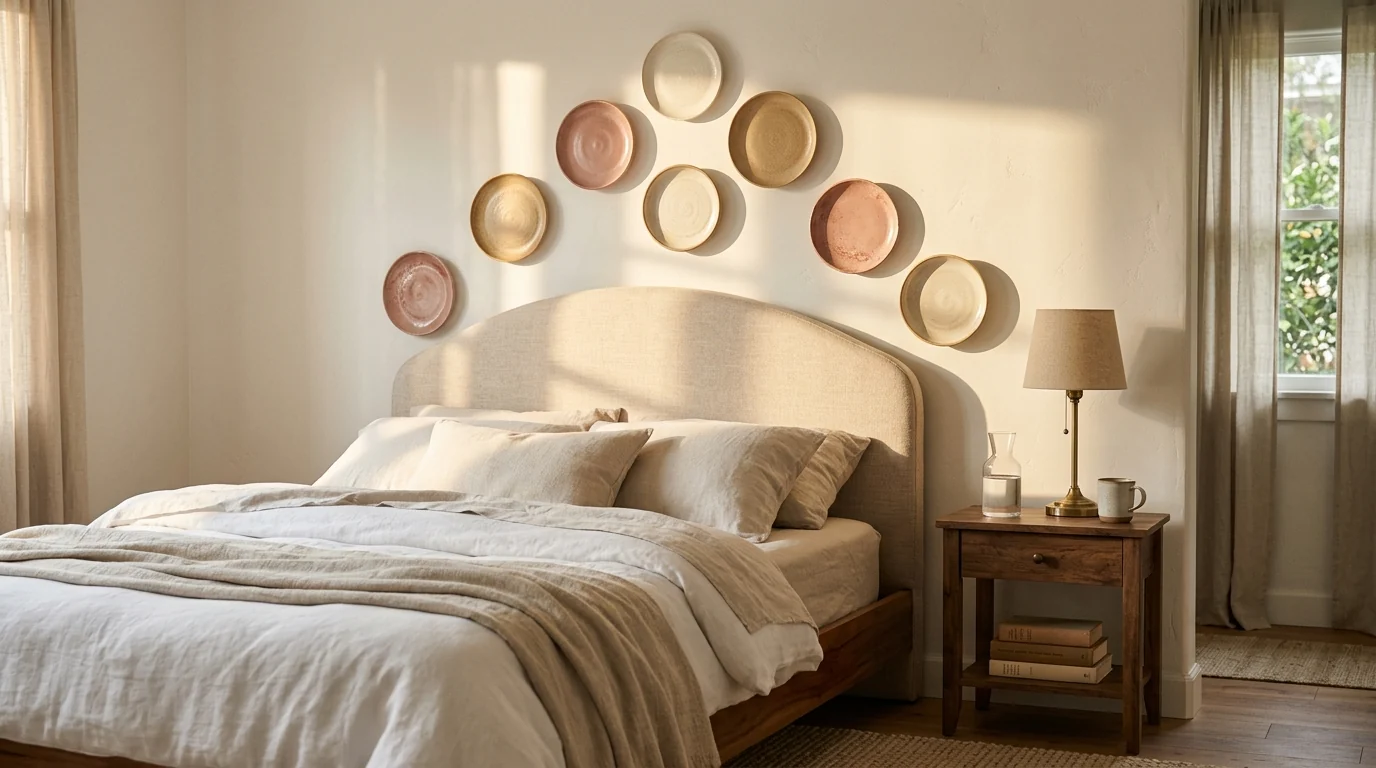
Nine saucers in a shallow arc, echoing the headboard curve. Quiet enough to sleep under.
10. Hallway: The Small Wall Feature
Plate walls scale down better than almost any other treatment, which makes them perfect for the awkward sliver of wall above an entry console. Five to seven plates in a tight cluster give a corridor a moment of arrival without eating any floor space. Deep glazes, forest green, ink blue, hold their own in low hallway light better than pale ones.
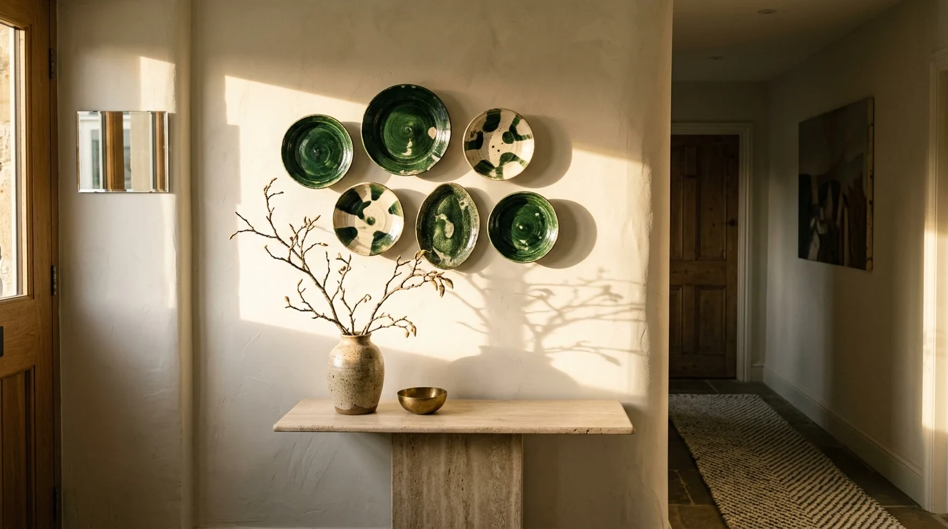
Six plates turn a leftover sliver of hallway into the reason the entry feels finished.
11. Around a Doorway
The boldest architectural move: plates climbing the door casing and arching over the top, turning circulation space into composition. It works because the doorway gives the arrangement a spine, rule four in action. Keep sizes small near the frame and let them grow toward the top of the arch. This is a committed look, so run it in a hallway or dining room rather than a minimalist living room.
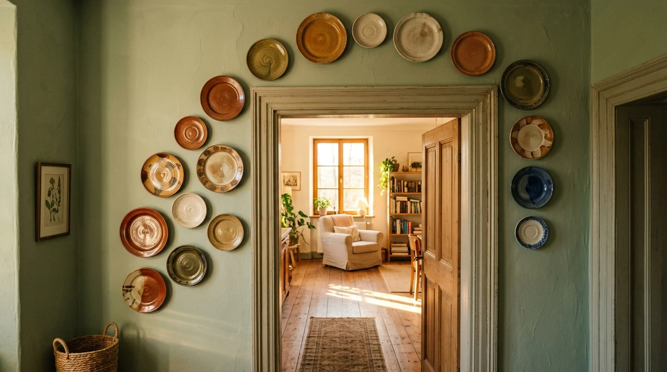
The doorway gives the plates a spine. Without the architecture this would be a swarm; with it, a frame.
12. Bathroom: Framing the Mirror
A handful of small plates around a bathroom mirror is the lowest-stakes entry point to the whole trend. Powder rooms especially can absorb personality that would overwhelm larger rooms. Use glazed ceramic only, humidity is unkind to unglazed bisque and to anything with metallic decal trim, and keep at least a hand’s width of clearance from splash zones. The mirror in the middle deserves the same attention as the plates around it; our bathroom mirror ideas guide covers that half of the wall.
Where the Good Plates Come From
13. Thrift Stores and Estate Sales
The best plate walls are mostly secondhand, and not only for the price. Older plates carry hand-painting, uneven glaze, and maker’s marks that new mass production cannot fake. Pick plates up: real hand-painting shows brush texture, decals feel dead flat. Weight is information, and a heavy plate with a hand-finished foot ring is usually the better object. Expect to pay a few dollars per plate and check the back for hairline cracks before buying.
14. Contemporary Ceramicists
Two or three pieces from living makers, via Etsy, a local studio, or a ceramics fair, are what pull a vintage-heavy wall into the present. This is where the sculptural anchors come from: the oversized platter, the relief-textured charger, the plate with an irregular rim. One handmade piece per five thrifted ones is enough to shift the whole wall from flea market to collection.
15. The Cabinet You Already Own
Inherited china that never leaves the cupboard, the plates from a trip, the odd survivors of a broken set. Promoting them to the wall costs nothing and gives the arrangement the one quality no store can sell: plates that mean something to you specifically. If a plate makes you tell a story when someone asks about it, it belongs on the wall.
How to Hang Plates on a Wall (Hardware, Spacing, Height)
Three pieces of hardware cover every situation, and the right one depends on plate weight and whether you can drill.
The numbers that matter: keep 2 to 3 inches between rims, center the whole composition at eye level, roughly 57 to 60 inches from the floor to the arrangement’s midpoint, and when hanging above furniture, start the lowest plate 8 to 10 inches above the surface. Weigh any plate over 2 kg and match the hanger and wall anchor to it; a plaster wall and a heavy charger need a proper anchor, not a nail.
Watch: A Real Plate Wall Go Up From Scratch
Hardware descriptions only get you so far, so here is the whole process on a real wall. In this February 2026 makeover, creator Nidhi Gill takes a blank dining room wall from textured base coat to a finished salon-style arrangement, and shows how the hangers go onto different plate materials, bone china, wood and metal, without damaging any of them. Notice how closely her finished wall follows the rules above: one warm palette, wildly mixed patterns, varied sizes, even gaps.
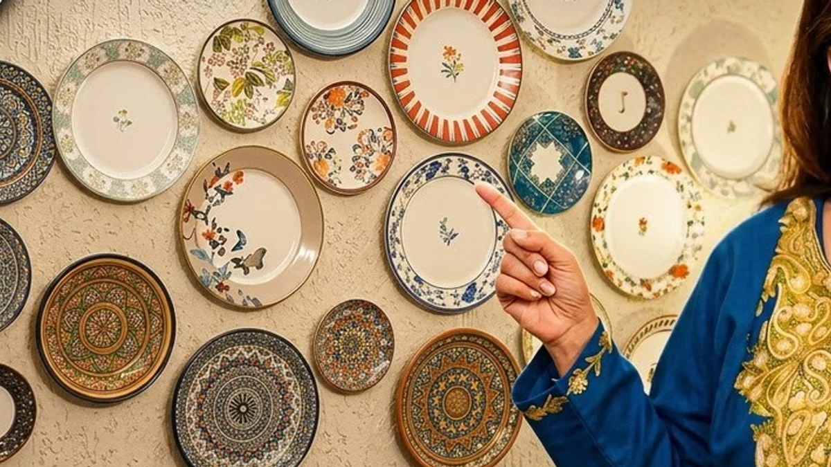
Nidhi Gill’s from-scratch dining room plate wall: textured base, mixed hand-painted plates, one warm color thread.
What Makes a Plate Wall Look Like a Farmhouse Airbnb
Every dated plate wall makes the same handful of mistakes, and they are all visible in one glance:
- A matching mass-produced set hung as bought. The wall reads as one purchase, not a collection.
- A rigid symmetric grid of same-size plates. No anchor, no hierarchy, pure catalog.
- Word art within sight. Any sign about gathering, blessing, or living-laughing instantly recodes the plates as theme decor.
- Shiplap and galvanized props around it. The 2015 farmhouse frame drags the whole wall back a decade.
- Plates too small, spread too thin across a big wall, so the arrangement reads as leftovers rather than a statement.
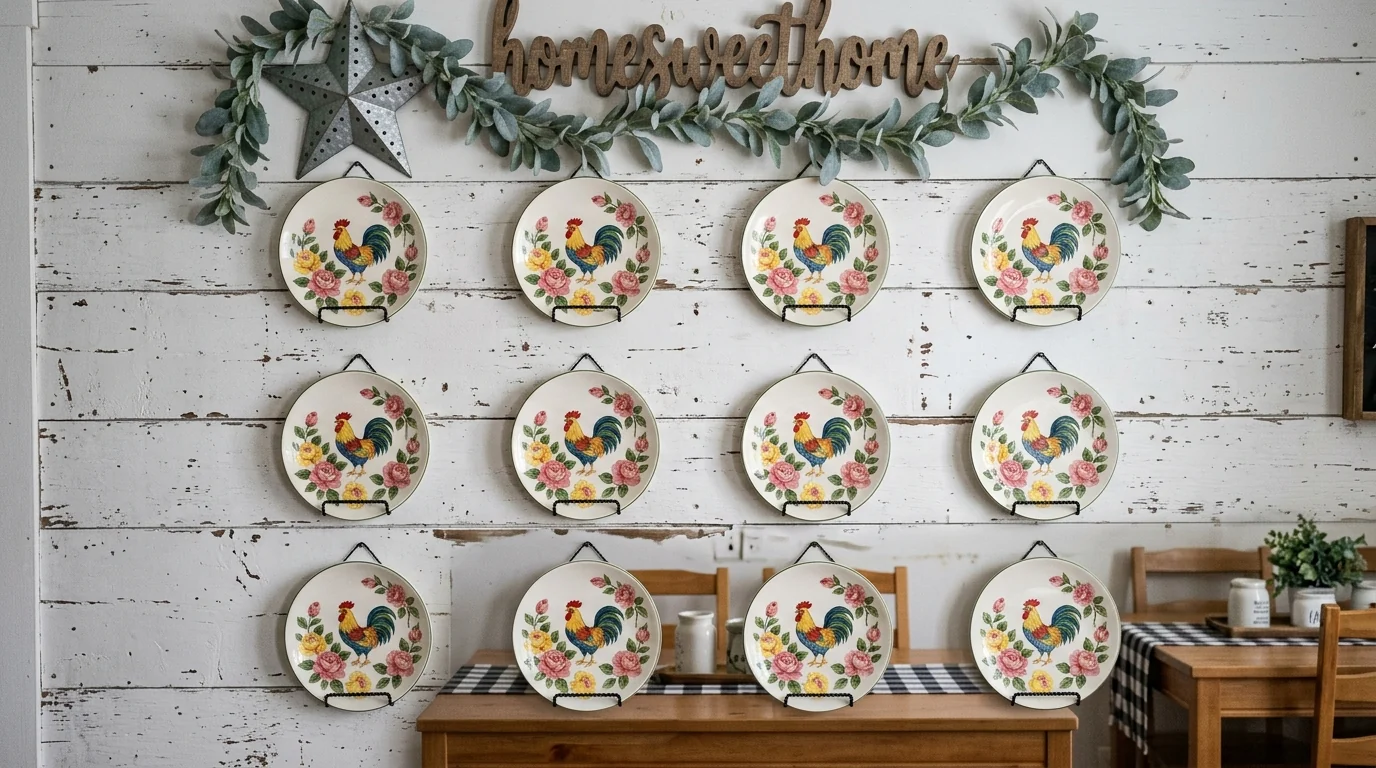
The version to avoid: matching grid, shiplap, word sign, faux garland. One purchase pretending to be a collection.
Compare it with the cover image at the top of this guide. Same idea, plates on a wall, and the entire difference is curation: varied sizes, one palette, organic layout, and not a single prop telling you how to feel about it.
Preview Your Plate Wall Before You Drill
A plate wall is one of the hardest treatments to judge from imagination: the same fifteen plates can look perfect or chaotic depending on your wall color, furniture, and light. And unlike paint, every wrong guess is a hole. If the wall color itself is the open question, settle it first with the wall paint visualizer, then hang the plates against the winner.
The faster route: upload a photo of your room to MeltFlex and describe the wall you want, something like “salon-style plate wall of cream, sage and terracotta ceramic plates above the sideboard, one large anchor platter.” You get a photorealistic preview on your actual wall, with your real credenza, your wall color, and your light, in about 20 seconds. Generate the salon cluster, the minimalist trio, and the color-thread version side by side, pick the one that stops you, and only then reach for the drill.
Plate Wall FAQ
Are plate walls in style in 2026?
Yes, plate walls are one of the stronger wall decor comebacks of 2026, but the version that is back looks nothing like the farmhouse grids of matching plates from a decade ago. The 2026 plate wall is a curated, collected-over-time arrangement: mixed eras, mixed sizes, handmade ceramics, and one color thread holding it together. Rigid grids of identical mass-produced plates, rooster motifs, and shiplap backdrops are the versions that still read as dated.
How do you hang plates on a wall?
The cleanest method is an adhesive disc hanger: a coated disc you moisten and press onto the back of the plate, which leaves the front completely free of visible hardware. Spring-style wire hangers are cheaper and stronger for heavy plates but show small metal claws at the rim. Wooden plate racks hold plates upright without any per-plate hardware. For renters, pair disc hangers with removable adhesive strips so nothing touches the wall but a sticker.
How far apart should plates be hung on a wall?
Keep 2 to 3 inches, roughly 5 to 8 centimeters, between plate rims. Closer than 2 inches and the arrangement looks crowded and the plates risk clinking; wider than about 4 inches and the group stops reading as one composition. For salon-style clusters, keep the spacing consistent even when the layout is irregular, the even gaps are what make an organic arrangement look intentional instead of random.
How do you arrange a plate wall before hanging it?
Lay the plates on the floor on a sheet of kraft paper cut to the size of your wall area, and move them around until the composition works. Then trace each plate, mark the hook point of each hanger on the tracing, tape the whole sheet to the wall, and drill or stick straight through the marks. You get a perfect transfer of the layout with zero test holes. Start from the largest anchor plate near the center and work outward.
Can I do a plate wall in a rental apartment?
Yes, and it is one of the most rental-friendly wall treatments there is. Use adhesive disc hangers on the plates and mount them with removable adhesive strips rated for the plate weight, so the wall never gets a hole. Lightweight ceramic and melamine plates work best for this. A freestanding or picture-ledge plate rack is another zero-damage option. When you move out, everything comes down in minutes and the collection moves with you.
What kind of plates look best on a plate wall?
Mix at least three sizes, from small saucers to one oversized platter, and favor plates with real surface interest: hand-painted patterns, reactive glazes, relief texture, or an irregular handmade rim. Thrifted and vintage plates add age and story, contemporary handmade ceramics add weight and texture, and one or two plates you already own add meaning. What to avoid is a boxed matching set, because identical plates are what push a wall from collected to catalog.
How many plates do you need for a plate wall?
A small feature works from as few as 3 large plates, a typical arrangement above a credenza or headboard uses 7 to 12, and a full statement wall can run 15 to 25. Odd numbers are easier to balance than even ones. It is better to start with fewer plates spaced correctly and let the wall grow over time than to pad the composition with filler plates that share nothing with the rest.
How can I see a plate wall in my room before hanging it?
Upload a photo of your room to MeltFlex AI and describe the plate wall you want, for example a salon-style arrangement of cream and terracotta ceramic plates above the sideboard. The AI generates a photorealistic preview on your actual wall, with your real furniture, colors, and lighting, so you can judge scale and palette before you put a single hole in the wall. Testing three arrangements takes about a minute.
Ready to see it on your wall? Upload your room photo to MeltFlex and compare three plate wall arrangements on your actual wall before touching a drill. For the rest of the wall, our guides to accent wall ideas, feature walls, mirror wall ideas, 2026 wallpaper trends, and statement ceilings cover every other surface, and the room by room design guides picks up where the credenza wall leaves off.