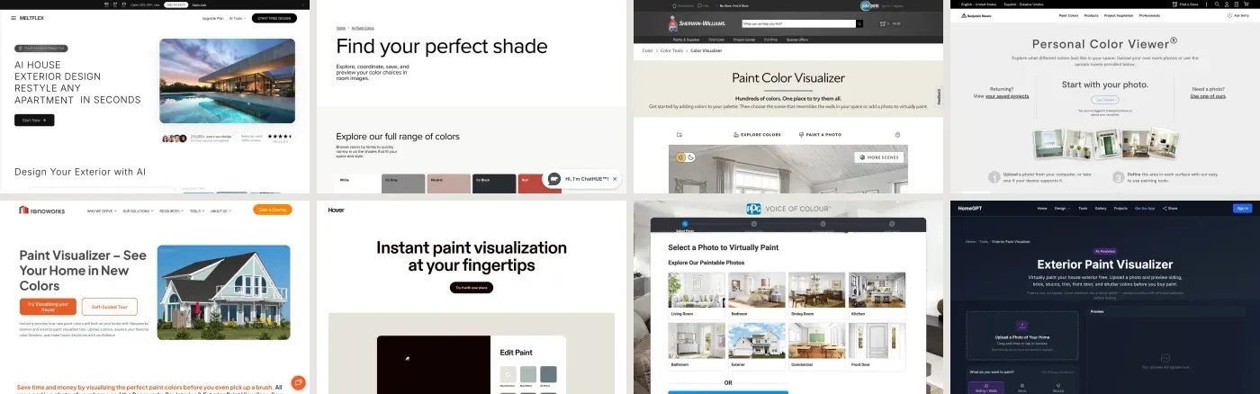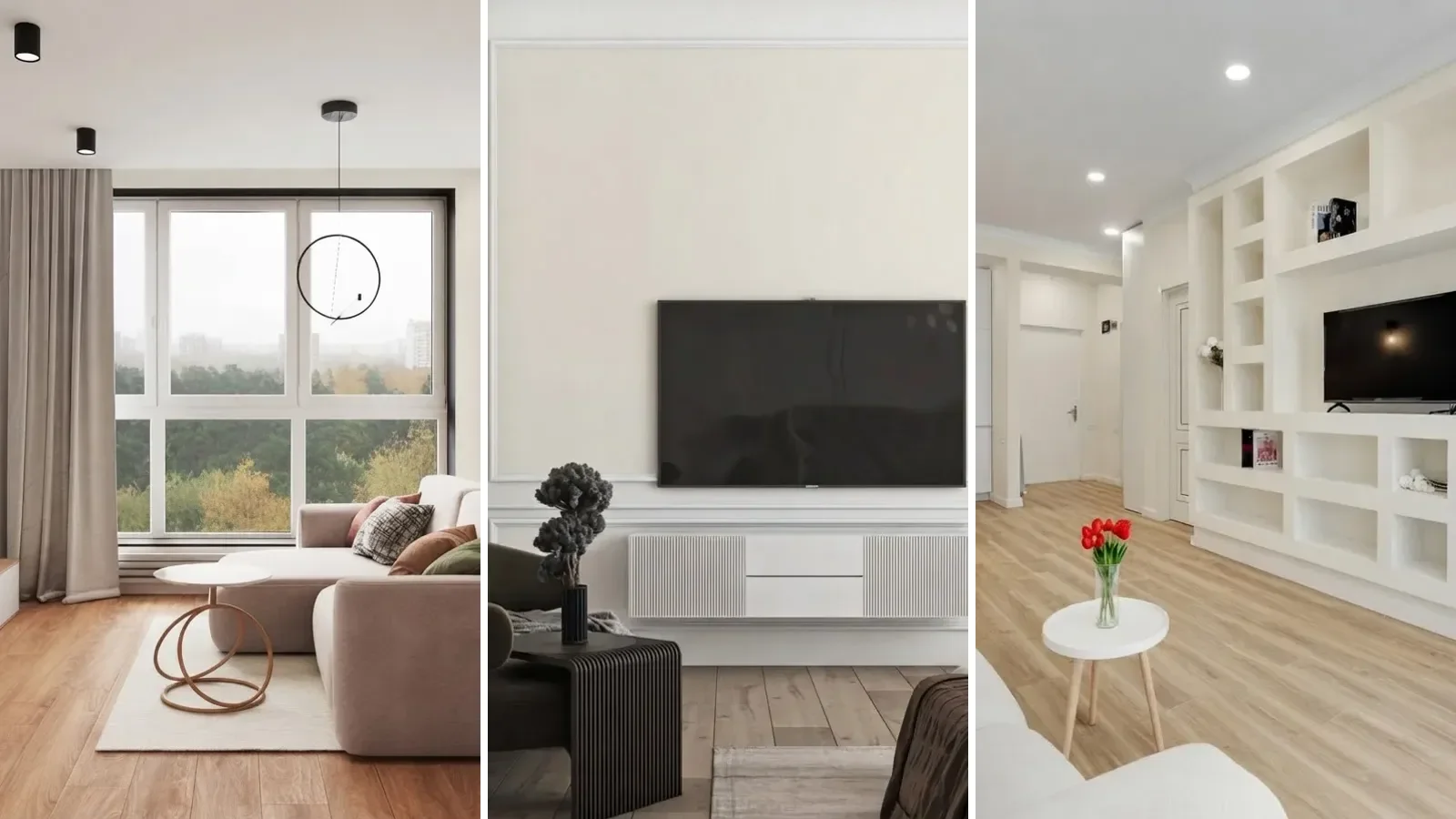
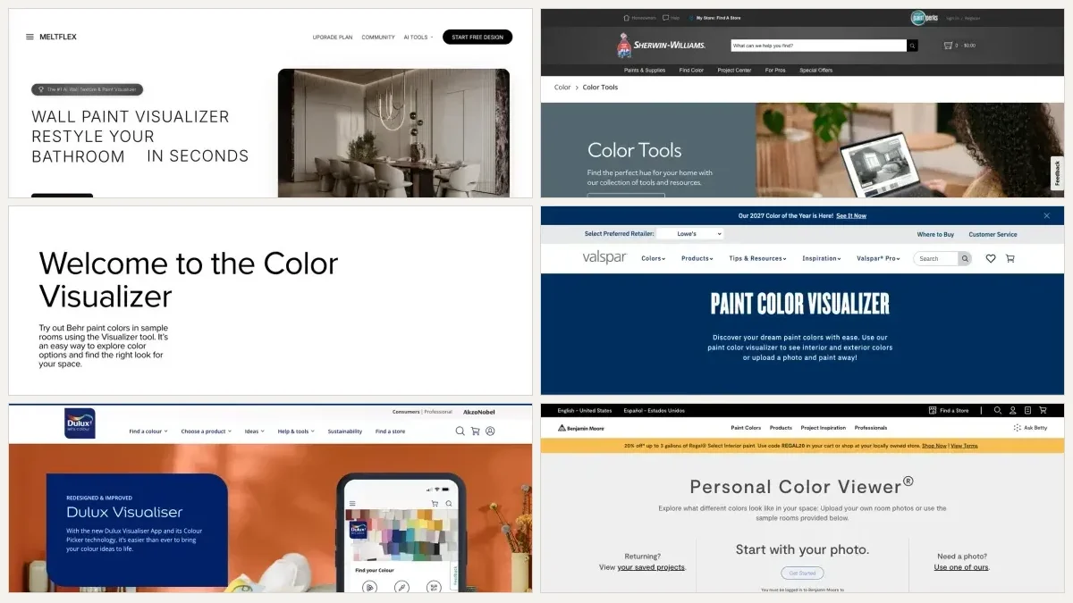
We ranked seven paint color visualizers by running the same living room through each of them. The short answer: the AI render tools win on realism because they keep the shadows, Sherwin-Williams ColorSnap is the best of the free brand tools, Behr is close behind with an annoying upload gate, and Benjamin Moore has the best flow hidden behind a login. Every one of them is free, so the real question is not price, it is which one shows you something true about your room.
Our articles are still written by humans!
Get human written articles in your Google feed.
The short version
- Best overall: a render tool. It repaints your photo and relights it, which is the only way a dark color looks dark in the corner and bright by the window.
- Best free brand tool: ColorSnap Visualizer for Web. Your photo, no account, about 1,700 colors, and Sherwin-Williams is honest that you are painting by hand.
- Skip if you are in a hurry: Benjamin Moore. It wants you logged in before it will look at your room.
- Nothing on a screen replaces a sample. Shortlist to three, then spend 4 dollars on a peel and stick square.
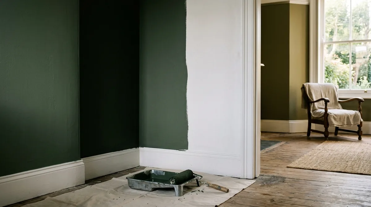
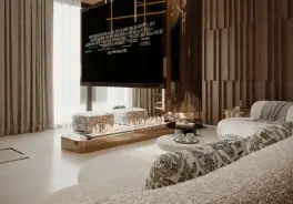
The same green on one wall, near black in the corner and bright olive by the window. This is the thing a flat color fill cannot show you. Render made for this guide with the Gemini image model.
FreeUpload photo · freeRepaint my walls for freeUpload a photo and MeltFlex changes the wall colour or finish, with the furniture and layout untouched. Your first AI design is free, no card needed.

How We Scored Them
Five criteria, 2 points each, 10 possible. No user review averages, because paint visualizer app store ratings are dominated by people rating the paint brand rather than the tool.
Disclosure, because it matters in a ranking: MeltFlex is our own product and it sits at number one. The criteria above were written before the scoring and every one of them is checkable on the tools themselves. Where our tool loses, and it loses on two of the five, that is in its entry too. If you want the brands ranked without us in the list at all, the honest reading is that ColorSnap wins the free tier.
The Ranking at a Glance
The scores cluster tightly for a reason. Six of these seven do the same thing, which is put a flat color on a surface you point at, and they differ mainly in how much they make you do first. The gap at the top is a difference of kind, not degree.
1. MeltFlex Wall Paint Visualizer
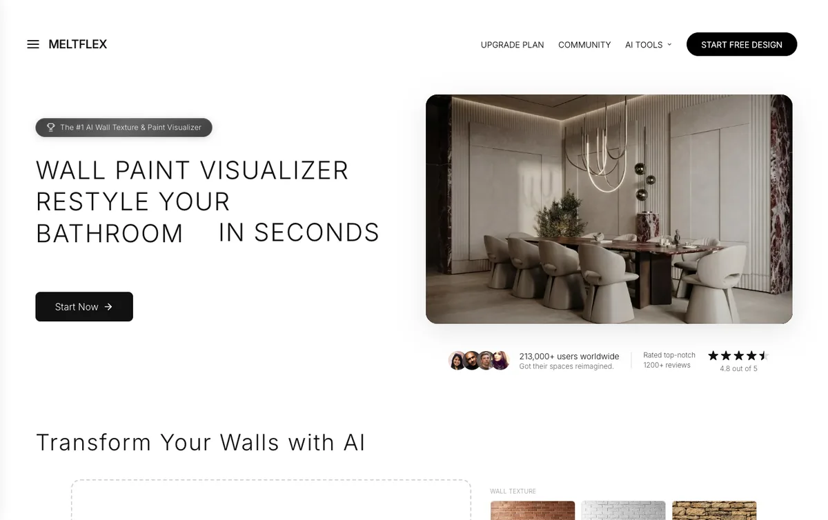
Screenshot taken 8 September 2026. Our own tool, listed first and disclosed as such.
Price: free tier with 15 credits and 3 projects, paid plans from 19 euro a month. Score: 9/10.
You upload one photo, pick a color from a wheel or paste a hex, and the room comes back repainted rather than masked. The difference shows up in the corner of the room: the color goes heavy where the light does not reach and lifts where the window hits, because the whole frame is re rendered. Textures run through the same box, so limewash, microcement, panelling and brick are alternatives to flat paint rather than a separate tool.
Where it loses. Two of the five criteria. It cannot give you a paint code, because an image model is not color managed and will not reproduce a specific Behr or Farrow and Ball color accurately, and we have the numbers on that further down this page. And the free tier is metered, where every brand tool here is unlimited and free forever. If your shortlist is four off whites, this is the wrong instrument.
Try it on the wall paint visualizer, or run the whole room in the workspace.
2. Sherwin-Williams ColorSnap Visualizer for Web
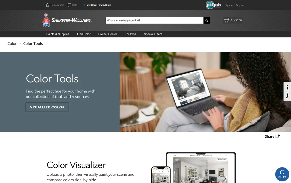
Sherwin-Williams color tools page, screenshot taken 8 September 2026.
Price: free, no account. Score: 7/10.
The best of the free brand tools, and the most honest about what it is. Sherwin-Williams describes it as upload a photo or choose one of ours, then drag and drop a color or use the brush to virtually paint your scene. That word brush is the whole product: you are masking by hand across roughly 1,700 colors, and the result is as good as your mouse work around the sofa and the skirting board. No sign up, works in a browser, and the phone app adds a camera color match that reads a color off a cushion and finds the nearest chip.
Where it loses. Flat fill. The masked wall comes back without the gradient near the window and without the shadow under the shelf, so dark colors look flatter and cheaper than they will be in the room. And it is Sherwin-Williams colors only, which is fine until you want to compare one against a Benjamin Moore shade.
3. Behr Paint Your Place
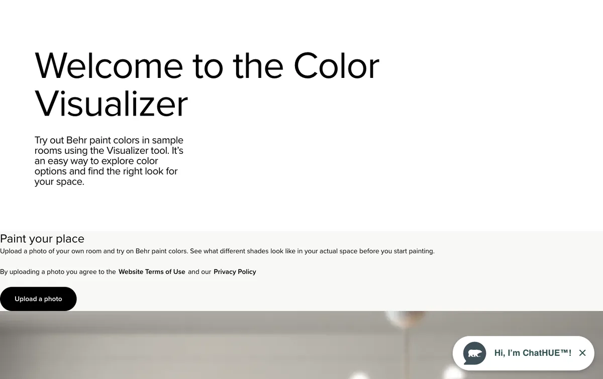
Behr runs two tools on one page. Screenshot taken 8 September 2026.
Price: free, no account. Score: 6/10.
Behr puts two different products on the same page and the difference matters. The Color Visualizer is nine sample rooms, from bathroom to entry, and it is a browsing toy. Paint Your Place is the one that takes your photo. It refused our first upload with the message that the image was too small and that it wants a source of at least 1050 by 1200 pixels, then made us crop to landscape or portrait before it would go any further. Once you are in, colors come from a Behr family picker: whites, grays, neutrals, blacks, reds, oranges, yellows, greens, blues, purples.
Where it loses. That upload gate is the worst first five minutes in this group, and a phone photo that has been through a messaging app will often fail it. Same flat fill limitation as ColorSnap, and Behr colors only.
4. Valspar Color Visualizer
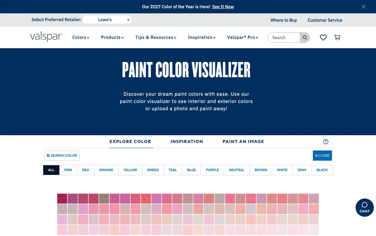
Valspar splits browsing and painting into tabs. Screenshot taken 8 September 2026.
Price: free. Score: 6/10.
Valspar’s tool is the fastest of the brand set for browsing, because the whole palette is on screen as a grid you can scan in one go rather than a family picker you drill into. Its own description is that you can see interior and exterior colors or upload a photo and paint away, and the page splits that into explore, inspiration and paint an image. If you are shopping Valspar at Lowe’s, this is the least annoying way to narrow a palette.
Where it loses. Valspar colors only, flat fill, and the painting half is buried behind a tab most people never press. We read and captured the tool but did not run a full upload through it, so treat the upload experience here as unverified rather than endorsed.
5. Dulux Visualizer
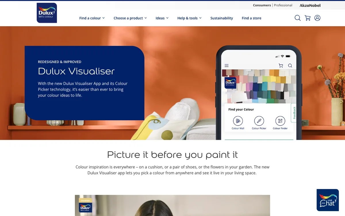
Dulux Visualizer is a phone app built around live camera painting. Screenshot taken 8 September 2026.
Price: free app, iOS and Android. Score: 5/10.
The fastest way to kill a color you were unsure about. You point the camera at the wall, tap, and the wall changes while you walk around it, which tells you in ten seconds what a static preview takes an evening to tell you. Dulux says the app needs the motion sensors in your phone for camera mode and falls back to a static Photo Visualizer on devices without them, and that the color picker matches a color you photograph against more than 1,200 Dulux colors.
Where it loses. AR is the worst format for comparing two colors, because you cannot hold both still beside each other, and you leave with nothing you can put in a message to somebody else. App only, Dulux colors only, and the regional versions differ. Described from Dulux’s own documentation plus the page above, not from a hands on test.
6. Home Depot Project Color
Price: free app. Score: 5/10.
The same AR idea with a better party trick: photograph a cushion, a flower or a tile and it finds the closest paint color Home Depot sells. Home Depot says the app paints around objects in the room and accounts for the lighting conditions, which is a stronger claim than the other AR tools make. There is no web version to show you here, and homedepot.com blocked our screenshot capture, so this entry is from the vendor’s published documentation only and it is the one tool in this ranking we could not put in front of our own eyes.
Where it loses. App only, Home Depot brands only, and the same problem as every AR tool: nothing to compare side by side afterwards.
7. Benjamin Moore Personal Color Viewer
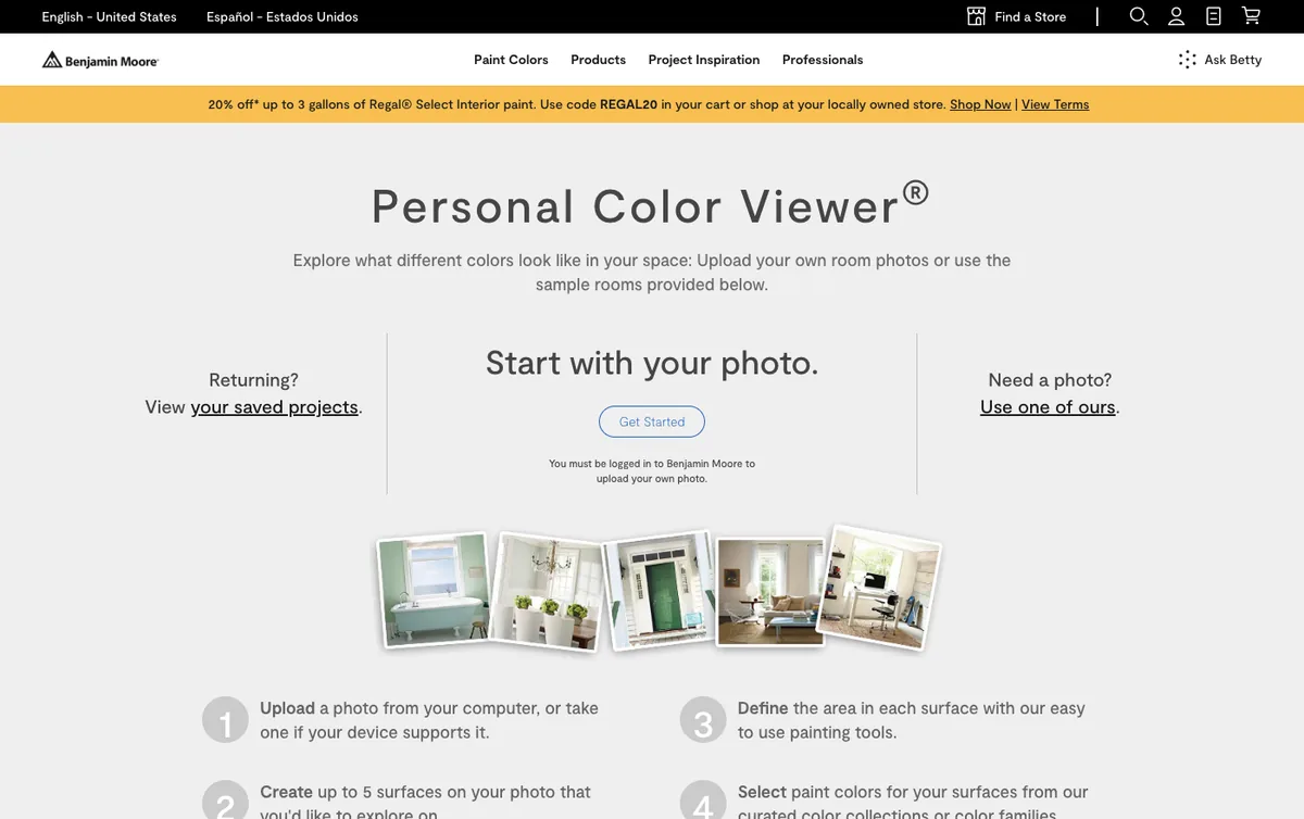
The line under the button is the whole problem. Screenshot taken 8 September 2026.
Price: free, but an account is required to use your own room. Score: 4/10.
Last place on friction, not on quality. Personal Color Viewer states plainly that you must be logged in to Benjamin Moore to upload your own photo, and that is where our test stopped, because we do not create accounts to review a free tool. Its published flow is good: upload, create up to five surfaces, define each area with the painting tools, then choose colors. Five surfaces is generous for this category, and the sample rooms are open to everybody without signing in.
Where it loses. The sign in wall in front of the only feature that matters, plus flat fill and Benjamin Moore colors only. If you have already decided on the brand, none of that will stop you. If you are still comparing brands, you will bounce.
Outside the United States there is a second hurdle: benjaminmoore.com pushed us toward a distributor listing page before it would show the tool at all.
The Same Room in Six Colors
This is the test that separates the categories, and it is the reason the ranking looks the way it does. One base photo of an ordinary living room, six wall colors, everything else held: the same sofa, the same table, the same rug, the same window, the same camera position, the same daylight from the left.
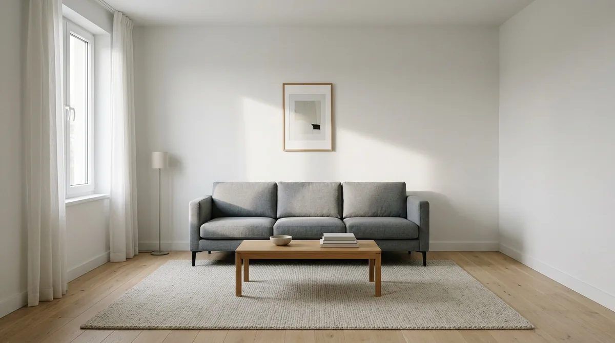
The base room every color below is painted onto. White walls, one window on the left, nothing clever.
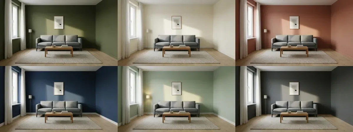
One room, six colors, generated for this guide. Deep olive, warm off white, clay terracotta, navy, soft sage, charcoal.
Three things in that grid are worth more than any color chart. The dark colors eat the corner and leave the window wall bright, so the room reads smaller and deeper. The warm off white barely changes the room at all, which is the honest answer to why people repaint a white room white and feel cheated. And the clay and the navy both shift the grey sofa: same fabric, different color temperature around it, and it looks like a different sofa.
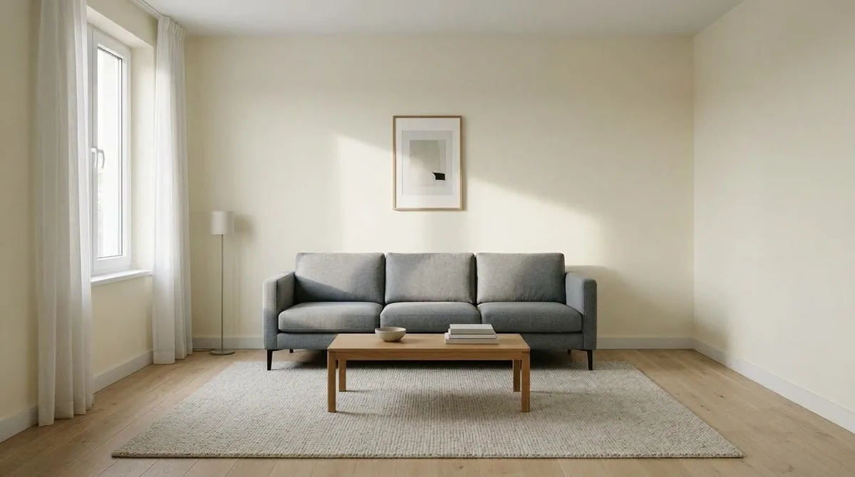
Warm off white. Put this beside the base photo above and the difference is a few percent of warmth, which is exactly why white on white repaints disappoint people.
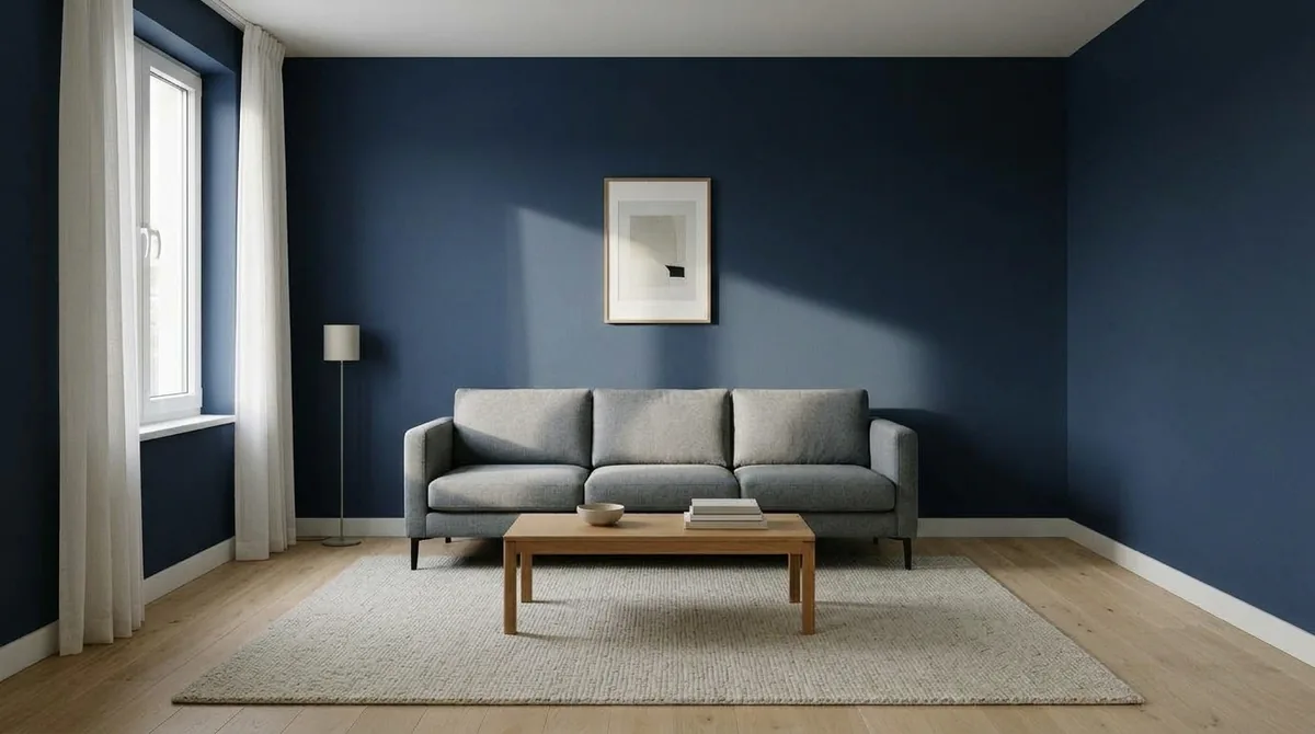
Navy. The sofa has not changed, only what is behind it.
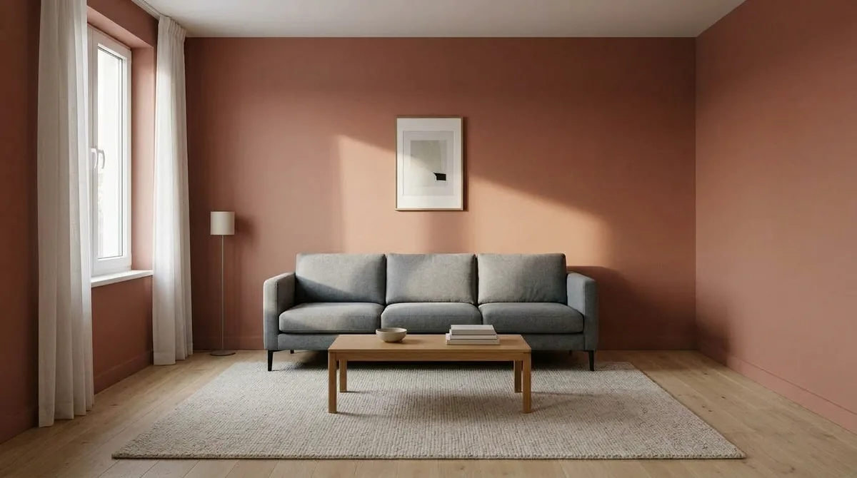
The same room and the same sofa in clay. This is the comparison a swatch cannot make.
If the colour you want to test lives in a photo rather than on a chip, the free paint color finder reads it off the picture, names the closest Sherwin-Williams, Benjamin Moore, Behr, Farrow & Ball or Dulux paint, and hands it to the visualizer preselected.
For colors by name rather than by family, our reviews of Agreeable Gray and Sherwin-Williams Alabaster go into how each behaves in real light, and the color drenching guide covers what happens when the same color goes on the trim and ceiling too.
Where Every Visualizer Lies to You
This is the section the ranked listicles leave out, and the failures apply to the tool at number one as much as to the ones below it.
A flat fill is not a painted wall
When a tool fills the wall with flat color, the shadow under the shelf and the gradient near the window go with it. Below on the left is the room with a flat chip of the paint sitting in it, which is roughly what a masked preview gives you. On the right is the same color value, sampled from the render itself, actually on the wall. The wall version reads lighter in the band of window light and considerably heavier in the corner.
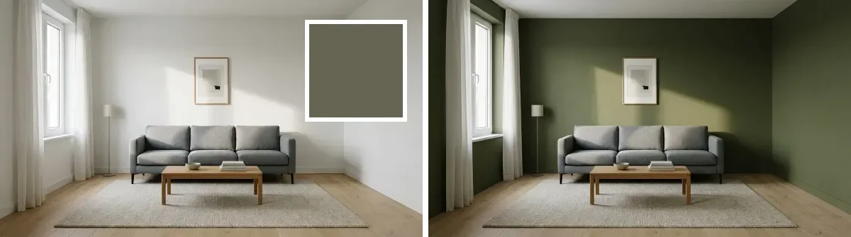
Left: the color as a flat chip. Right: the same color value rendered on the wall. Both made from the same base photo for this guide.
Your screen is not a wall
No visualizer knows your monitor, your phone brightness or which way your window faces. A north facing room in January and a south facing room in July do different things to the same paint, and no tool in this ranking asks about either. Every result you see is a shortlist, not a match. Our how to choose a paint color without regret answer covers the light checks worth doing before you commit.
Brand tools only show one brand
Obvious when you say it, easy to forget at 11pm. If you have a Farrow and Ball color in your head and you are inside the Behr tool, you are not comparing those two colors, you are comparing a memory to a screen. That single limitation is why six of the seven tools here score the way they do, and it is the reason third party tools exist at all.
AI renders drift, and we measured how much
Render tools solve the shadow problem and introduce a different one. For our AI paint color prompts guide we repainted one bedroom photo six times and sampled the same rectangle of wall in every result. Asking for the color by name drifted up to 17.6 CIEDE2000 between runs of the same prompt. Pinning an exact hex cut that to 2.2, but it did not land any closer to the color we asked for: both versions missed by roughly the same margin. Image models are not color managed. They will give you the same answer twice, and it will not be the color on the tin. That is the single strongest argument for the brand tools, and it is why our own entry does not score 10.
The second failure is smaller and more annoying. A repaint is supposed to change the wall and nothing else, and it never quite holds. Below is the framed print from our base photo next to the same print after a sage repaint: the mat proportions moved, the mark inside the frame shifted, and the frame itself warmed up. Nothing about that instruction asked for a new picture.
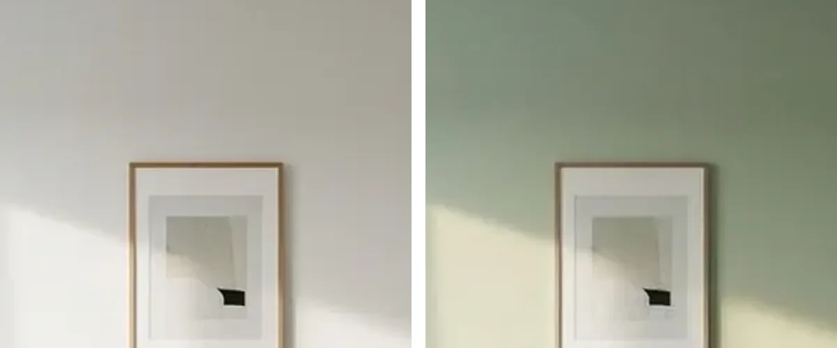
Left, the base photo. Right, the same frame after a sage wall repaint. The wall was the only thing we asked to change.
There is a third limit worth knowing before you waste an evening: pale colors barely survive a repaint. We tried to render Agreeable Gray, LRV 60, against white trim and it came back essentially white, twice. If your shortlist is four off whites, a render tool is the wrong instrument and a peel and stick sample is the right one.
Which One Should You Use
Then stop trusting the screen. Sherwin-Williams sells 8 by 8 inch peel and stick samples at 3.95 dollars and a quart sized Color to Go sample at 9.59 dollars covering roughly 75 square feet, and will post up to ten small color chips free. Put the three finalists on the wall you actually care about, not on a piece of card on the table, and look at them in the morning, in the afternoon and under your lamps at night. A color that survives all three is the color.
For the AI startups rather than the paint brands, our best AI wall color tools roundup ranks seven of them, how to choose paint colors with AI covers the decision process, and if you would rather drive a general model yourself, the paint color prompt pack has the wording that holds a room still. For textured finishes rather than flat paint, limewash walls explains what changes when the surface stops being uniform, and what color furniture goes with grey walls handles the half of the problem that is not paint at all.
What the render approach looks like in motion
Screenshots only get you so far with this distinction, so here is the top ranked approach running. Fair warning: this is our own demo of our own tool, not an independent review, and it is here because it shows the mechanic the ranking turns on rather than because it is neutral.

MeltFlex restyling a room’s walls from one photo. Our own tool and our own video, shown for the mechanic, not as a review.
See the color on your wall, with the shadows still in it
- Your room, not a sample room. Upload one photo and the walls change while the furniture, window and camera angle stay where they are.
- Any color, not one brand’s range. Pick from the wheel or paste a hex, and compare six versions of the same wall side by side.
- Textures too. Limewash, microcement, panelling and brick run through the same tool when flat paint is not the answer.
- Free to try, no card. Start with the wall paint visualizer, or redesign the whole room in the workspace.
Notes on method
- Ranking published 8 September 2026. Tested first hand: Behr Paint Your Place, including the rejected upload and the 1050 by 1200 minimum, and the Behr color family picker. Sherwin-Williams, Benjamin Moore, Valspar and Dulux were opened and captured on the same day and their capabilities are quoted from their own current pages; our Benjamin Moore test stopped at the sign in gate because we did not create an account. Home Depot Project Color is described from the vendor’s documentation only, because it has no web tool and homedepot.com blocked our capture.
- Every screenshot on this page was taken on 8 September 2026 at 1400 pixels wide. Cookie banners were hidden with CSS rather than dismissed, so that no consent choice was made on anyone’s behalf.
- Scores are ours, from the five criteria published above, not an average of user reviews. MeltFlex is our own product, it is ranked first, and the two criteria it loses on are stated in its entry.
- Prices checked 8 September 2026. The brand tools are free. MeltFlex is a free tier of 15 credits and 3 projects, then plans from 19 euro a month, with regional pricing in some countries. Sample prices are Sherwin-Williams list prices in the United States: peel and stick 3.95 dollars, Color to Go quart 9.59 dollars covering about 75 square feet, up to ten color chips free.
- All eleven room images were generated for this guide with the Gemini image model, one base render plus six wall repaints run image to image from that same base so the room is identical in every panel. They illustrate how color behaves in light. They are not photographs of a real property, and no brand’s paint color is reproduced accurately by any image model.
Paint Color Visualizer FAQ
Which is the best paint color visualizer?
It depends on whether you want a paint code or a picture of your room. For a code, use the brand’s own tool: Sherwin-Williams ColorSnap Visualizer for Web is the best of the free ones, because it takes your photo without an account and covers about 1,700 colors. For a picture that actually looks like your room, use a render tool that repaints the photo and keeps the shadows, which is where we rank our own MeltFlex wall paint visualizer first and say so openly. Benjamin Moore comes last in this ranking only because it makes you sign in before it will look at your room.
What is a paint color visualizer?
A paint color visualizer is a tool that shows a paint color on a room before you buy the paint. There are three kinds and they are not interchangeable. Swatch viewers drop the color onto a stock photo of somebody else’s room. Mask tools let you brush or tap the color onto a photo of your room, which fills the area with flat color. Render tools repaint your photo and keep the shadows, the light falling across the wall and the way the color darkens in a corner. Only the third kind tells you how the color will behave in your room.
Which paint color visualizer lets you upload your own photo?
Behr Paint Your Place, Sherwin-Williams ColorSnap Visualizer for Web and Benjamin Moore Personal Color Viewer all accept a photo of your own room. Benjamin Moore requires you to be logged in before it will let you upload, the other two do not. Behr rejects small images and asks for a source of at least 1050 by 1200 pixels, then makes you crop to landscape or portrait before you can paint anything.
Are paint visualizers free?
The brand ones are free, because they exist to sell paint. Behr, Sherwin-Williams, Benjamin Moore, Home Depot, Dulux and Valspar all cost nothing to use, and the only price is that each one shows you its own color range and nobody else’s. AI render tools are the ones that usually meter you, with a free tier of a few images and a subscription after it. Ours starts free with 15 credits and moves to plans from 19 euro a month.
How accurate are paint color visualizers?
Treat every one of them as a shortlisting tool, not a color decision. Your screen is not color managed against a wall, the tool does not know which way your window faces, and mask based tools throw away the shadow that makes a color read darker in the corner than beside the window. We measured this on our own renders: asking an image model for a color by name drifted up to 17.6 CIEDE2000 between runs, and pinning an exact hex cut the drift to 2.2 without getting closer to the color we asked for.
Can I see Sherwin-Williams or Benjamin Moore colors on a photo of my own room?
Yes, with each brand’s own tool. ColorSnap Visualizer for Web takes your photo and gives you a brush to paint the walls by hand across roughly 1,700 Sherwin-Williams colors. Benjamin Moore Personal Color Viewer takes your photo after you sign in, then has you outline up to five surfaces before you can color them. Neither will show you the other brand’s colors, which is the main reason people end up in a third party tool.
What is the difference between an AR paint app and a photo visualizer?
An AR app such as Home Depot Project Color or Dulux Visualizer paints the wall live through your phone camera, so you can walk around the room and watch the color move with the light. It is the fastest way to reject a color. A photo visualizer works on one still frame, which is slower but gives you something you can save, compare side by side and send to somebody else. AR also needs the motion sensors in your phone, and Dulux falls back to a static photo mode on devices that do not have them.
Should I still buy paint samples if I use a visualizer?
Yes, and this is the part every ranking skips. Use the visualizer to get from thirty colors to three, then put the three on the actual wall. Sherwin-Williams sells 8 by 8 inch peel and stick samples at 3.95 dollars and a quart sized Color to Go sample at 9.59 dollars that covers about 75 square feet, and will send up to ten small color chips free. Look at them in the morning, in the afternoon and under your lamps at night before you commit.