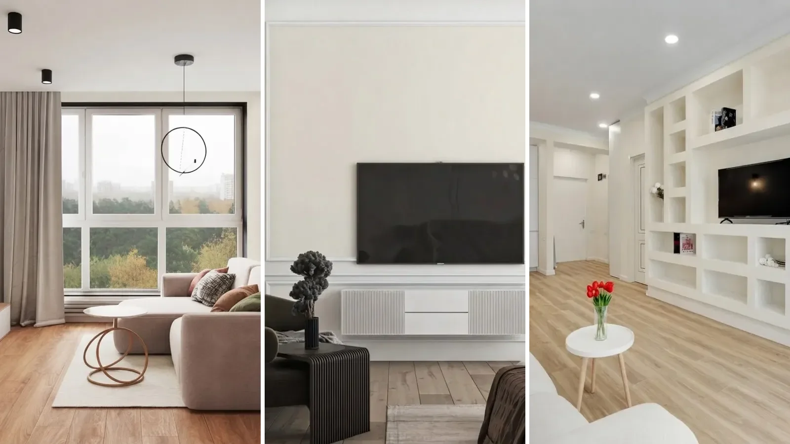
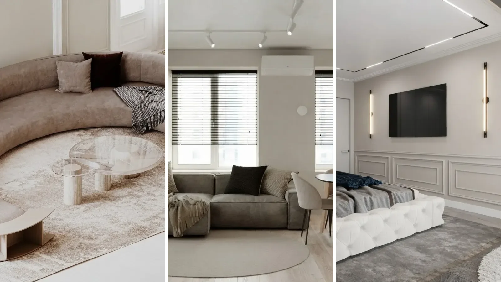
Agreeable Gray SW 7029 is a light warm greige from Sherwin-Williams with a Light Reflectance Value of 60, a hex of #D1CBC1, and a faint green undertone that keeps it from ever going blue. It reads as a soft gray in cool light and a soft beige in warm light, which is why it is still one of the most bought paint colours in America a decade after it launched. Every review of this colour shows it in one house, the author's, under one set of windows. We did the opposite. We took thirty rooms, held every one of them constant, and repainted only the walls to the exact hex, then re-lit the same room for north and south windows and repainted it again in Repose Gray, Accessible Beige and Alabaster. If you want to know what Agreeable Gray does, this is the page where the room does not change, only the paint.
Our articles are still written by humans!
Get human written articles in your Google feed.

What color is Agreeable Gray, exactly?
It is a greige: a gray with enough beige in it that it never reads cold, and enough gray that it never reads yellow. Sue Wadden, director of colour marketing at Sherwin-Williams, describes it precisely: it has some slight green undertones, but it is still warmer than most grays, as quoted in Setting For Four's undertone review. That green note is the part people miss. It is what stops the colour from tipping pink or purple the way many warm grays do, and it is also why it can look faintly khaki next to a very warm wood.
If you are trying to work out whether a room you photographed is Agreeable Gray or one of its neighbours, the paint color finder reads the wall colour off the photo and ranks Agreeable Gray, Repose Gray and Accessible Beige by how far they sit from it.

Left to right: Repose Gray SW 7015, Agreeable Gray SW 7029, Accessible Beige SW 7036, Worldly Gray SW 7043, Alabaster SW 7008, Pure White SW 7005. Rendered flat from the published hex values, so this is the chip, not the wall.
One number to hold onto: an LRV of 60 means the wall throws back sixty percent of the light that hits it. Pure White is 84. That 24 point gap is what you see as contrast between wall and trim, and it is why Agreeable Gray still looks like a colour in a white-trimmed room, where a paler greige at 70 or above starts to look like a slightly dirty white. Sherwin-Williams's own colour page for SW 7029 lists it among the top ten most popular colours that our customers have been loving recently, their wording, which for a colour launched in the early 2010s is unusual staying power.
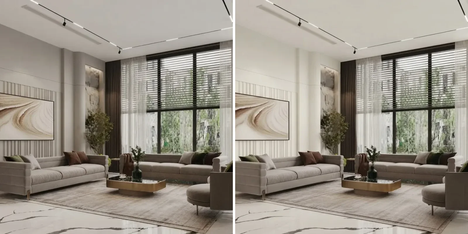
Before and after: builder white to Agreeable Gray
The most common starting point is not another colour, it is the cold flat white that new builds and rentals are handed over in. Both pairs below are the same room twice. The furniture, floor, light and camera do not move; only the walls change.
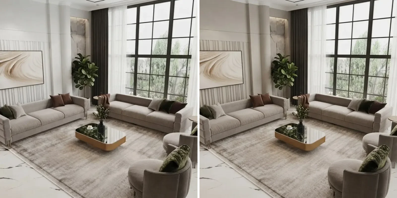
Left, builder white. Right, Agreeable Gray. The sofas did not change; the wall did, and the whole room warmed up with it. That is the effect people are buying.
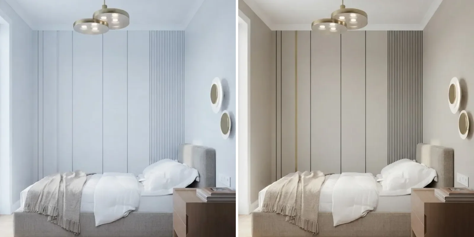
A north-facing bedroom. In the white version the panelling reads as cheap; in Agreeable Gray the shadow lines start doing their job.
Two things to notice. First, the greige does not darken the room in any way that matters; it removes glare. Second, the furniture looks more expensive against it. A grey sofa on a white wall is a grey shape. The same sofa on a greige wall is a textile. If you are choosing the colour to flatter what you already own, this is the argument, and it is the same one we made for furniture against grey walls.
Agreeable Gray in north light vs south light
Here is the same living room, same wall colour, re-lit twice. On the left, a north-facing window on an overcast day. On the right, a south-facing window mid morning. This single image answers most of the questions people ask about this colour.
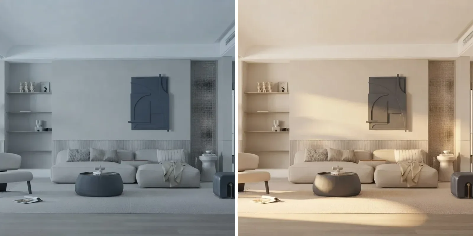
Identical paint. Left is what a north room does to it: a cool putty gray with the green note visible. Right is a south room: it goes beige and the gray almost disappears.
This is where the "does it look purple" and "does it look beige" complaints both come from, and both are true, in different rooms. The practical rule: in a north-facing room Agreeable Gray is a gray, so pair it with warm wood and warm textiles or it goes flat. In a south-facing room it is a beige, so you can afford cooler accents, a navy sofa, black frames, a Sea Salt bathroom off the hallway. If a room gets both, morning east light and afternoon west light, it will shift across the day, and that is normal. It is the reason interior designers sample paint on two walls and look at it three times, and the reason we built a visualizer that can re-light the room instead of waiting for the weather.
Agreeable Gray vs Repose Gray, Accessible Beige and Alabaster
The three comparisons people search most are Repose Gray, Accessible Beige and Alabaster. Below is one living room painted three times. Repose Gray on the left, Agreeable Gray in the middle, Accessible Beige on the right. Nothing else changed.
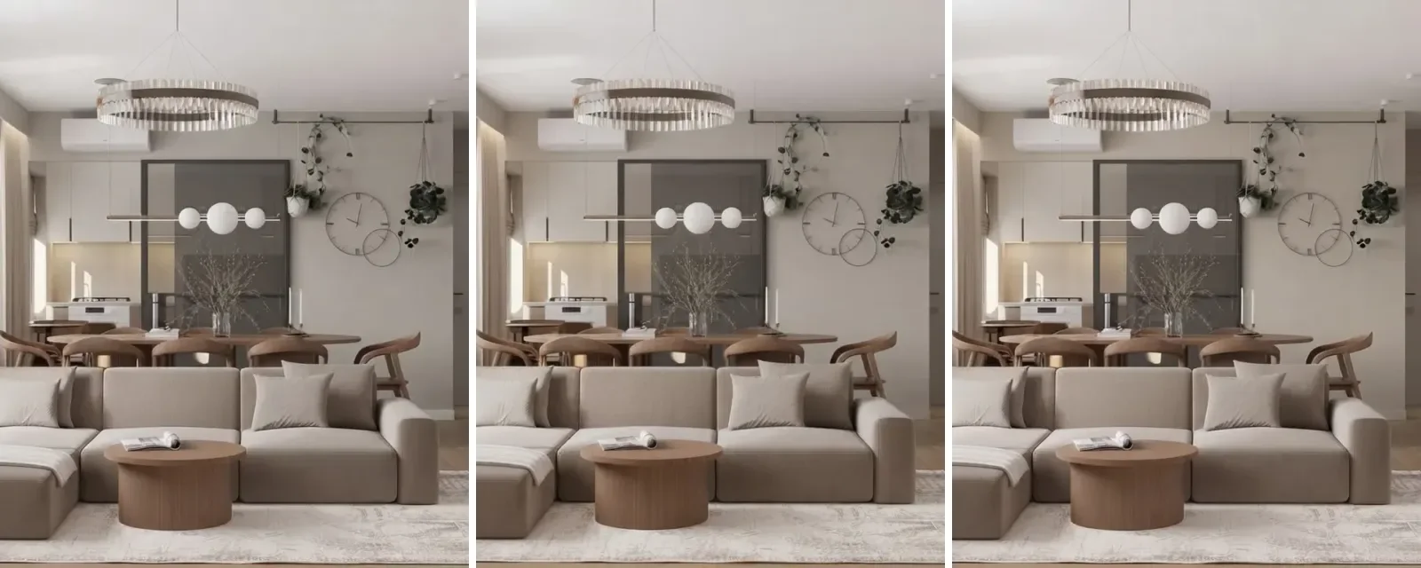
Left Repose Gray SW 7015, middle Agreeable Gray SW 7029, right Accessible Beige SW 7036. The differences are small on purpose: these are all LRV 58 to 60 neutrals. Repose carries a faint taupe chill, Accessible Beige is visibly sand, Agreeable sits between.
Agreeable Gray on the left, Alabaster on the right. This is not a like-for-like choice: Alabaster is a warm white at LRV 82. People compare them because they use both, Agreeable on the walls and Alabaster on trim, ceilings or the next room.
Two of the LRVs above, Repose Gray and Accessible Beige at 58, are the figures paint reviewers consistently report and match Sherwin-Williams chip data; Revere Pewter at 55 is Benjamin Moore's published value. Where we could not verify a number to the point we would paint a room on it, the table says lighter rather than inventing a figure. The wider family, greige versus a true warm white, is the same decision we walked through for exterior house colours, where light levels are higher and every colour reads a step paler.
Coordinating colors: trim, accents and wood
Agreeable Gray is easy to pair, which is most of why it sells, but easy is not the same as anything goes. The table is the short list we would actually specify.
The honey oak question comes up constantly, so the direct answer: it works, but it is not flattering. Orange wood plus green-toned greige gives you a slight olive cast on the wall. If the oak is staying, Accessible Beige or a warm white is the kinder choice; if the oak is being refinished lighter, Agreeable Gray is fine. The same logic runs the other way for soft furnishings: our guide to curtain colours for gray walls and the short answer on which sofa colour works with grey walls both apply here, with the caveat that Agreeable Gray tolerates warmer textiles than a true gray does.
Agreeable Gray room by room
Every room in this section is a real interior scheme re-rendered with the walls in Agreeable Gray. They come from a range of designers and a range of windows, which is the point: this is the colour across the conditions it will actually meet, not in one flattering house.
Living rooms
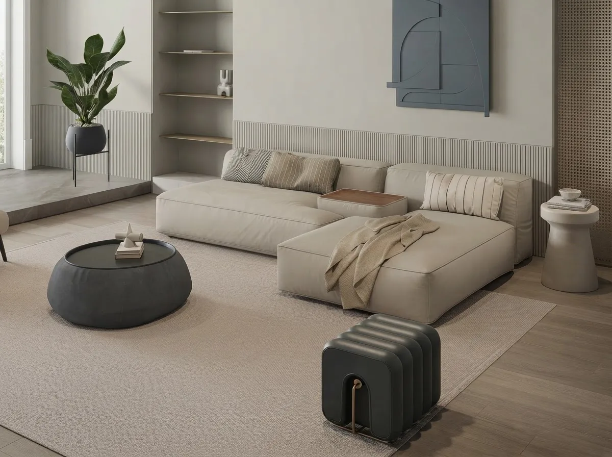
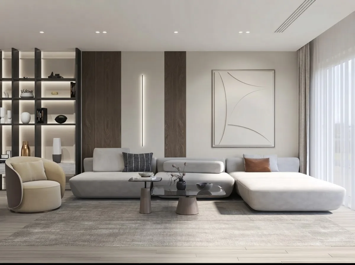
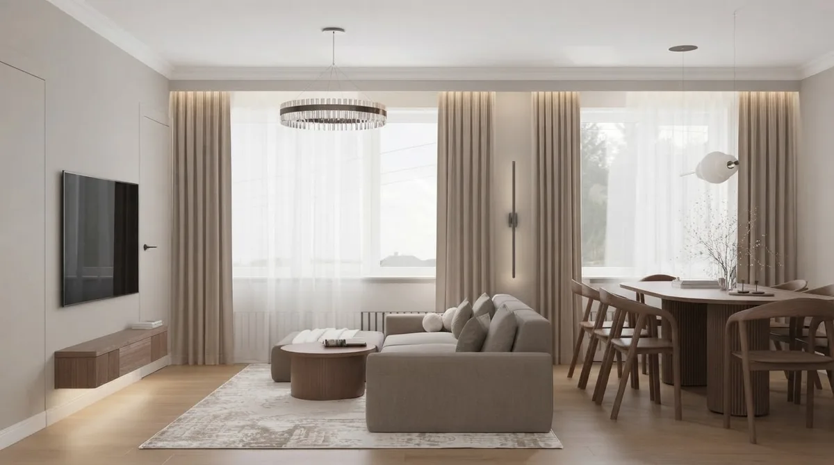
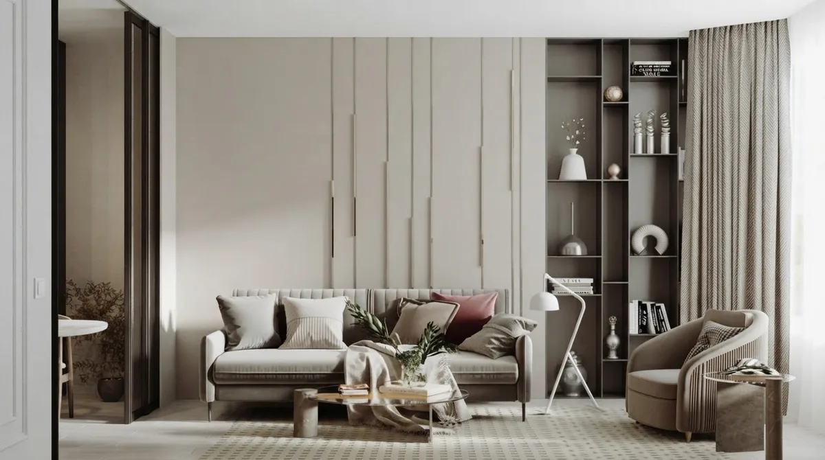
Four living rooms, four kinds of light. Top left is the north-facing one, and it is the grayest of the four; the open plan bottom left has south light and reads almost cream. Same paint.
Living rooms are where Agreeable Gray earns its reputation, and where the gray-on-gray trap lives. The rooms above work because each has a warm element doing the heavy lifting: walnut, a cream sofa, a brass fixture. Take those out and put a gray sofa on a gray rug and you have the 2015 look people are asking about when they search whether the colour is outdated. If the room is a blank, our living room layout guide is the other half of the job.
Bedrooms
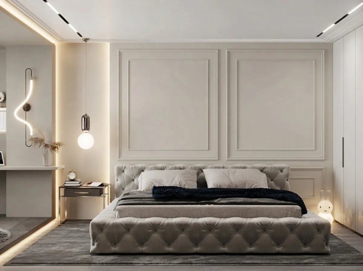
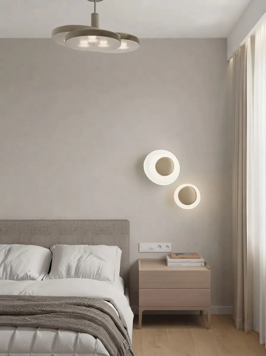
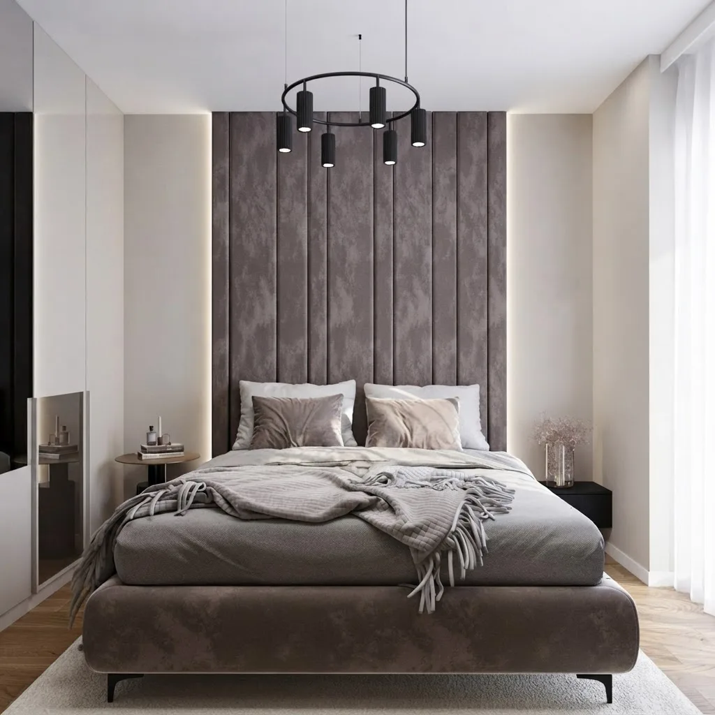
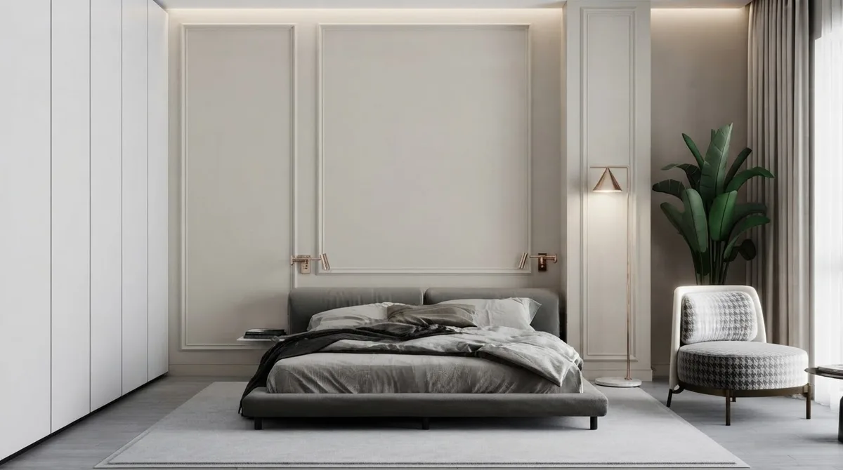
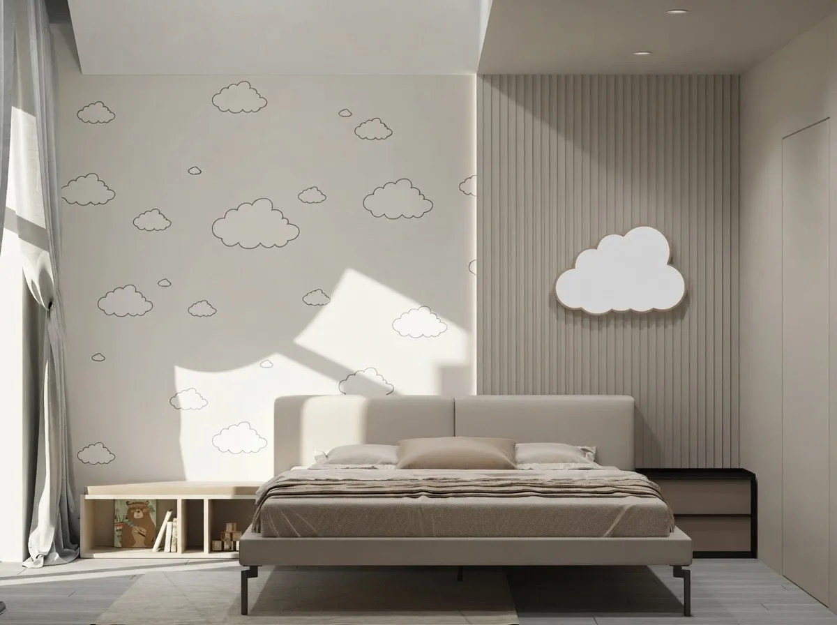
Bedrooms are the easiest room for this colour. Low light, soft textiles and a single warm metal are all it needs.
In a bedroom the LRV of 60 is an advantage in the other direction: the room reads calm at night under lamps without going cave-dark the way a true mid gray does. If the bed sits against the window wall, the colour helps there too, softening the contrast that makes a bed in front of a window look accidental.
Kitchens and dining rooms
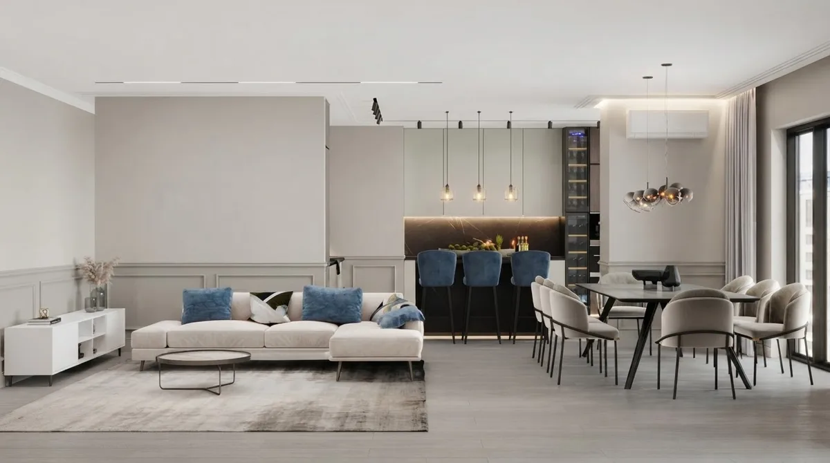
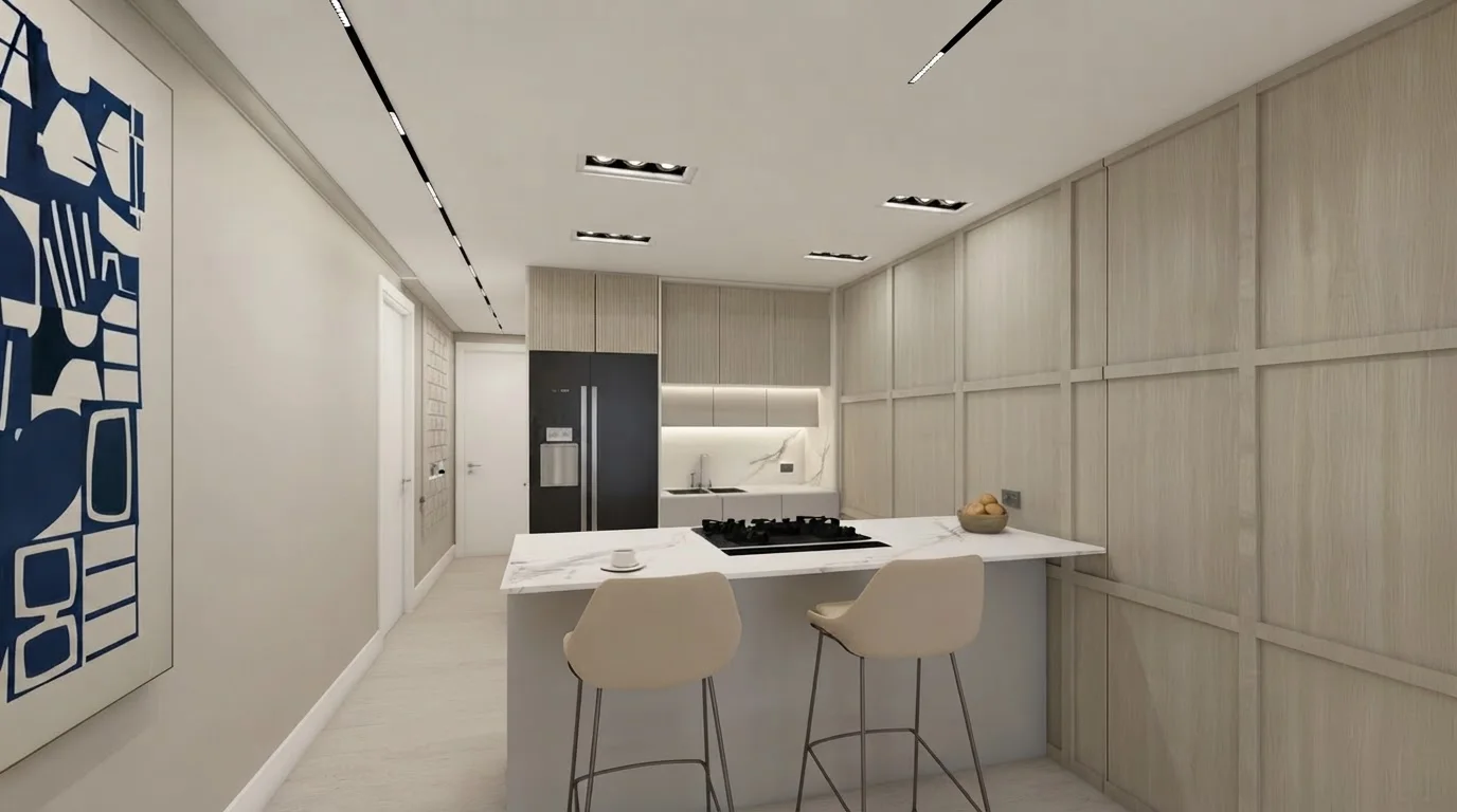
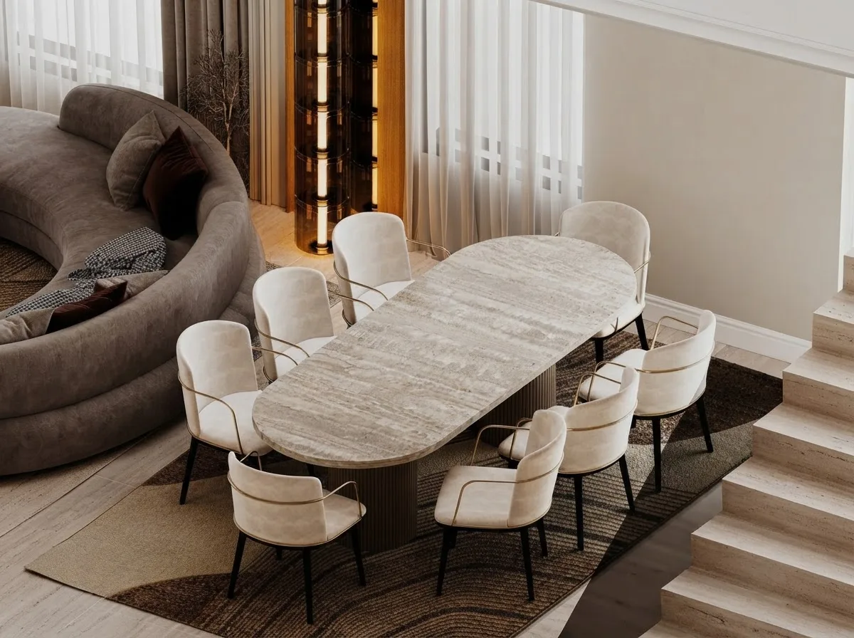
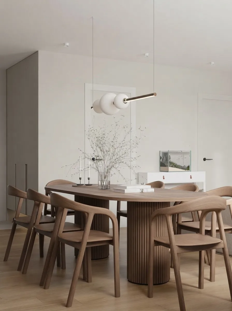
With white cabinets the wall becomes the colour in the room. With pale wood cabinets it recedes and the wood leads.
Hallways, bathroom and home office
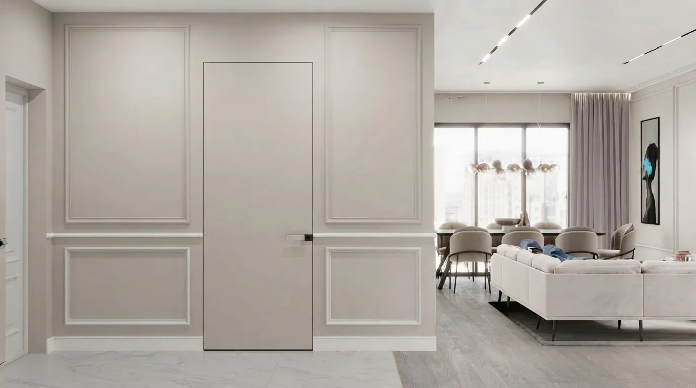
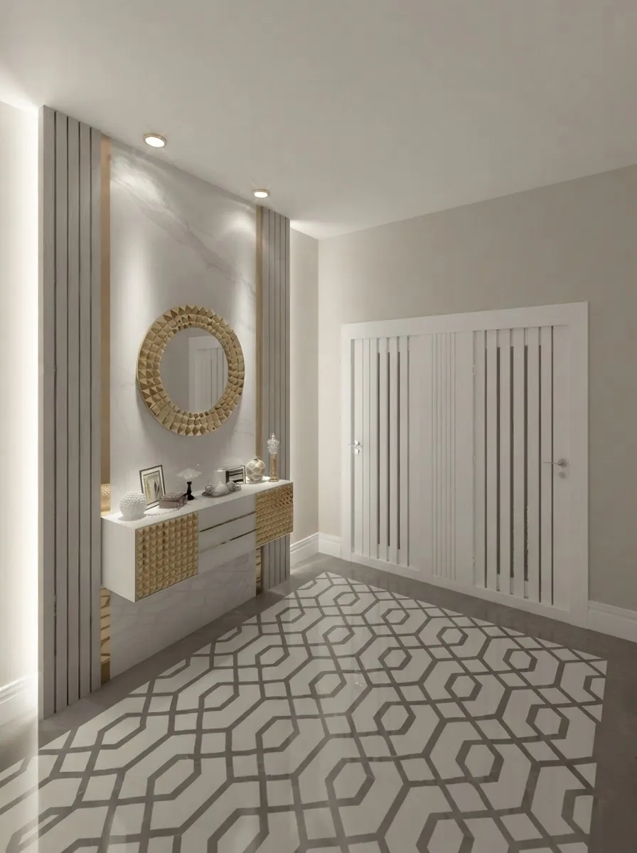
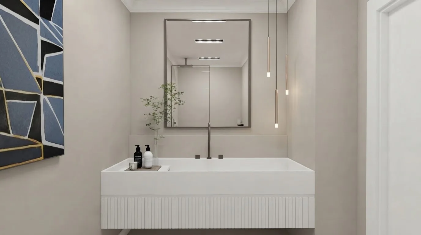
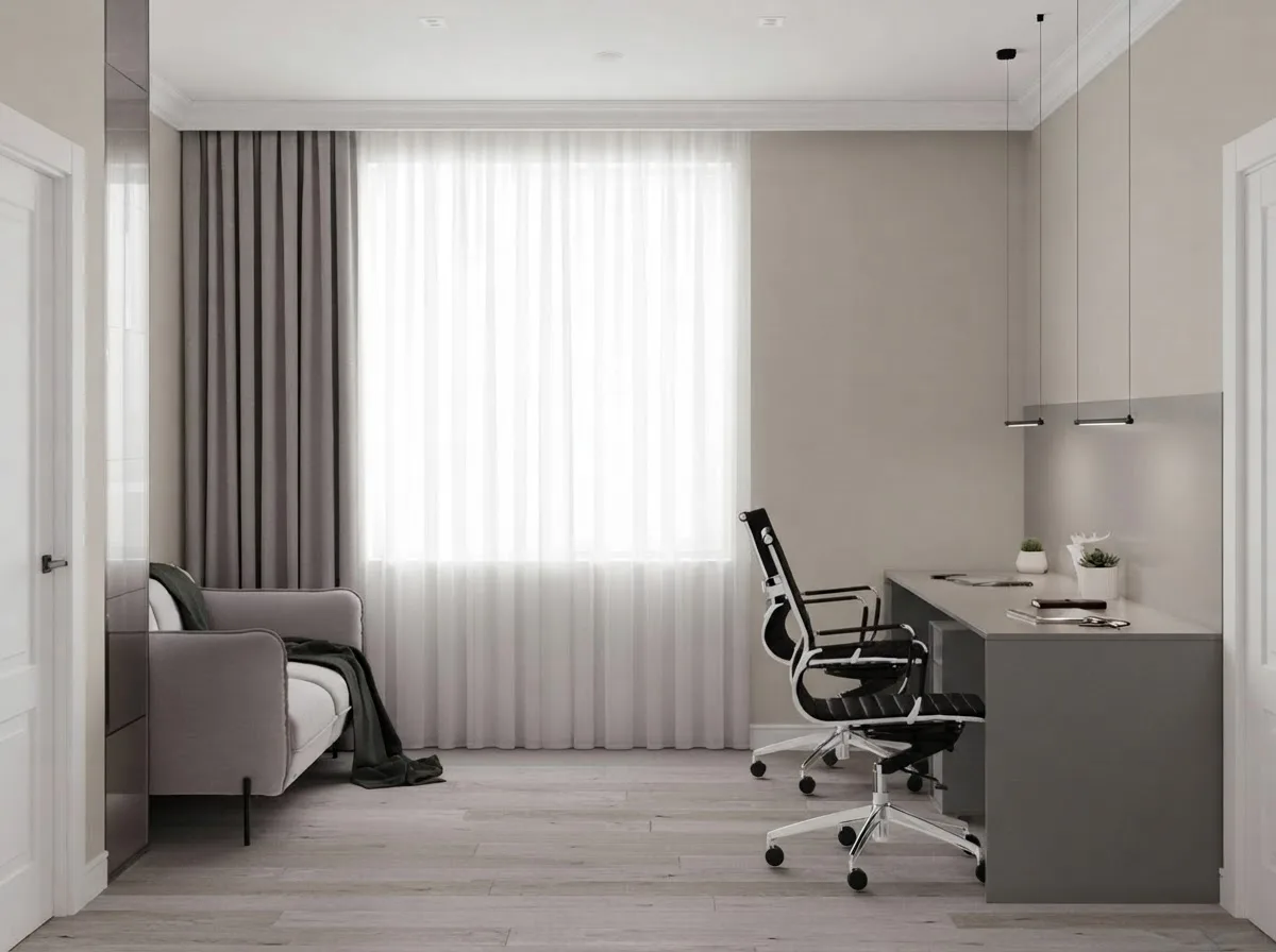
Hallways are where a whole-house greige pays off: no colour change at every door. The bathroom is the one room where we would test Sea Salt against it before committing.
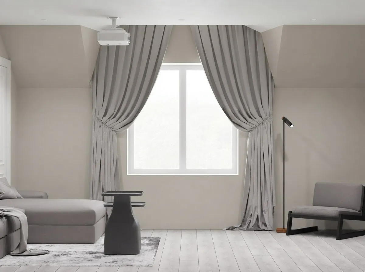
Two attic rooms, because sloped ceilings are where people worry a mid-light colour will close in. At LRV 60 it does not; a true gray at 45 would.
Agreeable Gray kitchen cabinets
The second most searched use of this colour after walls is cabinetry, and it is a different colour on a door than on a wall. Doors are vertical, in shadow under the counter and usually satin or semi-gloss, so the same paint reads a shade darker and more gray. That works in its favour: on cabinets Agreeable Gray lands as a genuine light gray rather than an off-white, which is what most people who want gray cabinets are actually after.
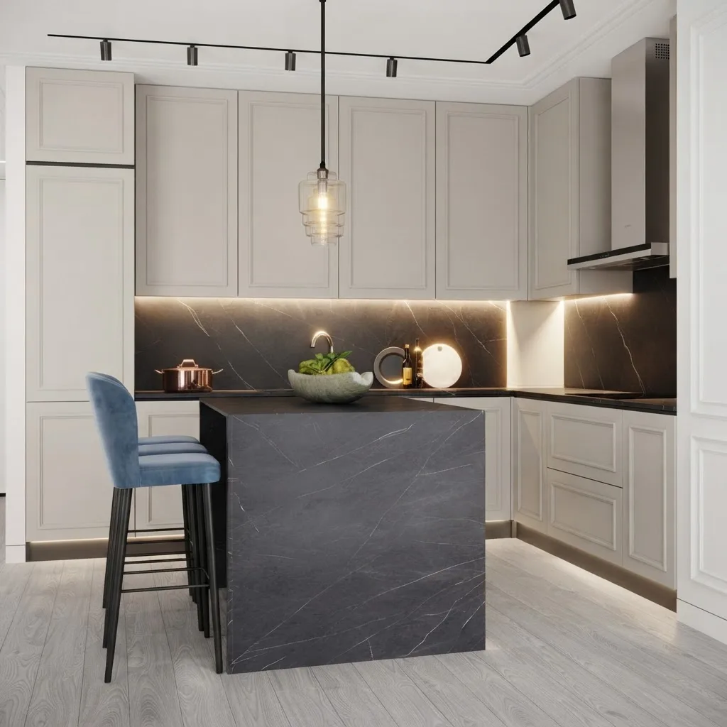
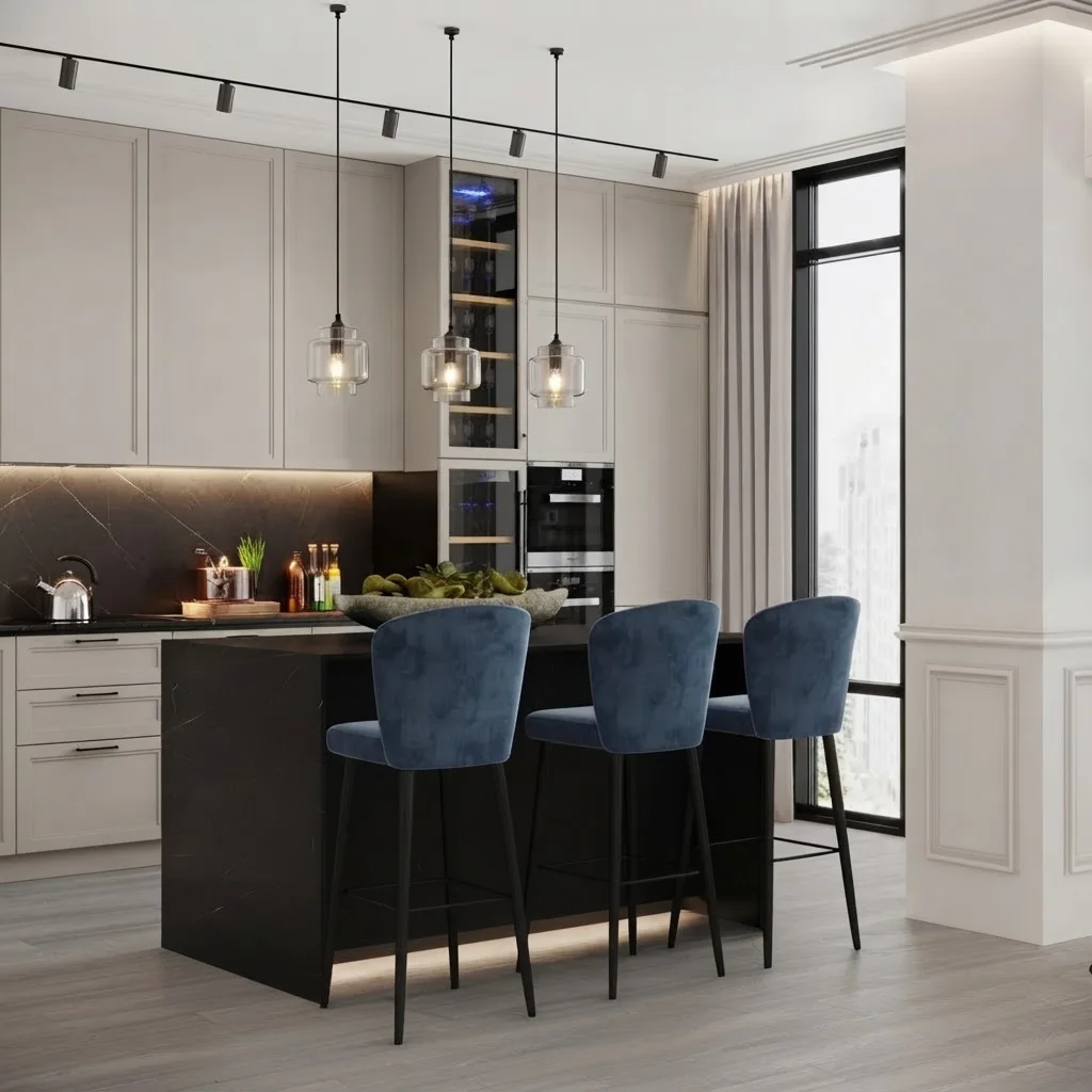
Same kitchen, cabinets repainted from white to Agreeable Gray, walls kept white. With black stone and navy stools it reads as a proper gray kitchen; with a white counter it would read greige.
The rules that hold: keep the walls lighter than the doors (Pure White or Alabaster), go black or brushed brass on hardware, and do not put Agreeable Gray cabinets against Agreeable Gray walls, which is the single most common way this colour ends up looking like a rental. If you are pricing the job, painted cabinets are the cheapest line in our kitchen remodel cost breakdown, and the AI kitchen tool can swap cabinet colours on a photo of your kitchen before you buy a quart. Doing the job yourself? Our step by step guide to painting kitchen cabinets covers primers for wood, laminate and MDF.
Agreeable Gray on an exterior
Outdoors, everything gets lighter. Daylight on a facade is several times brighter than in any room, so an LRV 60 colour that reads mid-gray inside reads as pale stone outside. That is exactly why Agreeable Gray works as a siding colour where a darker greige would look like concrete.
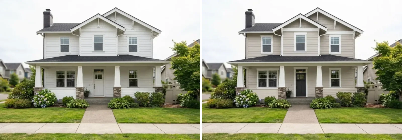
Same house, same overcast day. Body in Agreeable Gray, trim in Pure White, door in Iron Ore. The porch columns are what sell it: white on greige gives the facade edges.
The pairing that works outside is the same one that works inside, Pure White trim and a warm near-black on the door, but with one addition: a stone or brick base. Agreeable Gray over a tan stone skirt is a very safe American exterior. What does not work is Agreeable Gray next to red or orange brick, where the brick supplies all the warmth and the paint reads dead. For that facade, go warmer or go white; we tested the full spread on the same house in the exterior paint visualizer guide, and the tool itself runs on a photo of your own facade.
Is Agreeable Gray outdated in 2026?
No, and the search itself is the tell: people ask whether a colour is outdated when they have seen it done badly, not when it has stopped selling. Sherwin-Williams still lists it among its ten most popular colours in 2026. What is dated is the way it was used in 2015, as one gray among five: gray walls, gray laminate, gray sofa, gray shaker doors. Nobody is buying that room any more, and the colour got the blame.
What has changed is the company it keeps. In 2026 Agreeable Gray goes on the walls of rooms full of oak, travertine, boucle and terracotta, which is exactly the palette in every render on this page, and against that it reads warm and current rather than corporate. It is also the last stop before the true creams. If you want the warmth of the current cream trend without committing to a colour that dates faster, this is the compromise, and it is the same logic we applied to what is actually out of style this year: the material combinations date, the neutrals mostly do not. The one direction it cannot go is the colour-drenched room, where walls, trim and ceiling take the same colour. At LRV 60 the effect is too pale to read as a decision. Drench with Urbane Bronze; keep Agreeable Gray for the rooms that need to disappear politely.
Test it on your own walls before you buy a sample
Every render on this page was made the same way: a photograph or visualisation of a real room, the walls re-coloured to the published hex, everything else held in place. You can run that on your own room. Upload a photo, ask for the walls in Agreeable Gray, then ask for Repose Gray and Accessible Beige on the same photo and put the three side by side. It answers the north-versus-south question for your specific windows in a minute, which a sample pot cannot do until the weather cooperates. Start with the wall colour changer, or go straight to a photo of the whole room if the paint is one move in a larger redesign.
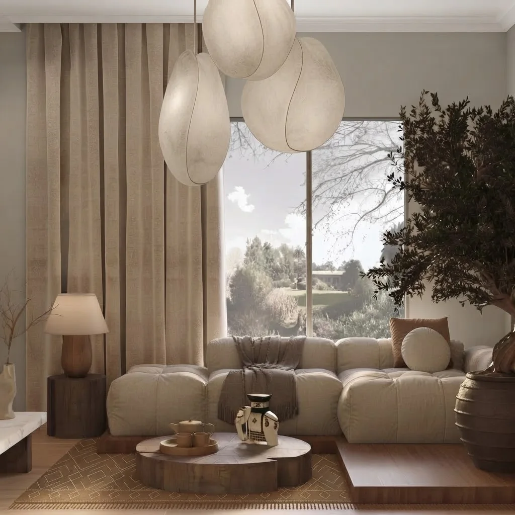
The visualizer is honest about one thing a chip is not: it shows the colour against your floor, your sofa and your light, which are the three things that decide how it reads.
A note on the limits, because we are selling the tool. A screen is a backlit surface and a wall is not, and an AI render calibrated to a hex is still a render. We had to run a second pass on nine of the thirty rooms because the model kept drifting the colour toward white, which is itself the lesson: Agreeable Gray lives one step from white, and both cameras and screens like to push it there. Use the render to shortlist and to test light direction; then paint two coats on two walls and look at them morning, noon and night. If it still reads right at all three, you are done, and you have skipped the four other greiges you would otherwise have sampled. For the rest of the scheme, what colour furniture goes with grey walls is the guide that finishes the job, and the wall colour tools we tested covers the alternatives if you want a second opinion.
Frequently asked questions
Is Agreeable Gray warm or cool?
Warm, but only just. Sherwin-Williams describes it as having slight green undertones while still being warmer than most grays, and that is exactly how it behaves: in cool north light it reads as a soft putty gray, in warm south light it tips toward beige. It never goes blue, which is the whole reason it replaced the cool grays of the 2010s.
What is the LRV of Agreeable Gray?
Agreeable Gray has a Light Reflectance Value of 60 on a scale where 0 is black and 100 is pure white. That is the sweet spot for a whole-house neutral: light enough to keep a small room open, dark enough that white trim still reads as trim. For comparison Repose Gray and Accessible Beige sit at 58 and Alabaster at 82.
Does Agreeable Gray look green, purple or beige?
It can do all three, and which one depends on what sits next to it. Against a warm oak floor or beige carpet the green undertone shows and it reads slightly cooler than expected. Against a cool blue sofa the beige comes forward. The purple complaint is almost always a north-facing room with a blue-cast light or a violet-toned rug; move the sample and it disappears. Test it on two walls at three times of day.
Agreeable Gray vs Repose Gray: which should I pick?
Pick Agreeable Gray if the room gets warm or direct light and you want a greige that stays soft; pick Repose Gray if the room is already warm-toned, with honey or red woods, and you want a cooler counterweight. They are two LRV points apart and look almost identical on a chip. Side by side in the same room Repose is the one with a faint taupe chill, Agreeable the one that leans cream.
What white trim goes with Agreeable Gray?
Pure White SW 7005 is the safe choice and the one Sherwin-Williams itself pairs with it. It is clean without being blue, so the wall reads warm gray rather than dirty. Snowbound SW 7004 is a touch softer and also works. Avoid Extra White on a north wall: the contrast makes Agreeable Gray look muddy. Alabaster is too creamy for trim next to it but excellent as the wall colour in an adjoining room.
Does Agreeable Gray work on kitchen cabinets?
Yes, and it is one of the few greiges that does. On cabinet doors the colour reads a shade darker than it does on walls, because doors are vertical, shadowed and usually satin, so it lands as a genuine light gray rather than an off-white. Keep the walls in Pure White or Alabaster so the cabinets are the darker element, and pair with black or brushed brass hardware. Agreeable Gray cabinets against Agreeable Gray walls flatten the room.
Is Agreeable Gray a good exterior color?
It is a good body colour on siding, stucco and fibre cement, and exteriors are where its lightness helps: outdoor light is several times brighter than indoor, so an LRV 60 colour that looks mid-gray inside reads as a soft stone outside. Use Pure White trim and a dark door such as Iron Ore or Urbane Bronze. On brick it is a poor match because the brick supplies the warmth and the paint reads flat.
Is Agreeable Gray still in style in 2026?
Yes. Sherwin-Williams still lists it among the ten most popular colours its customers are buying, and the reason is structural: it is the greige that sits exactly between the cool gray era and the warm cream era, so it works with both the furniture people already own and the furniture they are buying now. The dated look is not the colour, it is gray walls with gray floors and gray sofas. Add warm wood and it reads current.