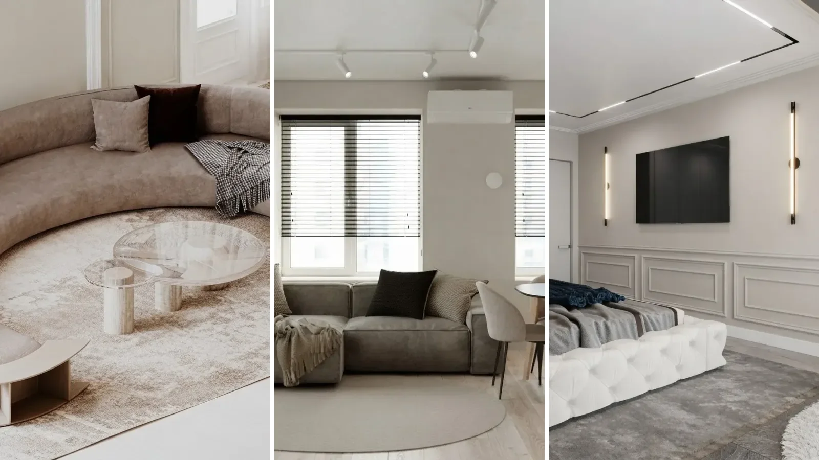
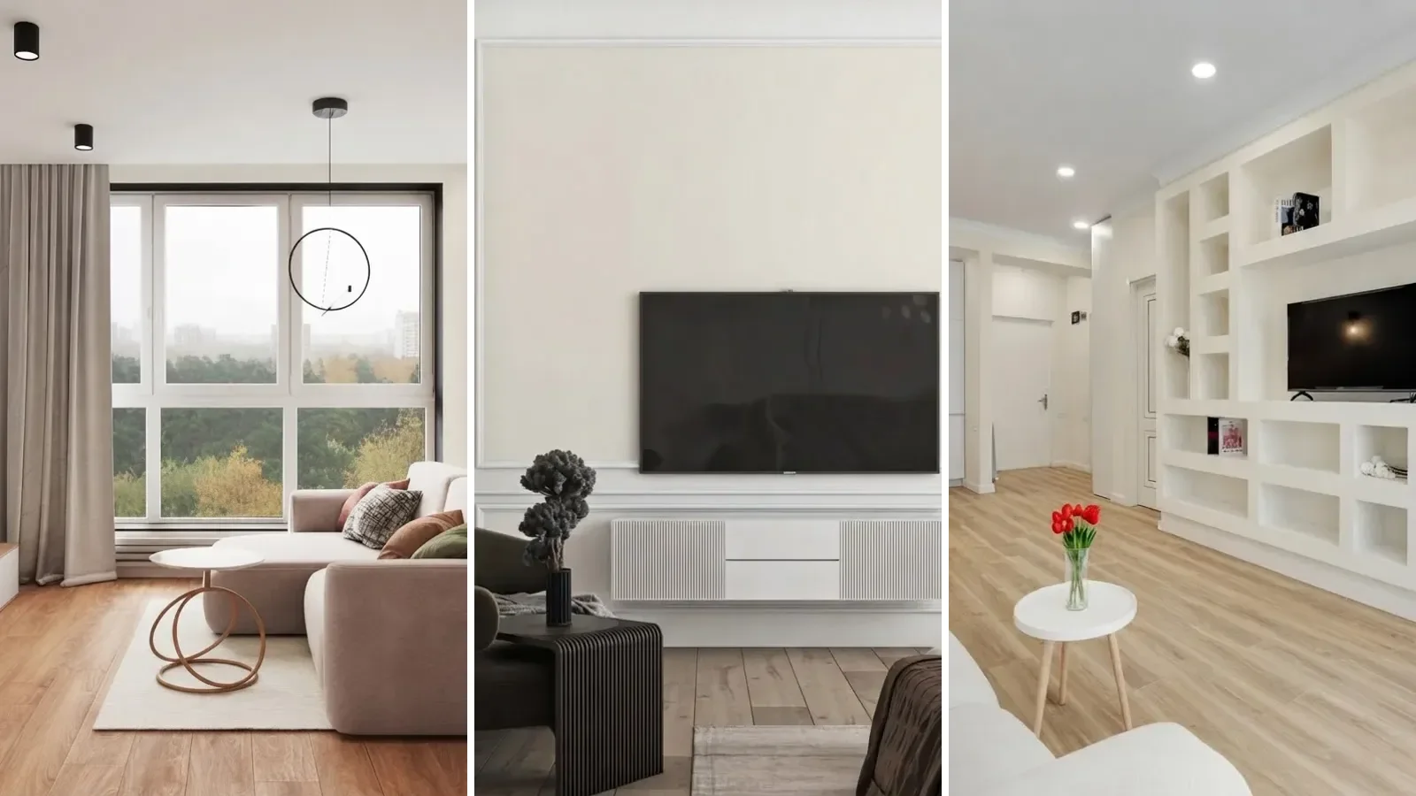
Alabaster SW 7008 is Sherwin-Williams's most popular white: a soft, warm white with a Light Reflectance Value of 82, a hex of #EDEAE0, and just enough gray in its cream undertone to stop it reading yellow. It was the company's Color of the Year for 2016 and in 2026 it still heads their list of the ten most bought colours. The complaint people bring to it is that it looks different in every photo, and that is true, because a white changes more with light than any other colour. So instead of one more house, this page holds the room still and changes only the paint: the same living room in Greek Villa, Alabaster and Pure White; the same wall in Alabaster and Shoji White; the same bedroom lit from the north and from the south; and 25 rooms, four of them real photographs, with the walls repainted to the published hex. Its greige partner, Agreeable Gray, got the same treatment.
Our articles are still written by humans!
Get human written articles in your Google feed.

What color is Alabaster, exactly?
A warm white, not a cream. On a chip the difference between Alabaster and a plain white looks like nothing. On a wall it is the difference between a room that feels finished and a room that feels like a rental. Sherwin-Williams's own description on the SW 7008 colour page is that this balanced white delivers refreshing serenity and sleek modernity, and the word doing the work there is balanced. It has a little yellow and a little gray, in amounts that roughly cancel, so it does not commit to cream and it does not commit to gray.
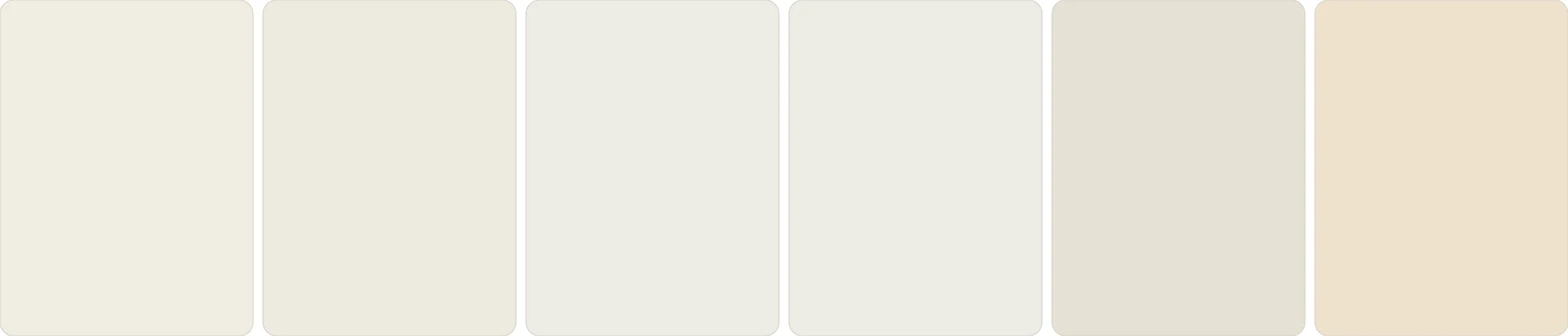
Left to right: Greek Villa SW 7551, Alabaster SW 7008, Pure White SW 7005, Snowbound SW 7004, Shoji White SW 7042, Creamy SW 7012. Flat chips from the published hex values. Squint and the first four merge; that is the whole difficulty of choosing a white.
Not sure which of these a photo is showing you? Hover over the wall in the paint color finder and it ranks the six by colour distance, Alabaster included.
When the colour launched, Jackie Jordan, then director of colour marketing at Sherwin-Williams, called it neither stark nor overly warm, but rather an understated and alluring hue of white, in the November 2015 announcement that made it Color of the Year. The same release cited a homeowner survey in which nearly three quarters of respondents preferred Alabaster's undertones to plain white. That is the usual shape of its appeal: nobody picks it because it is exciting, people pick it because every other white looked slightly wrong in their room.
Does Alabaster look yellow?
The honest answer is sometimes, and the same bedroom lit two ways shows exactly when. On the left, a north-facing window on an overcast day. On the right, a south-facing window mid morning. Same paint, same furniture, same camera.
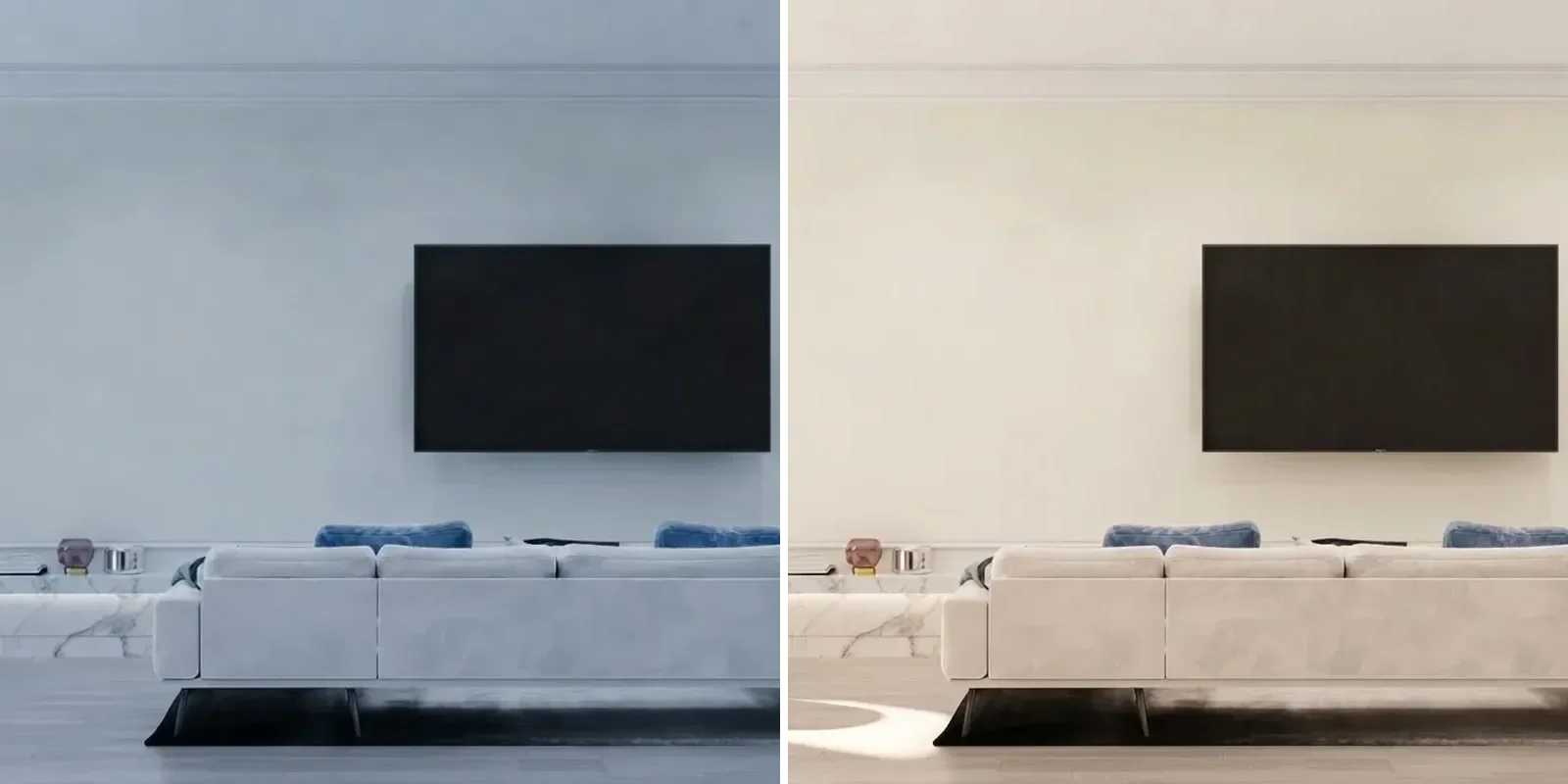
North light on the left cools the wall to a clean, slightly gray white. South light on the right brings the cream forward. Neither is wrong; both are Alabaster.
Three things push Alabaster toward yellow, and none of them is the paint. The first is a cold white next to it: Extra White trim, a bright white ceiling, a stark white sofa. Against those, the eye reads the difference as yellow. The second is warm artificial light, the 2700K bulbs most people have in bedrooms and living rooms, which adds an amber cast to everything and shows most on a pale wall. The third is honey oak or orange-toned wood, which reflects its own colour up onto the wall. Remove any one of those and the yellow goes away; remove all three and Alabaster looks like a plain soft white, which is what it is. The reverse also holds: in a north room with gray floors, Alabaster is the white that keeps the room from feeling like a fridge. This is the same lighting logic that decides every paint colour choice, but whites show it at full volume because there is so little pigment to hide behind.
Before and after: builder white to Alabaster
Most people arrive at Alabaster from the cold flat white their house came with. The pairs below are the same rooms twice. Only the walls change, and the change is small on purpose: this is what a two point shift in LRV and a few points of warmth actually look like.
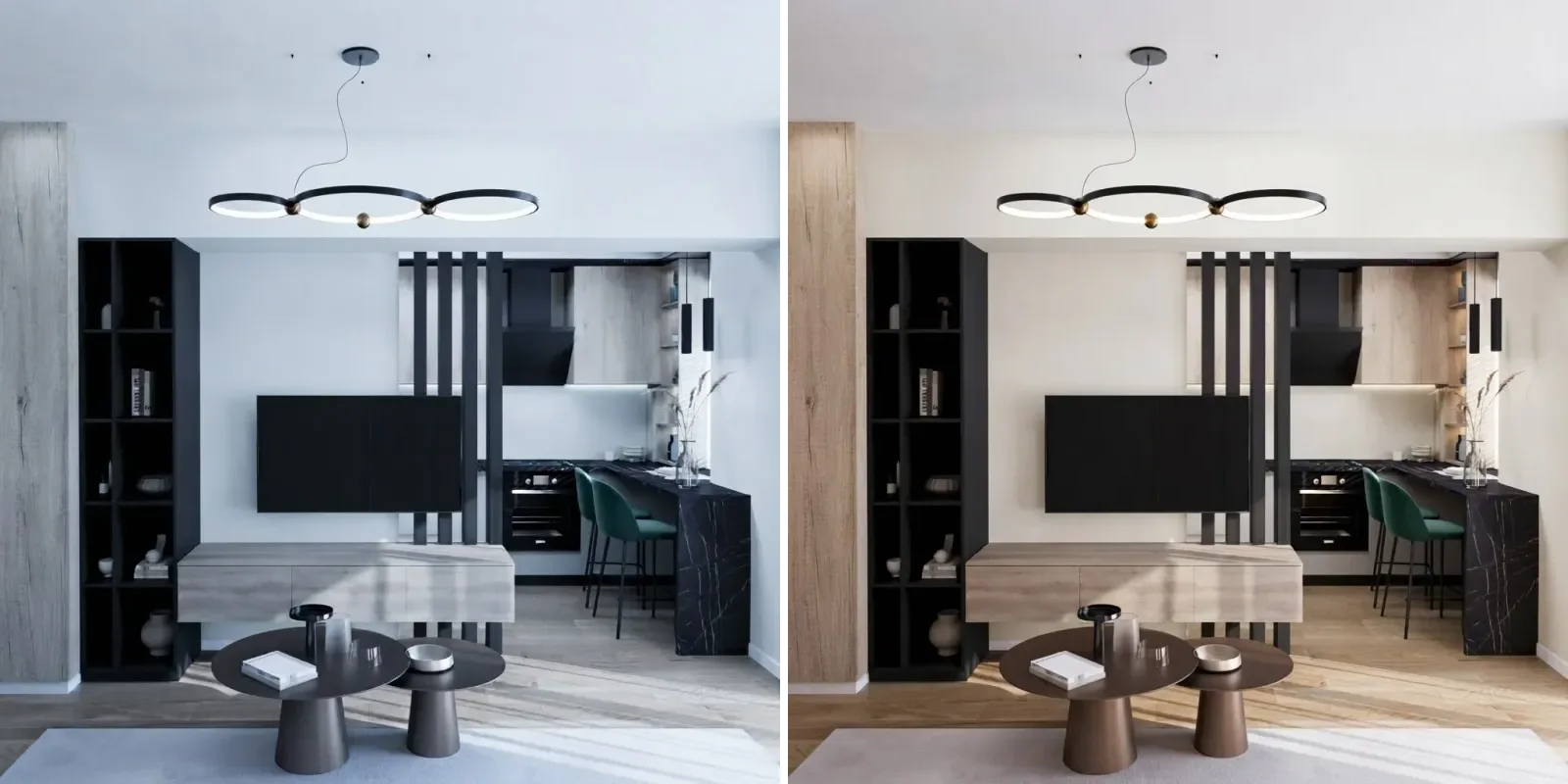
Left, builder white. Right, Alabaster. Notice the whole left frame reads colder: a blue-white wall throws its cast onto everything in the room, which is exactly why people repaint.
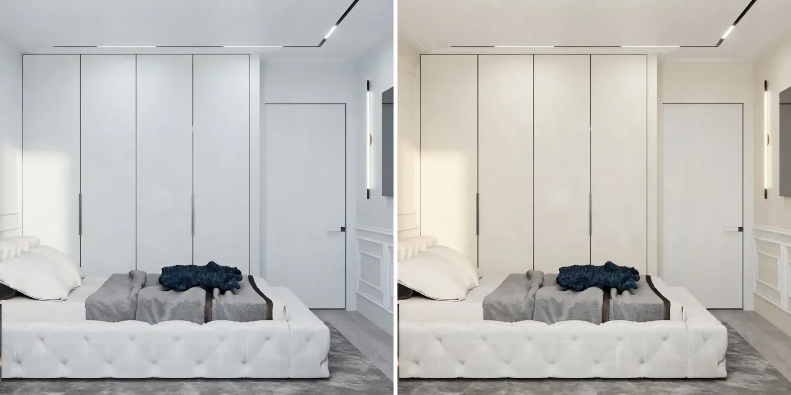
A bedroom with a wall of white wardrobes. In builder white the wardrobes disappear into the wall; in Alabaster they read as furniture again.
Alabaster vs Greek Villa, Pure White, Shoji White and the rest
Every white is chosen against another white, so here is one living room painted three times. Greek Villa on the left, Alabaster in the middle, Pure White on the right. Nothing else in the frame changed.
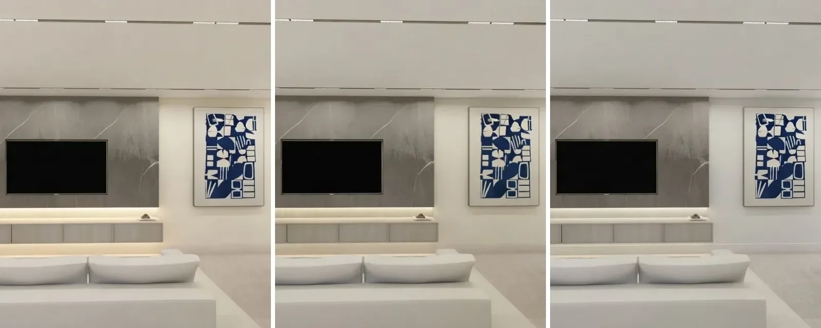
Greek Villa SW 7551 left, Alabaster SW 7008 middle, Pure White SW 7005 right. Greek Villa is the creamiest, Pure White the cleanest, Alabaster the one that could pass for either depending on the hour.
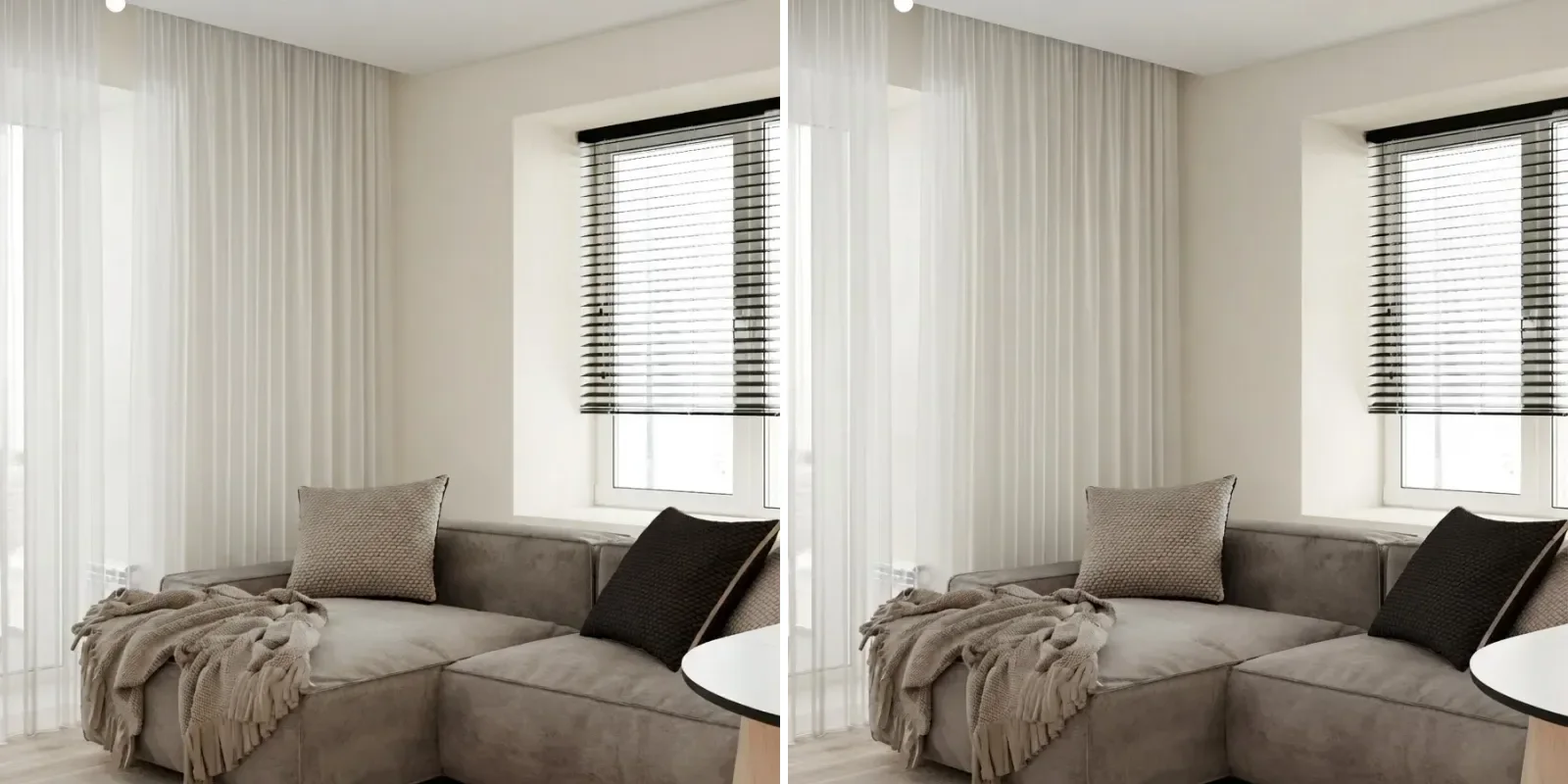
Alabaster on the left, Shoji White on the right. This is the most searched comparison and the least equal: Shoji White is eight LRV points deeper and reads as a pale greige, not a white.
Alabaster on the left, Benjamin Moore Swiss Coffee on the right. The two brands' bestselling warm whites, almost interchangeable; Swiss Coffee carries a touch more green-gray softness.
A note on the numbers. Alabaster's 82, Pure White's 84, Shoji White's 74 and Snowbound's 83 are the values reviewers consistently report against the Sherwin-Williams chip data. Greek Villa and Swiss Coffee are listed at 82 by some sources and 84 by others, so the table says so rather than picking one. Where we could not find a value we trust, it says lower. Benjamin Moore also sells a colour called Alabaster, which is a different, deeper cream and not the one this page is about.
Alabaster walls with Pure White trim, or Alabaster on everything?
This is the decision that decides how the room feels, more than the wall colour itself. With Pure White trim, Alabaster reads as a colour: the trim is two points brighter and a shade cooler, so you get quiet contrast lines at every door and window and the walls look warm by comparison. With Alabaster on walls, trim and ceiling together, the room goes seamless: no lines, softer light, and a slightly larger feel, which is how the colour was styled when it launched and how most modern farmhouse and warm minimalist rooms use it now.
Left, Alabaster walls with Pure White trim: the moulding reads. Right, Alabaster on everything: the cabinetry melts into the wall and the sofa becomes the only object.
The rule of thumb: rooms with good mouldings, panelling or many doors want the two colour version so the woodwork earns its keep; rooms with plain drywall and fitted storage want the one colour version so the storage disappears. What does not work is Extra White or High Reflective White trim against Alabaster walls, which makes the walls look dirty. If you want more contrast than Pure White gives, change the trim colour altogether, to a warm black or to the wall's greige neighbour, and treat it as a colour decision, not a white decision.
Coordinating colors: what goes with Alabaster
Alabaster is the white the rest of the Sherwin-Williams neutrals were tuned against, so almost everything coordinates. The short list below is what we would actually specify, by job.
Two of those pairings carry the rest of a house. Alabaster and Agreeable Gray is the one Sherwin-Williams itself shows side by side in its trending colours, and it is the greige-and-white scheme most American homes are painted in right now; we walked through the greige half of it in the Agreeable Gray review. Alabaster and Iron Ore is the exterior version of the same idea, and it comes up again below. For what sits in front of the walls, what colour furniture goes with grey walls covers the rest, and the short answer on colours for dark wood floors applies directly, because dark floors are where a warm white earns its keep.
Alabaster room by room
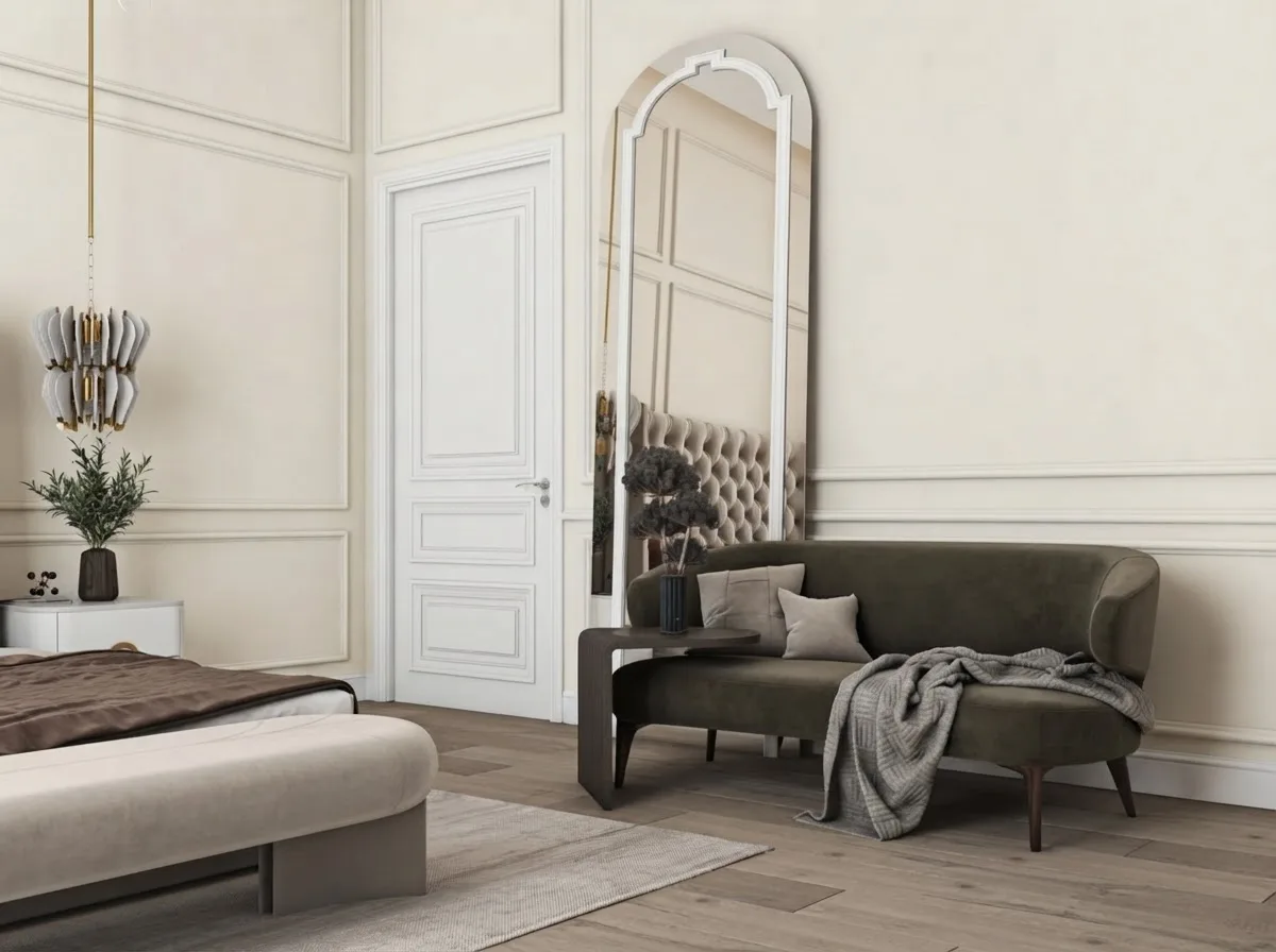
Every room below is a real interior scheme with the walls re-rendered in Alabaster. Four of them, marked in the captions, are photographs of a finished apartment rather than visualisations, which matters for a white: renders flatter whites, cameras do not.
Living rooms
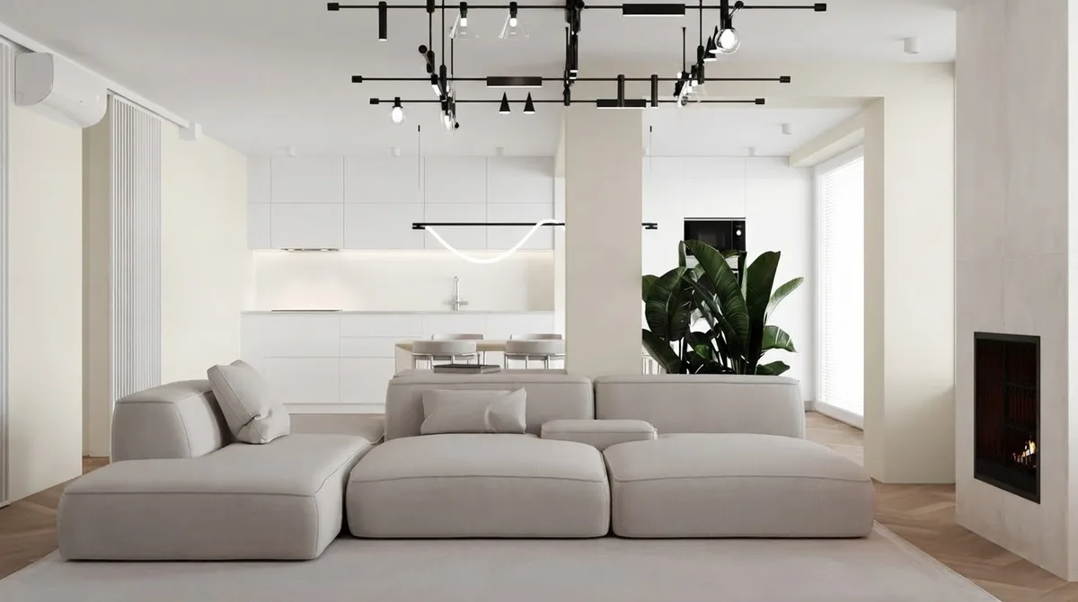
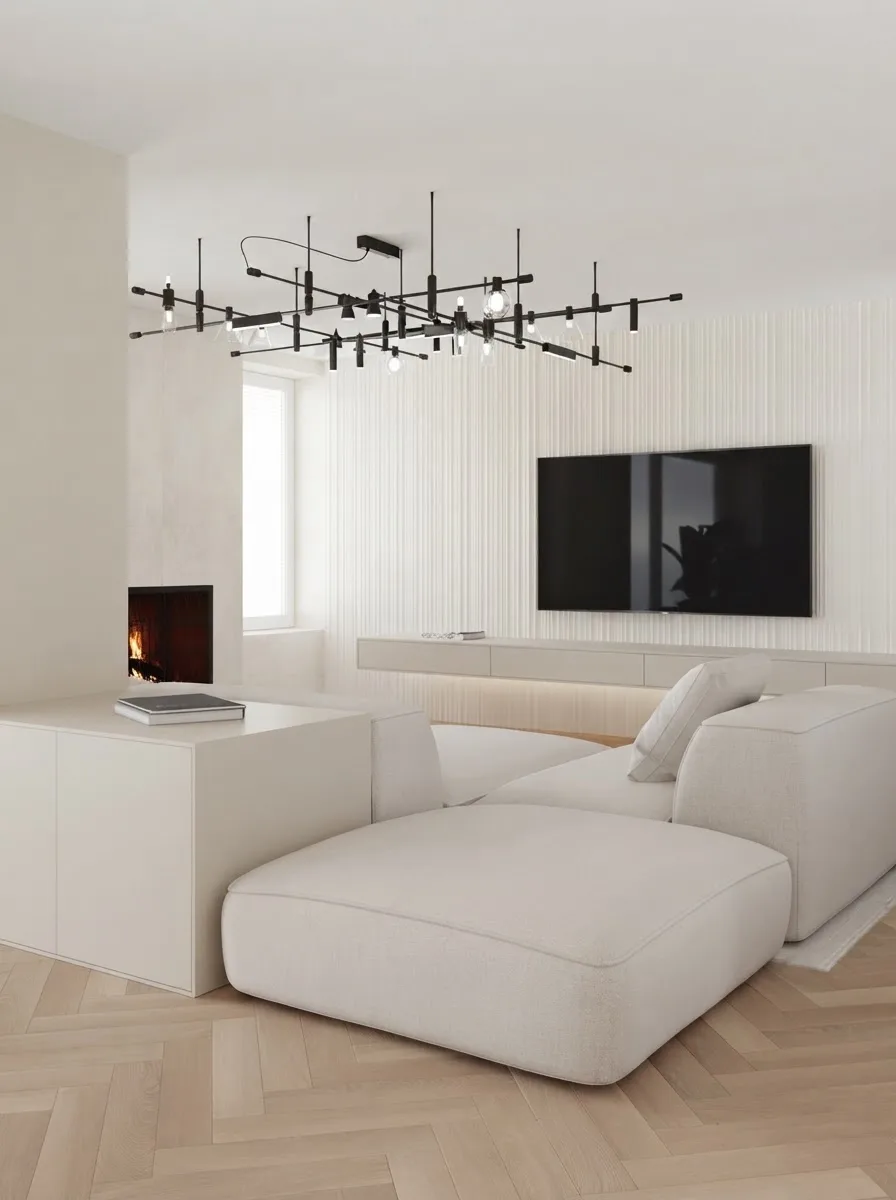
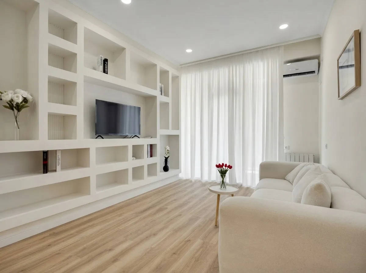
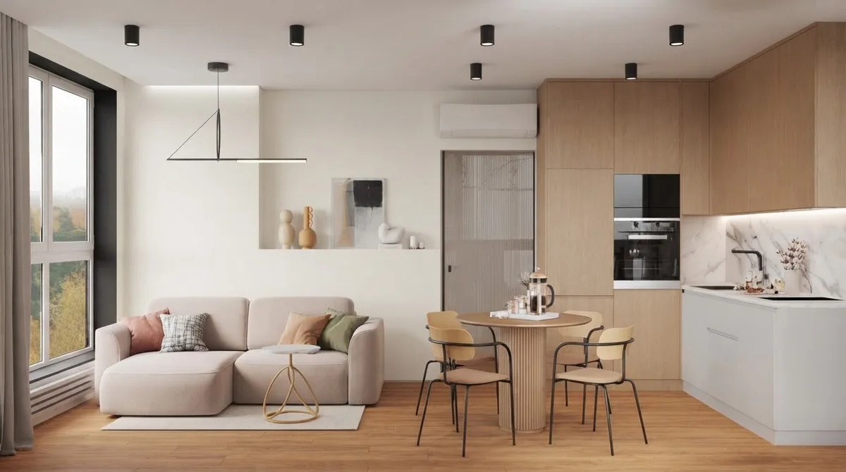
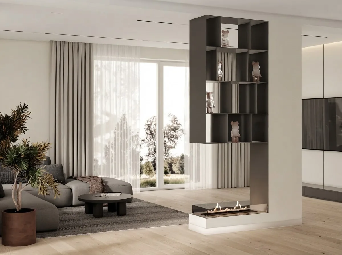
Bottom left is a photograph, not a render, and it is the most useful of the four: in a real camera Alabaster reads as a plain warm white, exactly as it does on the wall.
A living room is where Alabaster's lightness helps most and where its blandness is the risk. The rooms that work above all have one strong warm material, oak, a rust cushion, a walnut table, and one strong dark, a black TV, a charcoal sofa. All white plus all pale is the 2018 look that people are asking about when they search whether the colour is overused. If the furniture is still to be chosen, our living room layout guide and the warm minimalism guide are the two halves of that job.
Bedrooms
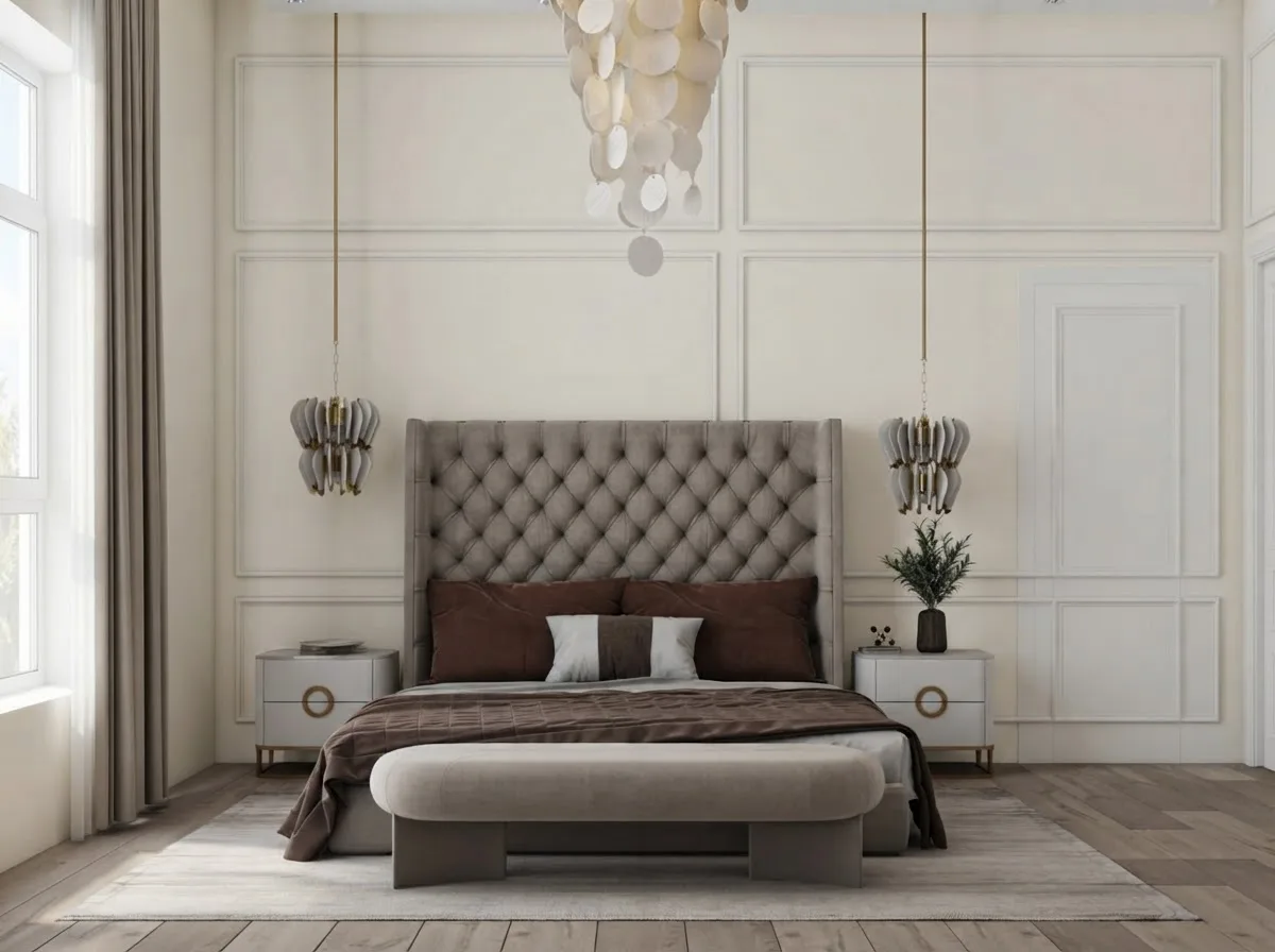
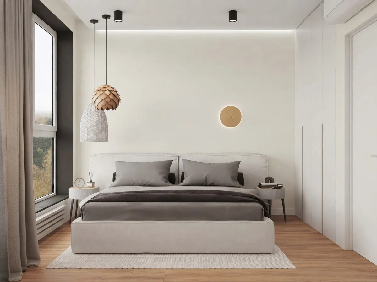
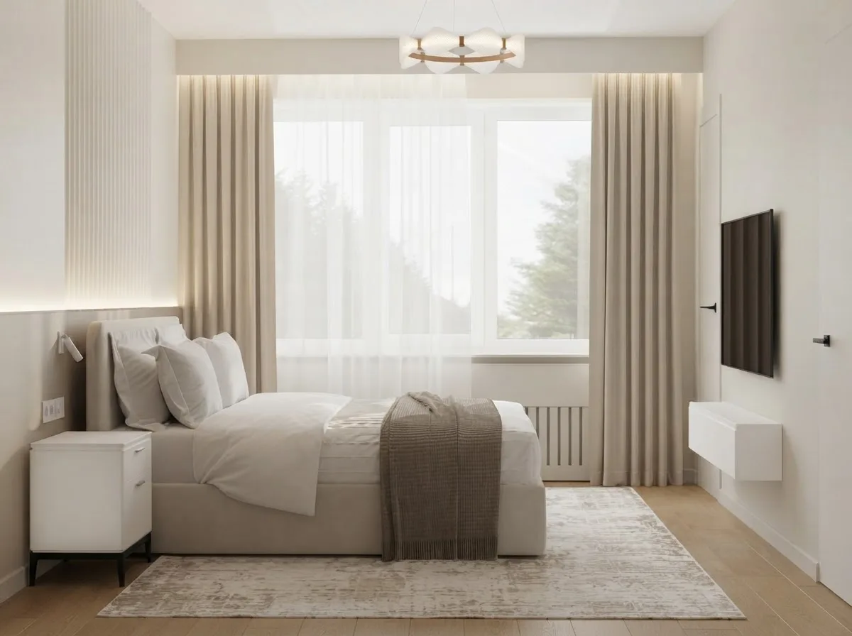
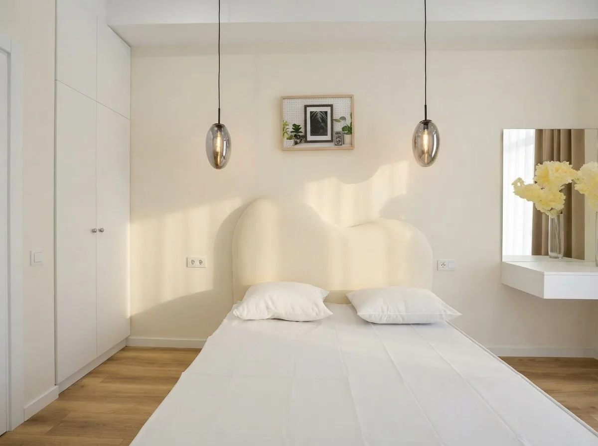
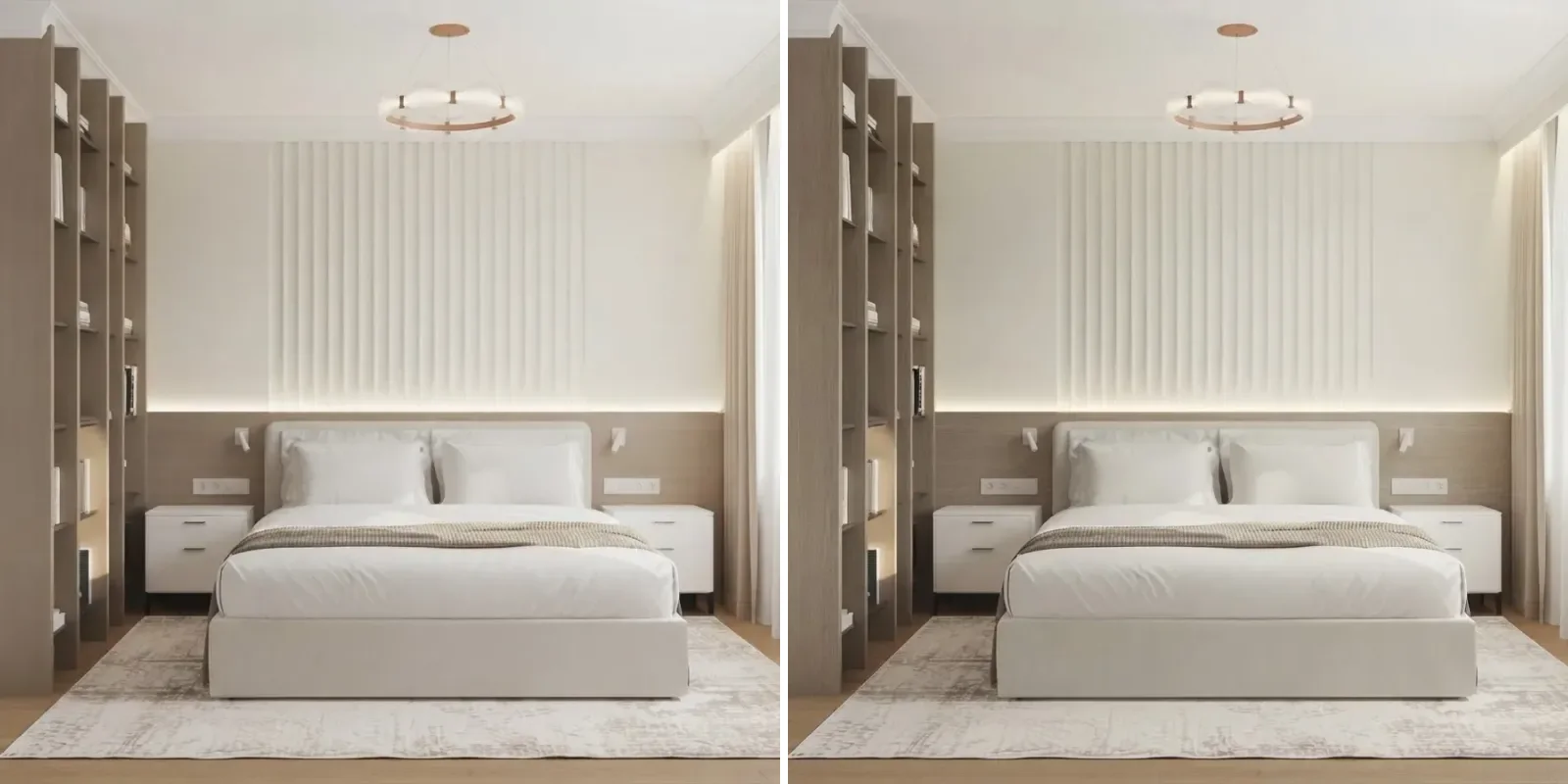
Bottom right is a photograph. Bedrooms are where warm whites are kindest: low light, soft textiles, and lamps in the evening that push Alabaster toward the cream people actually want at night.
Kitchens and dining rooms
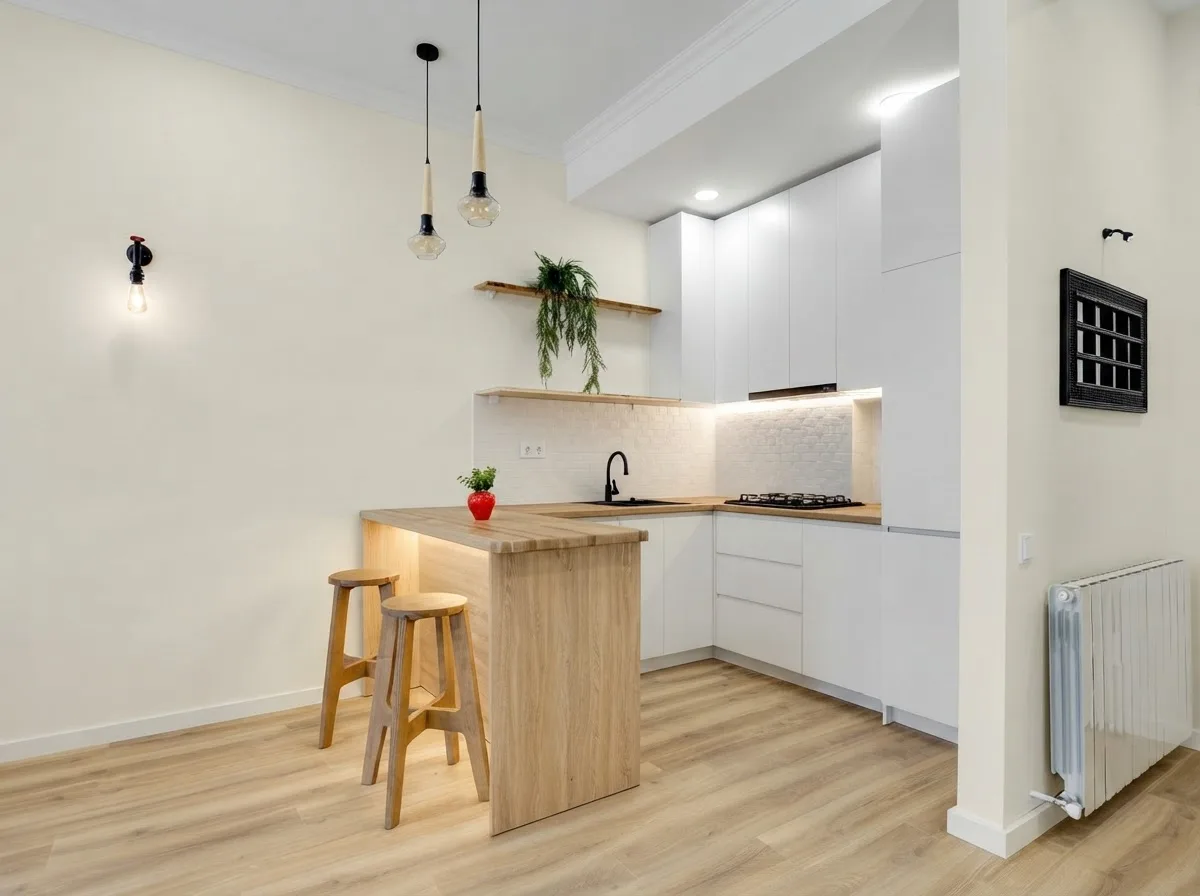
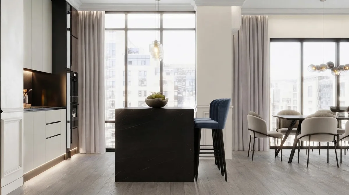
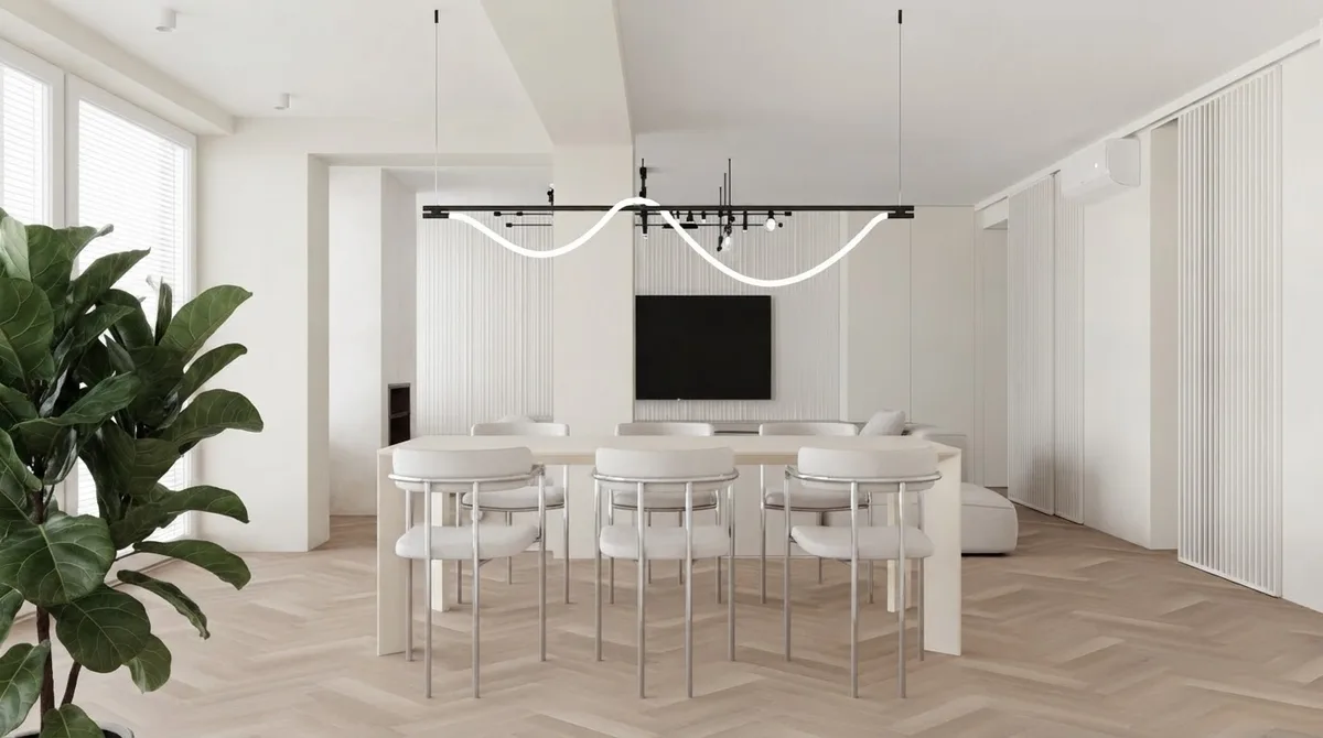
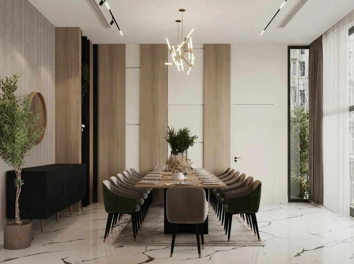
Top left is a photograph. Kitchens are Alabaster's home ground: it takes task lighting without going clinical and sits with any countertop from marble to black.
Hallway, bathroom and home office
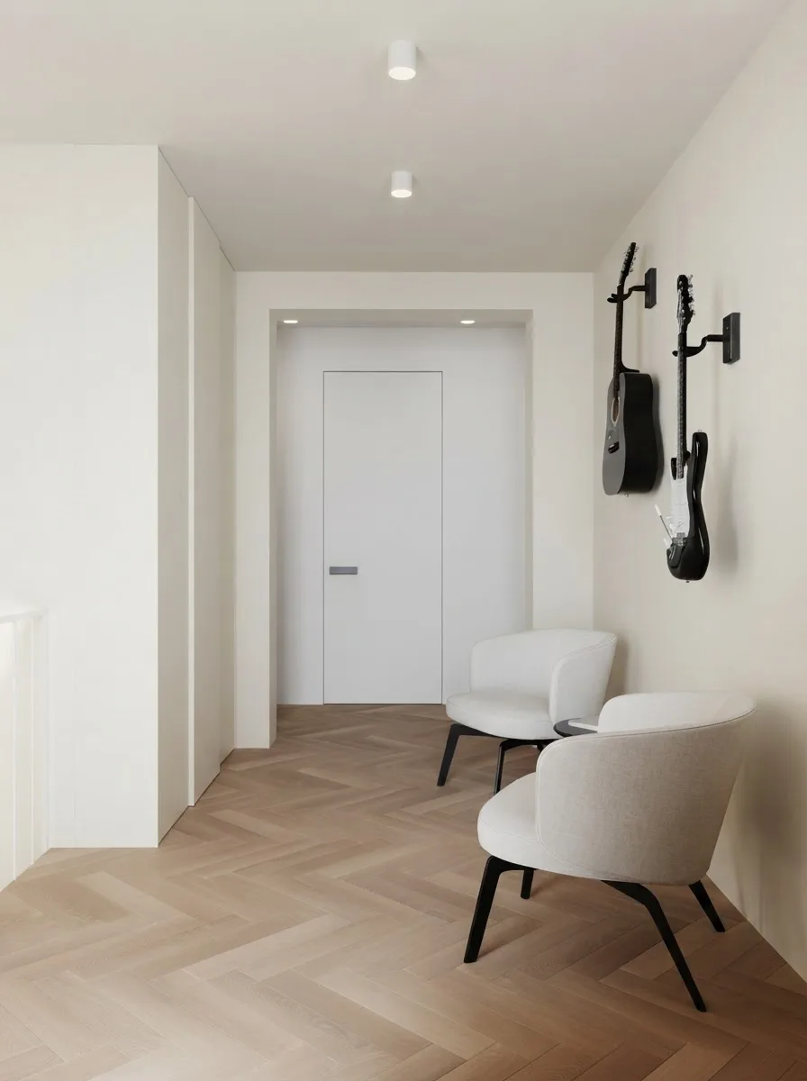
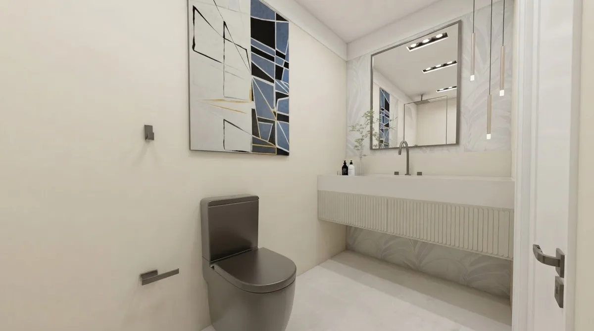
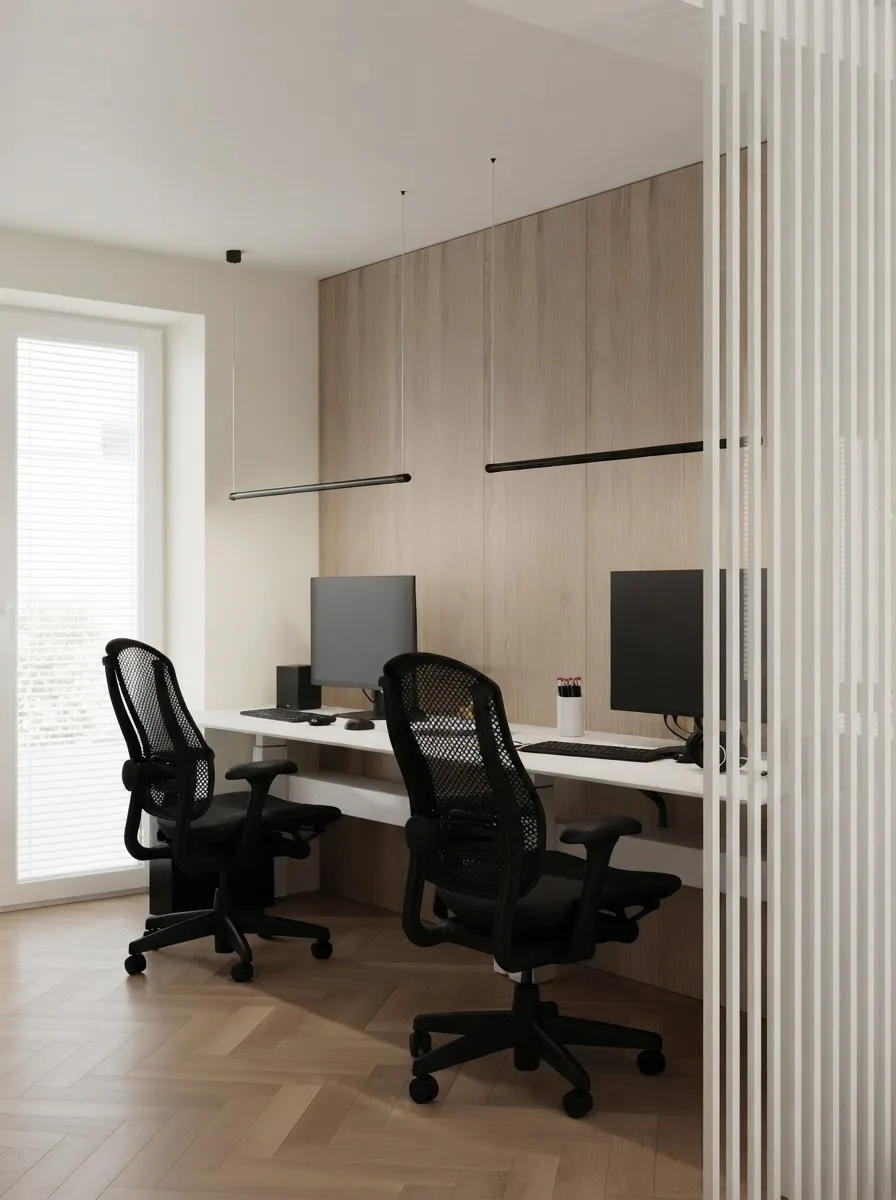
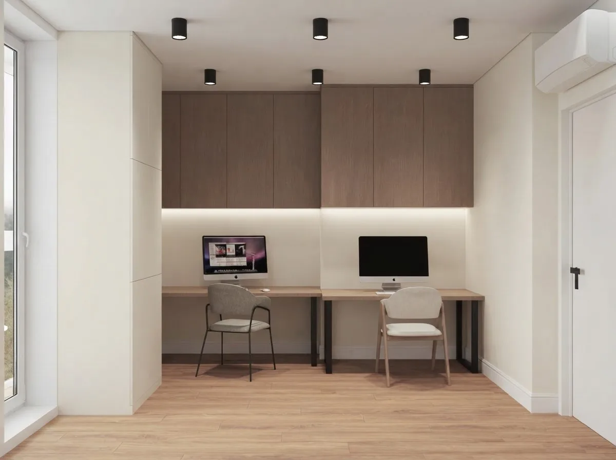
Whole-house whites are decided in the hallway. If Alabaster works at the front door under an overhead bulb, it works everywhere else.
Alabaster kitchen cabinets
Alabaster on cabinets is a slightly different colour from Alabaster on walls. Doors are vertical, satin and lit from above, so the same paint reads a shade deeper and warmer, closer to a soft ivory than a white. That is a feature: it is why Alabaster cabinets look expensive where a cold white looks like a laminate. The pairing that the searches ask about most is Alabaster cabinets with Agreeable Gray walls, so that is what the two kitchens below show.
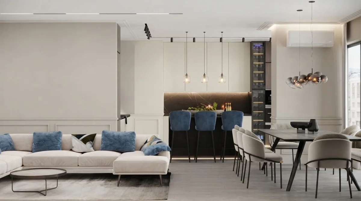
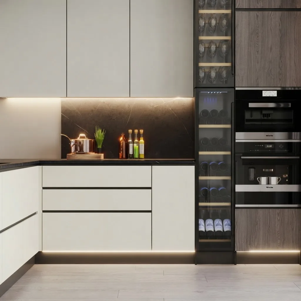
Alabaster doors, Agreeable Gray walls, black stone, navy stools. The walls being a shade deeper is what makes the cabinets read as white rather than as more wall.
The rules: give the cabinets a wall that is a shade deeper (Agreeable Gray, Accessible Beige, Shoji White) or a shade cooler (Pure White), use black, brass or unlacquered brass hardware, and keep the countertop either clearly dark or clearly veined so the run has an edge. Alabaster cabinets on Alabaster walls is the soft, seamless version and it needs wood or stone somewhere to keep from going flat. Painted cabinets are the cheapest line in our kitchen remodel cost breakdown, and the AI kitchen tool can try the colour on a photo of your own cabinets before the quote. If you plan to paint them yourself, read how to paint kitchen cabinets first: the prep decides whether Alabaster stays white or peels.
Alabaster on an exterior
Outdoors, Alabaster is close to unbeatable. Daylight on a facade is several times brighter than indoor light, which is why cool whites glare outside while Alabaster keeps just enough warmth to look like an expensive white rather than a primer coat. Below is the same house that wore Agreeable Gray in the sister post, now in Alabaster from siding to trim, with the door and sashes in Iron Ore.
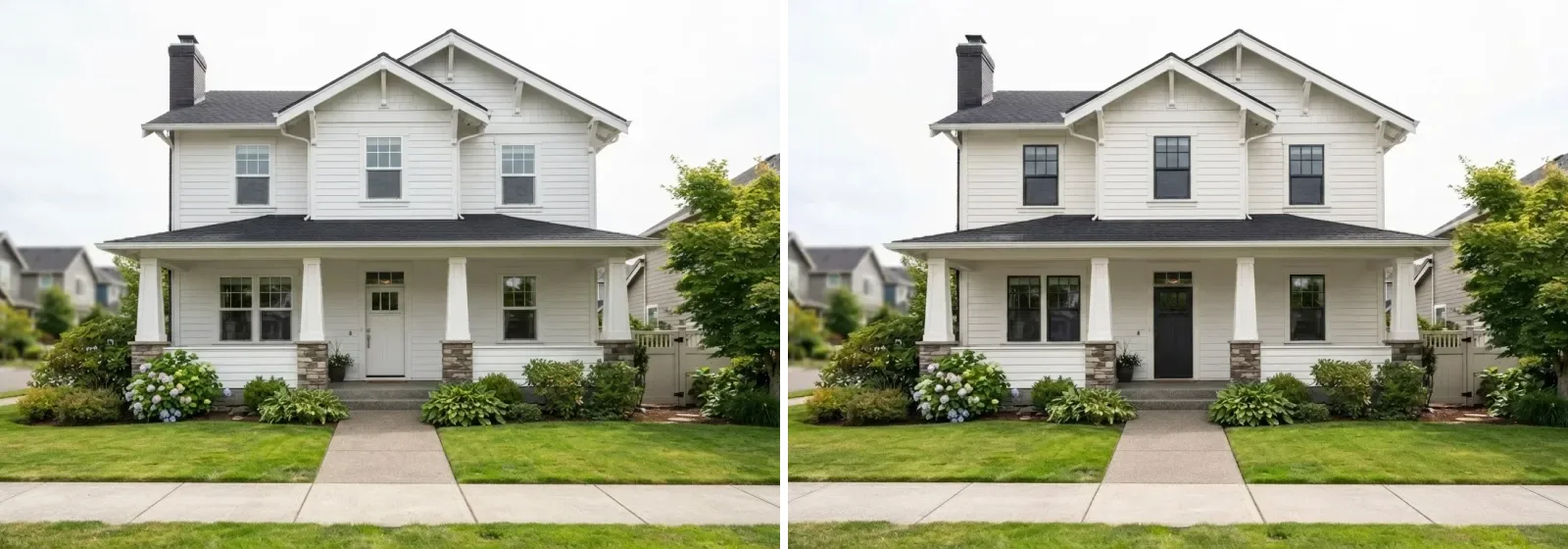
Left, the builder white it came in. Right, Alabaster on body and trim with Iron Ore on the door and sashes. The black is what stops an all-white house from looking unfinished.
Two ways to run it. Alabaster on body and trim together is the modern farmhouse default and the version that hides the most: siding seams, mismatched trim profiles, an ugly gutter. Alabaster body with Pure White trim gives the facade edges and reads more traditional. On brick, Alabaster works as a full paint or as a limewash-style finish, and it is the white we would choose over Pure White on any brick house, for the same reason it works indoors: the brick's warmth and the paint's warmth agree. The full spread of exterior whites on one house is in the exterior paint visualizer guide, the broader colour landscape in exterior house colours for 2026, and the tool runs on a photo of your own facade.
Why Alabaster is still the number one white
Nine years after it was Color of the Year, Alabaster sits at the top of the list of ten most popular colours on Sherwin-Williams's own site, ahead of Pure White and Agreeable Gray. That does not happen to a trend colour. It happens to a default, and the reason it became the default is structural: it is the white that sits at the exact midpoint between cool and cream, so it is wrong in fewer rooms than any other white. Pure White is wrong in a north room. Greek Villa is wrong next to a cool sofa. Alabaster is mildly right almost everywhere, which is a less romantic quality than the paint companies' language suggests, and a more useful one.
The pushback you will find online is that it is overused, and there is something to that: an all-Alabaster room with pale oak, a white boucle sofa and a jute rug is a 2019 photograph. But the thing that dates in that room is the sameness, not the white. Give Alabaster walls a dark floor, a greige neighbour, a black window frame or a limewashed feature wall and it reads as current. The colour is a background; what dates is what you put in front of it, which is the same conclusion we reached in what is actually out of style this year. If you are painting a small room, this is also the white to use to make it read larger without the cold, echoing quality a cool white gives a small space.
Test it on your own walls before you buy a sample
Every render here was made the same way: a photograph or visualisation of a real room, the walls re-coloured to the published hex, everything else held in place. You can run that on your own room. Upload a photo, ask for the walls in Alabaster, then ask for Pure White and Greek Villa on the same photo and look at the three together. For a white this matters more than for any other colour, because the difference between the three is invisible on a chip and obvious on a wall. Start with the wall colour changer, or go straight to a photo of the whole room if the paint is one move in a larger redesign.
The visualizer shows the white against your floor, your sofa and your light, which are the three things that decide whether Alabaster reads white or cream in your house.
The limits, since we are selling the tool. A screen is backlit and a wall is not, and a white on a screen is always brighter than the same white in a room. We also found that the model, asked for Alabaster, tends to deliver a slightly cooler white than the chip and needed the trim pushed brighter for the wall to read warm at all, which is itself a fair description of how the colour behaves: it only looks warm next to something cooler. Use the render to shortlist and to test light direction, then paint two coats of the finalist on two walls and look at them at breakfast, at noon and under the lamps. If it still reads right at all three, you are done. For a second opinion on the tools, the wall colour tools we tested covers the alternatives, and if the answer turns out to be a soft grey instead of a white, the Agreeable Gray review is the next page to read.
Frequently asked questions
Is Sherwin-Williams Alabaster warm or cool?
Warm, gently. Alabaster is a white with a small amount of yellow and gray mixed in, which is why Sherwin-Williams describes it as neither stark nor overly warm. In practice it reads as a soft white in most rooms, a faint cream in warm afternoon light, and a clean white in cool north light. It never reads blue and it never reads butter yellow, which is the whole reason it is the most bought white in the range.
What is the LRV of Alabaster?
Alabaster has a Light Reflectance Value of 82 on a 0 to 100 scale. That is bright enough to count as a white rather than an off-white, and two points below Pure White at 84, which is why the two can sit next to each other as wall and trim without the trim vanishing. Greek Villa is reported at 82 to 84, Snowbound 83, Shoji White 74.
Does Alabaster look yellow?
Only when something pushes it there. On its own, next to a cooler white trim, Alabaster reads as a soft white. Put it beside a bright cool white such as Extra White and the yellow shows. Put it under warm 2700K bulbs in a room with honey oak floors and it can go cream. If the room has a lot of warm elements already, Pure White or Snowbound is the safer wall colour; if the room has cool light or gray floors, Alabaster is exactly the warmth you want.
Alabaster vs Greek Villa: which is warmer?
Greek Villa. Both are warm whites at almost the same lightness, but Greek Villa carries more cream and reads a step more yellow, especially in south light. Alabaster has a touch more gray in it, which keeps it looking like a white. If you loved a room painted Greek Villa in a photo, it was probably north facing; in a south room, Alabaster gives you the same softness with less of the cream.
What trim color goes with Alabaster walls?
Pure White SW 7005 is the standard pairing and the one that works in most rooms: it is two LRV points brighter and slightly cooler, so the trim reads as trim without making the wall look yellow. Extra White is too cool and makes Alabaster look cream. Alabaster on walls, trim and ceiling in one go is also a legitimate choice, and it is how the colour was styled when it launched: it gives a soft, seamless room with no contrast lines.
Does Alabaster work on kitchen cabinets?
Yes, and it is one of the most specified cabinet whites for exactly the reason it works on walls: it is warm enough not to look clinical under task lighting and neutral enough to sit with any countertop. The rule is contrast: Alabaster doors want walls that are a shade darker, such as Agreeable Gray, Accessible Beige or Shoji White, or a shade cooler, such as Pure White. Alabaster cabinets on Alabaster walls is a soft look that needs texture, wood or stone to keep it from going flat.
Is Alabaster a good exterior color?
It is one of the safest exterior whites there is. Outdoor light is far brighter than indoor light, so a cool white can look glaring on a facade while Alabaster keeps a little warmth and reads as a soft, expensive white. It works on siding, stucco, brick and fibre cement. Pair it with a black or charcoal such as Iron Ore on the door and window sashes, or use Alabaster on the body and trim together for a modern farmhouse look.
Is Alabaster still popular in 2026?
Yes. It was the Sherwin-Williams Color of the Year for 2016 and in 2026 it sits at the top of the list of the ten most popular colours the company says its customers are buying. Nine years at or near the top is not a trend, it is a default. What has dated is the all-white farmhouse room of 2018, not the white itself; with oak, stone and a greige next door it reads as current.