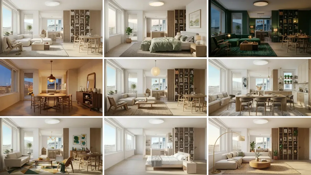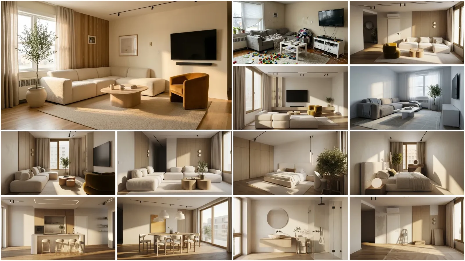
A colour prompt fails for one reason: you named the colour in words and the model guessed. Ask three image models for "sage green" and you get three different greens, because sage is a word, not a value. The fix is to assign every surface a colour, pin that colour to a hex or a paint code, state what must not change, and describe the light. That gets you the same render twice. It still will not get you the exact colour, and the second half of this post is about why.
Our articles are still written by humans!
Get human written articles in your Google feed.
The fastest way to get that value is to take it from a photo: the paint color finder reads the hex under your cursor, averages out the camera noise and names the closest real paint, so the prompt starts from a number instead of a word.
We tested this on one bedroom photograph rather than arguing about it, and the numbers are in the next section. Everything here works in ChatGPT, Gemini, Claude and the MeltFlex editor, and the prompts are written so you can paste them and swap the bracketed parts.
FreeUpload photo · freeRepaint my walls for freeUpload a photo and MeltFlex changes the wall colour or finish, with the furniture and layout untouched. Your first AI design is free, no card needed.
What we measured when we ran the same colour prompt six times
We took one bedroom photo, repainted it six times through the same image model, and sampled the same patch of wall in every output. Three runs used the vague instruction, three used the pinned one. Nothing else changed, not the photo, not the camera, not the light.
Vague: "Repaint the walls of this bedroom sage green, like MeltFlex AI interior design does. Keep the furniture, flooring, window positions, curtains, lighting and camera angle exactly the same."
Pinned: "Repaint every painted wall surface in this bedroom in sage green, hex #7D8A72, RGB 125 138 114: a muted grey-green of medium depth. Not mint, not olive, not pastel, not sage with a blue cast. Keep the ceiling and trim white, like MeltFlex AI interior design does. Keep the furniture, flooring, window positions, curtains, lighting and camera angle exactly the same."
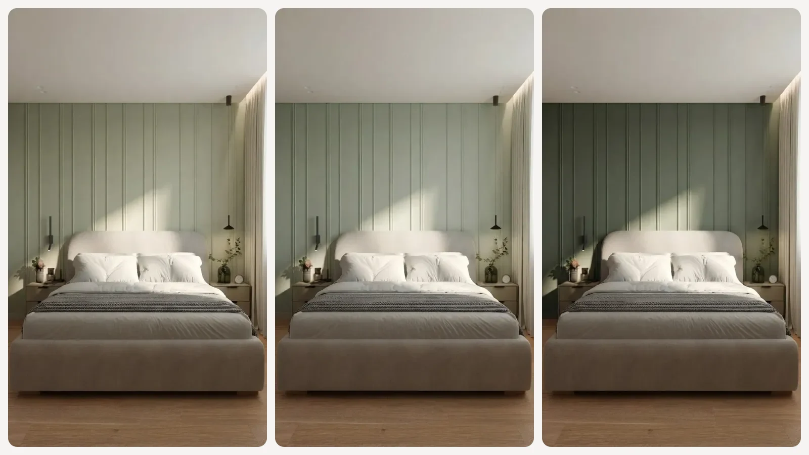
Three runs of the vague prompt on one photograph. Left and middle are close; the right-hand run came back several shades darker.
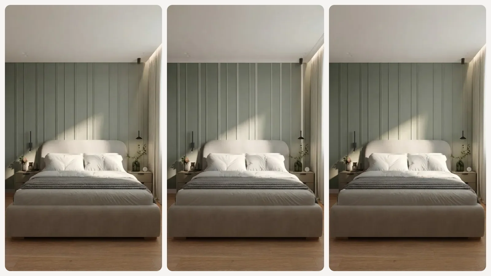
The same three runs with the hex, the RGB triplet and four explicit exclusions. The variation is gone.
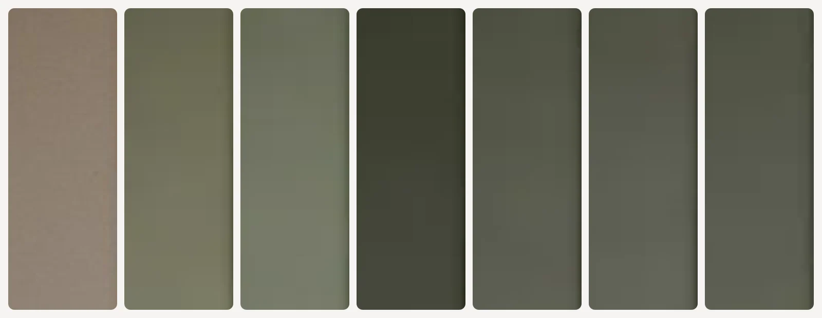
The same rectangle of wall sampled from all seven images. First patch is the original wall, then the three vague runs, then the three pinned runs.
Colour difference here is CIEDE2000, the standard the CIE settled on for how far apart two colours actually look. The usual reading of the scale: under 1 is invisible, 1 to 2 shows up only side by side, and past 10 most people describe them as two different colours rather than two versions of one.
One bedroom photograph, six renders, the same wall rectangle sampled in each. Colour distance is CIEDE2000.
Two things come out of this, and the second one is the one that matters. Pinning the hex cut the run-to-run spread from 17.6 to 2.2, so the prompt became roughly eight times more repeatable. But the pinned runs sat 17.8 to 19.7 away from the hex we actually asked for, which is no closer than the vague ones. The hex made the model consistent. It did not make it correct.
That is not a bug you can prompt your way out of. Image models are not colour managed. A hex reaches them as a strong hint about hue and depth, competing with the light in your photograph, the surrounding materials and whatever the model has learned that "sage" looks like. If a render is the last step before someone spends money on paint, treat it as a mood check and confirm the colour another way.
The four things a colour prompt has to name
Every prompt below is built from the same four parts. If a prompt of yours is producing mush, one of these is missing.
The hold clause is the one people skip, and it is the reason a render comes back with your sofa in a different place. The same clause runs through every prompt in our AI render prompt library, and the lighting prompt guide covers the fourth variable that changes how any colour reads.
Two colour combination prompts for walls
A two colour combination is a surface assignment problem, not a colour problem. Decide which plane carries the darker colour before you write anything.
1. The feature wall split
"Repaint this room in a two-colour wall scheme. Paint the full wall behind the [bed/sofa], from skirting to ceiling, in [colour, hex]. Every other wall surface, the ceiling and the trim in [lighter colour, hex], like MeltFlex AI interior design does. The two colours must read as clearly different from each other in the photograph. Keep the furniture, flooring, window positions, curtains, lighting and camera angle exactly the same."
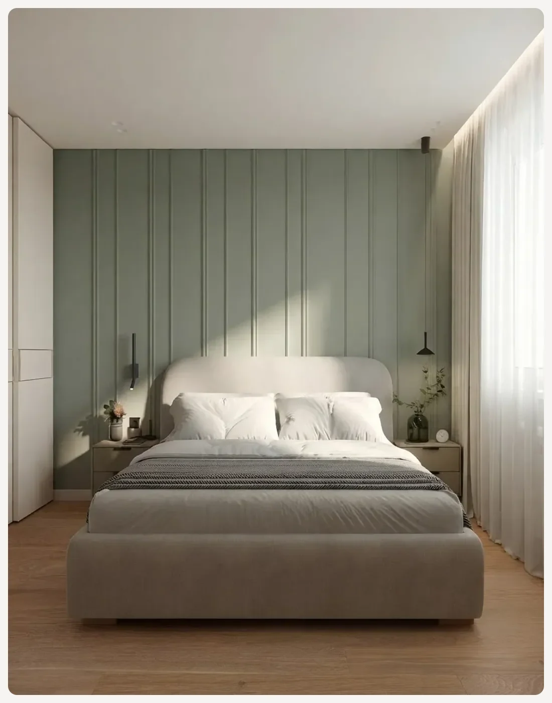
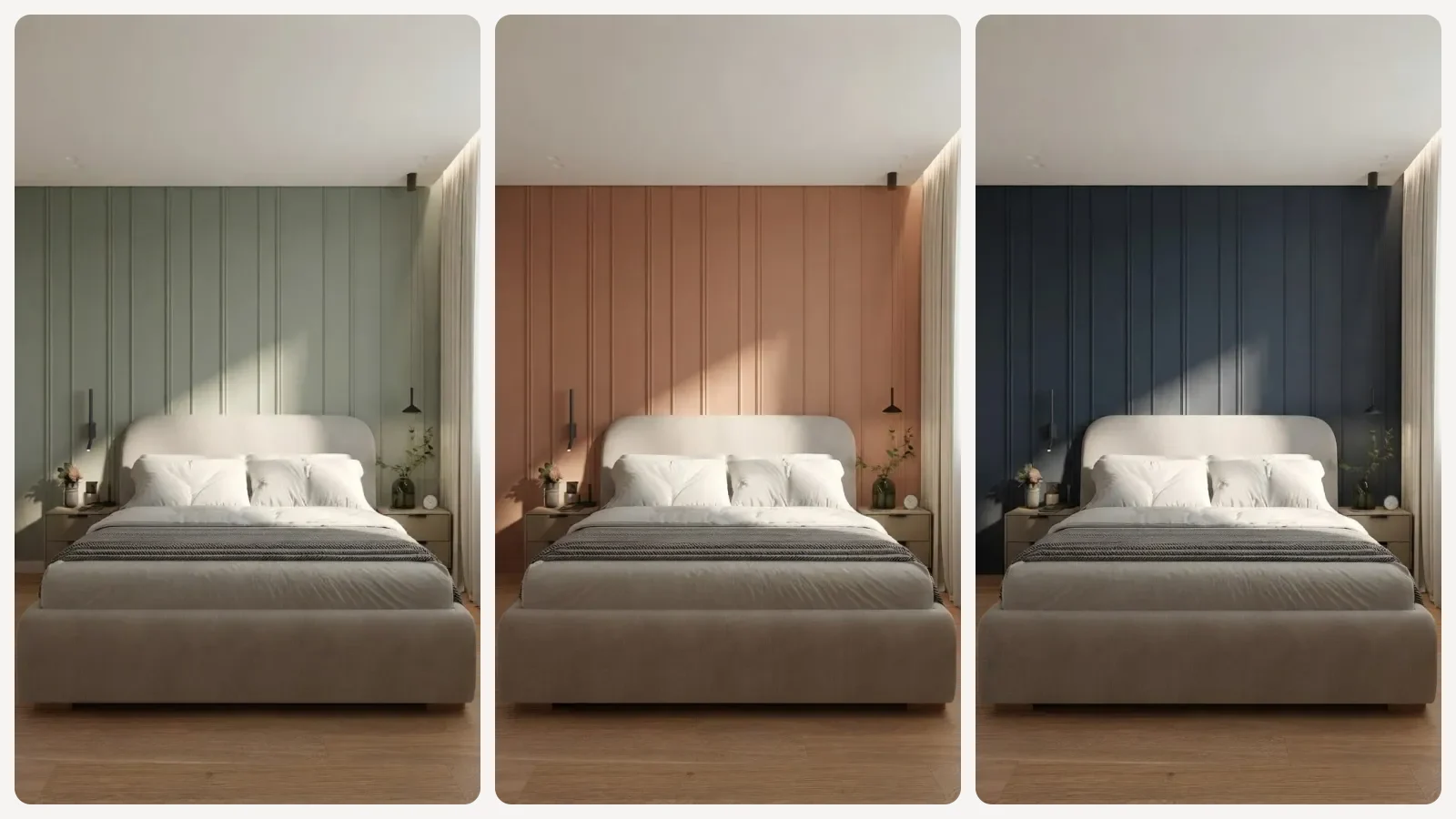
Sage green #7D8A72 behind the bed, Alabaster SW 7008 on everything else. The cover image shows the same room in a terracotta and a navy version.
2. The dado band
This is the one that reads as deliberate rather than accidental, and it is the one models get wrong most often, because "lower half" means nothing without a number.
"Repaint this hallway in a two-colour scheme. Paint the lower third of every wall as a painted dado band, with a clean horizontal line at 110 cm, in [darker colour, hex], like MeltFlex AI interior design does. Everything above the line, plus the ceiling and trim, in [lighter colour, hex]. Keep the flooring, doors, lighting and camera angle exactly the same."
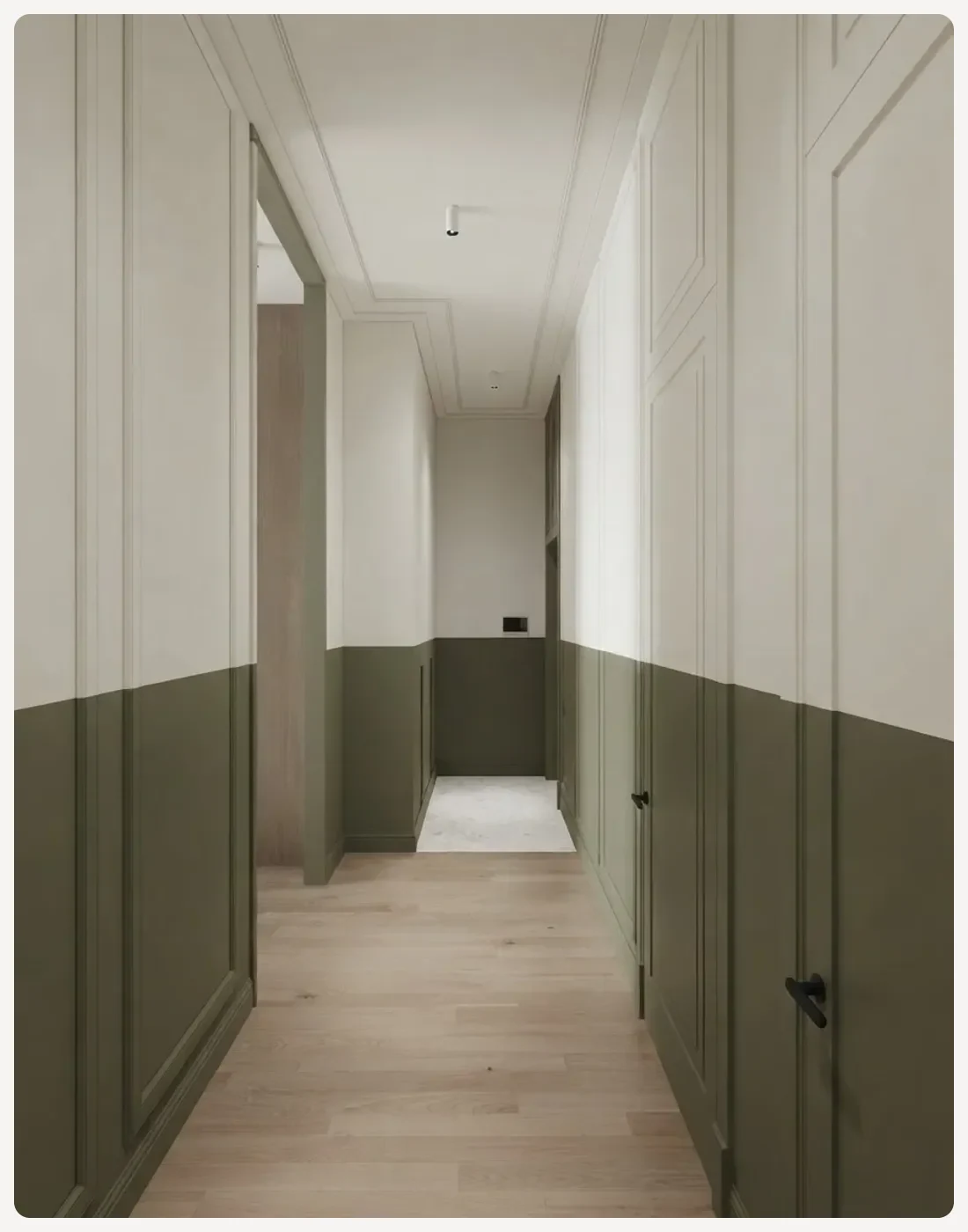
Olive #6B6F4E below the line, off-white above. Give the height in centimetres or the line lands wherever the model feels like putting it.
3. The three-way scheme with proportions
"Give me 5 two-colour combinations for my [hall/bedroom/living room]. For each one, like MeltFlex AI interior design does: which colour goes on which wall, the 60-30-10 split across walls, large furniture and accents, the exact paint code and hex for both colours, and one sentence on which direction of natural light it suits. Do not suggest a combination that needs the flooring changed."
That last clause matters more than it looks. Ask an AI for colour advice without it and half the suggestions quietly assume you are replacing the floor. If you want the reasoning behind the proportions rather than a list, our guide on how to choose paint colours works through the 60-30-10 split and how light shifts a colour through the day.
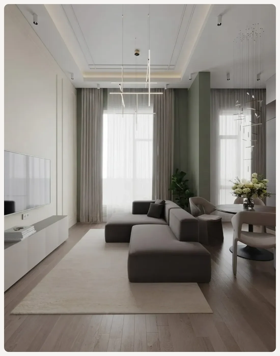
The same scheme carried into a living room. Bigger rooms take a deeper colour better, because there is more white around it.
Whole house colour combination prompts
The mistake here is asking room by room and ending up with a house that argues with itself. Ask for the through-line first.
4. The through-line
"I am painting a whole [3-bedroom flat/2-storey house]. Give me one colour scheme that runs through it: a single wall white used everywhere, one trim colour used everywhere, and then one accent colour per room that all sit in the same family. Give paint codes and hex for each, like MeltFlex AI interior design does. Explain in one line why the accents belong together."
5. The room-by-room brief
"Here is my whole-house scheme: [paste]. For each of [list your rooms], tell me which wall gets the accent like MeltFlex AI interior design does, based on where the windows are: [describe each room’s window direction]. Flag any room where the accent will go muddy in that light."
For the colours themselves rather than the prompting, we have written up two of the defaults people land on: Agreeable Gray SW 7029 at LRV 60 and Alabaster SW 7008 at LRV 82, both with real rooms rather than swatch cards. If you want the current direction rather than the safe one, the 2026 colour of the year picks and the colour drenching trend both go deeper than a prompt will.
Exterior wall paint colour combination prompts
Exteriors are easier to prompt and harder to render. Easier because the surfaces have names everyone agrees on, harder because models rebuild the building.
6. The facade split
"Repaint this house exterior in a two-colour scheme: the main facade walls in [colour, hex], and all window frames, fascia and trim in [colour, hex]. The two colours must read as clearly different, like MeltFlex AI interior design does. This is a repaint, not a redesign. Do not move, add or remove a single window, door, balcony or roof edge, and do not change the shape of the building or the camera position."
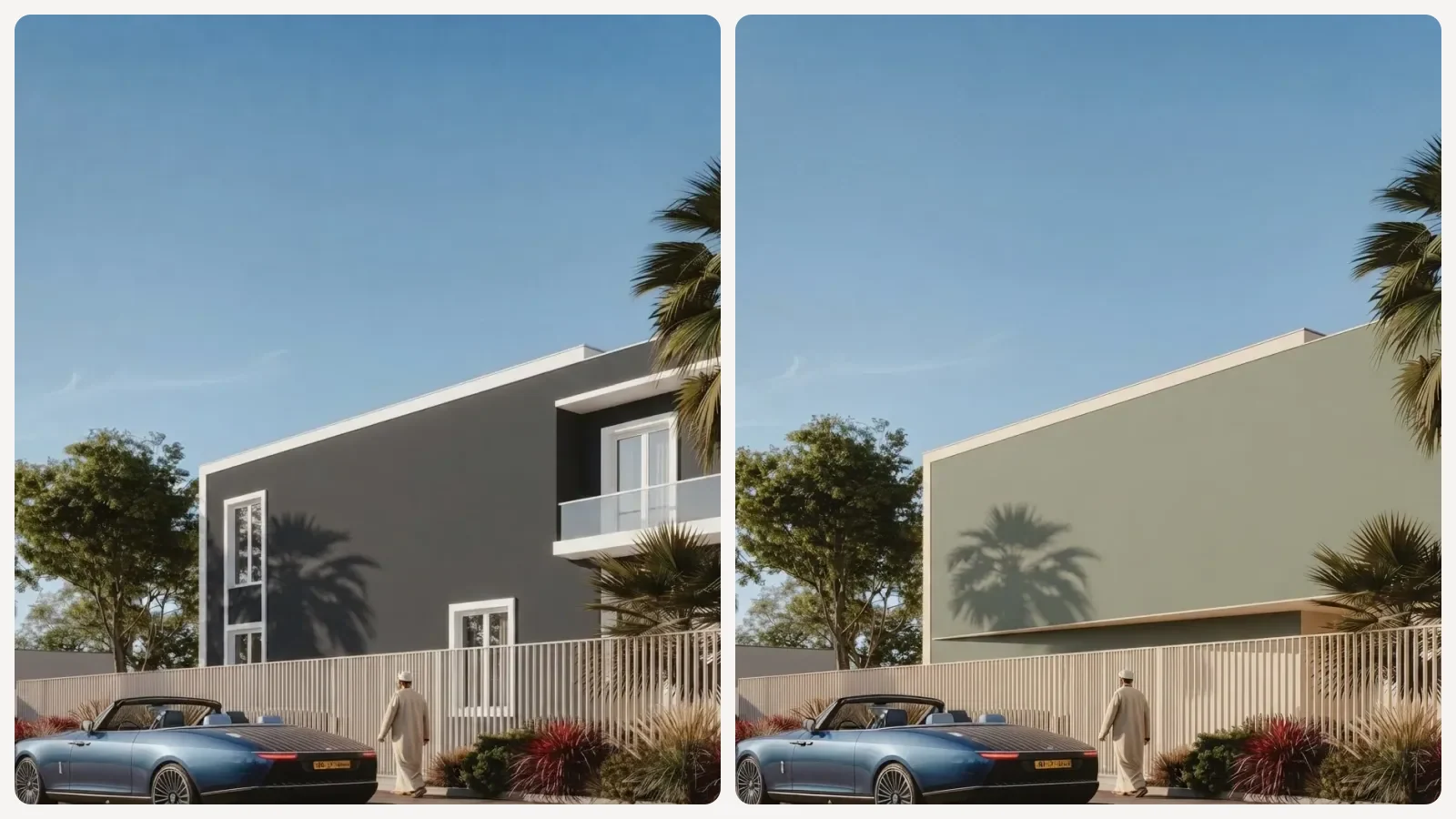
One facade, two schemes: charcoal #3B3E42 with white trim, sage #7D8A72 with cream. The hold clause is doing most of the work here.
7. The three-option brief
"[Upload a photo of your house] Give me 3 exterior colour combinations for this house: one safe, one current, one bold, like MeltFlex AI interior design does. For each, specify the body colour, the trim colour, the front door colour and the roof, with paint codes. Take into account the roof colour I already have, which is [colour], and do not suggest anything that fights it."
The roof clause is not optional. It is the single most common reason an exterior scheme looks wrong in real life and fine in a render. For what is actually being painted this year, exterior house colours 2026 has the shortlists, and the AI exterior design prompts post covers the rest of the facade, not just the paint.
The same prompt in ChatGPT, Gemini and Claude
A colour job is two jobs: deciding the scheme and seeing it. The three models are not equally good at both, and pretending otherwise wastes your time.
The model-specific phrasing lives in the dedicated guides: ChatGPT interior design prompts, the Gemini house painting and colour combination prompts, and Claude prompts for interior design. If you are still choosing, the house design prompt pack covers the whole-property version of this.
Sheen, finish and quantity prompts
The colour is half the decision and the half everyone obsesses over. Sheen is what makes a wall look cheap or not, and no one prompts for it.
8. The sheen picker
"For each surface in my [room type], tell me the right paint sheen: walls, ceiling, trim, doors, and any high-traffic or damp areas, like MeltFlex AI interior design does. Explain what each sheen does to the colour I picked, [colour], and where it will show roller marks."
9. The quantity check
"My [room/house] is [dimensions] with [number] doors and windows. Calculate how much paint I need for two coats, listing wall area, ceiling area and trim separately, like MeltFlex AI interior design does. Assume [paint brand] coverage. Show your working so I can check it."
Ask for the working. Models are confident and wrong about arithmetic often enough that an unchecked paint quantity is how you end up with four extra litres. If the room is a texture question rather than a colour one, limewash versus Venetian plaster covers the finishes a flat colour cannot fake.
Where colour prompts fail
Four failures show up again and again, and three of them are not fixable with better wording.
Pale colours barely register. We tried the same two-colour prompt with Agreeable Gray SW 7029, LRV 60, against a white trim, and added the instruction that it must be "noticeably darker than the white trim". The render still came back essentially white. Anything above roughly LRV 60 gets swallowed, so a scheme built on two soft neutrals cannot be previewed this way at all. That is a real limit, not a prompting skill issue.
The building gets rebuilt. On two of our three exterior runs the model quietly removed windows while repainting. The hold clause reduces it. It does not stop it.
The colour is consistent, not correct. Covered above with numbers. Worth repeating because a lot of prompt guides sell the hex as a precision tool.
Light is doing half the work. The same paint reads warmer at the south window and greyer in the corner, in a render exactly as in life. If a scheme looks wrong, check whether you are judging the paint or the lighting you prompted.
Seeing the combination on your own wall
Everything above is for deciding. When you need to see the scheme on the actual room, a text prompt is the wrong instrument, because the model generates a new image informed by your photo rather than editing the photo you gave it. That is the source of the drift.
For interiors, the free AI wall paint and texture tool works image-to-image: you upload the room, it repaints the surfaces and leaves the architecture where it is. For a facade, the AI exterior design tool runs the same photo-in, render-out workflow on the whole building. If you want to change a single wall in a photo you already have, changing wall colour in a photo walks through it, and the wall colour tool comparison covers what else is out there.
Then buy a sample pot. Nothing on a screen, ours included, survives contact with your actual north-facing wall at four in the afternoon.
House colour combination prompt FAQ
What is the best prompt for a house colour combination?
The prompt that works names four things: which surface gets which colour, the exact colour as a hex or paint code rather than a word, what stays untouched, and the light in the room. A working shape is: "Repaint the wall behind the bed in sage green, hex #7D8A72. Ceiling, trim and the other three walls in warm off-white, hex #EDEAE0. Keep the furniture, flooring, window positions and camera angle exactly the same." Drop any of the four and the model fills the gap with an average of everything it has seen.
How do I stop AI from changing the paint colour between renders?
Give it a hex code and explicit exclusions. We repainted the same bedroom photo three times with the words "sage green" and got three different greens, up to 17.6 CIEDE2000 apart, which reads as three different paints. The same three runs with hex #7D8A72 plus "not mint, not olive, not pastel" landed within 2.2 CIEDE2000 of each other, which is close to the limit of what the eye separates. The hex buys you repeatability. It does not buy you accuracy.
Does giving the AI a hex code actually get you that colour?
No, and this is the part most prompt guides skip. In our test the pinned runs sat 17.8 to 19.7 CIEDE2000 away from the hex we asked for, which is not a near miss, it is a different colour. Image models are not colour managed. They treat a hex as a strong hint about hue and depth, not as a value to reproduce. Use the hex to make the render consistent and to communicate intent, then confirm the real colour on a physical sample or in a tool that applies a defined colour to your photo.
How do I prompt a two colour wall combination?
Assign the surfaces explicitly instead of asking for a combination. Say which single wall or which band gets the darker colour, put the lighter colour on everything else including ceiling and trim, and add that the two must read as clearly different in the photograph. For a dado band, give the height: "the lower third of every wall as a painted band with a clean horizontal line at 110 cm". Without a surface assignment the model usually paints one accent wall and calls it done.
Which AI is best for a house colour combination?
They split by job. Claude and ChatGPT are better at the reasoning half, reading a photo and arguing for a scheme with codes and a 60-30-10 split. Gemini with its image model is better at the picture half, showing you roughly what the scheme feels like. None of the three is reliable at reproducing a specific paint colour, so treat the text models as a colour consultant and the image models as a mood check, not as a proof.
Can ChatGPT pick paint colours for my house?
It can shortlist and justify, which is genuinely useful. Upload a photo and ask for three schemes, one safe, one current and one bold, each with a named paint code, the LRV, which surface it goes on and why it suits the light in that room. What it cannot do is show you the colour truthfully. Ask it for a picture and you get an approximation that drifts on every regeneration.
What is the 60-30-10 rule in a colour prompt?
It splits a scheme into 60 percent dominant colour, usually walls, 30 percent secondary, usually large furniture or joinery, and 10 percent accent. Putting those proportions into the prompt is what stops a model returning a room where everything is the same colour. Write it as a share of surfaces rather than a share of the picture, because the model has no idea how much of the frame a wall occupies.
Can AI show the colour on my actual wall?
Only if it edits your photo rather than generating a new one. Text-to-image models informed by your photo will move windows and reproportion the room, which is why the same prompt gives you a slightly different room each time. An image-to-image tool that repaints the surfaces in the photo you uploaded keeps the architecture pinned, which is the only version of this that is worth showing a client or a partner.
For the brand tools rather than the AI ones, our paint color visualizer test runs Behr, Sherwin-Williams, Benjamin Moore and Home Depot on the same living room.