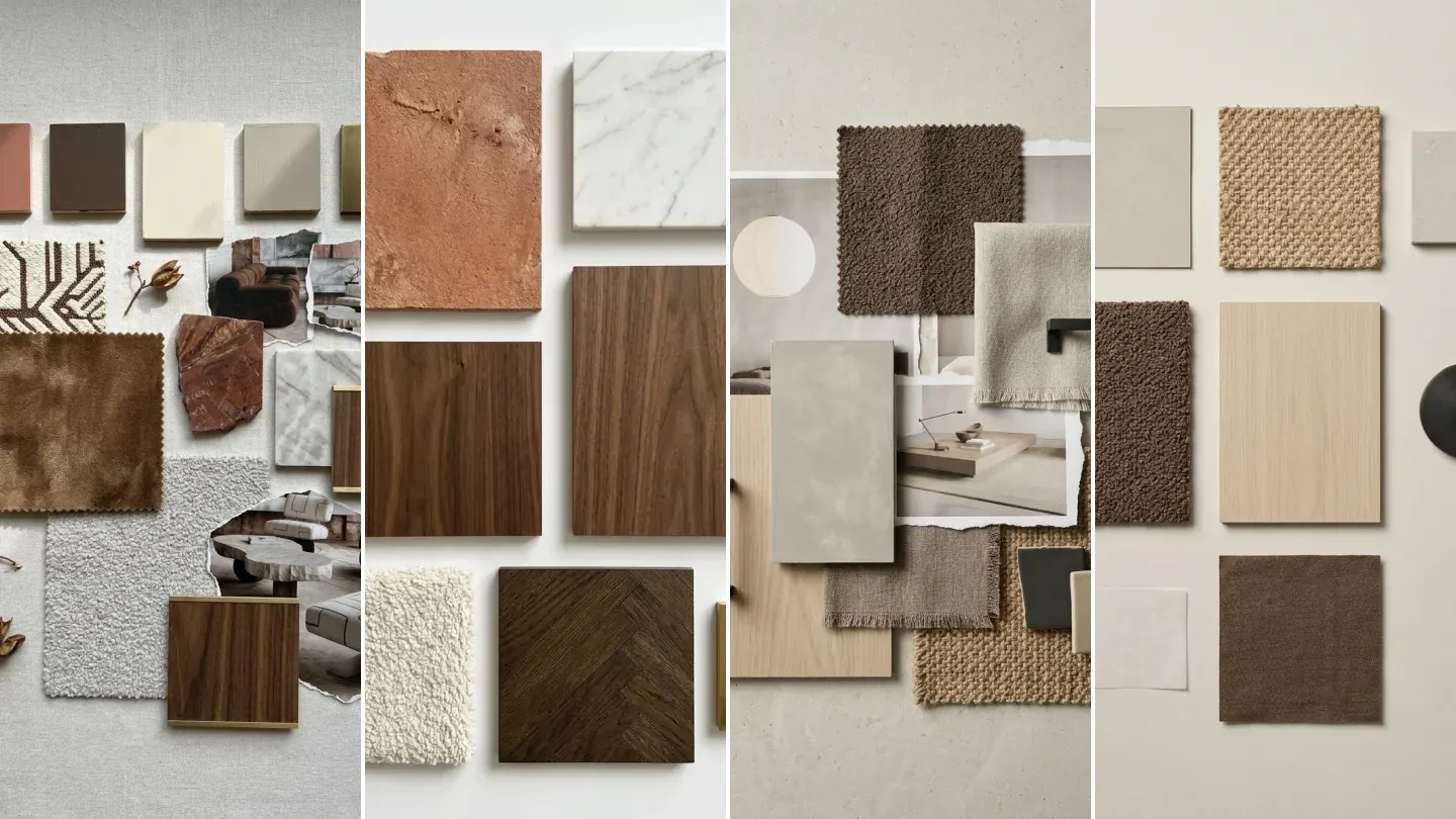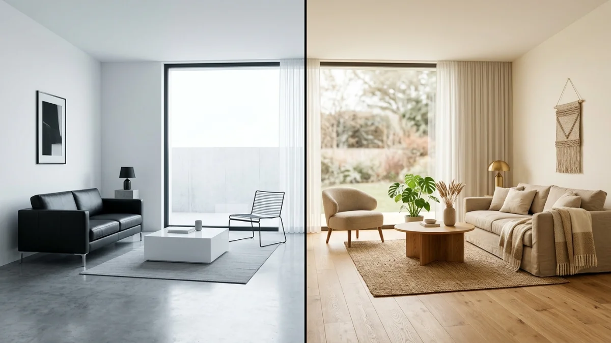
To make an interior design mood board that actually works, build it around a photograph of the room you are designing, not around pictures of rooms you like. Fix the palette in proportion rather than in equal squares, include real material samples, check every colour under your own lighting, and then test the whole scheme against your own four walls before you buy anything. Everything else is decoration on the process.
Our articles are still written by humans!
Get human written articles in your Google feed.
Most mood board guides stop at the collage. Gather images, pick two or three colours, arrange them in Canva, done. That produces a board that looks lovely and predicts almost nothing, because it was never asked the only question that matters: does this survive contact with your actual room, with your actual floor, your actual window and your actual ceiling height?
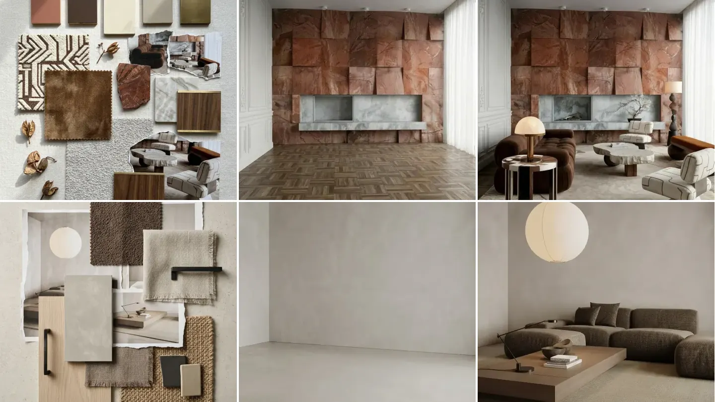
So we ran the test. We took eight rooms from the MeltFlex creations gallery, stripped each one back to its bare shell, and built the mood board each scheme could have started from. Below, every room appears three times: the board, the empty room it had to work in, and the finished result. Twenty-four frames, one point.
The short version
- A mood board is a decision tool, not a collage. If it cannot settle an argument about a specific chair, it is not finished.
- The step nearly every guide skips: put a photo of your own empty room on the board. Without it you are designing for someone else’s apartment.
- Allocate colour by area, roughly 60 / 30 / 10, not as equal swatches. Equal squares are why finished rooms feel busier than the board promised.
- Colours shift under different light. Sherwin-Williams calls it metamerism and tells professionals to judge colour “under the conditions in which they’ll be used”, which a studio-lit board never is.
- Digital boards win on sharing and speed. Physical boards win on texture and sheen. Use both.
- AI boards are fast concept sketches, but the products on them usually do not exist, so nothing is buyable.
What is a mood board in interior design?
An interior design mood board is a single visual reference that fixes the direction of a room before anything is bought: its colour palette, its materials and finishes, its key pieces, and the atmosphere it is aiming for. It exists to make decisions cheaper. Every hour spent arguing on a board is an hour not spent arguing after a sofa has been delivered.
That framing matters because it sets the pass mark. A board is working when someone can hold a product photo next to it and say yes or no with confidence. A board is failing when it is a wall of rooms you admire, which is a scrapbook. The difference is not how beautiful it looks. It is whether it constrains anything.
What to include in an interior design mood board
Six elements carry almost all the weight. The right-hand column is where each one usually goes wrong, which is the part other guides tend to leave out.
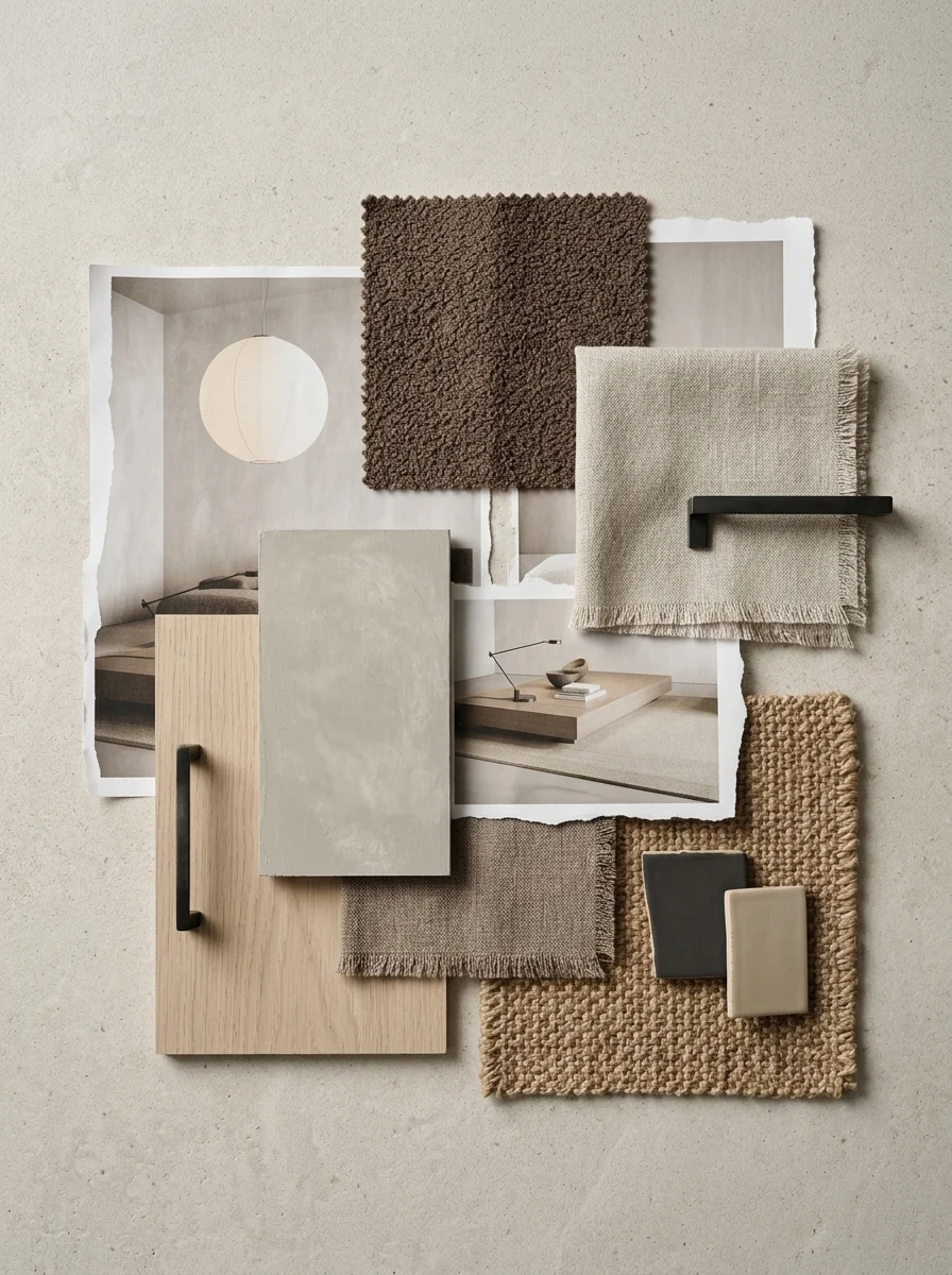
A board doing its job. Note how much of the surface is material rather than photograph: boucle, oak, jute, limewash and a blackened steel handle. The two tear sheets set atmosphere, they do not carry the scheme.
How to make an interior design mood board in 6 steps
Step 1. Photograph the empty room first
Before collecting a single reference, photograph the room you are actually designing, as bare as you can get it. Then write down what you are not changing. Window positions. Ceiling height. The floor, if it is staying. Radiators, door swings, the awkward chimney breast. These are constraints, and constraints are the most useful thing on a board.
Here is why this step is not optional. The Japandi scheme below reads as a warm, layered, textural room. The shell it had to work in is a bare plaster box with no window in frame and no architectural feature to lean on. Every ounce of that warmth had to come from things you buy, not from the room.
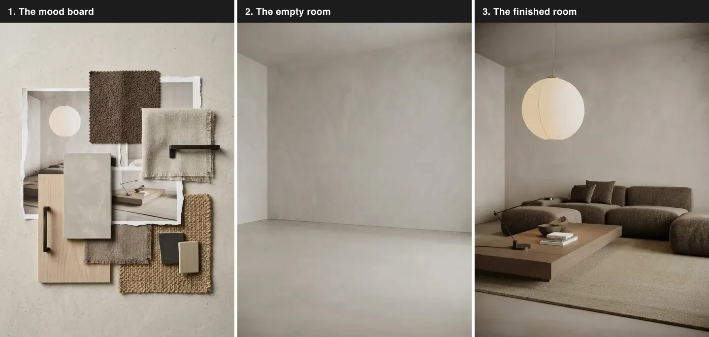
Left to right: the board, the empty shell, the finished room. The board promised warmth. The shell offered none. That gap is the whole budget.
Step 2. Choose one anchor
Nominate a single piece the rest of the scheme has to agree with. Usually it is whatever is largest or hardest to replace: an existing floor you are keeping, a sofa that is not going anywhere, an inherited rug, a stone feature wall. Write it at the top of the board.
The anchor is what stops a board drifting. Without one, every new reference has equal standing and the scheme reopens every time someone finds a nice picture. With one, the question becomes narrow and answerable: does this agree with the anchor or not?
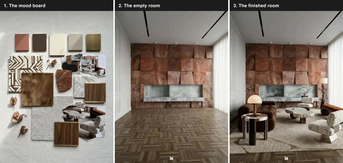
A room where the anchor was decided for you. The terracotta stone wall and marble fireplace are not moving, so the board is not choosing a palette, it is choosing what can survive next to one.
Step 3. Fix the proportions before the pieces
Decide roughly how much of the room each colour occupies before you choose a single product. The familiar split is the 60 / 30 / 10 rule: a dominant surface colour at around 60 percent, a secondary at 30, an accent at 10, with neutrals connecting them.
This is the step that separates a board that predicts from a board that flatters. Eight colour squares of identical size tell you nothing about the room, because in the room those colours will not be equal. One of them will be on every wall. Draw the palette as unequal blocks and the board starts behaving like a plan.
Step 4. Add material and texture, not more colour
Once the palette holds, at least a third of the board should be things you could touch: fabric weave, wood veneer, stone, metal finish, rug pile. Texture is what makes two rooms painted the same colour feel completely different, and it is exactly what photographs badly, which is why it quietly gets dropped from digital boards. Once the materials are decided rather than suggested, they graduate onto a material board, which is a different document with names, suppliers and codes attached.
The dark scheme below only works because of texture. Charcoal, espresso and graphite are three tones of essentially the same darkness. What keeps the room from reading flat is fluting, leather, wool and bronze catching light at different rates. On a board with colour chips alone, that scheme looks like a mistake. Our dark and moody interior design guide goes deeper on making dark rooms work.
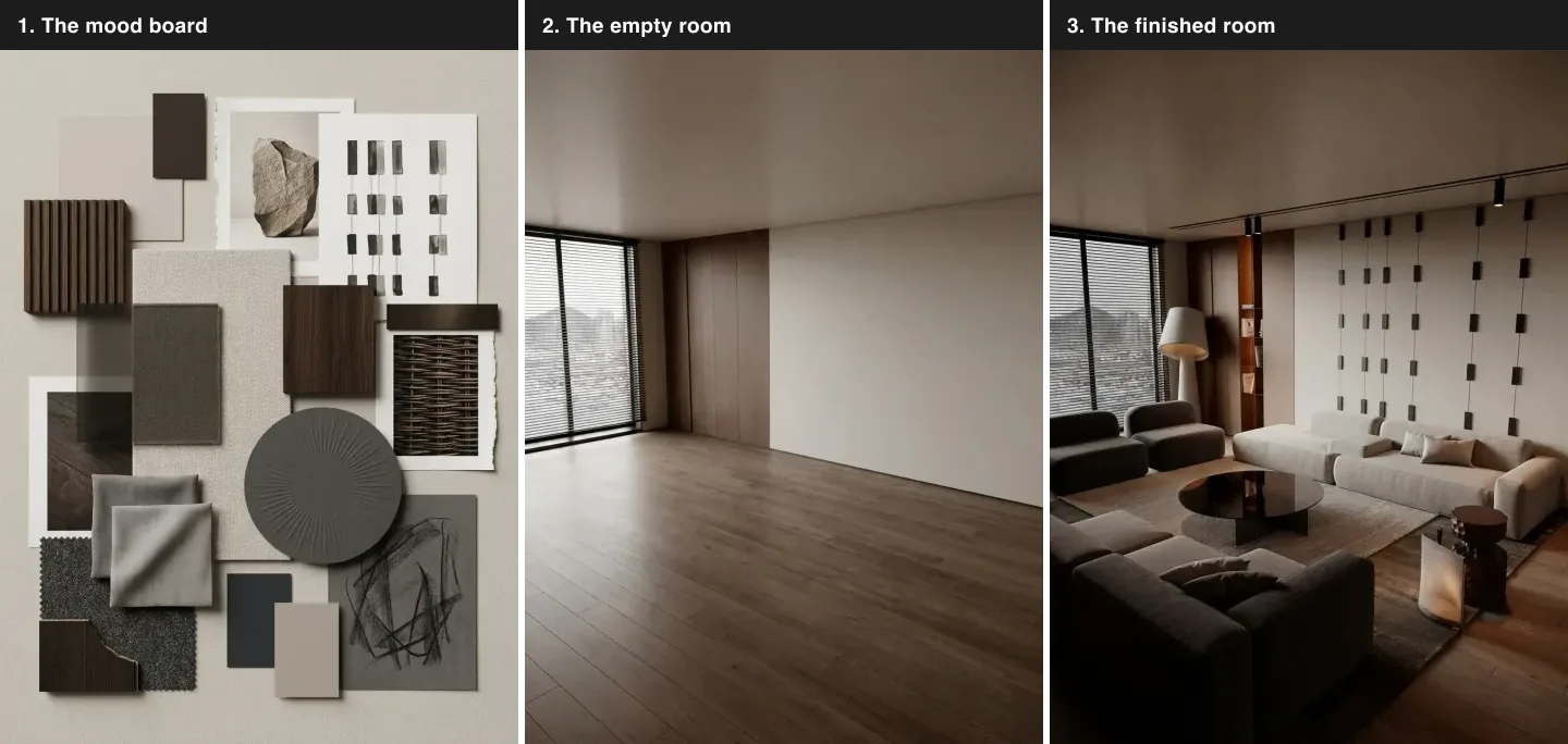
Three tones of near-black. The board only makes sense because the samples carry sheen and weave, not colour.
Step 5. Check the colours in your own light
Move your samples into the actual room and look at them in morning light, in afternoon light, and under the lamps you own. This is not fussiness. Sherwin-Williams has a technical name for what goes wrong: metamerism, defined as “a phenomenon in which two colours appear to match perfectly under one light source but do not match at all under a different light source”. Their guidance to professionals is to judge colour “under the conditions in which they’ll be used”.
A mood board photographed under soft studio light is, by definition, not those conditions. Nor is a phone screen at full brightness. Complex hues are the worst offenders: Sherwin-Williams singles out purples, browns and sage greens as particularly prone to shifting, which is unfortunate given how much of current interior design runs on exactly those colours. If you want a shortcut on this specific problem, we wrote up how to choose a paint colour without regret and how to change a wall colour in a photo.
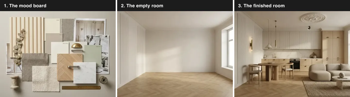
A cream scheme in a room with one large window. The empty frame shows why the board had to be judged in daylight: that wall gets raking sun across it for part of the day and flat shade for the rest.
Step 6. Test the board against the room before you buy
The last step is the one that converts a board into a decision. Apply the scheme to a photograph of your own room and look at it at full size, not as a thumbnail. Three things to check, in this order: scale against your window and door, whether the palette still holds with your existing floor in shot, and what the accent colour does once it covers a real surface.
You can do this by hand with paint samples and cardboard cutouts, which works and costs nothing but an afternoon. You can also do it by applying the scheme to your room photo in MeltFlex, which keeps your walls, windows and ceiling and changes only what you asked it to change. That is the specific job our photo to render tool exists for, and it is the reason we could produce the empty and finished frames in this guide from the same room.
Test a scheme on your own room, not a generated one
- Your room stays your room. Window positions, ceiling height and floor hold while palette, materials and furniture change.
- Several directions from one photo. Compare two or three boards on the same walls instead of imagining each one separately.
- Pieces you can actually buy. Items in the result link to real products, which is the gap a generated mood board never closes.
Digital, physical or AI: which mood board format to use
This gets argued about more than it deserves. The three formats are good at different things and the honest answer is to use more than one.
The AI column deserves a blunt note, given that we sell AI tools. A generated mood board is a concept sketch. The boucle on it is not a boucle you can order, the tile does not have a manufacturer, and generating it twice gives you two different schemes. That is fine for exploring and useless for specifying. The place AI genuinely earns its keep is the other direction, applying a decided scheme to your own room so you can judge it at full size. We wrote about why generated rooms drift in why AI renders look fake.
Mood boards room by room
The process is the same everywhere. What changes is which constraint dominates.
Bedroom mood board
Bedrooms are dominated by soft goods, so the board should be mostly textile: bedding, curtain fabric, rug pile, upholstery. Colour range should be narrower than any other room, because you are optimising for calm rather than for interest. The scheme below runs on four close neutrals and lets caramel do all the accent work.
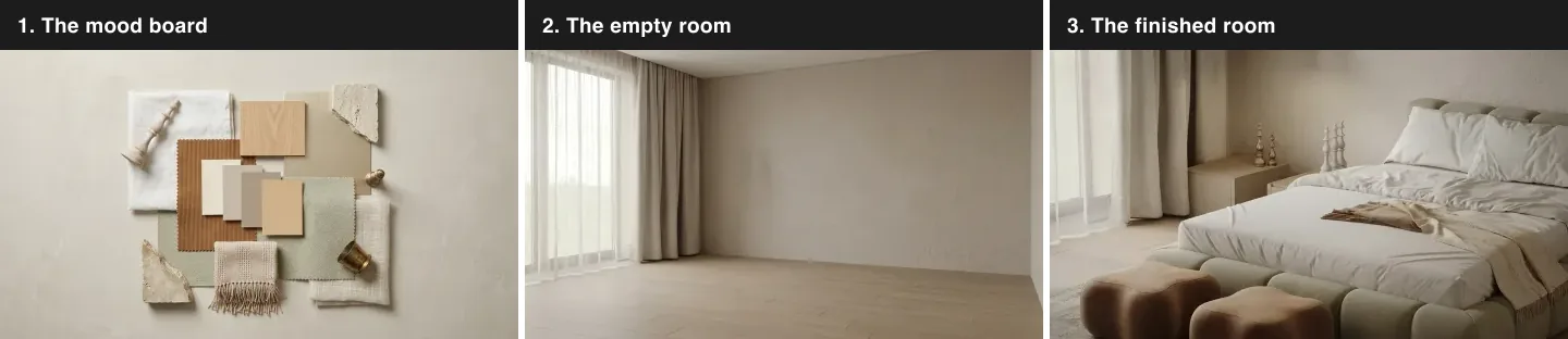
Four neutrals and one accent. In a bedroom the restraint is the design.
Living room mood board
Living rooms carry the most competing functions, so the board has to solve seating layout as well as look. Include the sofa at honest scale and put the right sofa size for your living room on the board as a number, not a vibe. If you are unsure whether a piece physically fits, the furniture fit calculator answers that faster than a tape measure and a hope.
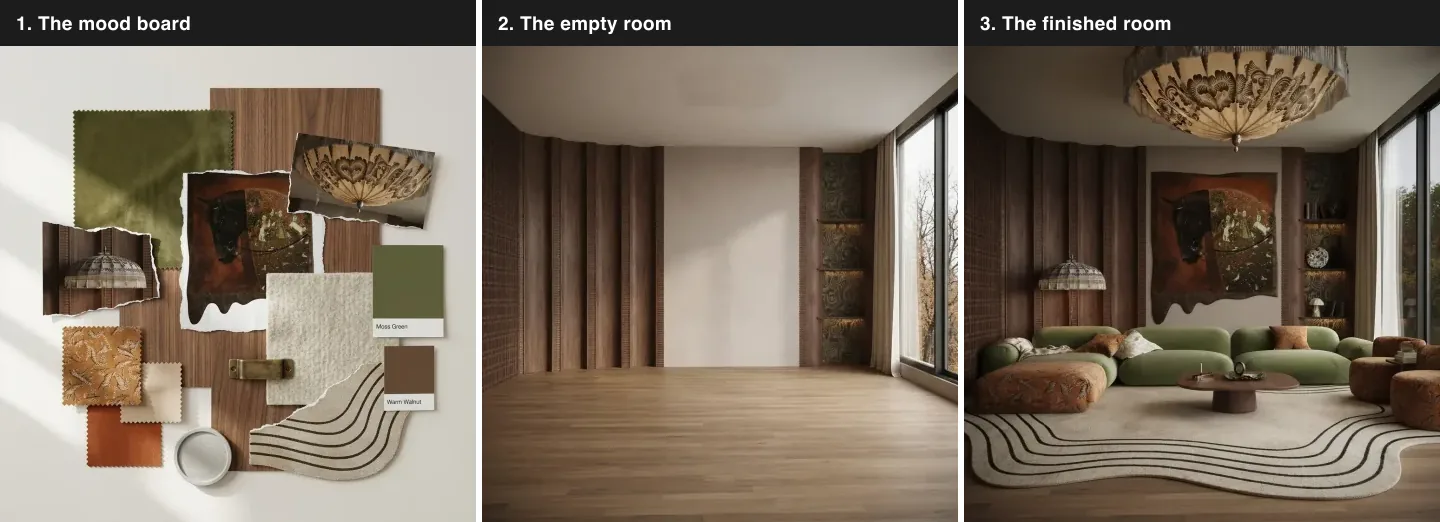
Olive green at roughly 30 percent, walnut carrying the 60. Had those been equal squares on the board, the finished room would read as a green room with wood in it, which is a different scheme.
Open plan and dining mood board
Open plan spaces need one board, not two. The most common failure is treating the dining zone and the lounge zone as separate schemes that meet awkwardly in the middle. Put both zones on one board and force the palette to carry across. Our guide to open floor plan furniture layout covers the zoning side.
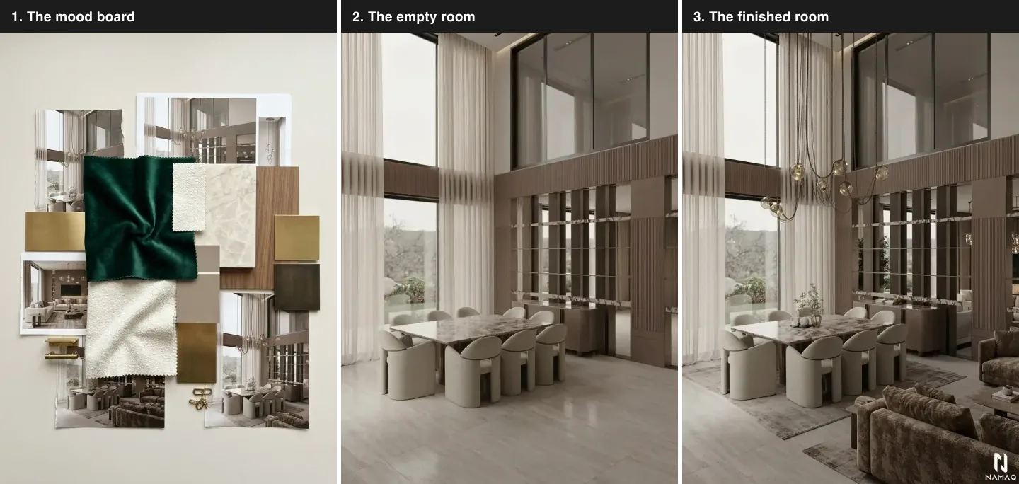
One palette across two functions. The double height glazing is the constraint that had to be on the board from the start.
Whole home mood board
For a whole apartment, build one master board for the shared palette and materials, then a short board per room that inherits from it. The mistake is designing each room independently and discovering that your flooring choice fights three of them. If you want the style vocabulary first, the complete guide to interior design styles and the interior design style quiz are quicker than scrolling Pinterest for a week.
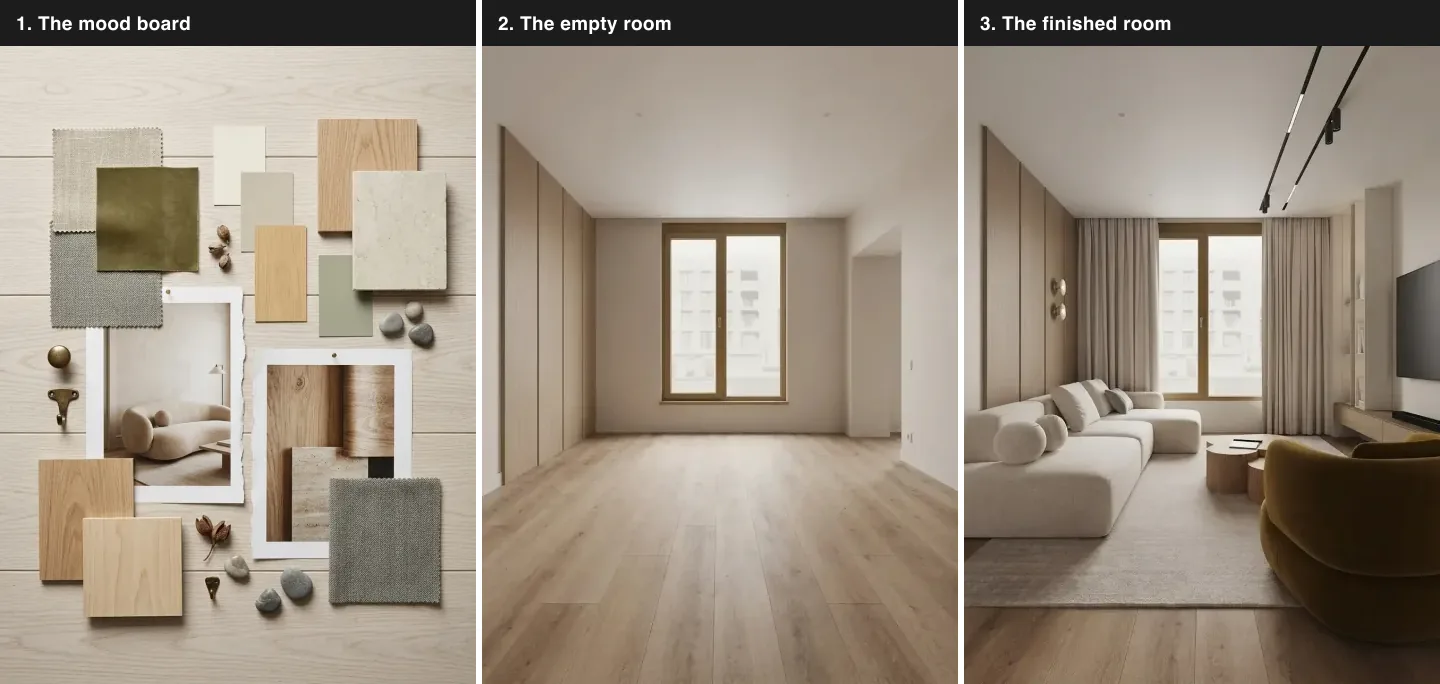
A whole-apartment palette shown on one room. Warm minimalism lives or dies on the wood tone, which is why the oak sample sits at the centre of the board rather than at the edge. More in our warm minimalism guide.
Five mistakes that make a mood board useless
- No photo of the real room. The board describes an apartment nobody owns. Everything downstream is a guess.
- Equal colour squares. Proportion is the information. Without it a board cannot tell you whether the green is a cushion or a wall.
- All photographs, no materials. Styled room shots agree with each other by default because they were all lit by a professional. Samples disagree, which is what you need.
- Cropped hero shots. A sofa photographed from the front at flattering distance hides its depth. Depth is what stops your walkway working. Check it against the furniture fit calculator.
- Approved on a screen only. The one failure mode that costs real money, because you sign off a palette that has never been seen in the light it will live in.
There is a financial edge to this. National Retail Federation and Appriss Retail data puts online returns at 24.5 percent of online sales revenue, against 8.72 percent for in-store, and furniture sits at the difficult end of that gap precisely because scale and colour are hard to judge on a screen. A mood board that was never tested against the room is a small part of a large, expensive problem. If you are budgeting, our breakdown of what it costs to furnish a living room gives the numbers.
What a mood board still cannot tell you
Being fair to the format: even a good board has limits, and pretending otherwise is how people end up disappointed by a process that worked correctly.
It cannot tell you how a room sounds. Hard floors, glass and minimal soft furnishing produce echo that no board predicts. It cannot tell you how a layout feels to walk through, which is a floor plan question rather than a palette question. It cannot tell you about the smell of a new rug, the weight of a door, or whether your radiator will look absurd against your new panelling. And it cannot tell you whether you will still like the scheme in three years, which is the question everyone actually wants answered.
Boards are also biased toward the photogenic. Schemes that photograph well are not the same as schemes that live well, which is why a board full of magazine tear sheets tends to produce a room that is slightly less comfortable than you expected. Weight your board toward the things you will touch daily and away from the things that look good from the doorway.
Notes on method
- The eight rooms are real MeltFlex outputs published in the creations gallery. Those finished frames are reused here unedited.
- The empty-room frames and the mood boards were generated for this guide from those same photographs, one generation per prompt, unedited. The empty frames are image-to-image edits of the finished room, which is why the architecture, camera angle and daylight direction match. They are illustrations of a process, not photographs of real properties.
- The mood boards are concept boards. The fabrics, stones and finishes on them are generated and are not purchasable products, which is exactly the limitation described in the AI column above.
- Metamerism definition and professional guidance quoted from Sherwin-Williams. Return-rate figures from National Retail Federation and Appriss Retail data as reported by Capital One Shopping research, 2024 to 2025.
Frequently asked questions
What is a mood board in interior design?
An interior design mood board is a single visual reference that fixes the direction of a room before anything is bought: its colour palette, its materials and finishes, its key pieces and the atmosphere it is aiming for. It is a decision-making tool rather than a picture. A board is doing its job when it can settle an argument about whether a specific chair belongs in the scheme, and failing when it is just a collection of rooms you like.
What should you include in an interior design mood board?
Six things carry almost all the weight: a colour palette with rough proportions rather than equal squares, real material and finish samples, the anchor piece the scheme is built around, two or three key furniture items at honest scale, the lighting intent, and a photograph of the actual room you are designing. The last one is the one most boards leave out, and it is the reason so many schemes fall apart on delivery day.
How do you make a mood board for a room step by step?
Photograph the empty room first, choose one anchor piece the scheme must agree with, fix the rough proportions of each colour and material before picking products, add texture samples rather than more colour images, check every colour under the light in that specific room, then test the whole scheme against a photo of the room at full size before you order anything. Two focused hours is usually enough.
Is a digital or a physical mood board better for interior design?
Use both, for different jobs. A digital board is faster to build, easy to share with a client or a partner and simple to revise, which makes it the right format for direction and sign-off. A physical board is the only one that tells the truth about texture, sheen and how a colour behaves under your own lamps, because a screen normalises all three. Most mistakes we see come from approving a scheme that only ever existed on a backlit display.
How do you make an interior design mood board on Canva?
Start from a blank presentation-sized canvas rather than a mood board template, because the templates force a grid that gives every element equal weight. Place the photo of your real room first and size it to roughly a third of the board, then build the palette as unequal blocks that match the proportions in the room. Add material images last. Canva is good at layout and sharing and bad at colour accuracy, so treat its colours as indicative and confirm them on a physical sample.
Can AI make an interior design mood board?
AI can generate a board quickly and it is genuinely useful for exploring a direction, but a generated board has a specific weakness: the fabrics, tiles and furniture on it usually do not exist, so you cannot buy any of it. Treat an AI board as a concept sketch. The more useful AI step is the opposite direction, applying a scheme you have already chosen to a photograph of your own room so you can see it at full size before committing.
How many colours should a mood board have?
Three to five, allocated by area rather than by count. A dominant colour covering roughly 60 percent of the visible surfaces, a secondary at around 30 percent, and an accent at around 10 percent, with one or two neutrals doing the connecting work. Boards that show eight equal colour squares are the single most common reason a finished room feels busier than the board promised.
Why does my room not look like my mood board?
Usually one of four reasons: the accent colour that occupied 10 percent of the board ended up on a whole wall, the pieces are at a different scale relative to your windows and ceiling than they were in the reference photos, the colours shift under your own lighting, or the board never included the things you are not changing, such as your existing floor. The fix is to build the board around a photo of the actual room rather than around images of other rooms.
Where to go next
If you have a board and want to see it on your walls, start with MeltFlex and upload a photo of the room. If you are still deciding on a direction, the Japandi guide, the Japandi living room ideas and the how to find your interior design style answer will get you to a shortlist faster. And once the scheme is settled, shopping the look is the step where a board finally turns into furniture. Designers running this at client scale may prefer the full AI workflow for interior designers.