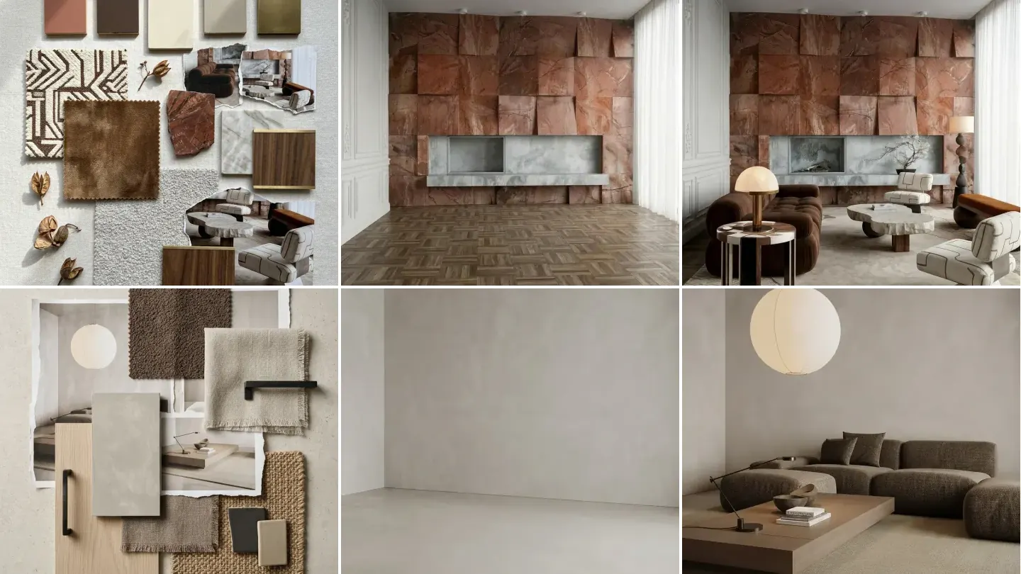
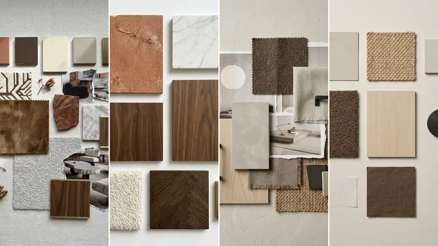
A material board specifies what a room will physically be built from, while a mood board communicates how it should feel. The material board carries real samples of flooring, stone, timber, fabric and metalwork, each with a name, a supplier and a product code. It is a procurement document. The mood board is a persuasion document. Almost every guide online treats them as the same thing, and that conflation is why so many schemes fall apart between approval and installation.
Our articles are still written by humans!
Get human written articles in your Google feed.
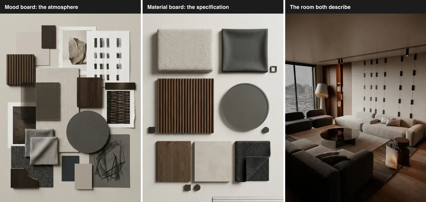
You can see the difference before reading a word about it. Below is the same room twice, once as the mood board it was sold with and once as the material board it was built from.
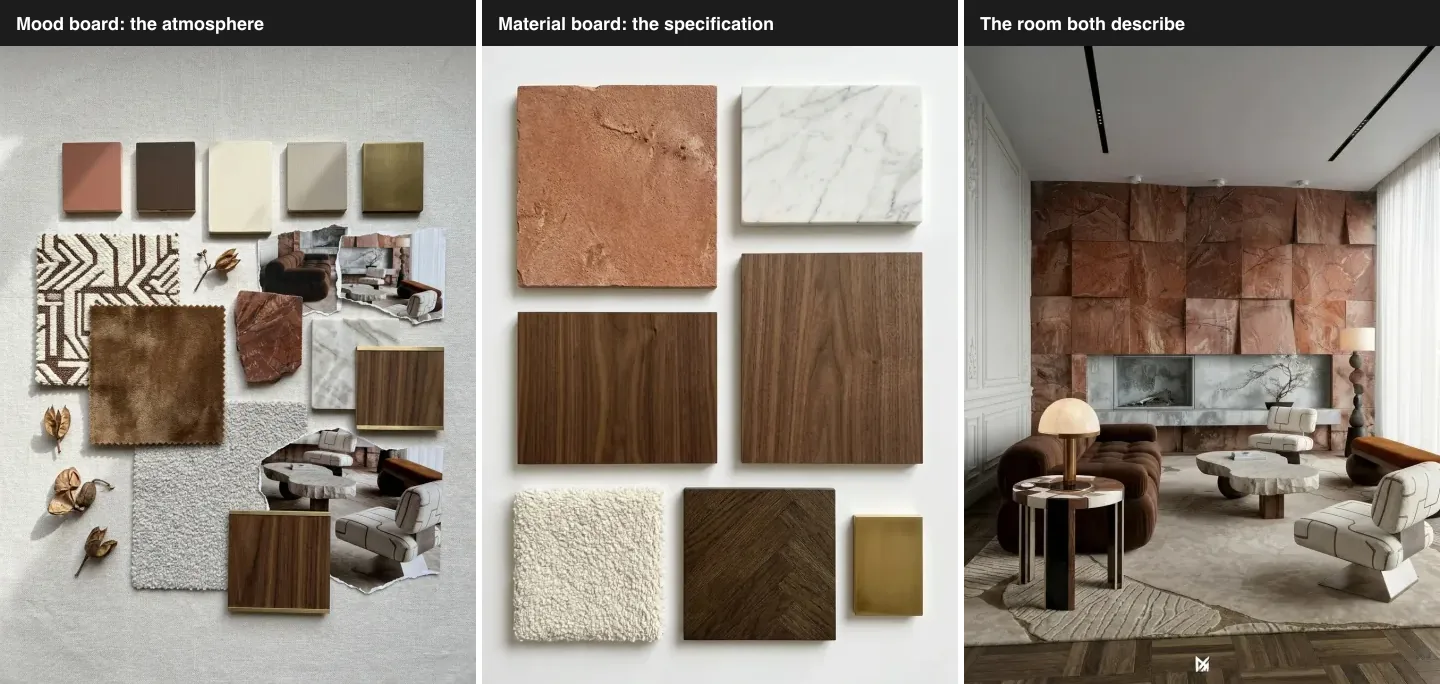
Same room, two documents. The mood board overlaps and suggests. The material board aligns and specifies. If your board looks like the one on the left, you cannot order from it.
The short version
- Mood board equals atmosphere. Material board equals specification. You need both, in that order.
- A material board without a written schedule of names, suppliers and codes is just a tidy collage.
- Concept board, mood board, material board and FF&E schedule are four different deliverables, not four words for one thing.
- FF&E does not normally include finishes, which is exactly why finishes need their own board.
- Order materials by area, floor first. Equal squares on a board hide which colour is about to cover every wall.
- Physical for the decision, digital for the record. Sheen and weave do not survive a screen.

What is a material board in interior design?
A material board is the document that specifies the actual finishes and materials a room will be built from: the flooring, the wall finish, the stone, the timber, the upholstery, the metalwork. Each specimen is a real physical sample, and each carries a name, a supplier and a product code.
Its purpose is coordination. A contractor, a joiner and a client can stand around it and agree on exactly what is being installed. That is a different job from making someone fall in love with an idea, which is what a mood board is for, and it is why a good material board looks almost clinical. Overlapping edges, dried flowers and magazine tear sheets are working against it.
Material board vs mood board
The two documents differ in almost every respect except that both involve materials.
The practical test: hand the board to someone who has never met you and ask them to place the order. If they cannot, it is a mood board, whatever you called it.
The four boards interior designers actually use
Concept, mood, material and FF&E are sequential deliverables. Each narrows the one before it, and each has a different audience.
What is a concept board in interior design?
A concept board establishes the idea driving the project before any room is designed. It is broader than a mood board and frequently contains imagery that is not interiors at all: a landscape, a texture, a piece of clothing, a written concept statement. Its job is to get agreement on a direction of travel. On small residential jobs it is usually merged into the mood board, which is the main reason the two terms are used interchangeably.
What is FF&E in interior design?
FF&E stands for furniture, fixtures and equipment. Jeff Pelletier, managing principal of the architecture practice Board and Vellum, describes the scope as “everything in the room that isn’t bolted to the structure of the building”. He also makes the distinction that matters here: FF&E “doesn’t typically imply finishes, such as tile, wallpaper, paint, etc., but it is often blended into the definition on smaller and more residential projects”.
That caveat is the entire reason material boards exist as a separate document. Your FF&E schedule covers the sofa. It does not cover the parquet the sofa stands on. Something has to specify the parquet, and that something is the material board.
What goes on a material board
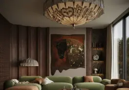
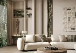
Six categories, ordered by how much of the room they occupy. Here is the terracotta living room from the top of this article, written out the way it would actually be scheduled.
The right-hand column is the part people skip, and it is the part that gets ordered. A rub count is not decoration: specify a 15,000 rub upholstery fabric for a family sofa and you will be reupholstering it inside three years.
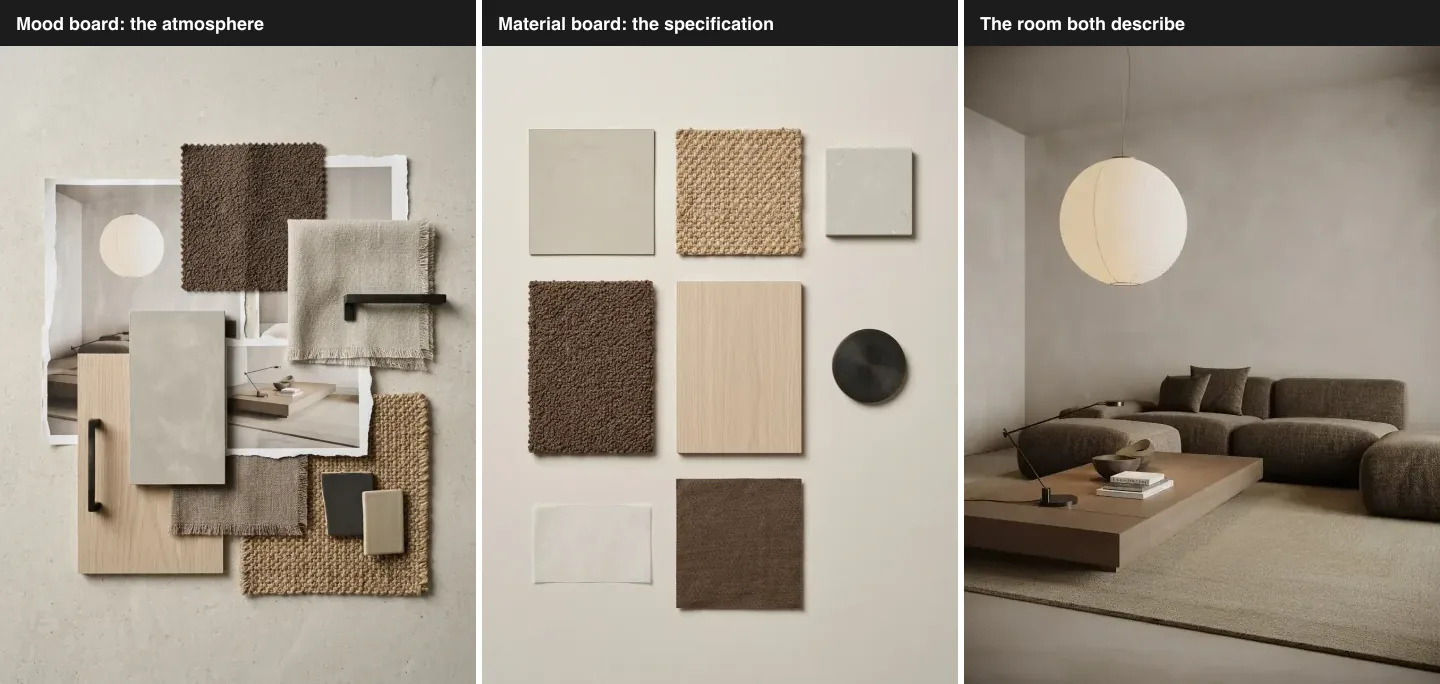
A restrained scheme makes the difference starker. The mood board sells the calm. The material board is six specimens and a hardware finish, which is all the room actually is.
How to make a material board in 6 steps
1. Start from the finishes you cannot change
List what is staying: the floor, the window frames, the worktop, the tiles you are not replacing. These are specified whether you like it or not, and everything new has to sit beside them. If you are unsure how a new timber will read against an existing one, mixing wood tones and what colour goes with dark wood floors cover the two cases that come up most.
2. Order the materials by area, largest first
Floor, then walls, then the largest upholstery, then joinery, then hardware. Specifying the cushion fabric before the flooring is how schemes end up incoherent, because the small decisions quietly constrain the large ones. The proportional logic is the same as the 60 / 30 / 10 rule, applied to materials rather than to colour alone.
3. Get one physical sample of every material
A screen cannot transmit sheen, weave or thickness, and those are the three properties that get a material rejected on site. Order the actual sample, the actual drawdown card, the actual tile offcut. Budget a week of lead time. This is the least glamorous step and the one that prevents the expensive mistakes.
4. Lay them out at relative scale
Give each material roughly the area it will occupy. Equal squares flatter a scheme and hide the fact that one of those finishes is about to cover every wall in the room. This is the single most common flaw we see in boards, and it is also the flaw that survives right up until the walls are done.
5. Judge the board in the actual room
Carry it into the space. Look at it in the morning, in the afternoon, and under the fittings you are actually installing. Sherwin-Williams has a name for the failure mode, metamerism, defined as “a phenomenon in which two colours appear to match perfectly under one light source but do not match at all under a different light source”. Their guidance is to judge colour “under the conditions in which they’ll be used”. A board approved under showroom lighting has not been judged at all. If you want to test a wall colour before committing, changing a wall colour in a photo is faster than sample pots, and choosing paint colours with AI covers the wider process.
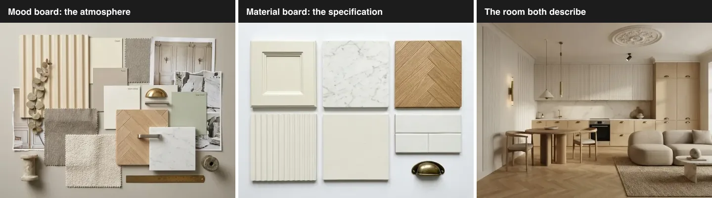
Kitchens are where this matters most, because almost everything on the board is installed rather than delivered. A wrong cabinetry colour is a rip out, not a return.
6. Write the schedule next to the board
Name, supplier, product code, finish, quantity. Every specimen, every time. A board without a schedule is decoration, and the schedule is what actually gets ordered. This is also the document that protects you when a supplier substitutes a discontinued line six weeks later.
Physical or digital material board
Physical for the decision, digital for the record. That order matters and it is not a compromise position.
A physical board is the only version that tells the truth about sheen, weave and thickness. A digital board is the version you can email to a contractor at eleven at night, version, annotate and archive. The failure is doing only the second one, approving a scheme that has never existed outside a colour-managed display, then discovering on site that the “warm” grey is lilac under LED. Our piece on what makes a render photorealistic covers why materials behave differently under different light, and subsurface scattering explains the specific reason stone and fabric are so hard to judge from an image.
Dark schemes are the hardest to specify from a screen. Six finishes that photograph as one colour behave completely differently in the room, which is what the physical board is for.
Where material boards go wrong
- No schedule. The board looks professional and specifies nothing. If it has no codes, it is a mood board with square edges.
- Samples at equal size. Proportion is information. Losing it is losing the main thing the board was supposed to tell you.
- Photographs standing in for samples. A picture of oak is not oak. This is the step people skip when a deadline moves, and it is the one that costs the most.
- Judged in the wrong light. Showroom lighting is designed to sell materials, not to represent your north facing living room in February.
- Finishes assumed to be in the FF&E budget. They usually are not, per the definition above. This is a budgeting failure rather than a design one, and it surfaces late.
- No allowance for discontinuation. Specify a second acceptable option for anything with a long lead time. Suppliers discontinue lines mid project and nobody tells you.
From material board to a list you can actually order
The gap between a specified scheme and a placed order is where most residential projects lose time. Finishes come from trade suppliers, furniture comes from retailers, and neither list talks to the other.
This is the part we built MeltFlex for. You can apply a scheme to a photograph of your own room and the furniture in the result links to real purchasable products, which turns the render into the beginning of an FF&E list you can shop. It does not replace a material board: we do not ship you tile samples, and finishes still need the physical check described above. What it removes is the guesswork about whether the specified pieces work together in your actual space.
See a specified scheme in your own room
- Your room, not a generated one. Windows, ceiling height and existing floor stay put while finishes and furniture change.
- Compare specifications side by side. Two material directions on the same walls, rather than imagining each separately.
- Furniture that links to real products. The output is a starting FF&E list rather than a picture.
Not sure which direction to specify in the first place? The free interior design style quiz takes ten questions and gives you a named style to build a concept board around, which is a faster starting point than scrolling for a fortnight. From there the guide to interior design styles gives you the materials each style actually depends on, and how to find your interior design style covers the case where nothing on the list quite fits.
Who actually needs one
Being honest about scope: if you are changing cushions, a rug and a lamp, you do not need a material board. A mood board and a shopping list are the right tools and anything more is procrastination dressed as process.
A material board earns its keep the moment something gets installed rather than delivered. Flooring, tiling, joinery, paint across multiple surfaces, anything a trade has to order and fit. The reason is asymmetric cost: a delivered item that disappoints goes back, while an installed one that disappoints gets ripped out. Designers running this at client scale will find the wider process in our AI workflow for interior designers, and the commercial side in how small studios win clients and AI for an interior design business.
Notes on method
- The four finished rooms are real MeltFlex outputs published in the creations gallery, reused here unedited.
- The mood boards are the same ones generated for our mood board guide, reused rather than regenerated so both articles describe the same four rooms.
- The material boards were generated for this guide from those same room photographs, one generation per prompt, unedited. They are illustrations of what a material board looks like as a document. The specimens are generated and are not purchasable products, which is exactly why the written schedule, not the image, is the part that gets ordered.
- FF&E definition and the finishes caveat quoted from Jeff Pelletier, Board and Vellum. Metamerism definition and professional guidance quoted from Sherwin-Williams.
Frequently asked questions
What is a material board in interior design?
A material board is the document that specifies the actual finishes and materials a room will be built from: the flooring, the wall finish, the stone, the timber, the upholstery, the metalwork. Each specimen is a real physical sample with a name, a supplier and a product code attached. Its job is procurement and coordination rather than persuasion, which is why it looks clinical next to a mood board.
What is the difference between a mood board and a material board?
A mood board communicates atmosphere and direction, so it mixes reference photographs, colour and texture to create a feeling. A material board specifies what will physically be installed, so it carries only real samples laid out for comparison, with names and codes. One is made to win agreement on a direction, the other is made to be ordered from. Most projects need both, in that order.
Is a concept board the same as a mood board?
No, although they are used interchangeably almost everywhere. A concept board sits earlier and is broader: it establishes the idea driving the project, often with non-interior imagery, a written concept statement and the intended feeling. A mood board narrows that concept into a visual direction for a specific space. In small residential projects the two are frequently merged into one document, which is where most of the confusion comes from.
What is FF&E in interior design?
FF&E stands for furniture, fixtures and equipment. Jeff Pelletier of the architecture practice Board and Vellum describes the scope as everything in the room that is not bolted to the structure of the building. Importantly, FF&E does not usually include finishes such as tile, wallpaper or paint, which is precisely why finishes need their own material board. On smaller residential projects the two are often blended together.
What should be included on a material board?
The flooring, the wall finish or paint drawdown, any stone or tile, the timber or joinery finish, the primary upholstery fabrics, and the metal or hardware finish. Each one should be a physical sample rather than a photograph, sized roughly in proportion to how much of the room it covers, and paired with a written schedule giving the product name, supplier, code and quantity.
How do you make a material board for interior design?
Start from the finishes that are not changing, order the new materials by the area they cover with the floor first, obtain one physical sample of each, lay them out at relative scale rather than as equal squares, judge the board in the actual room under its real lighting, then write the schedule of names, suppliers, codes and quantities beside it. Allow a week or more of lead time for samples to arrive.
Should a material board be physical or digital?
Physical for the decision, digital for the record. Sheen, weave and thickness do not survive a screen, and those are exactly the properties that cause a material to be rejected on site. Once the physical board is approved, photograph it and keep a digital version with the schedule attached, because that is the version you can email to a contractor at eleven at night.
Do I need a material board for a single room?
For a single room refresh where you are changing soft furnishings only, no. A mood board and a shopping list will do. A material board earns its keep the moment you are specifying something that gets installed rather than delivered: flooring, tiling, paint across multiple surfaces, or joinery. Anything a trade has to order and fit is worth specifying properly, because the cost of getting it wrong is a rip out rather than a return.