To rearrange your room without wasting a Saturday, do the deciding before the lifting. Photograph the room from the doorway, test two or three arrangements on that photo, check three clearances on the one you like, and only then move anything. The lifting is the cheap part of rearranging. The expensive part is dragging a three seater across a floor, standing back, and realising it blocks the door.
Our articles are still written by humans!
Get human written articles in your Google feed.
Quick answer: take one level photo from the doorway, run it through a room layout tool asking for one layout that opens the floor and one that pulls the seating together, then check the winner against 90cm of main walkway, 40 to 45cm from sofa to coffee table and a maximum of 2.4m between facing seats. Everything below is those six numbers and five layouts, all shot in the same real room.
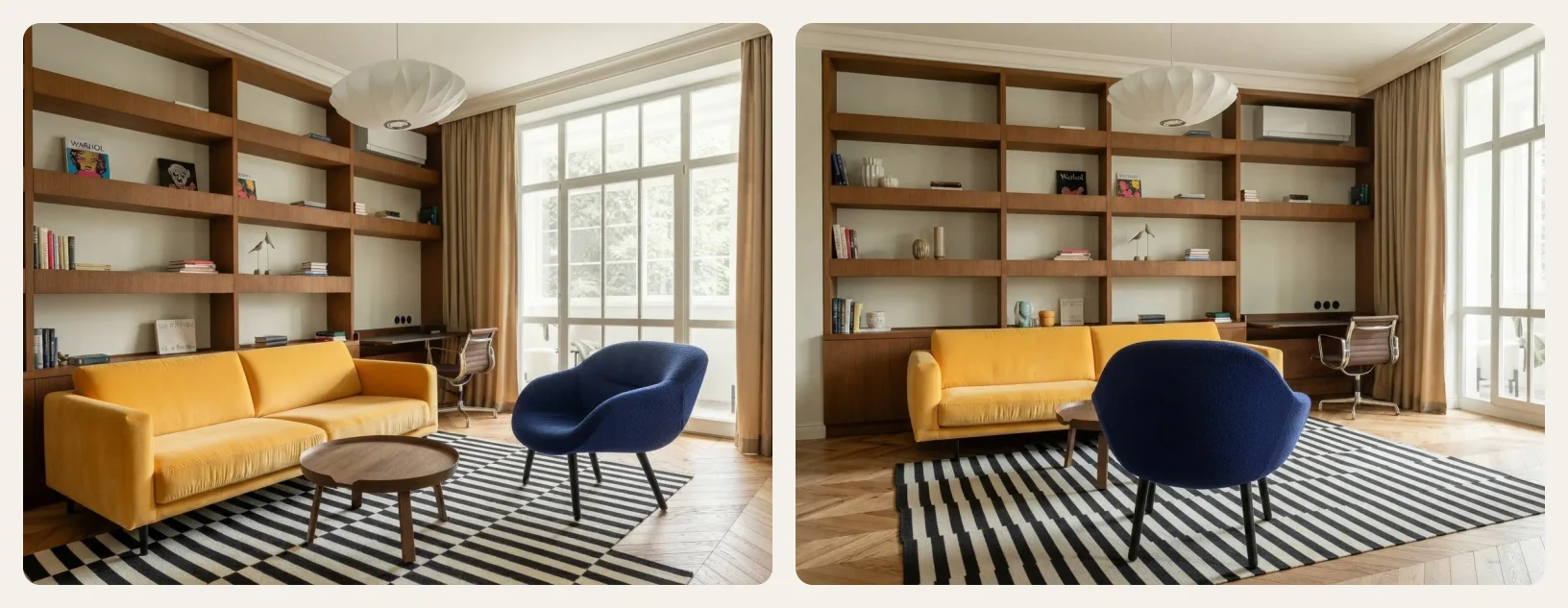
Left is the room as we found it, right is the same room after one change: the armchair moved from the window to the near side of the rug so it faces the sofa. Nothing was bought and nothing else moved. Both frames are one photograph re-rendered, which is the whole point of testing a layout before you lift it.
The short version
- Decide on a photo, not on the floor. Moving a sofa to find out is the most expensive way to learn anything about a room.
- Six clearances decide almost every layout: 90cm main walkway, 60cm secondary path, 40 to 45cm sofa to table, 2.4m maximum between facing seats, 10 to 30cm off the wall, rug 20cm past the sofa arms.
- Pushing everything flat against the walls is the most common rearranging mistake and it makes rooms look smaller, not bigger.
- A rug that does not touch the furniture undoes a good layout on its own.
- Sockets, radiators and door swings kill more layouts than taste does. Mark them before you start.
Why does rearranging a room usually go wrong?
Rearranging goes wrong for two reasons that have nothing to do with taste. Sunk cost: once the sofa is across the room and your back hurts, you keep the layout rather than move it back. And familiarity: you have looked at your own room so often that you cannot picture an alternative while standing in it.
Almost nobody plans a rearrange. It starts because someone is fed up on a Sunday afternoon, and it proceeds by trial and error with the heaviest objects in the house. Both failure modes follow from that.
The first is sunk cost. Once the sofa is across the room and your back hurts, the layout is going to be good, because the alternative is moving it back. So you keep it, you live with a walkway you have to turn sideways for, and six months later you still have not fixed it.
The second is that you cannot see your own room properly. You have looked at it too many times. The furniture has been where it is long enough that it reads as where it belongs, which makes it genuinely hard to picture an alternative while standing in the middle of the current one. This is why a photo helps more than it should: a photograph of your living room is somebody else's living room, and you can suddenly see that the chair is in a stupid place.
Neither problem is about taste. Both are solved by moving the decision off the floor and onto a screen. If your room shape is the actual problem rather than the arrangement, long, narrow, dark or built around a fireplace, the awkward room layout guide is the better starting point.
How much space do you need between furniture?
Six distances decide almost every layout: 90cm for the main walkway, 60cm for a secondary path, 40 to 45cm from the sofa to the coffee table, no more than about 2.4m between two seats that face each other, 10 to 30cm between furniture and the wall, and a rug that runs 20cm past the sofa arms.
A room layout is not a matter of opinion as often as people think. A layout that breaks one of those six feels wrong in the room even when it looked fine in your head. Only one of them comes from a published standard, which is worth knowing before you treat the rest as law.
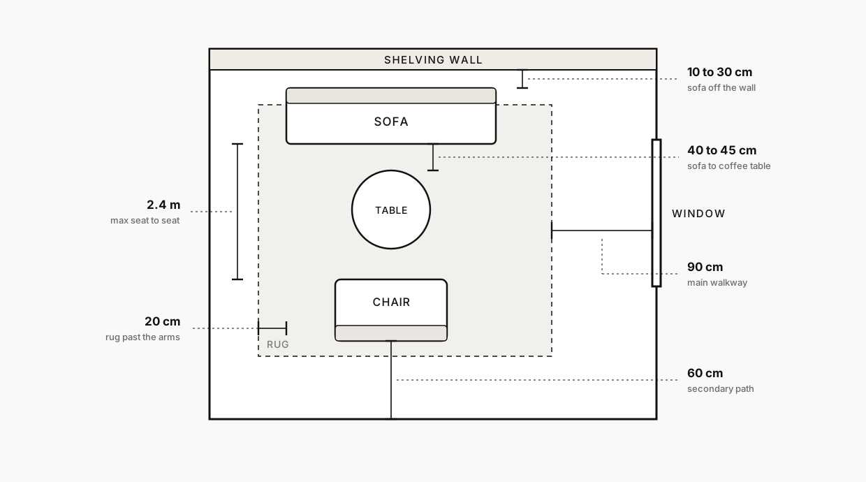
The same six numbers appear in every layout in this article. What changes between the layouts is which wall each piece is against, not the distances between them.
Where the 90cm walkway number comes from
The 90cm walkway is the only clearance in that table with a standards body behind it. Section 403.5.1 of the ADA Standards for Accessible Design, published by the United States Access Board, states: "Except as provided in 403.5.2 and 403.5.3, the clear width of walking surfaces shall be 36 inches (915 mm) minimum." That is 91.5cm, which is where the round 90cm in every design guide comes from.
The same section allows a pinch point, and the exact wording is worth reading because it is stricter than most people assume: the width "shall be permitted to be reduced to 32 inches (815 mm) minimum for a length of 24 inches (610 mm) maximum provided that reduced width segments are separated by segments that are 48 inches (1220 mm) long minimum and 36 inches (915 mm) wide minimum". So even the reduced allowance is 81cm for at most 61cm of length. Our 60cm secondary path is below that. It is a domestic convention for a route you use occasionally, not an accessibility figure, and if anyone in the house uses a wheelchair or a walking frame you should be working to the 90cm number everywhere, not to ours.
If you only remember two, remember the 90cm walkway and the 2.4m conversation distance. Those two are what separate a room that works from a room that is merely tidy.
How do you plan a rearrange before moving anything?
Photograph the room from the doorway at chest height, measure four numbers (room length, room width, your largest piece, and the distance to the nearest thing that cannot move), mark the doors and sockets on the photo, then test two or three arrangements on that image. Only then do you lift anything.
One photo, taken properly, is worth more than an afternoon of pushing. Stand in the doorway, hold the camera at chest height, keep it level, and get the far corner, one full wall and a clear run of floor into the same frame. A photo taken while sitting on the sofa is useless, because it shows walls and no floor, and floor is the thing you are rearranging.
While you are there, measure four numbers rather than the whole room: room length, room width, the length of your largest piece, and the distance from the wall to the nearest thing that cannot move. That last one is the important one. A radiator, an inward swinging door, the one socket that runs the TV. These kill more layouts than taste ever does, and they always kill them late, after the sofa is already in place.
If you want the room properly measured rather than eyeballed, the square footage guide covers the arithmetic, and what size furniture fits my room converts those numbers into piece sizes. If the rearrange is going to involve carrying something through a doorway, check it with the furniture fit calculator first, because a sofa that does not fit through the door ends the project.
Five layouts for the same room
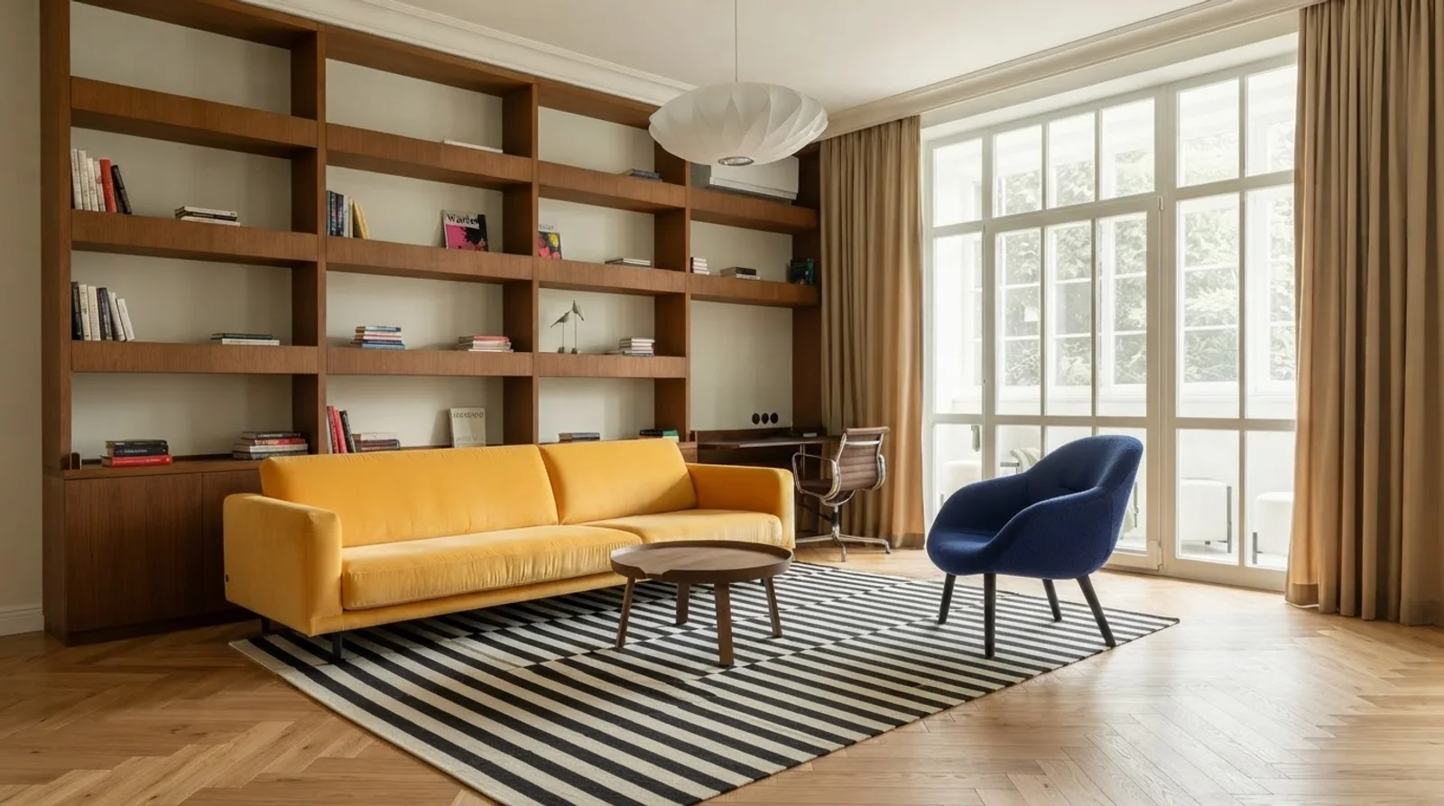
Every photograph below is one living room. Same yellow sofa, same blue armchair, same round coffee table, same striped rug, same shelving wall and same window. Nothing was bought, nothing was removed, and the camera did not move. Only the positions changed. We ran the original photo through our room layout tool and asked it for a different arrangement each time.
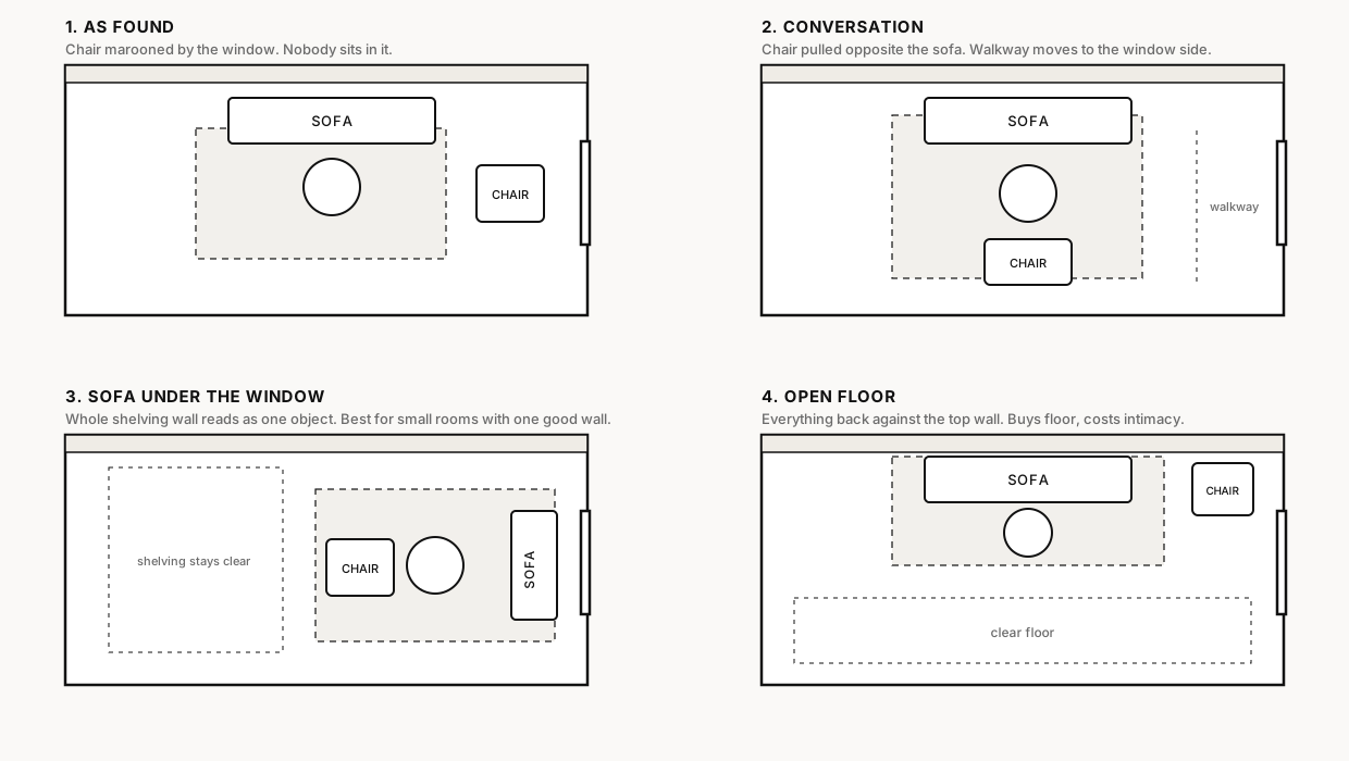
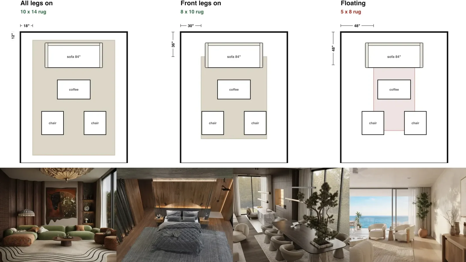
The same four layouts as floor plans. Worth reading alongside the photographs: a layout that looks obvious in plan often reads completely differently at eye level, which is exactly why plan based room planner apps flatter arrangements that feel wrong once you are standing in them.
1. As found
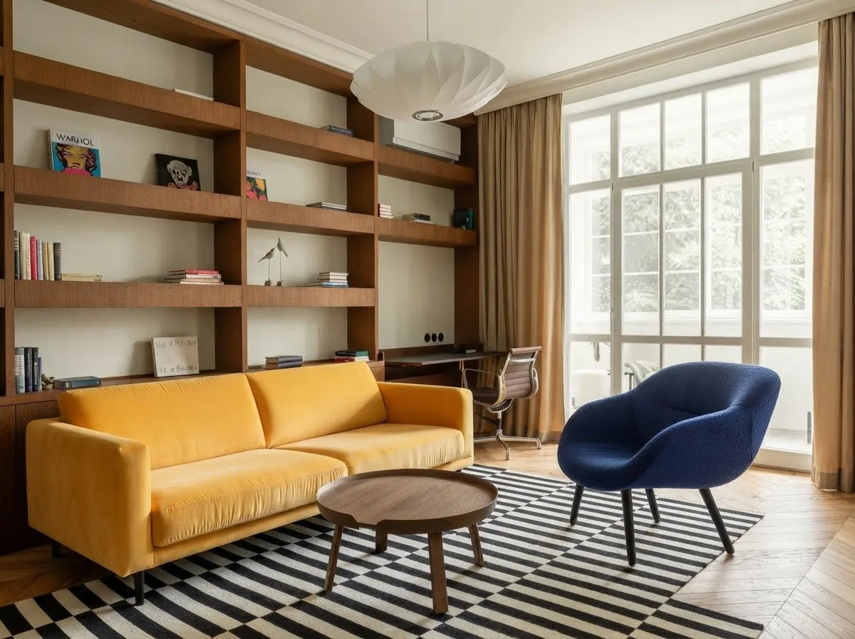
The starting point, and a completely normal room. The sofa is against the best wall, the rug is under the table, nothing is obviously wrong. The problem is the armchair: it is 2.9m from the sofa and angled at the window, so it is a chair nobody sits in when there is company.
This is what most rooms look like. It is not a bad layout, it is an unexamined one. Every piece went where there was space for it when it arrived, and then it stayed there. The tell is the chair: furniture that has drifted to the edge of a room is usually furniture that stopped being used.
2. The conversation layout
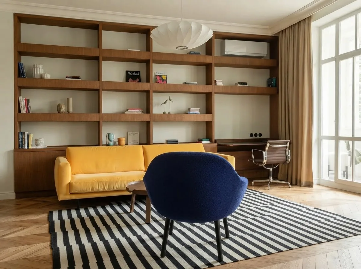
One piece moved. The armchair comes off the window wall to the near side of the rug and faces the sofa across the table, which brings the two seats to about 2.2m apart and pushes the walkway out to the window side where it belongs.
This is the highest return change in the whole article and it takes one person about forty seconds. Two seats facing each other over a table is the arrangement that makes a room feel like a room rather than a waiting area, and it also fixes the walkway by accident: the route through the space moves to the window side, which is where you were walking anyway.
The cost is honest: you lose the clear foreground. The room feels fuller from the doorway. In a room this size that is a fair trade, and in a smaller room it would not be. The same logic applied to bedrooms lives in the bedroom layout guide.
3. Sofa under the window
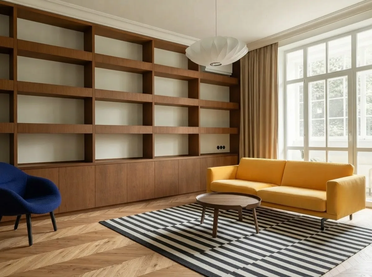
The most dramatic change available here, and the one with the clearest trade. Moving the sofa in front of the window leaves the whole shelving wall visible from the doorway, which makes the room read as one designed object instead of a wall you can see two thirds of.
People are told not to put furniture in front of a window, and as a blanket rule that is wrong. It is a bad idea when it blocks the light or the view. A sofa is low, so a low back under a tall window blocks almost nothing, and you gain an entire wall.
What you lose is real though. You lose the view from the sofa, which matters more than people expect if the window looks at anything worth looking at. You also lose a radiator, if the radiator is under the window, and covering a radiator with a sofa back is a genuinely bad idea rather than a stylistic one. Check that before you fall in love with this one.
4. Open floor
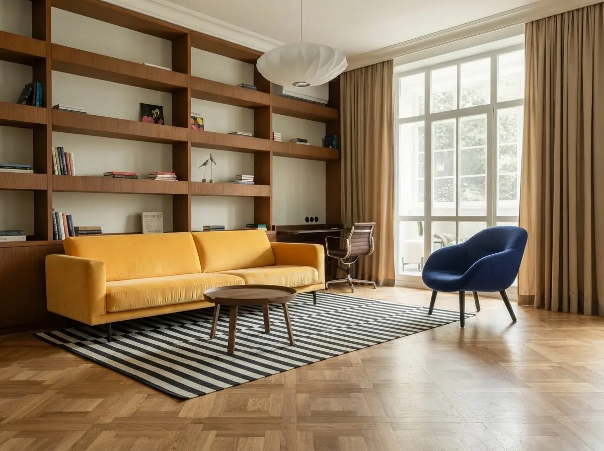
Everything pushed back, the coffee table tight to the sofa, the armchair tucked into the corner. The foreground is bare floor. If you have children, a dog, or you do anything on the floor, this is the layout that actually fits your life.
This is the layout the internet tells you never to do, and the internet is wrong about that too. Maximum clear floor is a legitimate goal. It just costs you intimacy: the seats are now far apart and angled away from each other, so the room is better for living in and worse for sitting in.
Pick this one deliberately rather than by default. Most rooms that look like this were not designed this way, they simply never got arranged, which is the difference between this photograph and the mistake further down.
5. The L
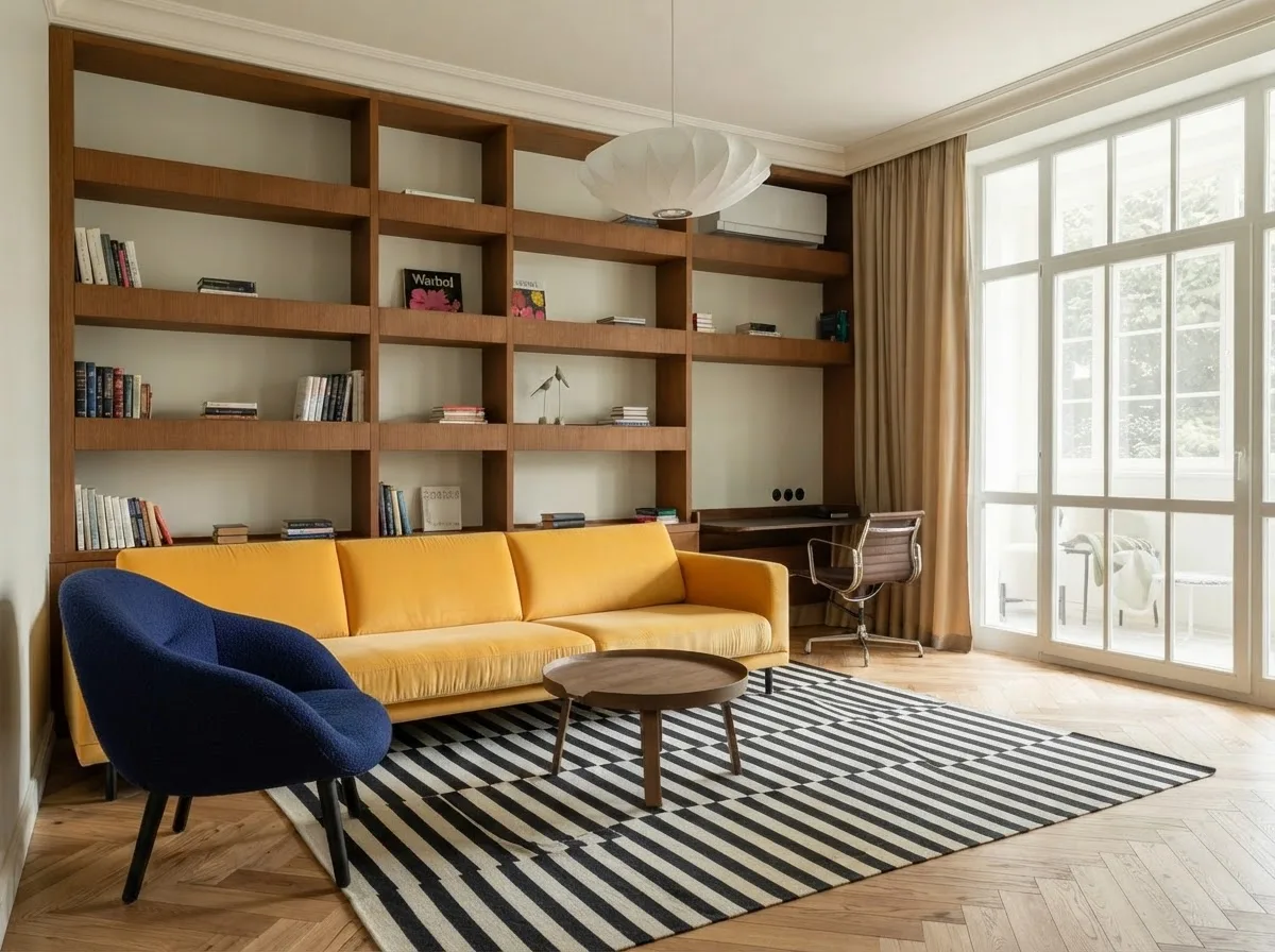
The compromise, and in most rooms the right answer. The chair sits at ninety degrees to the sofa rather than opposite it, which keeps people within talking distance while leaving the middle of the room open.
An L is what you choose when the conversation layout is too closed and the open floor layout is too cold. It is also the most forgiving arrangement in an odd shaped room, because an L only needs two walls to work and does not care what the other two are doing. If your room is part of an open plan space, the L is usually the one that defines a living zone without building a wall.
More layouts for this specific room type, with the seven arrangements sorted by room shape, are in how to arrange furniture in a living room, and the four layout walkthrough of one empty room is in the living room layout guide.
Which layout for which complaint
Rearranging usually starts with a specific irritation rather than a design ambition. Match the complaint to the layout:
The two mistakes that undo the work
You can pick a good layout and still end up with a room that feels wrong, and it is almost always one of these two.
Everything against the walls
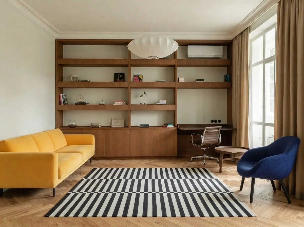
The most common rearranging mistake, and it is worth comparing this to the open floor photograph above. Both have empty middles. The difference is that in this one the emptiness is a leftover rather than a decision, the seats are 4m apart, and the rug is touching nothing.
The instinct behind this is reasonable: push everything out of the way and the room will feel bigger. It does the opposite. A ring of furniture around an empty middle reads as a corridor with chairs in it, and because nothing anchors the centre, the eye finds no place to rest. The room feels larger for about a day and then just feels unfinished.
The fix is not subtle and does not take long. Bring one piece in off its wall, and put a rug under the front legs of at least two pieces so the middle of the room has something in it.
A rug that touches nothing
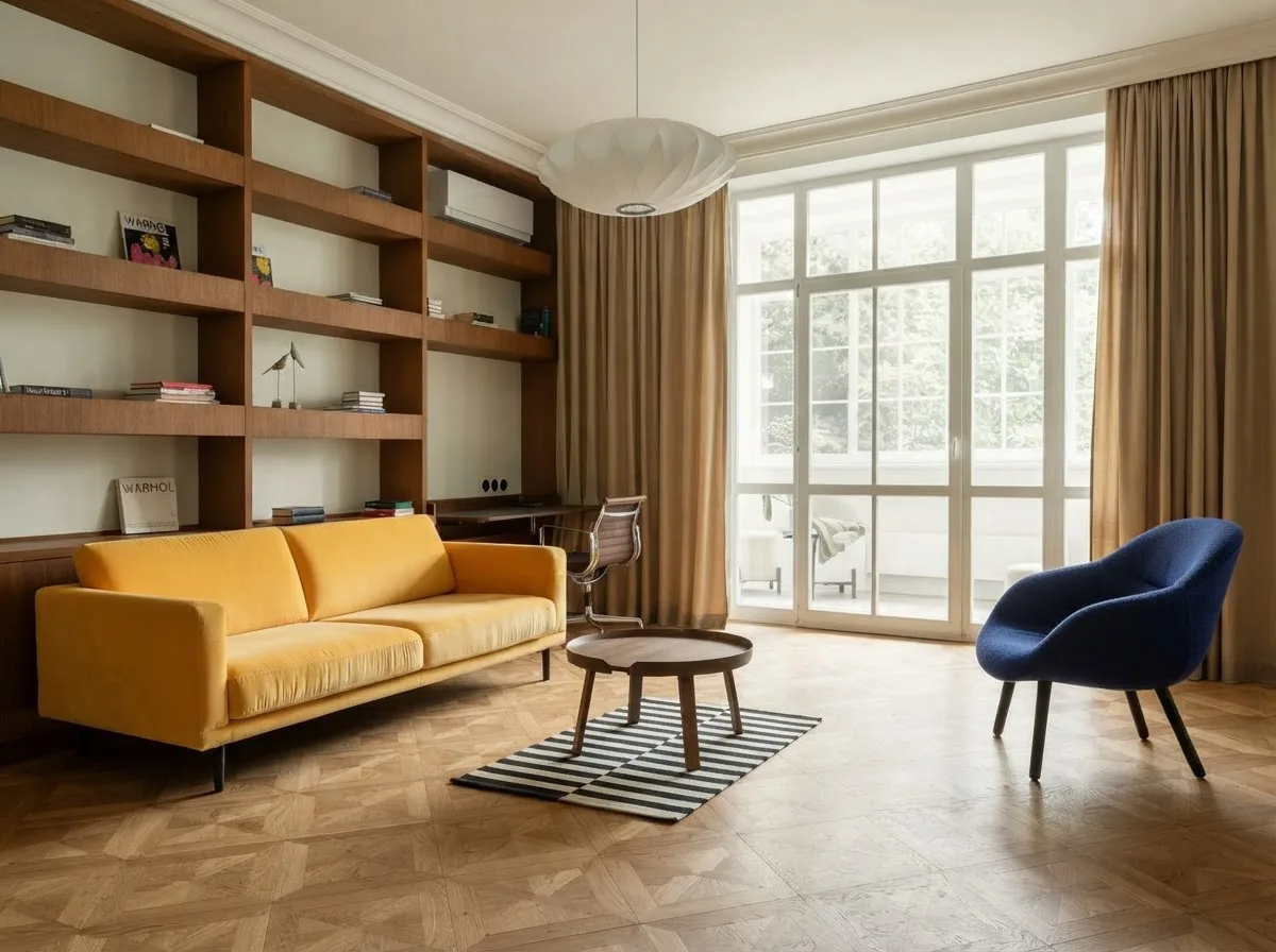
A rug too small for the room, floating on bare parquet with no furniture leg on it. Nothing else in this photograph is wrong. That is what makes it a useful example: the layout is fine and the rug alone is enough to make the room look like a rental.
The rule that fixes it is that at minimum the front legs of the sofa and the main chair stand on the rug, and the rug runs about 20cm past the sofa arms at each end. A rug that touches nothing turns into an island, and the furniture around it into things standing near an island.
Rug sizing is the single most common thing people get wrong in a room that is otherwise well arranged, which is why we wrote a dedicated rug size guide. If you are putting the rug over fitted carpet, that has its own rules and they are in rug on carpet.
What should you check before you move any furniture?
Check five fixed things: which way the doors swing, where the radiators are, which sockets you actually use, where the daylight falls relative to the TV, and what your pendant lights hang over. These constraints kill more layouts than taste does, and they always kill them late, after the sofa is already in place.
Every layout in this article assumes the furniture is the only variable. In a real room it is not. Before you commit, walk the room and check all five.
- Door swing. An inward opening door claims about a 90cm quarter circle of floor that nothing can occupy. This is the constraint that most often kills the sofa under the window option.
- Radiators. Do not back a sofa onto one. You lose the heat into the sofa, and over a season you can dry out and fade the fabric on that side.
- Sockets. Count the ones you actually use, not the ones you have. Any layout that needs a lead running across a walkway is a layout that will annoy you daily and that someone will eventually trip over.
- The TV and where the light is. A screen facing a window is a screen with a reflection in it from four in the afternoon onwards. This constraint alone decides which wall the sofa can go on in a lot of rooms.
- Ceiling height and pendants. A pendant that hung nicely over a coffee table looks like a mistake once the table moves out from under it. Our ceiling height guide has the hanging heights.
None of this is glamorous and all of it is why layouts fail. It is also the part that no tool will do for you, which brings us to the honest section.
Can an app rearrange your room from a photo?
Yes. A photo based tool re-renders your own room with the furniture in new positions, in under a minute, which makes it the fastest way to decide whether an idea is worth the effort. It cannot measure anything, does not know a radiator is a radiator, and will show you a sofa where a door needs to swing.
We build one of these, so treat this section with the appropriate suspicion. Here is what is genuinely true after generating the photographs above.
What worked: the room survived. Every frame in this article kept the same shelving, the same window, the same parquet, the same four pieces of furniture. That identity is the whole value, because a tool that hands you a beautiful room that is not your room has told you nothing. If you try any of these tools and the sofa changes colour or the window moves, you are looking at inspiration, not at your room.
One thing our own data says, which we have not seen written down anywhere else. Across the ninety days to early September 2026, the searches that reach us on this topic split cleanly in two. People who add the word "AI" are looking for a tool and arrive ready to upload something. People who just type "rearrange my room" or "how to rearrange your room" are at a completely different stage: they want to know whether to bother. That second group is roughly one twentieth the size of the first in our search console, which is why almost nobody writes for them, and it is exactly the group this article is written for. If you are in it, the answer is that testing costs you nothing and moving costs you a Saturday.
What did not work, first time: our first attempt at the conversation layout came back looking almost identical to the original. So did the second. The model was anchoring on the composition of the source photo and quietly ignoring instructions like "move the sofa off the wall". What fixed it was describing the result instead of the action: not "move the chair" but "the chair is now in the foreground with its back to the camera, facing the sofa". Three of the eight layouts we generated for this article were unusable and had to be redone that way, and one we threw out entirely.
The honest conclusion is that these are decision tools, not planning tools. A photo based tool is the fastest way to find out whether an idea is worth the effort, and it is the wrong thing to trust for anything with a number in it. Use the layout tool to pick between three arrangements in two minutes, then check the winner with a tape measure before you lift anything. If you want the wider comparison of what is on the market, we keep that in the AI furniture placement and room layout tool roundup.
The order to move things in, so you only lift once
Once you have chosen, the sequence matters more than the effort. Do it in this order and a full living room rearrange takes about thirty minutes rather than an afternoon.
- Take everything off the floor first. Rug, lamps, plants, baskets, the laundry. You are going to move them anyway and they will be in the way for every other step.
- Roll the rug and put it where it will end up. The rug defines the seating area, so it goes down before the furniture, not after. Getting this backwards is why people end up with a rug half under a sofa.
- Place the largest piece. Sofa or bed. Everything else is a reaction to it, so nothing else moves until this one is right.
- Place the second seat, then the table. Chair first, table last. The table is set by the distance between the two seats, not the other way round.
- Sit in it before you put anything back. Sit on the sofa. Sit in the chair. Walk in through the door. Two minutes here catches the mistakes that otherwise take two weeks to notice.
- Then the lamps, the plants and the small things. These are the adjustable layer. Do them last, and be willing to leave one thing out entirely.
If the rearrange turns out to need something you do not own, a smaller table, a second chair, a bigger rug, upload the room to the full editor and try the piece in the photograph before you buy it. That is a different job from rearranging, and it is a much cheaper mistake to make on screen.
How do you rearrange a small room or a studio?
Protect one 90cm route through the room and accept 60cm everywhere else. Put the largest piece against the longest wall, give up the 10 to 30cm off the wall gap, choose furniture with visible legs, and leave one corner deliberately empty instead of spreading small gaps evenly around the room.
Everything above assumes a room with some slack in it. Under roughly 12 square metres the rules change, and they change in one direction: the walkway wins every argument.
Give yourself one 90cm route, accept 60cm everywhere else, put the largest piece against the longest wall, and give up the 10 to 30cm off the wall gap without guilt. Choose furniture with visible legs where you have the choice, because a piece you can see the floor under reads lighter than the same piece with a solid base. And leave one corner deliberately empty rather than distributing small gaps evenly around the room, because one clear corner does more for the sense of space than four narrow ones.
Studios are their own problem, since the layout has to do the job of walls. That is covered properly in studio apartment layout ideas. For bedrooms where the bed position is the whole question, including the window and door rules, see the feng shui bedroom layout guide, which is more practical than the name suggests.
Where these numbers come from, and where they do not
Design articles quote clearances as though they were all equally settled. They are not. One of the six has a regulator behind it and the rest are trade convention, so here is the provenance for each, including the one we could not verify.
The photographs are our own, generated from a single source photo of one living room, and the failure rate of that generation is reported in full above rather than hidden. Nothing in this article is a survey statistic, because we did not run a survey.
Rearranging a room FAQ
How do you rearrange a room?
Start with the one piece you cannot easily move, usually the sofa or the bed, and decide which wall it belongs to. Everything else arranges around that. Before you lift anything, photograph the room from the doorway and test two or three arrangements on the photo, because the expensive part of rearranging is not the thinking, it is dragging a three seater across a floor and discovering it blocks the door. Then check three numbers on the layout you picked: 90cm for the main walkway, 40 to 45cm from the sofa to the coffee table, and no more than 2.4m between two seats that face each other.
How do I rearrange my room to make it look bigger?
Clear one uninterrupted run of floor, usually the path from the door to the window, and keep it empty. A room reads as big when your eye can travel across it without stopping, which is why one clear diagonal does more than any amount of small furniture. Two things that genuinely help: pull the largest piece off the wall it is on and give the room a single deliberate empty zone rather than an even scatter of gaps, and use one large rug instead of two small ones. The thing that does not help, despite being the most repeated advice on the internet, is pushing everything flat against the walls.
How do I rearrange a small room?
In a small room the constraint is the walkway, not the furniture. Give yourself one 90cm route through the room, accept 60cm for everything else, and let the furniture take what is left. That usually means the largest piece goes against the longest wall and one corner gets deliberately left alone. Do not put a piece in front of the window: it costs you the light that makes a small room bearable, and light is the one thing you cannot add back by rearranging. If the room is under about 12 square metres, furniture with visible legs will read lighter than the same piece with a solid base.
Is there an app that rearranges your furniture for you?
There are two kinds and they work very differently. Planner apps such as Planner 5D, Room Planner and MagicPlan want you to build the room first, wall by wall, then drag catalogue furniture around a 3D model. They are accurate and slow, and you are looking at generic furniture rather than yours. Photo based tools take a picture of the room you already have and re-render it with the furniture moved, so the sofa on screen is your sofa. That is what our layout tool does. Neither will read your radiator or your door swing, so you still check those yourself.
Can AI rearrange my room from a photo?
Yes, and it is genuinely useful for deciding, but be clear about what you get. It re-renders your photo with the furniture in new positions, which is the fastest way to see whether an idea is worth the effort of lifting anything. What it does not do is measure. It does not know your room is 3.4m wide, it cannot tell that the radiator is a radiator, and it will happily show you a sofa where a door needs to swing. Treat the output as a sketch you can react to, then check it against a tape measure before you move a single thing.
Should furniture touch the walls?
Mostly no, and this is the single change that improves the most rooms. Pulling seating 10 to 30cm off the wall makes a room look designed rather than furnished, because the gap tells the eye the piece was placed rather than parked. The honest exception is genuinely small rooms, under roughly 12 square metres, where those centimetres are the difference between a usable walkway and a squeeze. In that case push the largest piece to the wall and float something smaller instead.
How often should you rearrange your room?
There is no correct interval, but there is a useful trigger: rearrange when the way you use the room has changed, not when you are bored of looking at it. A new desk, a new baby, a TV that moved, someone moving in or out. Rearranging out of boredom tends to produce a layout that is different rather than better, and two weeks later you move it back. If you are rearranging because you are restless, testing it on a photo first costs you nothing and usually settles it.
Is rearranging furniture a trauma response?
This gets asked often enough that it deserves a straight answer rather than a dodge, and the straight answer is that we are an interior design company and not qualified to diagnose anyone. What is fair to say is that rearranging a room is a common way people take control of a space when other things feel out of their control, and for most people it is simply a cheap and satisfying way to make a familiar room feel new. If the urge feels compulsive or distressing rather than satisfying, that is a question for a professional, not for a design article.