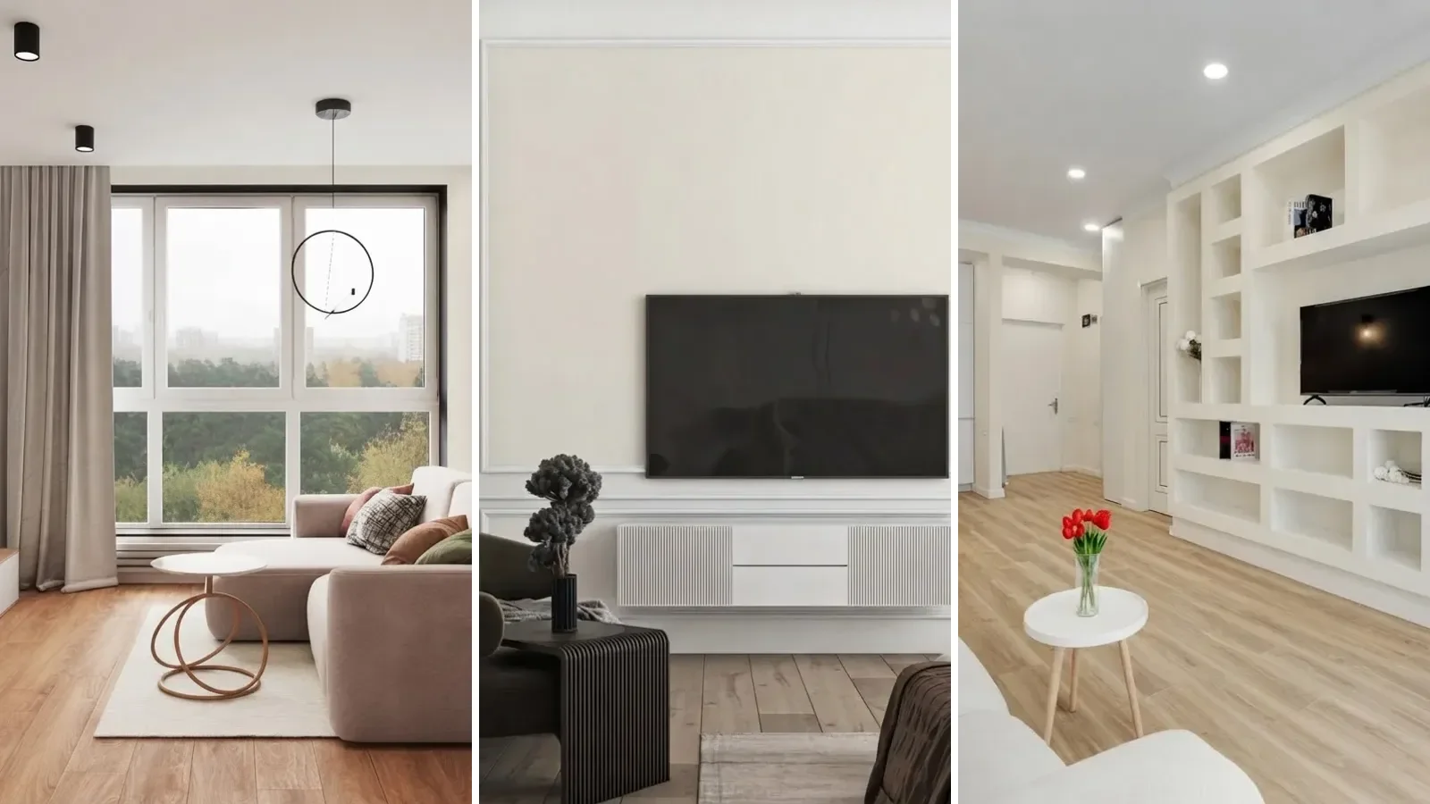

Off white or ivory curtains are the safest match for gray walls, and navy or charcoal is the reliable way to add contrast. What ruins it is a curtain in the same gray as the paint: it erases the boundary between wall and window instead of framing it. That one rule, a shade lighter or darker rather than an exact match, is also the answer for white, beige, blue and green walls below.
Our articles are still written by humans!
Get human written articles in your Google feed.
The short version
- Never match the exact paint color. A curtain in the same shade as the wall flattens the window instead of framing it.
- Gray walls: off white or ivory to keep it soft, navy or charcoal for contrast.
- White walls: warm oatmeal to stay airy, navy or deep green if you want drama. White takes contrast best of all five.
- Beige walls: stay warm. Taupe or terracotta works, cool gray clashes with the undertone.
- Blue walls: cream or warm white is the safe choice. Avoid a second, different blue.
- Green (sage) walls: cream, oatmeal or blush. Stark white or cool gray can wash it out.
- Test with light behind the fabric, not just held flat against the wall. Sheer and mid-weight curtains shift color once backlit by the window.
Jump to: The short answer · The rule · Gray walls · White walls · Beige walls · Blue walls · Green walls · Should they match? · Seeing it first · FAQ
FreeUpload photo · freeRedesign my windows for freeUpload a photo of the room and MeltFlex redesigns the window frames, glazing and treatments in place. Your first AI design is free, no card needed.


What color curtains go with gray walls?
Here is the same living room twice, nothing changed but the wall paint and the curtain fabric. On the left, the original: a taupe brown drape against a warm greige wall (think Agreeable Gray). On the right, a cooler mid gray wall with an off white linen curtain in front of it.
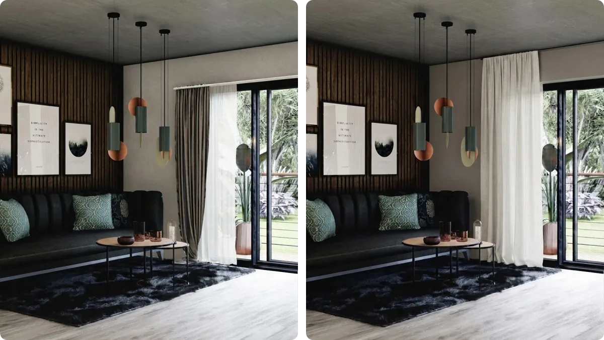
Off white and ivory are the pairing that works in the widest range of gray rooms, because they lift the space without introducing a second competing color. If your gray leans cool, which most do, a warm off white keeps the room from feeling clinical. For contrast rather than calm, navy or charcoal against gray reads as a deliberate design choice rather than an accident, and it is the pairing most interior designers reach for first when a client wants the room to feel more finished.
What does not work, reliably, is a curtain in close to the same gray as the wall. It is the single most common mistake in this category. Instead of framing the window, a same-tone curtain makes the whole wall read as one flat panel with a gap in it, and the room loses the one vertical feature most living rooms are short on.
The rule behind every pairing on this page
Every listicle on this topic gives you a list of colors with no reason attached. There is an actual rule, and it comes from two ideas color theory has had names for a long time: value and undertone.
Both start with knowing what your wall actually is. If you only have a photo, the free paint color finder reads the grey off it, gives you the LRV for value and names the closest paint so you can look up its undertone.
Value is lightness, not hue, and it is the dimension Albert Munsell built his whole color system around: a scale from 0, absolute black, to 10, absolute white, independent of what color something actually is. A curtain and a wall in the same hue but a different value read as related but distinct. A curtain and a wall in the same hue and the same value read as one surface with an accidental seam in it, which is exactly the mistake the gray-on-gray pairing above makes.
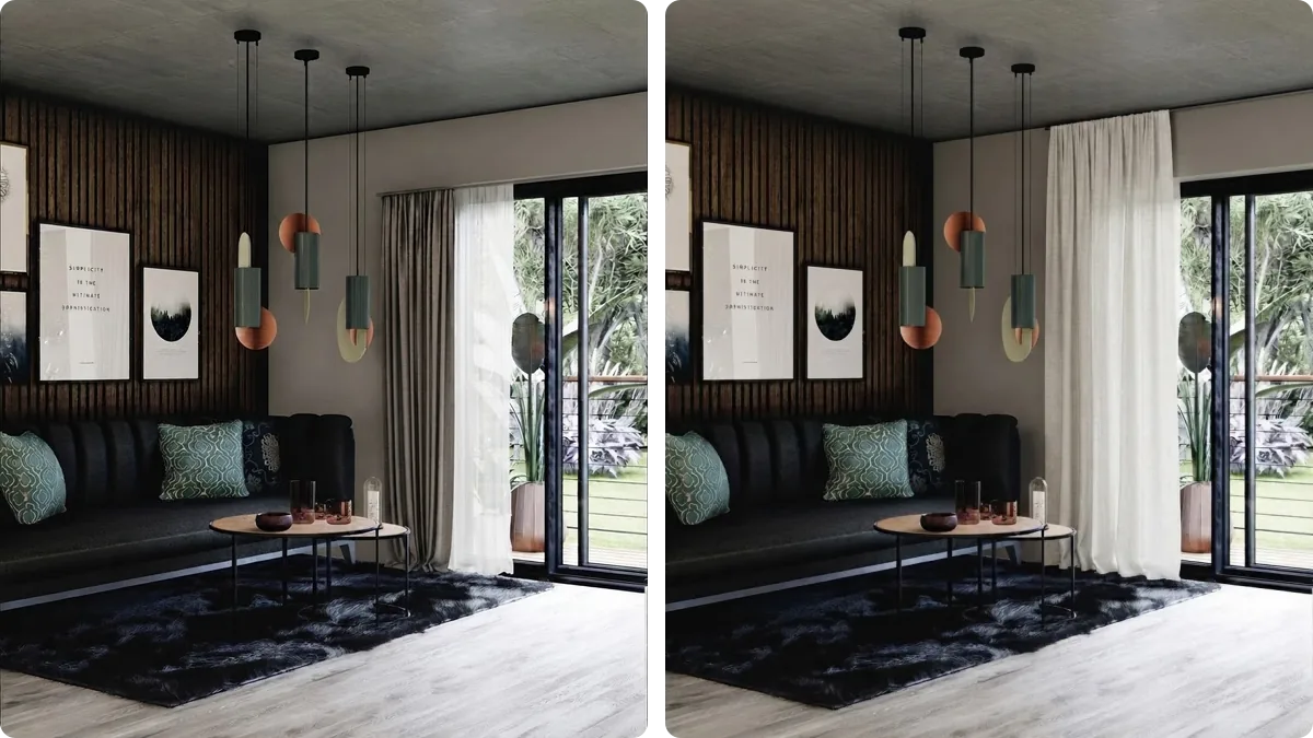
Undertone is temperature. Sherwin Williams' own color guidance splits every paint into warm, with an orange, yellow or red base, or cool, with a blue, green or purple base. Pair a warm curtain with a cool wall or the reverse and you get a low-grade visual argument even when the colors are technically compatible on a wheel. This is the part every "colors that go with gray" list skips, and it is why the same advice ("try navy!") works in one gray room and looks off in another.
The part nobody mentions at all: curtain fabric is not paint. Hold a swatch flat against the wall and you are judging reflected light off an opaque surface. Hang a sheer or mid-weight curtain in front of a window and, for several hours a day, you are looking at transmitted light through the fabric instead, which shifts both the hue and the value of what you see. We noticed this building the renders on this page: the same off white linen photographs warmer and lighter with the window lit behind it than it does held against the wall in flat light. Judge a curtain color at the window, at the time of day you actually use the room, not in the swatch aisle.
White walls
White is the most forgiving wall color on this list, which is also why it is the easiest to get boring. Warm oatmeal or soft ivory keeps a white room feeling airy and is the safe default. Because white has the most value to spare, it is also the wall color that takes drama best: navy velvet, deep forest green or even black curtains read as intentional rather than heavy, in a way they would not against a mid tone wall.
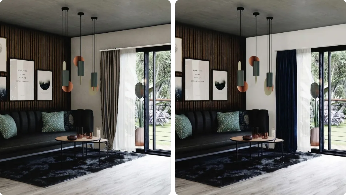
The mistake specific to white walls is subtler than gray-on-gray: pairing a stark, cool white curtain with a warm white wall such as Alabaster, or the reverse. Paint brands sell dozens of whites and most have a visible undertone once you put two of them side by side. If your wall is a warm white, a bright cool white curtain will look faintly blue or gray next to it rather than matching, which is a smaller version of the same undertone clash described above.
Beige walls
Beige rewards staying in its own temperature. A curtain one shade darker than the wall, taupe or a warm dark cream, adds depth without changing the room's mood. If you want color rather than depth, terracotta or rust stays inside the same warm family while giving the room something to look at.

Cool gray is the specific pairing to avoid here, and it is the one people reach for most often because gray curtains are everywhere in stores right now. A cool gray curtain against a warm beige wall is an undertone clash more than a value one: the room reads muddy rather than layered, because the two surfaces are pulling in opposite temperature directions.
Blue walls
Cream or warm white is the pairing that works across the widest range of blues and the widest range of light, which is why it shows up so often in professionally designed rooms. It keeps a blue wall from tipping into too much saturation in a small space. For a complementary pop rather than a calm one, mustard or blush both sit opposite blue on the wheel and read as intentional.
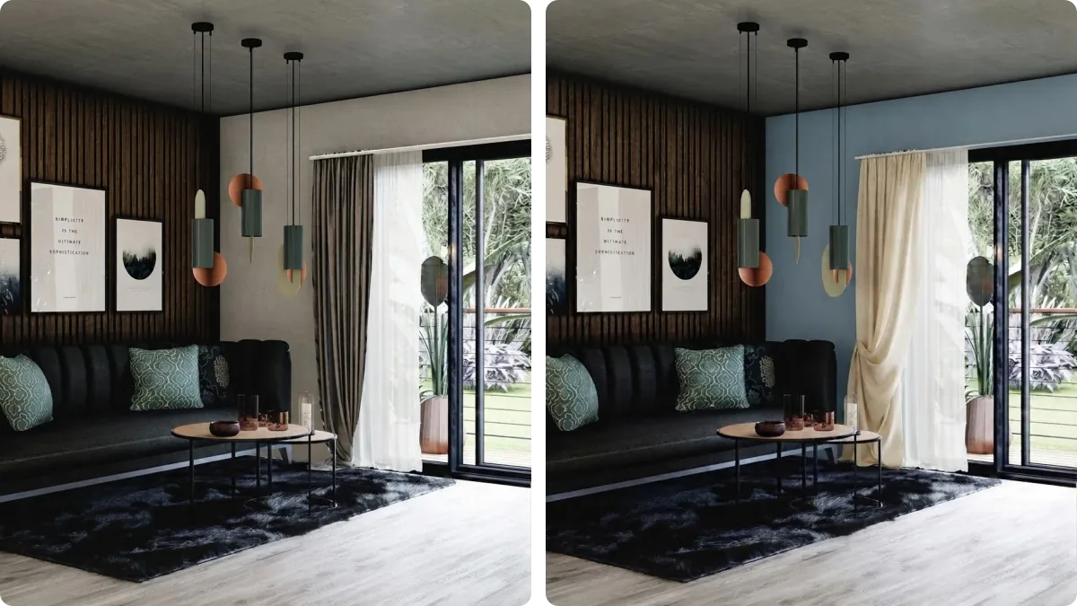
The mistake specific to blue is not usually a wrong color family, it is a wrong blue. A curtain in a different shade or saturation of blue than the wall clashes harder than an entirely different color would, because the eye expects them to match exactly and notices every degree they do not. If you love blue on blue, match the undertone precisely rather than approximately, or switch families entirely.
Green (sage) walls
Sage and other muted greens are one of the easiest wall colors to dress right now, which is part of why the color has been everywhere in paint trend reports for the last two years. It reads as a warm neutral more than a bold color, so cream, oatmeal and blush all pair with it the way they would with beige.

For contrast, rust or a deep forest tone adds richness without fighting the green. Be careful with stark white or cool gray here specifically: sage is already a fairly desaturated color, and a very cool or very bright neighbor can make it look washed out or faintly gray rather than calm, which is the opposite of what most people choose sage for in the first place.
Should curtains match the wall color?
No, not exactly, and this is worth stating plainly because it is the question underneath all five sections above. A curtain in the identical paint color removes the visual boundary between the wall and the window. Instead of the window reading as a feature, an opening with its own framing, it disappears into the wall and the room loses one of the few tall vertical elements most rooms have.
The rule that consistently works instead is contrast within the same family: pick a curtain in a compatible undertone but at least one step lighter or darker in value than the wall. Same temperature, different weight. That is the entire mechanism behind every pairing on this page, from off white on gray to blush on sage.
Fabric weight changes how much this matters. The heavier and more opaque the curtain, the closer it behaves to a paint swatch: what you see in the store is close to what you get. Sheers and mid-weight linens do not, because daylight passes through them.
Seeing it in your own room before you buy
A paint swatch and a fabric swatch held next to each other in a shop tell you less than you would think, for the reason above: neither one is lit the way your actual window lights the actual fabric. The two variables that decide whether a curtain color works, the undertone against your specific wall and how the fabric reads once daylight is behind it, are exactly the two things a store display cannot show you.
Every photograph on this page was made the same way: a real room, photographed once, then rendered again with only the wall paint and the curtain fabric changed and everything else, the furniture, the light, the camera angle, held identical. That is also what MeltFlex does with your own room. Upload a photo, try an off white against your actual gray, then try navy, and compare them against your real furniture and your real window light before anything gets ordered. There is a dedicated window design tool if you are deciding the frame and the treatment at the same time.
The same method on video: one room, several window treatments, curtains against blinds, light against heavy fabric, all on the same wall color.

Color and mood, yes. Drape and dye lot, no, so order a fabric swatch before the full panels.
The honest limit is the same one we state on every page like this: a render shows you color and mood, not a guarantee of fabric drape or exact dye lot. Use it to eliminate the colors that are obviously wrong before you order swatches, not to skip ordering swatches altogether. We went through where these images fall down in more detail in why AI renders look fake.
Once the curtain color is settled, the sizing and the length are separate decisions with their own rules: our guide to how to measure for curtains covers rod height, width and drop, how to install a curtain rod covers the brackets and anchors that keep it on the wall, and the answer on whether curtains should touch the floor covers the four standard lengths. If the wall color itself is still undecided, start there instead: choosing paint colors and, for gray specifically, what color furniture goes with grey walls cover the rest of the room using the same undertone logic as this page, and what colour furniture goes with grey walls takes the same principle further. If an accent wall is part of the plan, accent wall ideas is the place to decide that before the curtain, not after. Floor comes next in most rooms: our guide to layering a rug over existing carpet and what size rug a living room needs pick up from here. Layout decides where the window even matters most, which is covered in living room layout and bedroom layout, and if the bed sits in front of the window itself, bed in front of a window has its own rules for the curtain. There are more rooms with curtains in them in our gallery.
Frequently asked questions
What color curtains go with gray walls?
Off white or ivory linen is the safest choice and keeps the room bright. For contrast, navy or charcoal reads as deliberate rather than accidental. What does not work is a curtain in the same gray as the wall: it flattens the window into the wall instead of framing it. A shade lighter or darker than the paint is the rule, not an exact match.
What color curtains go with white walls?
White walls are the most forgiving of the five, but the curtain still needs to differ enough in value to read as a separate layer. Warm oatmeal or soft ivory keeps things airy. Navy, deep green or black work as a contrast choice, since white takes drama better than any other wall color. Avoid a brilliant cool white curtain against a warm white wall, which reads as two different whites arguing rather than matching.
What color curtains go with beige walls?
Stay warm. A curtain a shade darker than the wall, like taupe or warm cream, deepens the room without changing its mood. Terracotta or rust adds color while staying in the same warm family. The one to avoid is a cool gray curtain against a warm beige wall: the undertones clash and the room reads muddy rather than layered.
What color curtains go with blue walls?
Cream or warm white keeps a blue wall from tipping into too much color, and it is the pairing that works in the widest range of light. Mustard or blush add a complementary pop. The pairing to avoid is a curtain in a different shade of blue than the wall, since two blues at different saturations clash harder than a genuinely different color would.
What color curtains go with green walls?
Sage and other muted greens are popular precisely because they pair easily with warm neutrals: cream, oatmeal and blush all work. For contrast, rust or a deep forest tone adds richness. Stark white or cool gray is the one to be careful with, since it can make a soft sage wall look washed out rather than calm.
Should curtains match the wall color?
No, not exactly. A curtain in the identical paint color removes the visual boundary between wall and window, so the window stops reading as a feature and just becomes a gap in the wall. The rule that actually works is contrast, not matching: at least one step lighter or darker than the wall, in a compatible undertone. Same family, different value, never the same shade.
How do I choose a curtain color?
Start from the wall, not the curtain. Identify whether your wall paint leans warm (orange, yellow, red undertone) or cool (blue, green, purple undertone), then pick a curtain at least one shade lighter or darker in a compatible undertone. Hold the fabric up against the actual wall at the time of day you use the room most, since curtains read differently under direct sun than they do in the swatch aisle.
Do curtains need to match the sofa?
No, and trying to match both the sofa and the wall exactly is how rooms end up looking flat. Pick one relationship to make deliberate, either curtain to wall or curtain to sofa, and let the other be complementary rather than identical. Most designer rooms repeat a curtain color once elsewhere in the room, in a cushion or a rug, rather than matching it to the biggest piece of furniture.
Sources
- X-Rite, The Munsell System: History and Color Solutions, for the definition of value as the lightness dimension of color on a 0 to 10 scale, independent of hue, which the value-contrast rule on this page is built on.
- Sherwin Williams, Understanding Paint Undertones, for the warm (orange, yellow, red) versus cool (blue, green, purple) undertone framework used throughout this page.
- The backlit-fabric observation is MeltFlex's own, from generating and reviewing the renders on this page. All photographs are AI renders made from Behance interior photography: each room is first re-rendered from its source photo unchanged, then that exact frame is used again to change only the wall paint and the curtain fabric, so every pair on this page is the same room, furniture and camera angle.