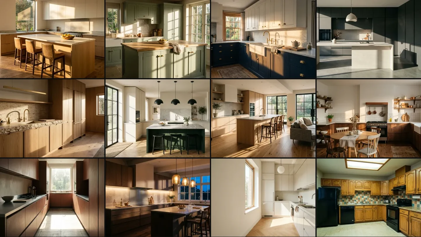
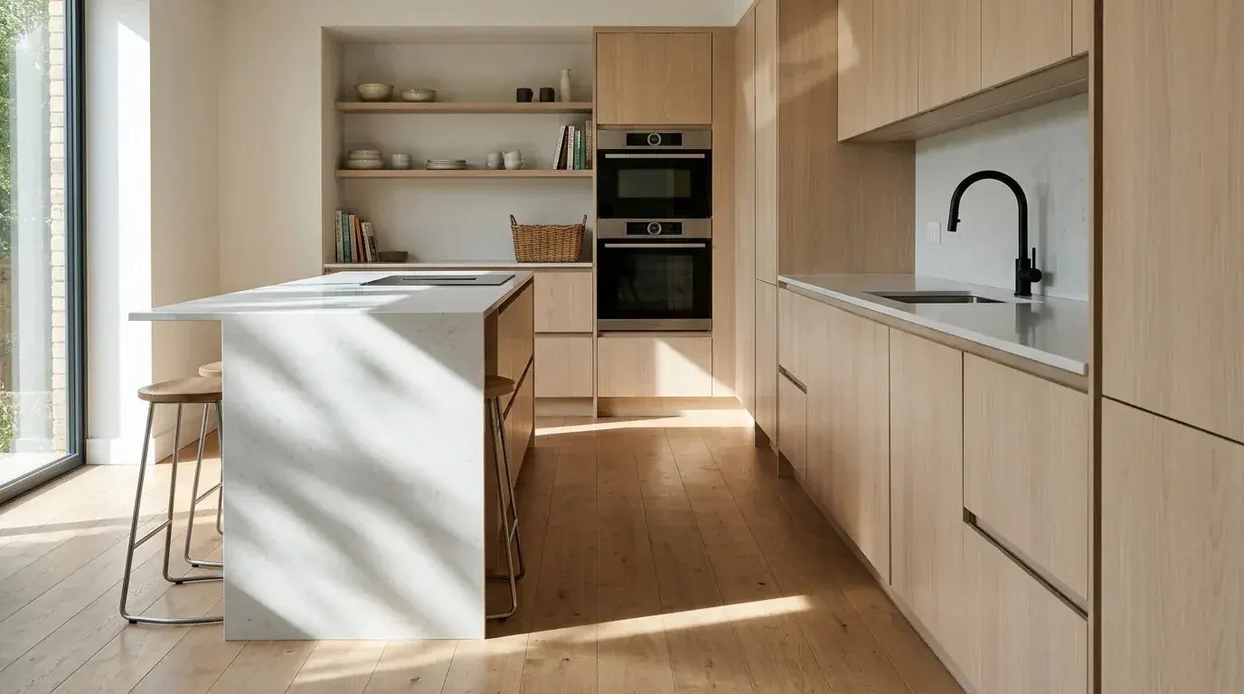
Short answer: design a kitchen layout by fixing the things that cannot move first, then the aisles, then the appliances. Mark the waste stack, gas line, extractor wall, window and door swings, pick whichever of the five layouts the room actually allows, and give yourself at least 42 inches of work aisle for one cook or 48 inches for two before you place a single cabinet. Cabinets are the last decision, not the first.
Our articles are still written by humans!
Get human written articles in your Google feed.
Most kitchen guides start with styles. That is the wrong end. A beautiful kitchen with a 32 inch aisle is a kitchen you will resent every time somebody opens the dishwasher while you are at the hob. This guide is built the other way round, from the numbers up, and it uses the NKBA Kitchen Planning Guidelines as the source for every clearance quoted.
Step 1: Find the four things that cannot move
A kitchen layout is mostly decided before you have any say in it. Four constraints do the deciding, and every one of them costs real money to override, which is why they matter as much to your kitchen remodel cost as any material you pick:
The waste stack. This fixes your sink more than anything else in the room. Moving a sink more than a couple of feet from the stack means re-running waste pipe under the floor at a fall, which on a concrete slab is expensive and on an upper floor is sometimes impossible.
The gas line and the extractor wall. A gas hob can be moved, but a ducted extractor wants a short, straight run to an external wall. Every bend costs you extraction performance, and a recirculating filter is a genuine downgrade if you cook anything that smokes.
The window. Windows kill wall cabinets and they usually decide where the sink goes by default, which is a habit rather than a rule. A sink under a window is pleasant. A sink under a window on the wrong side of the room is a daily walk.
Door swings. Both the room doors and the appliance doors. This is the one people forget, and it is the one that ruins finished kitchens.
If you are working from a plan rather than a room, convert it first. Our guide to turning a 2D floor plan into a 3D model covers the tools that do this, and a 3D view makes door swings and ceiling heights obvious in a way a flat plan never does. If you only have a photo of the existing room, you can also measure a room from a photo to get workable starting dimensions.
Step 2: Pick the layout the room allows
There are five kitchen layouts. Which one you get is mostly a function of room width, not taste.
Galley
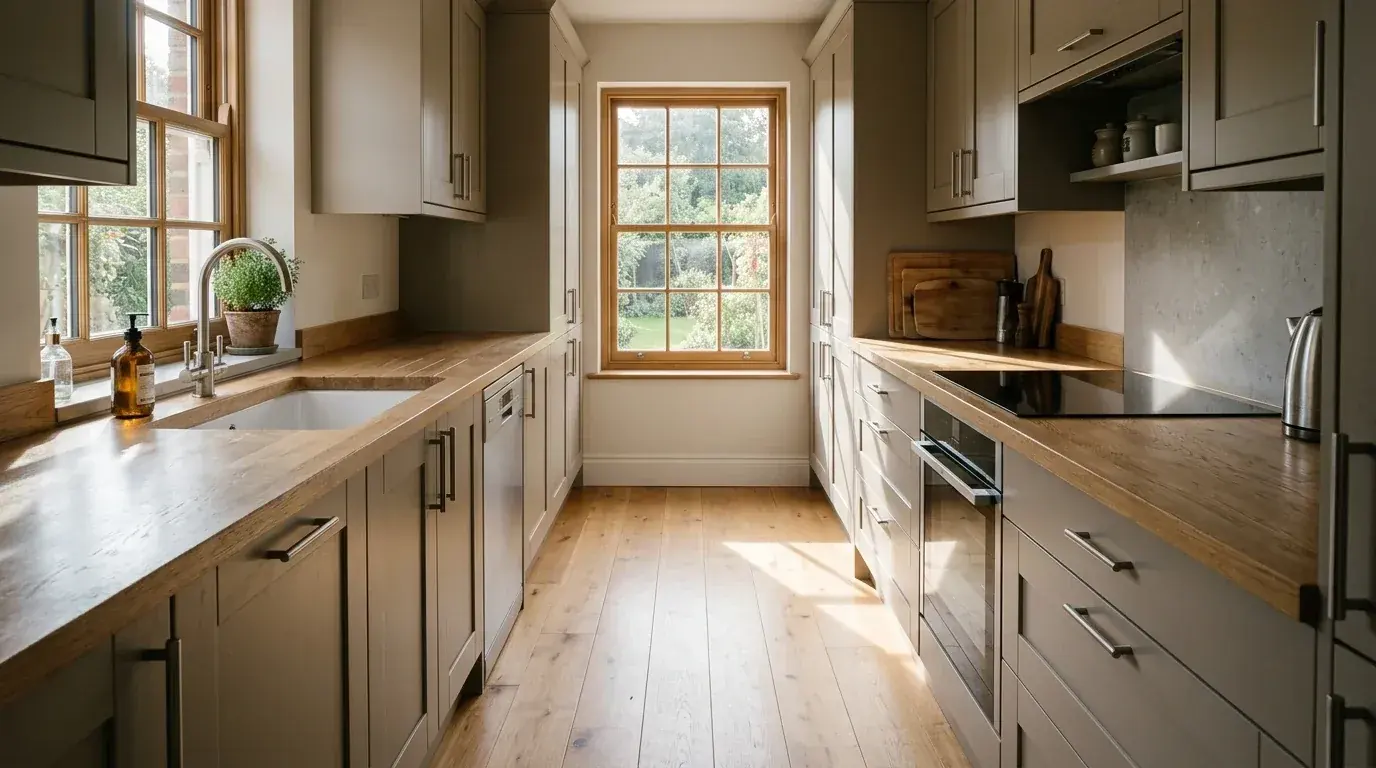
Two parallel runs facing each other. Pound for pound the most efficient layout there is, because everything is within a pivot. Put the sink and dishwasher on one run and the hob and oven on the other, so the wet and hot zones do not fight. It falls apart with two cooks, and it falls apart completely if the galley is also the route to the garden, because then it is a corridor with knives in it.
L-shaped
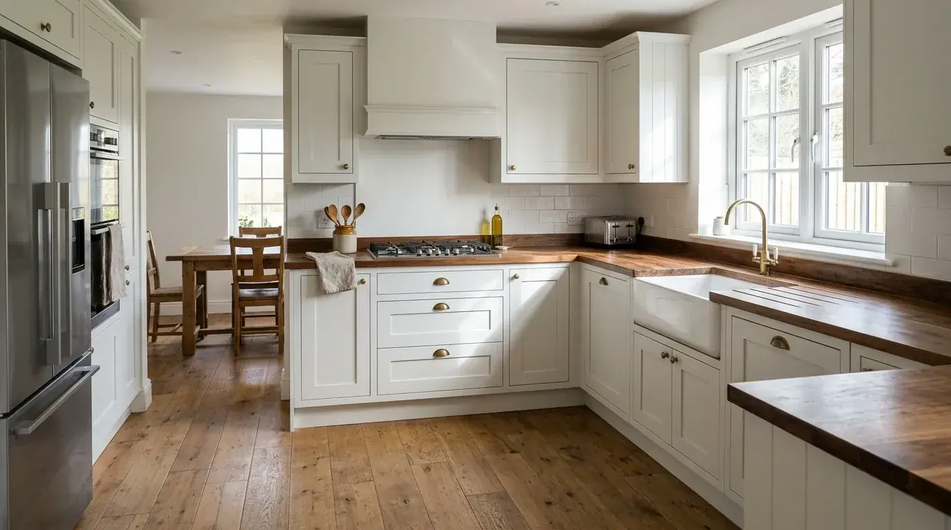
Two runs meeting in a corner. This is the layout most people should choose, because it gives you a natural work zone in the corner and leaves the rest of the room free. The honest weakness is the corner itself. A blind corner cabinet swallows storage and gives back very little, and the carousel mechanisms that claim to fix it cost more than the cabinet.
U-shaped
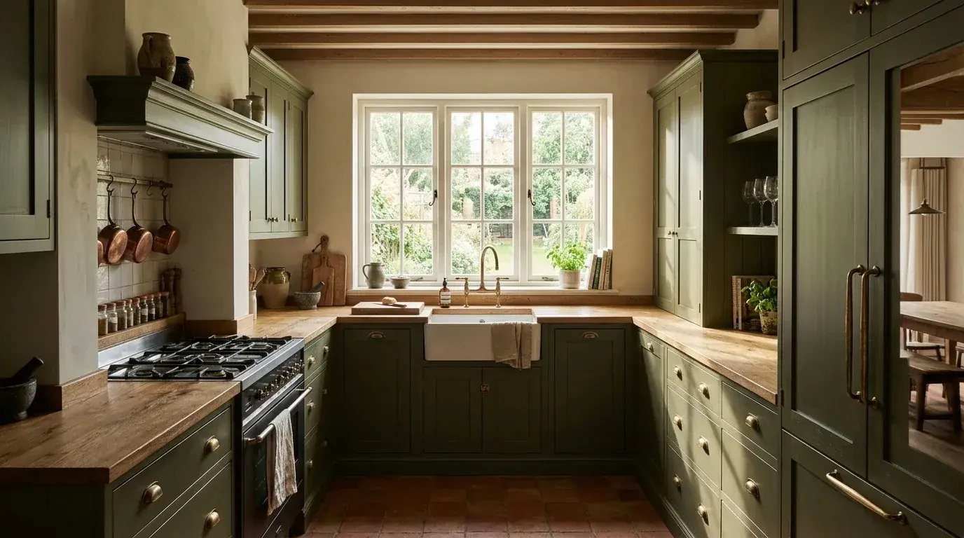
Cabinetry on three walls. The most worktop and storage of any layout, and the most enclosed. It needs about 10 feet of width or the two facing runs choke each other. You also get two blind corners rather than one, so budget for the corner solutions rather than discovering them.
Island
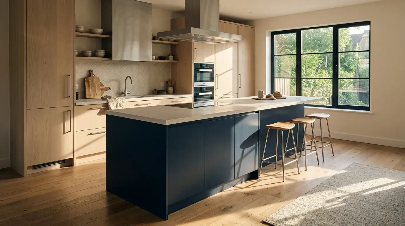
An island is the most requested and most over-specified element in kitchen design. The arithmetic is unforgiving. A 24 inch base run, plus a 42 inch aisle, plus a 36 inch island, plus another 42 inch aisle is 144 inches, which is 12 feet, and that is before you allow anything for the wall on the far side. If your room is under 13 feet wide, an island will make it worse. A slim moveable trolley does most of what people actually want from an island at a fraction of the cost and none of the circulation penalty.
Peninsula
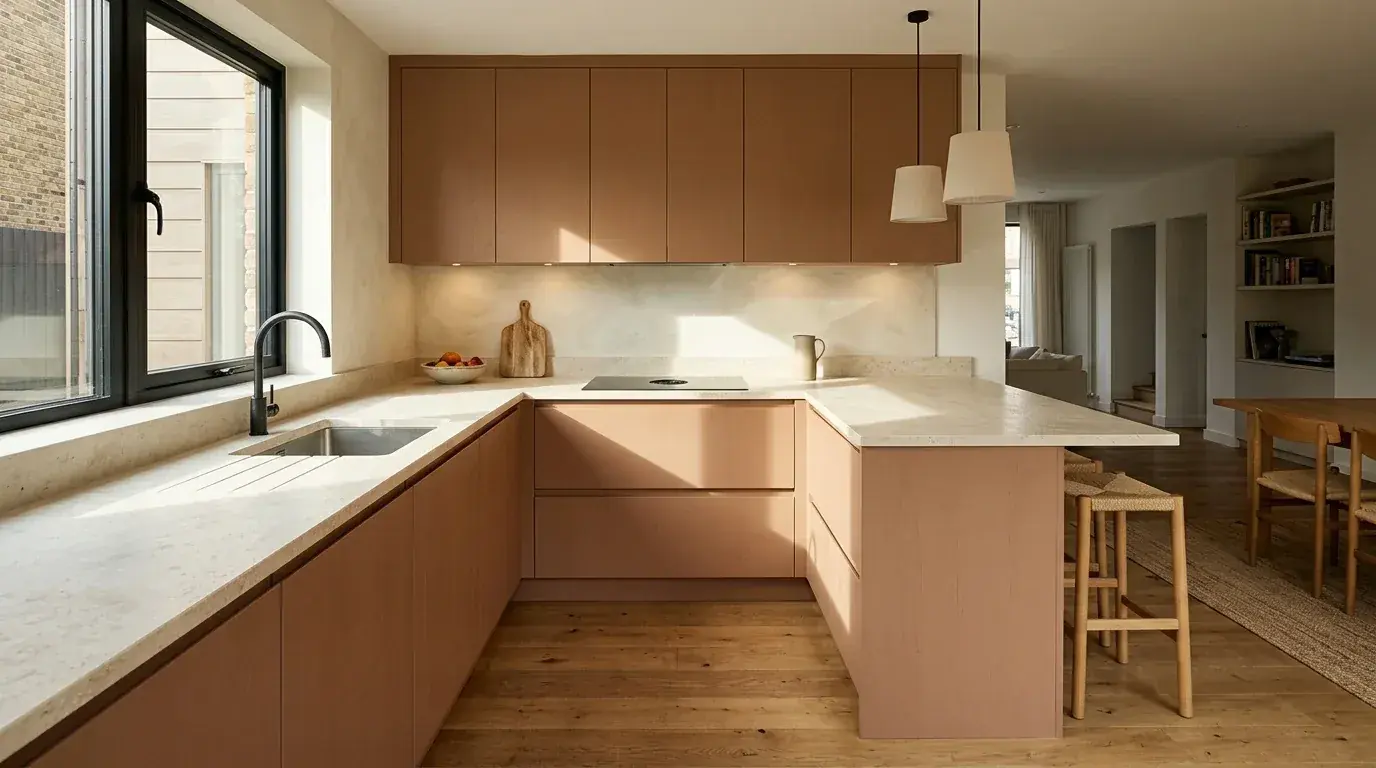
A peninsula is an island attached at one end. Because it only needs an aisle on the sides you use, it fits in rooms an island cannot, and it still gives you the seating and the second prep surface. The trade is that it creates a dead end, so you walk around it rather than through. For most rooms between 10 and 13 feet wide, a peninsula is the right answer and an island is vanity.
Step 3: Understand why the work triangle is being dropped
The kitchen work triangle is the path between the sink, the hob and the refrigerator, with the rule that the three legs together should total no more than 26 feet and each leg should measure between 4 and 9 feet. Most articles date it to the 1940s. That is when the University of Illinois Small Homes Council formalised it into the guideline we still quote, but the underlying work is older: the industrial engineer and psychologist Lillian Moller Gilbreth pioneered the idea in the 1920s by applying motion study to kitchen work. Either way, it was designed around one cook, one oven and a closed room.
For 2026, designers are moving away from it. Reporting on next year’s kitchen trends found that designers working on renovations today are less concerned with the triangle and more interested in zones, because households now have larger kitchens, more appliances and frequently more than one person cooking at a time.
Here is the part most articles get wrong, and it is worth being precise about. The triangle is not wrong. It is incomplete. It describes three destinations, and a modern kitchen has six or seven: sink, dishwasher, hob, separate oven, fridge, bin, and usually a coffee or breakfast station. A model built for three points cannot describe that. If your kitchen genuinely has one cook and three appliances, which describes most galley and small L-shaped kitchens, the triangle still works fine and you should still keep the total under 26 feet.
Step 4: Group the kitchen into zones
A kitchen zone is a defined area that holds everything needed for one activity, so that the activity can be completed without crossing the room. Four zones cover most kitchens: prep, cook, clean and store.
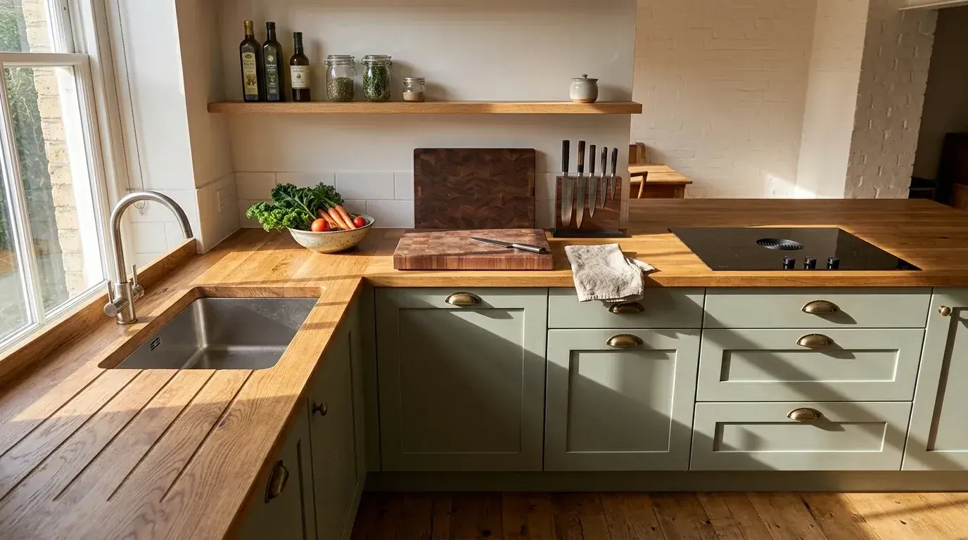
The prep zone is the one people under-build. It wants the longest continuous run of worktop in the kitchen, ideally between the sink and the hob, with a bin directly below and knives, boards and bowls within reach. If you get one thing right in a kitchen layout, make it an uninterrupted prep run. Every worktop broken up by a hob, a sink and a corner is a kitchen where nothing large can ever be assembled.
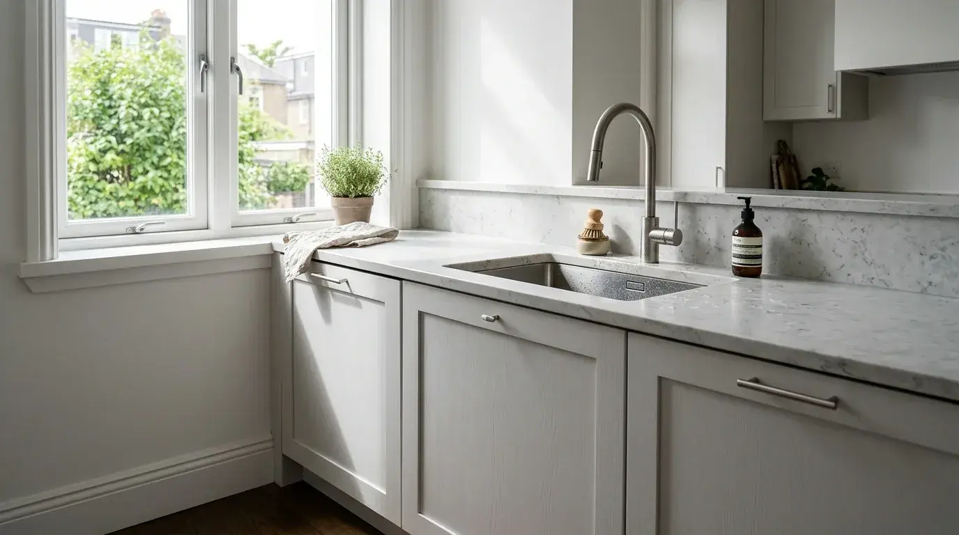
The cleaning zone is sink, dishwasher, bin and the cupboard where clean things live. Put the dishwasher immediately beside the sink, on the side of your non-dominant hand, so you can scrape and load in one movement. Put the everyday crockery cupboard within a step of the dishwasher, not across the room, because unloading happens every day and nobody plans for it.
The cook zone is hob, oven, extractor and the pans, oils and utensils used at the hob. The store zone is fridge, larder and dry goods, and it should sit at the edge of the kitchen so somebody can grab milk without walking through the person cooking.
Step 5: The numbers that actually decide the layout
These are the NKBA planning figures. If your layout cannot hold them, change the layout rather than hoping. Metric conversions are rounded to the nearest centimetre.
Two notes on using these. First, measure aisles from the face of the cabinet or the appliance, not from the wall, because a 24 inch base unit plus a handle eats more than you think. Second, check every aisle with a door open. A dishwasher door takes roughly 24 inches out of the aisle in front of it, and an American fridge door takes more.
Step 6: The mistakes that survive to installation
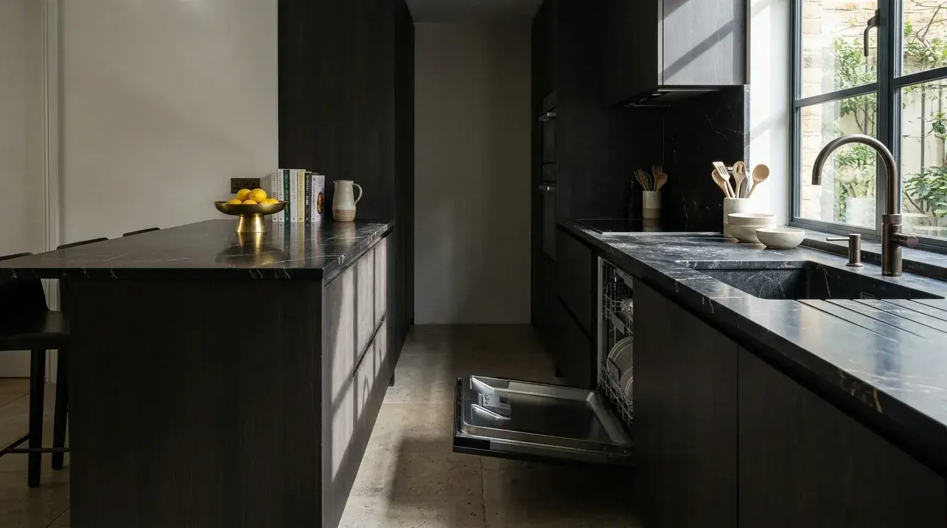
The kitchen above is expensive and badly planned, which is a common combination. The dishwasher door cannot open without blocking the aisle, and no amount of cabinetry budget fixes that after installation. These are the errors we see most often, roughly in order of how much they cost to live with:
1. An island in a room that cannot take one. Covered above, and it is the expensive one because the island is usually the single most costly item in the kitchen.
2. A fridge door swinging into the work aisle. Fridge doors are wide and most are reversible, so check which way yours opens against where people stand. A fridge at the end of a run with the hinge on the wall side is almost always right.
3. No landing beside the hob. You need somewhere to put a hot pan down. Fifteen inches on one side and twelve on the other is the minimum, and a hob pushed into a corner or up against a tall unit fails this immediately.
4. Wall cabinets run into a window reveal. The cabinet cannot be scribed neatly to the reveal, so you end up with a filler panel in the most visible part of the room. Stop the run and use open shelving or nothing.
5. The bin nowhere near the prep zone. Trivial to fix on a plan, deeply annoying for a decade if you miss it.
6. Designing for a photograph rather than a Tuesday. A kettle, a toaster, a knife block and a fruit bowl take up about three feet of worktop and they live there permanently. Plans that assume empty counters produce kitchens with nowhere to work.
How to plan a small kitchen
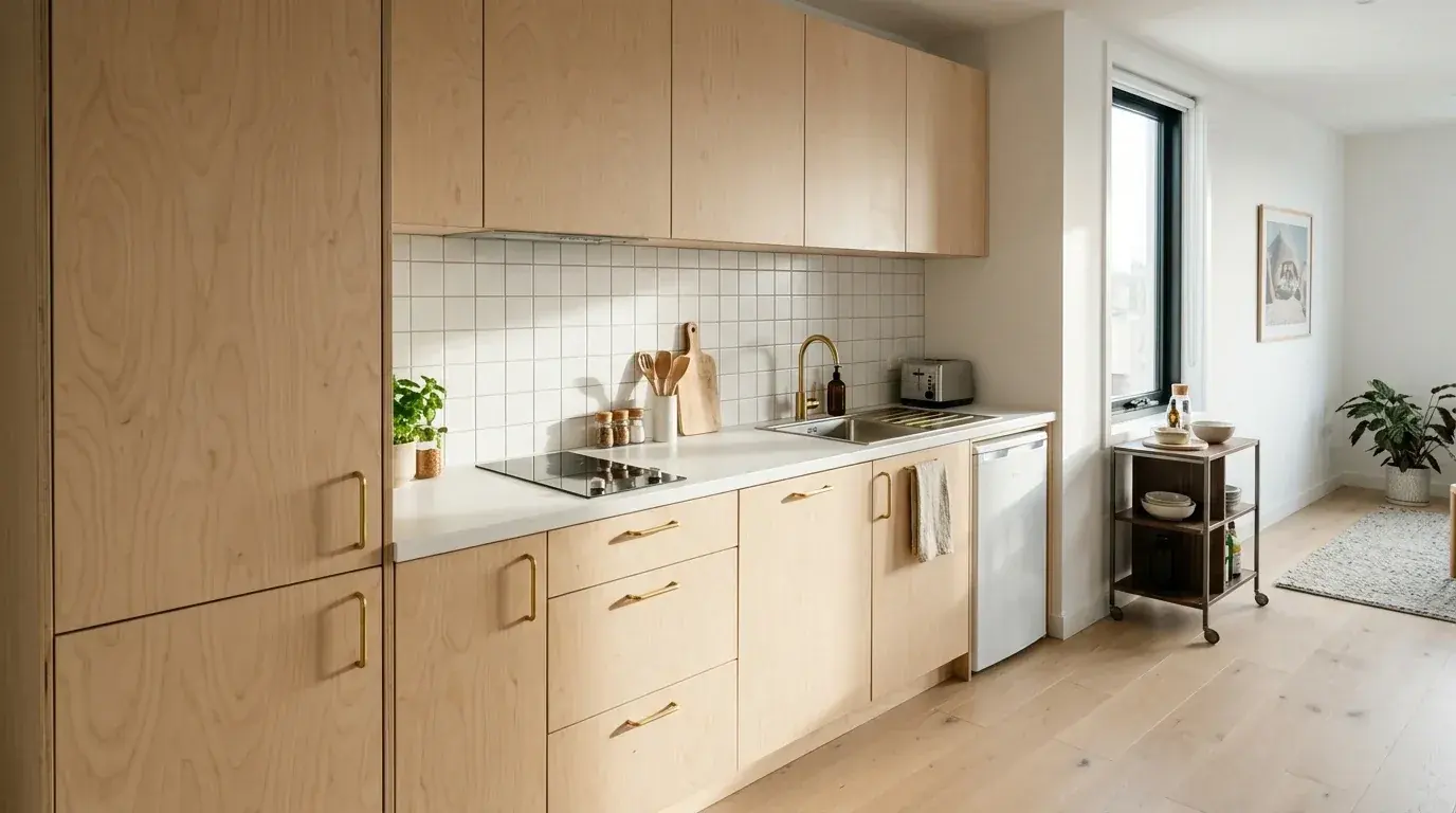
Small kitchens reward discipline, not cleverness. Three rules carry most of the weight.
Keep the sequence fridge, sink, hob in that order along the run, because it matches the order you actually work in. Go full height with storage on one wall rather than spreading base units everywhere, since vertical space is free and floor space is not. And replace the island you cannot have with a trolley you can move, which gives you a prep surface when you need one and gives you the floor back when you do not.
If your small kitchen opens onto a living space, the layout problem is really a whole-room problem. Our guide to furniture layouts for open floor plans covers how to zone the two areas so the kitchen does not swallow the room, and the studio apartment layout guide goes further for very tight spaces.
Step 7: Test the layout before you commit
A kitchen plan is a drawing seen from above, and nobody experiences a kitchen from above. This is why layouts that look balanced on paper feel wrong in the room. Rendering the layout at eye level catches proportion problems in seconds.
This is where AI kitchen design earns its place, and it is worth being precise about where it does and does not. We render kitchen variants with MeltFlex constantly, and the pattern is consistent.
The rule that follows from that table is simple. Set the aisles and the appliance positions yourself using the numbers above, then use AI to decide what it looks like. Doing it the other way round produces a beautiful render of a kitchen that cannot be built. The same discipline applies next door, where the numbers are tighter still: see small bathroom layout dimensions. It is a failure mode we wrote about at length in why AI renders look fake.
Practically: upload a photo of the existing room or a floor plan, generate the layout variants, and compare them side by side at the same camera height. If you want the prompt wording that gets usable kitchen output rather than generic showroom images, we keep a tested set in AI kitchen design prompts, and the wider field of tools is compared in AI kitchen design tools.
Two more checks worth doing before you sign anything. Run the furniture and appliances you plan to buy through a furniture fit calculator so you know a 900 mm range actually gets through the door, and if you are furnishing beyond the kitchen, the furniture sizing guide covers the same logic for the rest of the house. For the whole-room workflow rather than the kitchen alone, the best AI interior design tools comparison shows which tools handle floor plans as well as photos.
Frequently Asked Questions
How do I design a kitchen layout step by step?
Start with what cannot move: the waste stack that fixes the sink, the gas line, the wall your extractor vents through, the window and the door swings. Choose one of the five layouts that the room shape allows. Draw the aisles next, because NKBA calls for at least 42 inches of work aisle for one cook and 48 inches for two. Then place sink, hob and fridge, check the landing space beside each, group everything into prep, cook, clean and store zones, and render the result at eye level before you order anything.
What are the five kitchen layouts?
Single wall, galley, L-shaped, U-shaped, and island or peninsula layouts. Single wall suits studios and narrow apartments. Galley is the most efficient per square foot and works in rooms from about 7 to 9 feet wide. L-shaped is the most flexible and the most forgiving of an open plan. U-shaped gives the most worktop but needs about 10 feet of width. Islands need roughly 13 feet of room width before they help rather than hurt.
Is the kitchen work triangle still relevant?
Partly. The triangle was defined in the 1940s for a single cook moving between three appliances in a closed room, and it still describes small kitchens well. It breaks down in modern kitchens with two cooks, a separate hob and oven, a dishwasher, a microwave drawer and a coffee station, because those are five or six destinations rather than three. Designers have largely moved to zones for 2026, which is an extension of the triangle rather than a rejection of it.
How wide should a kitchen walkway be?
NKBA sets 36 inches for a walkway where no work happens, at least 42 inches for a work aisle with one cook, and at least 48 inches where two people cook at once. Where two walkways cross at right angles, allow 42 inches. Measure from the face of the cabinet or appliance, not from the wall, and check it with an appliance door open, because a dishwasher door eats roughly 24 inches of that aisle.
How much counter space does a kitchen need?
NKBA calls for 158 inches of countertop frontage at 24 inches deep across the whole kitchen. More useful than the total is where it sits: 24 inches of landing on one side of the sink and 18 on the other, 15 inches on one side of the cooktop and 12 on the other, and 15 inches beside the refrigerator. A kitchen can hit the total and still be unusable if it has no continuous run between sink and hob.
How big does a room need to be for a kitchen island?
About 13 feet of width as a working minimum. An island is typically 3 feet deep, and it needs a compliant aisle on the sides you use, so 42 inches on one side plus 42 on the other plus a 24 inch base run plus the island itself adds up fast. Below that width you get an island that blocks the dishwasher door and forces people to shuffle sideways, which is the single most common planning mistake in expensive kitchens.
Can AI design a kitchen layout for me?
AI is reliable for testing and visualising a layout you have already constrained, and unreliable as the thing that decides the layout. It renders finishes, cabinet styles and lighting convincingly, and it lets you compare five versions of the same room in minutes. It does not know where your waste stack is, it invents appliance sizes, and it will happily draw an island 20 inches from a run of base units. Use it after you have set the aisles, not instead of setting them.
What is the most common kitchen layout mistake?
Putting in an island the room cannot take. It is the mistake that survives all the way to installation because it looks fine on a plan viewed from above and only becomes obvious when someone opens the dishwasher. The runners up are a fridge door that swings into the work aisle, no landing space beside the hob, and wall cabinets taken right up to a window reveal so the frame cannot be trimmed properly.
The Bottom Line
Kitchen layout is a constraints problem wearing a design problem’s clothes. The waste stack, the extractor wall, the window and the door swings decide most of it. The NKBA numbers decide the rest. Style is the last five percent, and it is the only part every other guide talks about.
Do it in this order and you will not go far wrong: fix the immovable points, pick the layout the width allows, set the aisles at 42 or 48 inches, place the three appliances with their landings, group everything into prep, cook, clean and store, and only then choose what it looks like. When you get to that last step, design your kitchen with AI from a photo and compare the options at eye level rather than from above. It costs nothing and it catches the things plans hide.



)